Dropdowns clearly have their place in effective web design. However, their overuse and misuse creates many usability problems and confusion. Designers employ dropdowns for a variety of different purposes, including:
- Command menus, which initiate an action based on the selected option

- Navigation menus, which take users to a new location

- Form filling, which lets users select an option to enter into a form field
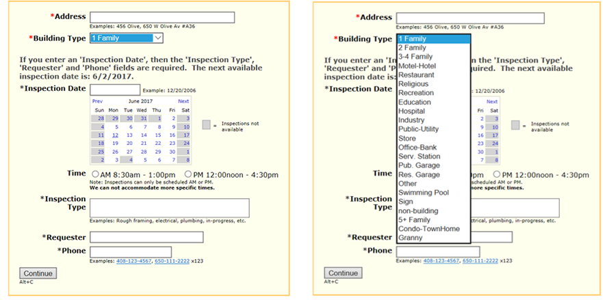
- Attribute selection, which lets users choose a value from a menu of possible values
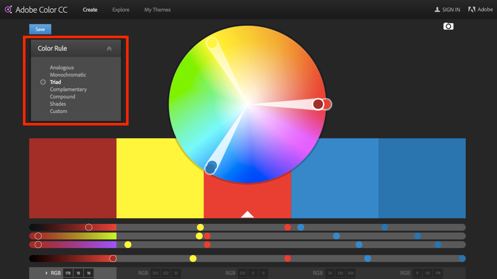
Adobe Color CC, a tool used to gather the RGB and HEX values for a set color palette, allowed users to choose a palette from a list of color rules.
Although originally the terms “dropdown box” and “dropdown menu” were used interchangeably, over time a functional distinction has emerged between the two. Today, dropdown menus mostly cover the first two uses of dropdowns (navigation and list of commands), whereas dropdown boxes are often the method of choice for form fill-in and attribute selection.
Dropdown boxes generally look different than dropdown menus: they have a dropdown arrow next to them and are used to select attributes or enter form data. This control tends to be supported by a field label or a title that takes the position of the first item in the dropdown box, so that it can be seen before making a selection. Although MacOS and Windows have different dropdown implementations, in both cases the command menus are different from the attribute-selection menus. In fact, the Macintosh Human Interface Guidelines explicitly recommends to not use dropdown menus for commands.
Guidelines for Dropdown Design
Dropdowns do have their advantages. First, they conserve screen space. Because they are a standard widget (even if an unpleasant one), users know how to deal with them. And, when used in forms and for attribute selection, dropdown boxes prevent users from entering erroneous data, since they only show legal choices.
Despite these advantages, web usability would increase if designers used dropdowns less often. To that end, here are some design guidelines for dropdowns:
- Avoid interacting menus, wherein the options in one menu change when users select something in another menu on the same page. Users get very confused when options come and go, and it is often hard to make a desired option visible when it depends on a selection in a different widget.
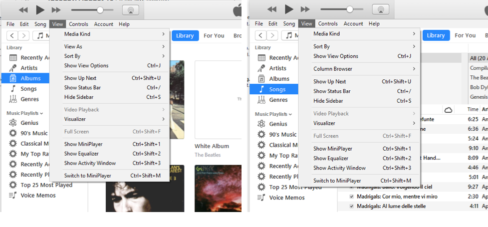
iTunes: The View menu contains different options depending on whether the Albums (left) or the Songs (right) option is selected in the Library side menu. - Gray out any unavailable options instead of removing them: any items that cannot be selected should remain in view. For extra UX credit, consider showing a short balloon help message if users hover over a grayed-out option for more than a second, explaining why that option is disabled and how to make it active.
If disabled items are removed, the interface loses spatial consistency and becomes harder to learn.
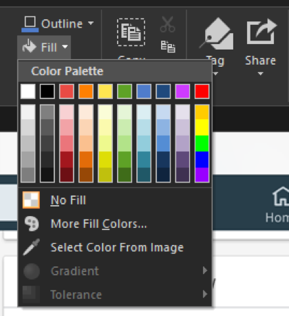
Snagit: Gradient and Tolerance options are grayed out to indicate that they cannot be selected when the No Fill option is chosen. - Very long dropdowns that require scrolling make it impossible for users to see all their choices in one glance. They also require careful steering of the mouse so that it does not leave the dropdown. (This is an instance of the steering law, which says that the time it takes a user to steer a pointing device through a tunnel depends on the length and the width of the tunnel: the longer and narrower the tunnel, the more time it takes users to move the pointer from one end to another. The steering law is derived from Fitts’ law, which we discuss in our Human-Computer Interaction course.)
Resist the temptation to include many items whenever possible. If you have many items, consider alternative ways of presenting them — such as HTML lists of traditional links or mega menus, which are two dimensional instead of linear and offer easier mouse management and also faster average reach time to items inside.
Angie’s list used a dropdown for listing service categories. To see all the options, users had to scroll down several times.Users were unable to predict the end of the list because there was no scroll bar. - Avoid dropdown boxes when typing may be faster. Typical situations include lists of states or countries, such as for U.S. mailing addresses. It is much faster for users to simply type, say, "NY," than to select a state from a scrolling dropdown. Free-form input into fields with restricted options does require data validation on the backend, but, from a usability perspective, it's often the best way to go. (This is one of our ecommerce-usability guidelines because of the many errors we observed in checkout forms with state dropdowns.)
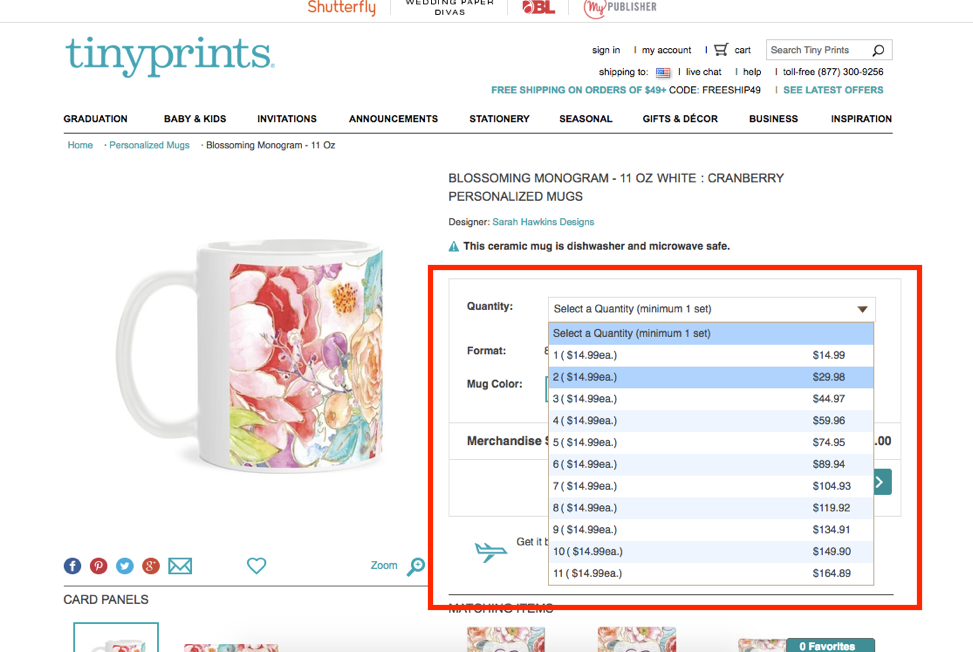
Tinyprints complicated the purchasing process by using a dropdown to change the quantity of mugs purchased. Typing the quantity would be much faster than selecting one from a dropdown. - Avoid dropdown boxes for data that is highly familiar to your users, such as the day, month, or year of their birth. Such information is often hardwired into users' fingers, and having to find these options in a long menu is tedious, breaks the previous guideline, and can create even more work for users.
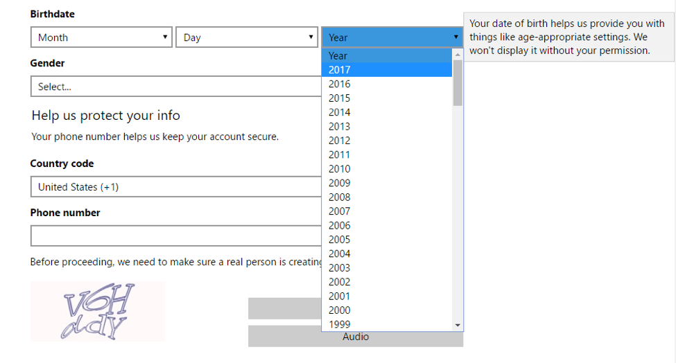
Live.com: To create an account, users had to enter their birthdates by selecting the month, day, and year from long dropdown boxes. It would have been easier to just type this information. - Keep the menu label or description in view when the dropdown is open. Menu titles provide scope and direction by reminding users what they are choosing. Whenever the labels are obscured or removed when the menu is open, users must recall what they need to select before they can take action. Plan for interruptions that can disrupt the user’s task at any time.
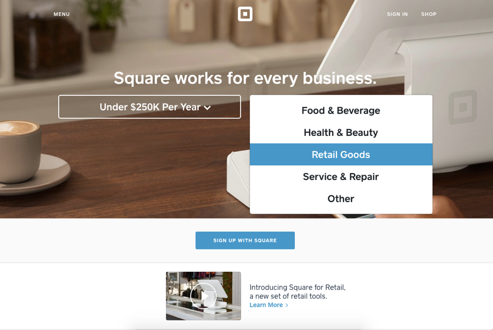
The Square site hid the label, Select Business Type, when the dropdown was open. Users would need to recall the label in order to understand the context of the options in the dropdown. (We also usually advise against centered or right-justified menu options, since left-justified menus are easier to scan.) - Keep global navigation options out of dropdown menus on desktop. Burying your site’s top-level categories can be detrimental to user success on any site.
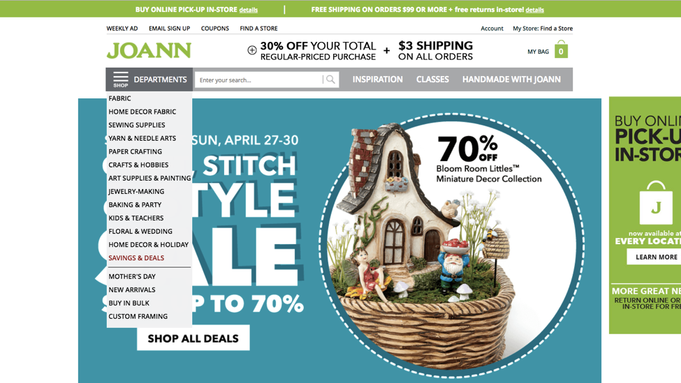
The Joann site featured a handful of links in their top-level navigation, but most of the global navigation was in the Departments dropdown menu. This design choice made navigation options less discoverable. - Support keyboard input to navigate within a dropdown. Dropdowns (both menus and boxes) should support not only mouse input, but keys as well. In dropdown menus, access keys should enable users to quickly select a visible option without using the mouse. In a dropdown box, users should be able to type a letter and quickly navigate to options starting with that letter.
These alternative options will alleviate some of the problems caused by long dropdown lists, and also improve accessibly for blind users.
Conclusion
A while back, as part of a presentation on web-usability methods, we ran a small user test for the audience. When completing a registration page, our test participant had to enter her address on a form with a text field for the name of the street but a dropdown menu for the type of street (Avenue, Boulevard, Court, Drive, and so on). Guess what? The user typed her full street address in the text entry field, because that's what she'd always done in the past. The dropdown menu then came as a complete surprise and she had to go back to the text field and erase part of her already typed address information.
This small study, conducted in front of a crowd of hundreds, shows that sometimes it is enough to run tests with a single user to clearly illustrate a point. Once you see such confusion in action, you realize that using a "helpful" dropdown menu to save users a few keystrokes can hurt more than it helps. Follow these guidelines in your own designs to improve your site navigation and increase task success.


Share this article: