Mega menus (sometimes spelled “megamenus”) are a type of expandable menu in which many choices are displayed in a two-dimensional dropdown layout. They are an excellent design choice for accommodating a large number of options or for revealing lower-level site pages at a glance.
As the following screenshots show, mega menus have the following characteristics:
- Big, two-dimensional panels divided into groups of navigation options
- Navigation choices structured through layout, typography, and (sometimes) icons
- Everything visible at once — no scrolling
- Vertical or horizontal form factors when activated from top navigation bars; when activated from left-hand navigation, they might appear as mega fly-outs (not shown)
- Menu options revealed on hover, click, or tap

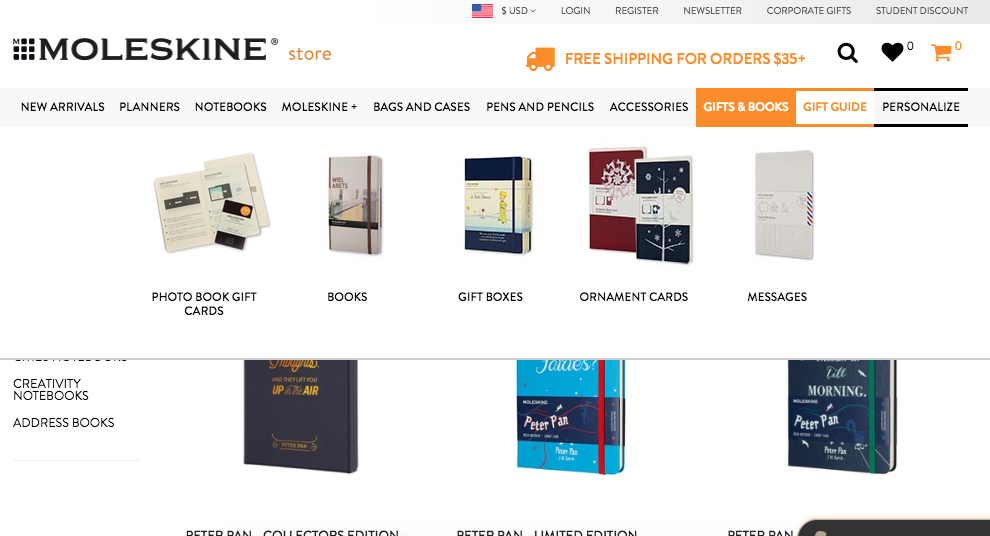
As the NovaScotia and Moleskine examples show, mega menus provide sufficient space for images and other rich content. Images in the mega menu can help users select the right option.
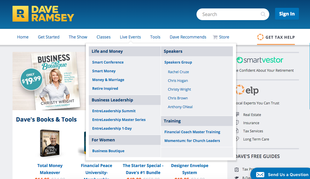
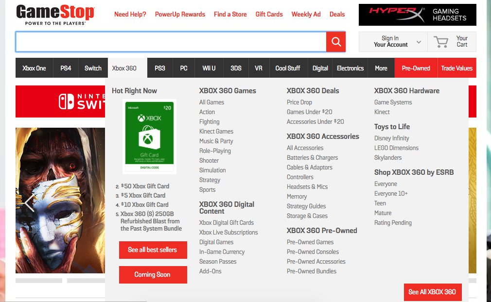
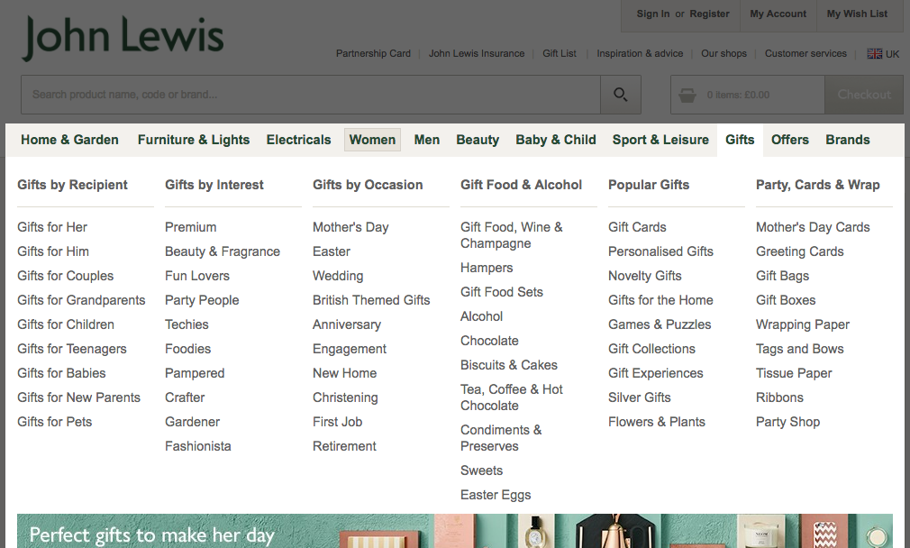
Mega menus also allow designers to show multiple levels of the site’s information architecture — in three out of the five examples above (Dave Ramsey, Game Stop, John Lewis), the mega menus contain both first-level categories and second-level categories.
Mega Menus Beat Regular Dropdowns
We know from user testing that mega menus work. Here are some arguments to support this empirical fact:
- For bigger sites with many features, regular dropdown menus typically hide most of the user's options. Yes, you can scroll, but (a) it's a pain, and (b) scrolling hides the options at the top of the menu. As a result, you can't visually compare all your choices; you have to rely on short-term memory. People have enough on their minds, and messing with short-term memory reduces their ability to accomplish tasks on your site. Mega menus show everything at a glance, so users can see rather than try to remember.
- Regular dropdowns don't support grouping unless you use kludges, such as prefixing secondary choices with a space character to indent them. Mega menus let you visually emphasize relationships among items. This again helps users understand their choices.
- While plain text can be wonderful, illustrations can indeed be worth a mouthful of words, as the Moleskine example shows. Mega menus make it easy to use pictures and icons when appropriate. And, even if you stick to text alone, you have richer typography at your disposal (letting you differentiate link sizes according to their importance, for example).
Timing Considerations for Mega menus Displayed on Hover
If mega menus are displayed on hover, one challenge is to distinguish between two different user intentions:
- The user is just moving the mouse towards a target on the screen, and the mouse trajectory intersects the link corresponding to the mega menu.
- The user actually looks at the navigation categories and needs more information about them.
The second situation should trigger the mega menu, but the first should not.
To account for these two user intentions, don't make response time for a mega menu be too fast: the mouse should remain stationary for 0.5 seconds before you display anything that's hover-dependent, such as a mega menu or a tooltip. Violating this guideline will make the screen flicker insufferably when users move the mouse. Only after 0.5 seconds of resting the pointer on a navbar item can you assume that a user actually wants to see its associated dropdown.
Thus, the timing should be:
- Wait 0.5 seconds.
- If the pointer is still hovering over a navbar item, display its mega menu within 0.1 seconds.
- Keep showing it until the pointer has been outside both the navbar item and the drop-down for 0.5 seconds. Then, remove it in less than 0.1 seconds.
One exception to item 3: The very best implementations can sense when a user is moving the pointer from the navbar item to a destination within the dropdown. When the pointer is on such a path, the dropdown should remain visible. This supplementary guideline addresses the diagonal problem, which happens when the path temporarily takes the pointer outside the active area. The dropdown shouldn't disappear when the user is on the way to point to something within it.

In the above example, the user first pointed to the Sport & Leisure navbar item and now wants to select Haberdashery. Moving the pointer between these two spots makes it cross the Baby & Child navbar item. Many users will move so fast that the pointer will exit the active area for less than 0.5 seconds. However, older or leisurely users might move the mouse so slowly that the dropdown would disappear while they're still aiming for a menu item. Very annoying.
Grouping the Options Within a Mega Menu
The main grouping guidelines are:
- Chunk options into related sets, such as those you discover after doing a card-sorting study of users' mental model of the features.
- Keep a medium level of granularity. Don't offer huge groups with numerous options that require extensive time to scan. Conversely, don't make the individual groups so small that the mega menu has an overabundance of groups that users have to spend time understanding.
- Use concise, yet descriptive labels for each group. Remember the standard rules for writing for the web: enhance scannability by starting with the most information-carrying word and avoid made-up terms.
- To keep words short and direct; the base form of verbs ("shop") is usually better than gerunds ("shopping").
- Differentiate labels. JohnLewis.com’s Gift by Interest and Gift by Occasion, for example, don't work well together.
- Order the groups. You can do this using an inherent order among the features (as for a workflow) or according to importance, putting the most important or frequently used group in the top-left corner (assuming a left-to-right language like English).
- Show each choice only once. Duplicating options makes users wonder whether the two occurrences are the same or different. Also, redundancy makes the entire interface bigger and more cumbersome.
Keep Mega Menus Simple
The standard usability guideline to "keep it simple" also applies to mega menus. Just because you can put anything into them doesn't mean that you should. Simplicity applies to interaction semantics at least as much as it applies to the presentation layer. Fewer options mean less to scan, less to understand, and less to get wrong.
In particular, avoid GUI widgets and other interface elements that involve more advanced interaction than a simple click. Mega menus are a fleeting screen presence and shouldn't replace dialog boxes, which are the natural home for more complex interactions and can support them better. Among other benefits, dialog boxes have a standard dismissal method (the OK/Cancel buttons), stay on the screen until they're dismissed, and can be moved around if users need to see something that the box obscures.
Similarly — but worse still — is hiding the search box within a mega menu. This is bad for two reasons:
- The search box should be continuously visible on the page rather than displayed only when users activate the mega menu.
- Having GUI widgets (a text field and a command button) makes the mega menu a heavyweight interaction area instead of a simple navigation menu.
Accessibility
Because dynamic screen elements always have the potential to cause accessibility problems, it's important to code them with screen readers and other assistive technology in mind.
Even if coded correctly, mega menus can cause problems for low-vision users who use screen magnifiers to enlarge tiny portions of the screen. (The same issue impacts smartphone and tablet users.) With a small screen or a screen magnifier, only a small portion of the mega menu might be visible.
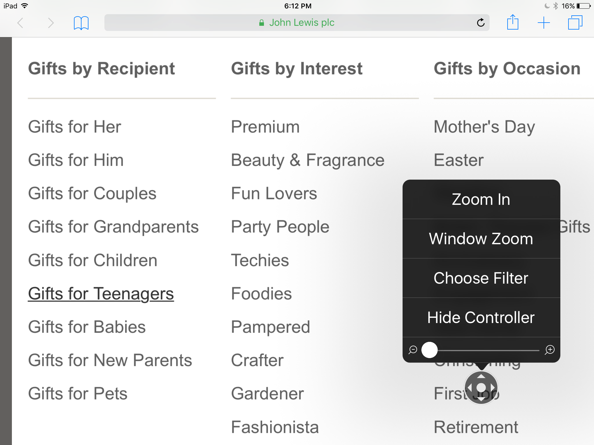
For example, in the JohnLewis.com screenshot above, the screen magnifier will show the first groups but not the Gift Food & Alcohol topic or those right of this groups. The missing drop shadow, which appears on the full menu's right edge, is too subtle a signal to help most users, particularly those with poor vision. Users may assume that the visible content is all the content that is available, and, thus, the site could lose orders if it had many low-vision customers (a common situation for sites targeting older users). Having a strong visual signal for menu borders is one way to alleviate this problem.
In addition, tiny options inside mega menus cause selection errors on touchscreens, and overly finicky show/hide behaviors hurt people with motor skills impairment.
There are two main approaches to improving the accessibility of mega menus:
- Simple: Don't bother making the dropdown itself accessible. Instead, make each top-level menu choice clickable, leading to a regular Web page where you present all dropdown options in plain, fully accessible HTML.
- Advanced: Edit the site from the backend using a jQuery plugin that will make the mega menu screen reader accessible. This will also require structural changes to the HTML and CSS.
If you're a rich company and/or especially concerned with accessibility, you should implement both the simple and advanced features. Most sites, however, will probably have to make do with the simple approach.
Conclusion
Mega menus may improve the navigability of your site. (Of course, it's always best to test.) By helping users find more, they'll help you sell more (or meet other business goals, such as attracting donations or disseminating helpful information for nonprofit or government sites).
See also: article on the downsides of poorly-designed mega menus.


Share this article: