The Transportation Security Administration (TSA) helps keep air travelers safe. But since being delayed or forced to take clothes off in public is also guaranteed to annoy a lot of people, you’d expect the TSA to get a pretty healthy volume of complaints.
So when I first saw the TSA’s complaint form, the design error seemed so obvious that I wondered if it might be intentional. The form includes 2 buttons at the bottom: Preview and Clear Form. The Preview label is less than ideal, since most users would expect a Submit or at least a Next button. But the real problem is the Clear Form button, which actually deletes anything entered into the form.
Intentional or not, this arrangement undoubtedly reduces the volume of complaints! However it also violates a form-design guideline we first wrote about more than 15 years ago: to avoid Reset buttons on web forms.
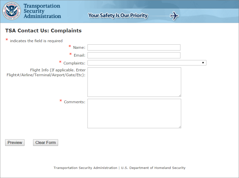
I’ve recently concluded that the design of this form was not intentionally bad, because the TSA actually has a second complaint form that correctly uses a single Submit button below the form. Since one form follows the guideline, it seems likely that the poor design of the other version is just accidental.
As a taxpayer, it’s comforting to think that my government agency isn’t deliberately using bad design to avoid hearing my comments. But from a UX perspective it’s a painful reminder that despite the buzz and popularity of “UX” in recent years, basic understanding of usability is often still lacking. Even simple guidelines that ought to be well established are often unknown or disregarded.
Careful form design has a huge impact on the speed with which users can understand and accurately complete a form. In fact, a recent paper published in CHI by Seckler and her colleagues shows that, when forms follow basic usability guidelines, the completion time decreases significantly and users are almost twice as likely to submit the form with no errors from the first try (78% one-try submissions in forms compliant with usability guidelines versus only 42% one-try submissions in forms violating them). If you wonder why your conversion funnel has big drop-offs on forms pages, this study may give you a clue: usability problems on forms really hurt business.
Do your website forms follow usability best practices?
Best Practices for Web Form Design
The best design solution for any given form depends on many factors: the length of the form, the context of use, and the data being collected. The exact implementation you should use may vary in certain circumstances, but this is no excuse for ignoring guidelines altogether. Instead, use these recommendations as a starting point, and if you stray from these established best practices make certain you have a good reason for doing so.
- Keep it short. The mathematician Blaise Pascal famously said: “I have made this longer than usual because I have not had time to make it shorter.” This principle applies to web forms as well as prose writing. Eliminating unnecessary fields requires more time, but the reduced user effort and increased completion rates make it worthwhile. Remove fields which collect information that can be (a) derived in some other way, (b) collected more conveniently at a later date, or (c) simply omitted. (We recently applied this technique to one of our own forms and reduced it from 6 fields down to only 2 fields.) Every time you cut a field or question from a form, you increase its conversion rate — the business case for this guideline is that simple.
- Visually group related labels and fields. Labels should be close to the fields they describe (immediately above the field for mobile and shorter desktop forms, or next to the field for extremely long desktop forms). Avoid ambiguous spacing, where labels are equidistant from multiple fields, and make sure to include the label attribute for screen readers. If your form asks about two different topics, section it into two separate groups of fields (and tag the groups for screen readers).
- Present fields in a single column layout. Multiple columns interrupt the vertical momentum of moving down the form. Rather than requiring users to visually reorient themselves, keep them in the flow by sticking to a single column with a separate row for each field. (Exceptions to this rule: short and/or logically related fields such as City, State, and Zip Code can be presented on the same row.)
- Use logical sequencing. Stick to standard sequences both for fields (e.g., Credit-card number, Expiration date, Security code) and for value choices (e.g., Standard shipping, 2-day shipping, 1-day shipping). But for field values, also consider usage frequency, and list the most common values first when possible. Help keyboard users by testing the Tab-key navigation to ensure it follows the correct field sequence.
- Avoid placeholder text. Designers like placeholder text because it eliminates visual clutter. But placeholder text causes many usability problems, and is best avoided.
- Match fields to the type and size of the input. Avoid drop-downs when there are only 2 or 3 options that could be displayed as radio buttons (which require only a single click or tap). Text fields should be about the same size as the expected input since it’s extremely error prone when users can’t see their full entry. For example, for 2,130 recent participants in the UX Conference, the user’s city of residence ranged between 3 characters (Leo, Indiana) to 22 characters (San Pedro Garza Garcia, Mexico). 99.9% of city names were 19 characters or shorter, making 19 characters a reasonable width for a city field.
- Distinguish optional and required fields. First, eliminate as many optional fields as possible (see the first recommendation above). If some fields truly are necessary, but only apply to a subset of users, don’t make users find out through trial and error. Limit the form to only 1 or 2 optional fields, and clearly label them as optional.
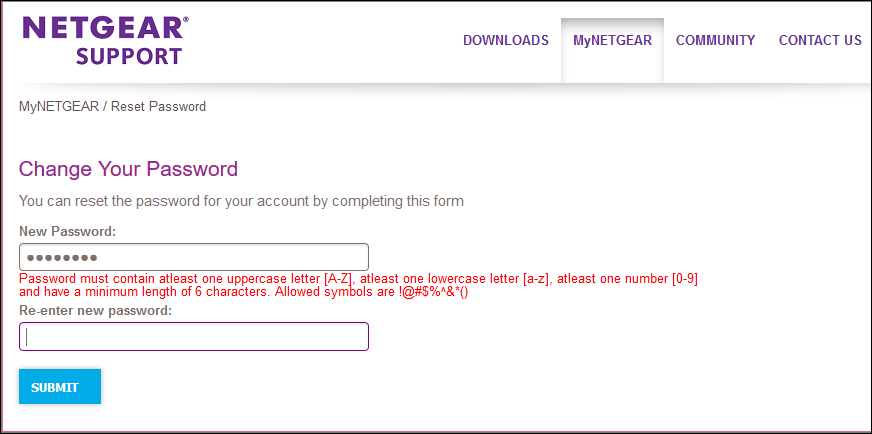
- Explain any input or formatting requirements. If a field requires a specific format or type of input, state the exact instructions. Don’t make users guess your obscure password requirements. The same applies to syntax rules such as punctuation or spacing for phone numbers or credit cards. (Though as much as possible you should eliminate these arbitrary formatting rules: death to parentheses for phone-number area codes!)
- Avoid Reset and Clear buttons. The risk of accidental deletion outweighs the unlikely need to ‘start over’ on a web form. In forms that collect extremely sensitive input such as financial information, provide a ‘Cancel’ button to support those users who abandon the form and want to delete their information. But make sure that the Cancel button has significantly less visual prominence than the Submit button, to avoid accidental clicks.
- Provide highly visible and specific error messages. Errors should be signaled through a variety of cues, not solely through color: outline the field AND use red text AND use a heavier font, to ensure users don’t overlook this critical information. Now is not the time to be subtle.
Erroneous input should be preserved so users can correct it, and accompanied by a specific explanation of the problem.
Conclusion
The usability of web forms is by no means a new topic. It has been covered in general usability references (including several NN/g books of both general usability guidelines, eyetracking usability research, and mobile usability). Many of the 114 UX guidelines for e-commerce shopping carts are specialized issues in forms design. There are also entire books specifically written about form design, as well as academic studies demonstrating the effectiveness of complying with guidelines.
This brief summary is not intended to replace the in-depth analysis found in other resources: if you work extensively with form design, absorbing the intricacies of best practices in various situations is well worth your time.
But many bad web forms have problems that are not intricate or complex, and that could have been avoided by a simple reminder of what we already know. Take a look at the forms on your site and make sure that they don’t make these well-known mistakes. Who knows, you just might double your conversion rate.
References:
Mirjam Seckler, Silvia Heinz, Javier A. Bargas-Avila, Klaus Opwis, and Alexandre N. Tuch. 2014. Designing usable web forms: empirical evaluation of web form improvement guidelines. In Proceedings of the SIGCHI Conference on Human Factors in Computing Systems (CHI '14). DOI=http://dx.doi.org/10.1145.2556288.2557265


Share this article: