Ideally, we’d like users to go to a site and find the answer they’re looking for right there, in front of their eyes. That would mean zero interaction cost and is the holy grail of usability as a field.
Unfortunately, zero interaction cost is rarely attainable, since most sites and apps offer many things that users may want to do. Most of the time, users have to look around, read, possibly scroll, find a promising link, click on it, wait for the page to load, and then repeat the process all over. Sometimes a new window may pop up on top of the existing one, and in that case users have to switch attention to the new window and perhaps also look back to the old one to integrate information in both windows. In other situations, users may need to remember information on one page and apply it on a different one. All these actions require cognitive effort and make up the interaction cost.
Usable sites minimize the interaction cost required to attain a variety of user goals. That is, they minimize:
- reading
- scrolling
- looking around in order to find relevant information
- comprehending information presented to you
- clicking or touching (without making mistakes)
- typing
- page loads and waiting times
- attention switches
- memory load — the information that users must remember in order to complete their task.
These user actions contribute differently to the total interaction cost. Their relative importance may depend on the user — for example, dyslexic users may have a harder time reading than clicking around, whereas users with motor impairments may find clicking more difficult. They also depend on the device — a page load on a desktop connected to a high-speed network may be insignificant, but a page load on a mobile device may take forever if the cellular coverage is slow.
Many usability guidelines address the question of minimizing the various components of the interaction cost. For instance, the rules of writing for the web lower the cost of reading by recommending bullet points and short, to-the-point sentences and paragraphs.
An Example of Interaction Cost
Let’s take a simple example. Assume we want to find where the word “ceremony” comes from. We’ll use the Dictionary iPhone app for this task. We’ll ignore the cost involved in finding the app on the phone and we start our analysis immediately after launching the Dictionary app.

At this point, the interaction cost involves waiting for a few seconds for the splash screen to disappear and make room for the first actionable screen of the app:

Next, users have to edit the search query.
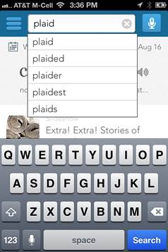
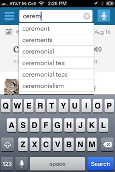
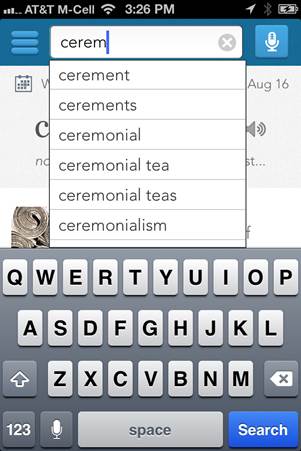
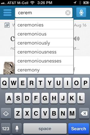
Users must look at the autosuggestions and decide they are irrelevant, and then erase the current query. They can either do so by pressing the gray x button on the right (if they are familiar with the iOS convention) or by erasing the characters one by one, pressing the delete key on the touch screen.
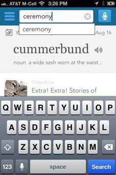
Once the word “ceremony” has been selected (or typed), the users have to press Search to get to the result page. They need to wait for a few instants for the new page to appear:
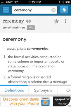
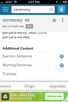
Users must infer that Origin is likely to contain information about where the word comes from. (This is an easy inference for most users, so this cognitive cost is low; however, if the word “etymology” were used instead, it’s possible that some users would have more trouble reading it and understanding what it means; thus the word “origin” is a better choice, as it incurs a lower interaction cost.)
Let’s summarize the various components of the interaction cost to find the origin of the word “ceremony”:
- wait for the splash page
- search
- find the search box and tap to move the input focus to it
- read the query displayed in the search box and the autosuggestions
- decide that the query is not relevant
- delete the query displayed in the search box
- type and/or choose autosuggestions
- enter a few characters
- scan the list of autosuggestions to see whether the desired word is among them
- if no, enter more characters and repeat at the previous step
- if yes, choose the desired word by tapping it
- tap Search
- wait for the result page
- find where the relevant etymology information may be on the result page
- scroll down the page and scan the content to find the etymology information
- find the tabs and read them
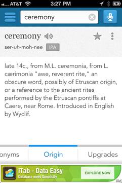
- notice that there are more hidden tabs to the right
- infer that etymology may be one of the hidden tabs
- remember that swiping exposes content to the right
- swipe to the right
- read Origin and connect that word with the goal of finding where the word comes from
- tap Origin
- read about where the word “ceremony” comes from
As you can see, a fairly simple and painless process takes a lot of steps and substeps; each of them incurs an interaction cost. For some, the interaction cost is insignificant — for instance, remembering that swiping to the right exposes more content has a very low interaction cost, because people have encountered horizontal scrolling before many times on mobile devices or on the web. Other steps can be optimized to minimize the interaction cost; thus, having the little gray x button in the search box can significantly lower the cost of deleting the query displayed in the search box. Similarly, making the buttons big can help with tapping the targets. The placement and the visual design of the tabs can impact how quickly people find the tabs. (And, of course, the choice of tabs itself versus using some other way of structuring the content also impacts the interaction cost for finding where the relevant information is on the result page.)
Expected Utility
Note that for some of the steps in the previous sections users have multiple choices. For instance, they can either press the gray x button to erase the current string or they can use the delete key multiple times. Or they can either pick a suggestion from the autosuggest list or type the string to the end.
How do people decide which action to pick? The answer lies in the concept of expected utility:
Expected utility = Expected benefits – Expected interaction costs
Users try to maximize the expected utility of an action: In other words, they weigh the benefits and the costs of each action, and they choose the one that has the best balance of benefits versus costs.
When there are several ways to reach the same goal with similar benefits, users typically tend to pick actions that minimize the estimated interaction cost.
For instance, many people may not scroll down in the list of autosuggestions to find the word “ceremony” and might rather type one (or a few) more characters until the word ceremony is visible, because the cost of scrolling down the small list and scanning the list for the right word is higher than the cost of hitting one or even a few more characters.
This type of thinking generalizes at the site level as well. If it looks like it is going to be really hard to reach their goal on any given site, most users will just move to another site with a lower estimated interaction cost unless the benefit of interacting with the initial site is really high. To give an example, if the user really wants to buy an Apple computer, they probably are going to stick with Apple’s site because it’s unlikely that they will be able to buy it elsewhere. In this case, the user motivation is really high and so they may be willing to put up with a high interaction cost. However, if the user wants to buy a grill, they may not care if they buy it from Home Depot or Lowe's or some other site, and they will navigate away from sites that have high interaction costs.
Marketing and branding usually have the job of increasing the user motivation and expected benefits for engaging with a particular site or brand; usability deals with lowering the interaction cost. Both methods are ultimately addressing the issue of increasing the expected utility of using a site or a piece of software.
Why You Should Care About Interaction Cost
Interaction cost is a direct measure of usability. In fact, the concept was introduced back in the early days of human-computer interaction to evaluate the usability of a software system. All usability heuristics minimize the interaction cost for the user.
A quick assessment of the interaction cost of a design can save a lot of money on the long run, as it can give you a good measure of how difficult the interface is going to be for the user. It can also serve as a comparison tool between design alternatives: usually, the one that minimizes the interaction cost has better chances of success.


Share this article: