People’s behaviors are fairly stable and usability guidelines rarely change over time. But one user behavior that did change since the early days of the web is the tendency to scroll. In the beginning, users rarely scrolled vertically; but by 1997, as long pages became common, most people learned to scroll. However, the information above the fold still received most attention: even as recently as 2010, our eyetracking studies showed that 80% of users’ viewing time was spent above the fold.
Since 2010, with the advent of responsive design and minimalism, many designers have turned towards long pages (covering several “screenfuls”) with negative space. It’s time to ask, again, whether user behavior has changed due to the popularity of these web-design trends.
Eyetracking Data
About the Study
To answer that question, we analyzed the x, y coordinates of over 130,000 eye fixations on a 1920×1080 screen. These fixations were from 120 participants, who were part of our recent eyetracking study that involved thousands of sites from a wide range of sectors and industries. For this study, we focused our analysis on a broad range of user tasks that spanned a variety of pages and industries, including news, ecommerce, blogs, FAQs, and encyclopedic pages. Our goal was not to analyze individual websites, but rather to characterize the general range of user behaviors.
We compared these recent data with those obtained from our previous eyetracking study on 1024×768 monitors.
Study Results
Two changes happened between our studies: (a) bigger screens; and (b) new web-design trends, with possible adaptations on the side of the users. We can’t tease apart the relative impact of these two changes, but it doesn’t matter, since both are due to the passage of time, and we can’t undo either one, even if we wanted.
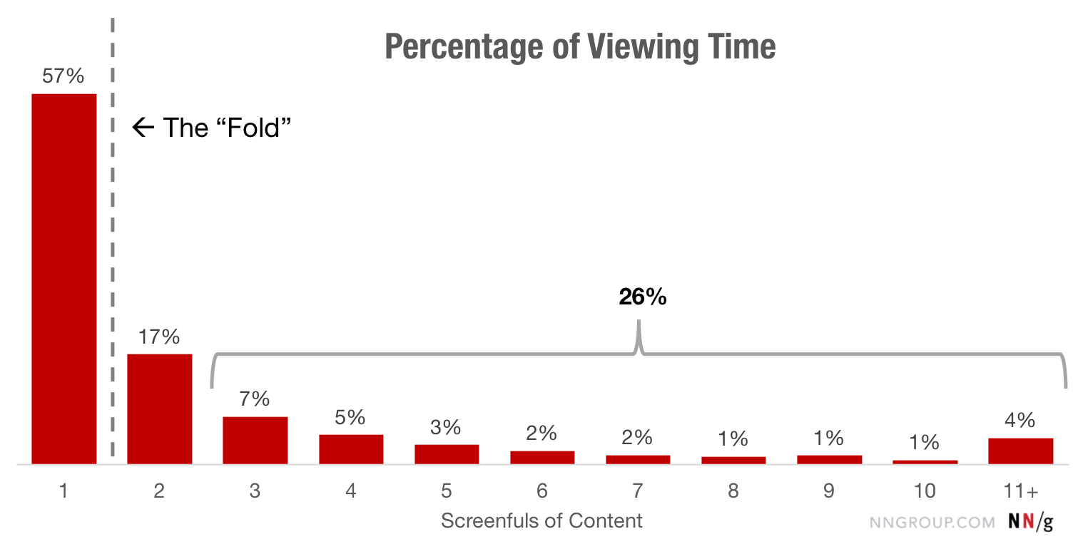
In our most recent study, users spent about 57% of their page-viewing time above the fold. 74% of the viewing time was spent in the first two screenfuls, up to 2160px. (This analysis disregards the maximum page length — the result can be due to short page lengths or to people giving up after the first two screenfuls of content.)
These findings are quite different from those reported in our 2010 article: there, 80% of the viewing time was made up of fixations above the fold. However, the pattern of a sharp decrease in attention following the fold remains the same in 2018 as in 2010.
Understandably, not every page is the same length. To determine how people divide their fixations across the page (independent of how long the page is), we split the pages into 20% segments (i.e., one-fifth of each page). On general websites, more than 42% of the viewing time fell within the top 20% of the page, and more than 65% of the time was spent in the top 40% of the page. On search-results pages (SERPs), which we did not isolate in the 2010 findings, 47% of the viewing time was spent on the top 20% of the page (and more than 75% in the top 40%) — likely a reflection of users’ tendency to look only at the top results.

If we look only at content above the fold — within the first screenful — the information towards the top of the screen received more attention than the information towards the bottom. More than 65% of the viewing time above the fold was concentrated in the top half of the viewport. On SERP, the top half of the first screenful received more than 75% of the viewing time above the fold. (It’s an old truth, but bears repeating: be #1 or #2 on Google, or you hardly exist on the Internet. Google gullibility remains as strong as when we identified this user behavior, 10 years ago.)

Scanning & Reading Patterns
We’ve seen that the content above the fold received most attention (57% of viewing time); the second screenful of content received about a third of that (17% viewing time); the remaining 26% was spread in a long-tail distribution. In other words, the closer a piece of information is to the top of the page, the higher the chance that it will be read.
Individual reading patterns confirm this finding. Many users engage in an F-pattern when they scan a page whose content is not well-structured — they tend to look more thoroughly at the text placed close to the top of the page (the first few paragraphs of text), and then spend fewer and fewer fixations and time on information that appears low on the page.
Even with lists or information presented in a structured way, people use more eye gazes (and thus reading time) for the top of the page, as they need to understand how the page is organized. Once they do so, they tend to focus very efficiently only on the information relevant to the task at hand, thus spending a lot fewer eye gazes (and thus viewing time) on the content placed farther from the top.

2010 vs. Present
In 2010, 80% of the viewing time was spent above the fold. Today, that number is only 57% — likely a consequence of the pervasiveness of long pages. What does that mean?
First, it could be that, overall, designers are doing a good job of creating signifiers to counteract the illusion of completeness and to invite people to scroll. In other words, they are aware of the disadvantages of the long page and mitigate them to some extent. Second, it could mean that users have become conditioned to scroll — the prevalence of pages requiring scrolling has ingrained that behavior in us.
At least to some extent. People still don’t scroll a lot — they rarely go beyond the third screenful of info. Basically, the fold as a barrier has been pushed down to the third screenful — 8 years ago, 80% of the viewing time was spent in the first screenful of info (above the fold); today, 81% of the viewing time is spent in the first three screenfuls of information.
We’ve always said that people will scroll if they have a reason to do it. Attention still lingers towards the top of the page — that is the portion of the content that is most discoverable and likely to be viewed by your users. The interaction cost of scrolling reduces the likelihood that content will be viewed in lower parts of a longer page.
Interestingly, the increase in screen resolution did not lead to a decrease in scrolling, as one might have expected. The reason is probably that designers and developers did not leverage the larger screens, and instead, opted to spread content further apart. For better or worse, users are now encouraged to scroll more than in the past — but not much more. Information density was probably too high (leading to crowded and busy layouts) in the early days of the web, but page designs definitely tend to be too sparse now.
Implications
Given that users spend more viewing time in the top part of the page, especially above the fold, here are some things you want to keep in mind:
- Reserve the top of the page for high-priority content: key business and user goals. The lower parts of the page can accommodate secondary or related information. Keep major CTAs above the fold.
- Use appropriate font styling to attract attention to important content: Users rely on elements like headers and bolded text to identify when information is important, and to locate new segments of content. Make sure that these elements are visually distinct and styled consistently across the site so users can easily find them.
- Beware of false floors, which are increasingly common with modern minimalist designs. The illusion of completeness can interfere with scrolling. Include signifiers (such as cut-off text) to tell people that there is content below the fold.
- Test your design with representative users to determine the “ideal” page length and make sure that the information that users want can be easily seen.
Conclusion
While modern webpages tend to be long and include negative space, and users may be more inclined to scroll than in the past, people still spend most of their viewing time in the top part of a page. Content prioritization is a key step in your content-planning process. Strong visual signifiers can sometimes entice users to scroll and discover content below the fold. To determine the ideal page length, test with real users, and keep in mind that very long pages increase the risk of losing the attention of your customers.


Share this article: