As one of the original 10 heuristics for web usability, visibility of system status remains among the most important and universally applicable principles in user-interface design. The goal is to provide the user with feedback about what is happening with the system or interface, within a reasonable amount of time, and, in Norman’s interaction theory, to bridge the gulf of evaluation between the user and the system.
One of the most common forms of system feedback on websites and applications is a wait-animation progress indicator. This design element shows “busy” feedback when the site is loading or processing information. In this article, we’ll explore the main types of progress indicators and provide recommendations on when to use which kind.
The Power of Feedback: Make Users Feel You’re Listening
By giving appropriate feedback on users’ actions, the interface assures the users that the system has understood their input and that progress is being made. It’s hardly a new concept, but it is worth reiterating for improved user experience.
Sadly, many websites and other computer systems take the opposite approach and don’t show any feedback until they’re completely done processing the user’s input and can display the final answer. This creates a great deal of anxiety as the user is uncertain as to whether the computer even received the command in the first place or whether it may have crashed. Plenty of extra clicks and double orders have resulted from such user-hostile design.
While speedy response times are best, there are simply times when even a server upgrade won’t allow you to comply with the guidelines for system speed. In these cases, you simply must reassure the user that the computer isn’t out for lunch but is working faithfully on their request. If the result will take more than 10 seconds to appear, you should also show users an estimate of when the computer will be finished. Otherwise, the user will go out for lunch.
To give a user-experience example from the offline world, I recently had to contact the California Department of Motor Vehicles (DMV) about a situation that I couldn’t fix using their website. Assuming the wait would be atrocious, I cleared my afternoon, put on my headphones, and settled in for a long time on hold.
- The first feedback I got was a recording telling me that all agents were busy, as I expected.
- The music playing on hold, while not exactly my taste, was another form of feedback, telling me that I was still on the line and that my call had not been dropped. Furthermore, the moments I spent chuckling about the music were moments that I was distracted from the actual waiting.
- Next, the recording informed me that the wait was estimated between 15-20 minutes. That information freed me from uncertainty and put me in control of how I wanted to spend my next 15 minutes.
- Eventually, to my surprise and relief, the DMV recording offered me the option of providing my phone number so that DMV could call me back when an operator became available, with the assurance that I would keep my place in line. So now that I knew approximately how long I would have to wait, I was completely freed to do other things without having to carry around my phone or watch the clock.
Jokes and complaints about tacky hold music aside, the truth is that, because of the multiple instances of feedback, I was much more at ease while waiting to connect to the DMV. And ultimately, I was impressed with their service. These few design improvements to their on-hold system must have been vastly cheaper than having to hire double the number of call center agents. (And more staff would still not be able to cope with the worst peak loads.)
Progress indicators tell users (a) that the system needs more time to process the last user action (for instance, to load a file, or to install a new update), and (b) approximately how much time remains. They offer 4 main advantages:
- They reassure the user that the system is working and reduce the user’s uncertainty. In my DMV example, hearing that all agents were busy was more reassuring than no message at all.
- They give the user something to look at while waiting, which makes the waiting period easier to tolerate. The on-hold music played this role in the DMV example.
- They offer a reason to wait for the system to finish— simply because something appears to be happening. I knew that DMV would need about 15 minutes to take my call, so I was willing to wait for the 15 minutes to lapse.
- They can reduce users’ perception of time: Users devote some cognitive resources to the feedback itself, and they pay less attention to the wait itself. As I was listening to and thinking about the DMV’s music, I forgot that the wait was unpleasant.
Studies on websites have shown that, much like the on-hold music and accompanying messages on DMV’s phone line, the graphical progress indicators mitigate the negative effects of waiting, and prolong the user’s attention on your website. In one study, conducted at the University of Nebraska-Lincoln, researchers wanted to find out how long people would wait for a webpage to download. After clicking a link and waiting for a page to load, one group of participants saw a continuous progress bar (animated on loop), while another control group was not shown any type of progress indicator. The researchers found that the people who saw the moving feedback bar experienced higher satisfaction and were willing to wait on average 3 times longer than those who did not see any progress indicators. (Learn more about studies like this in our full day course on User Interface Principles.)
Wait-Animation Progress Indicators
Even though connection speeds are getting faster every year, slow website response times are still a reality. They are a nuisance for users, increasing the likelihood that people will abandon the task or website entirely. A user’s willingness to wait for a system to complete an action depends on several factors, including:
- The urgency and complexity of the goal or task in mind
- The context of use, be it killing time in line on a mobile phone, or hurrying to get an important project uploaded
- Users’ expectations based on prior experience with the website or similar processes
Although we can’t predict or control those circumstances, we can increase the likelihood that the user will stay and wait for the information to load by abiding by the following guidelines:
Always give some type of immediate feedback.
A user’s wait time begins the moment when she initiates an action, whether by tapping the screen, clicking a mouse button, pressing a key, or speaking a voice command. Immediately, the system should give some visual feedback to communicate that it has received the request. For example, a button may change to state to look “pressed”, or the page may begin to refresh. Without any visual change from the system, most users will assume the action was not registered and they will try again.
Use a progress indicator for any action that takes longer than about 1.0 second.
After a few seconds, users’ attention begins to wander, and they may eventually wander away from your site. There are two main types of progress indicators: looped animation and percent-done indicators. The one you choose depends primarily on how long the process will take.
1. Looped animation: Use only for fast actions.
Showing an animated graphic on loop offers feedback that the system is working, but it doesn’t give any information about how long the user will have to wait. The animated-spinner icon is an example of this common progress indicator.
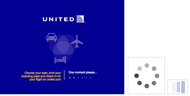
This indicator should be reserved for actions that take between 2-10 seconds. For anything that takes less than 1 second to load, it is distracting to use a looped animation, because users cannot keep up with what happened and might feel anxious about whatever flashed on the screen.
From a development perspective, it can be tempting to use looped-animation progress indicators for all types of delays, including long ones, because it doesn’t require estimating the duration of the action. However, we don’t recommend looped animation for actions that take longer than 10 seconds, because users quickly grow impatient if they feel like they aren’t making progress. And if a spinner is rotating indefinitely, users cannot be sure if the system is still working or if it’s stopped, so they may decide to abandon the task entirely. (Or, in rare events, they may wait forever, like it happened to one user in a testing session who patiently waited for 15 minutes for a magazine issue to start loading only to discover at the end that the app was stuck and needed to be restarted. That’s more likely to happen in a usability-testing session than in real life though.)
It can also be helpful to add additional clarity for the user by including text that explains why the user is waiting (e.g., “Loading comments…”). One note of caution though: spinning gears can be dangerous for data that is loaded from a server, simply because the connectivity quality is often beyond the control of the developer. Although your data should take 2 seconds to load, it might actually take 15 seconds in unfortunate circumstances.
2. Percent-done animation: Use for actions that take 10 seconds or more.
Percent-done progress indicators are the most informative type of wait-animation feedback. They show the current progress, how much has already been accomplished, and how much is left. They convey important information about (approximately) how long the wait time is. This information gives users control (that is, they can decide whether to wait or not); it decreases uncertainty about the length of the process and may reduce the perceived wait time. Progress bars or circles that fill from 0-100% are examples of this type of feedback.

Generally, percent-done progress indicators should be used for longer processes that take 10 or more seconds. A visual indicator that progresses towards completion puts the user at ease and increases their willingness to wait.
A percent-done indicator may be used for actions that take less than 10 seconds, if the action involves processing a series of documents or registries, because the user understands that the system is working with a set number of records. As with looped-animation indicators, include a text explanation of the process, for example “Updating address 3 of 50.” For actions that take a little while, give users the option to stop the process, in case they decide they cannot wait. Otherwise, your design may be hijacking control of the system, leaving the user powerless.
A percent-done indicator makes users develop an expectation for how fast the action is being processed. As a result, changes in speed will be noticed and will impact user satisfaction: if the progress moves quickly only to hang on the last percentage remaining, the user will become frustrated and the benefits of showing progress will be negated.
One issue for designers and developers using percent-done animation is the difficulty in calculating how long the process is going to take. Here are a few ways to handle this:
- Start the progressive animation slower and allow it to move faster as it approaches the end. This way you don’t risk establishing a faster expectation than the system can maintain. Exceeding customer expectations always creates more satisfaction than disappointing customers by delivering less than promised. (Note that this slow-fast recommendation only applies to wait-animations; research has shown that for surveys, progress indicators that start fast and end slow reduce drop-off rates.)
- Provide a general time estimate. (Don’t try to be exact, as it will inevitably be inaccurate at some point and the site’s credibility will suffer.) A simple, “This might take at least a minute” or “About 3 minutes remaining” can be enough to inform the user and encourage them to wait it out. Always allow for extra time, just in case. If the action goes faster towards the end, then it’s a pleasant surprise. We’ve never heard a user complain, “Hey! I wasn’t ready for it to be done yet!”.
- Instead of showing a percentage number, consider showing the number of steps. Users might not know how long each step lasts, but knowing the number of steps at least helps them form an estimate.
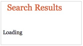
3. Static progress indicators: Don’t use them.
One final way to provide feedback is through a static progress indicator. This includes an unmoving image or text, such as “Loading…” or “Please wait while we process your request” to indicate that the request has been received. While any feedback is better than none, static indicators should be replaced with another type of indicator, because they do not offer enough information about what is happening. If the system hangs or becomes stuck, the user has no way of knowing they need to restart the action.
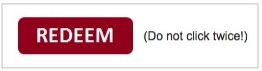
4. Don’t-click-again warnings: Don’t use them.
The worst design is seen on sites that warn users not to click twice by threatening them “clicking again may create an extra order” (or funds transfer, or whatever is the object of the command). First, it’s certainly a guideline for user-friendly design not to threaten the user. Second, this is a lost cause, because users rarely read such excess word count until it’s too late.
The way to avoid extra clicks is to show the user that the first click has been accepted and is being worked on.
A Note About Kids, Games, and Progress Indicators
In our research on Children on the Web, we saw a lot of interactive tools and games that took a long time to load. In an attempt to make the loading screens more entertaining and engaging, many sites incorporated video content or shorter games for users to play while waiting. Unfortunately, these ended up being more confusing than helpful, as children couldn’t separate the real game from the loading screen and they would often not understand why an (interim) game stopped midway (to start the real game). To keep users interested but not distracted from the main activity, we recommend a few approaches:
- Always use a percent-done progress indicator for activities that take a while to load, and give them sufficient prominence on the screen so children notice it and know that the system is working (kids, like adults, want to know how much time is left or if the system is stuck).
- Ensure that any interim animations don’t obscure the main progress indicator and cannot be mistaken for the actual game.
- Use simple and fun animations that are related to the main activity, as they are most likely to hold users’ attention and reduce the perception of wait time.
Conclusion
Providing feedback is fundamental to a positive user experience. By being forthcoming and transparent about wait times, designers can reduce uncertainty for users and increase the time they are willing to wait.
The main guideline is to use a looped indicator for delays of 2–9 seconds and a percent-done indicator for delays of 10 seconds or more. But since you can’t always estimate the delay precisely in advance, you may want to lower the cutoff point between the two forms of progress feedback so that the vast majority of response-time delays that end up taking more than 10 seconds will be alleviated by a percent-done indicator. The bigger the variability in your estimates, the lower the threshold for showing the more elaborate feedback.
Ultimately, good progress indicators can make users stick around to finish the task and generally have a more positive impression of your website or application.
Reference:
Nah, F. (2004). A study on tolerable waiting time: how long are web users willing to wait?, Behaviour and Information Technology, Vol. 23, No. 3.


Share this article: