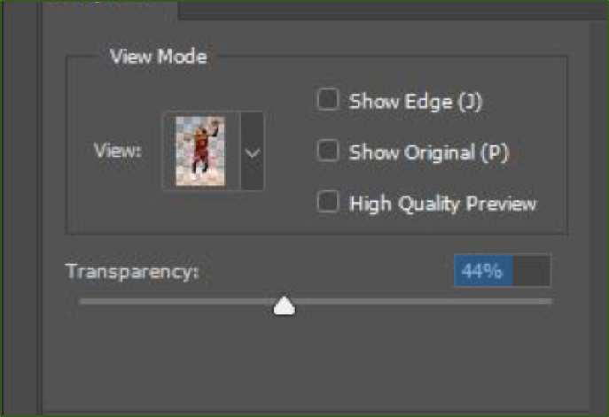
Numeric parameters are attributes of an object whose values are numbers. Examples include product price and quantity on ecommerce sites or object transparency in photo-editing applications.
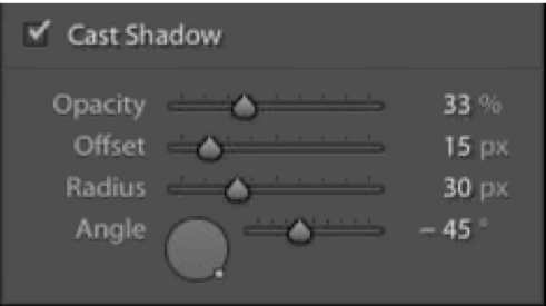
Common interactive controls for numeric parameters range from text input fields, sliders, virtual knobs that rotate, 2D matrices with editable curves, and steppers that increment or decrement a given value. Each type of control is useful in different circumstances and communicates information about the data being modified. Wherever possible, there should be a natural mapping between the type of control and the data. For example, a rotating virtual knob naturally corresponds to an angle parameter. When the UI control communicates some information about the parameter it modifies, the design adheres to one of the 10 usability heuristics — match between system and the real world.
Many applications and websites, particularly those used for creative pursuits or data analysis, have long lists of parameters that allow for detailed adjustment of specific attributes. With complex continuous parameters, a balance must be set between:
- Exploration: allowing users to easily explore the effect of the control for the whole range of the parameter, and
- Precision: enabling the user to precisely choose a specific value.
Discrete vs. Continuous Controls
There are two major types of input controls:
- Discrete controls offer a limited number of steps or options available. Examples include on/off switches or checkboxes and radio buttons with a few, preselected options.
- Continuous controls allow for a range of inputs, typically between a minimum and maximum value. Sliders or knobs are continuous controls. (Note that, in theory, a continuous parameter can take any possible value within the range.)
(Strictly speaking, a slider that ranges from 0–100 in steps of whole integers is technically a discrete control, since the set of integers is not continuous. In practical terms, a slider that features a large range of values instead of just a few fixed options can be thought of as a continuous control because that’s how it feels in the user experience.)
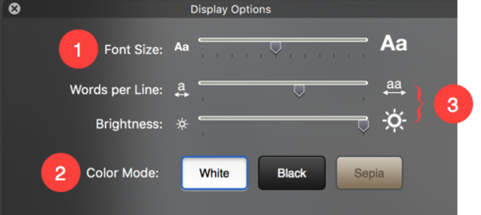
UI Controls that Support Exploration
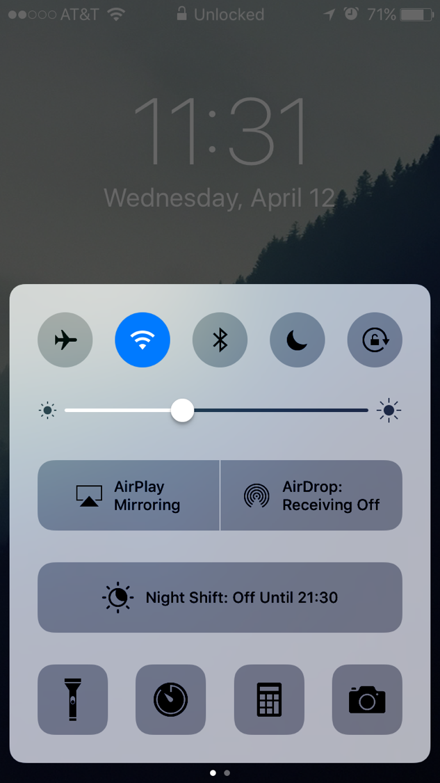
Linear sliders
A linear slider is a useful default control when the corresponding parameter has a defined range (with clear maximum and minimum values), but the precise value is less likely to be important to users. Acquiring a precise value on a slider is difficult, due to the Accot-Zhai Steering Law (a corollary of the well-known Fitts’ Law), which is an HCI principle that says that the time it takes a user to steer a pointing device through a 2D tunnel (such as a slider) depends on the length and the width of the tunnel. Most sliders have a narrow width, so users often have a hard time to hit a specific spot accurately.
Sliders are effective when users can scrub through the range of the control and see the effects in real time; they are not a good choice when there is significant response delay between the user action and its effect on the screen. (According to standard response-time guidelines, this delay should be at most 0.1 seconds.) Examples where sliders are a poor choice include complex computations such as video effects that might not render in real time or filter controls (e.g., price ranges) for large datasets, if it will take time to load the results of the change.
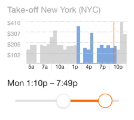
A variation of sliders features two controls that select a minimum and, respectively, maximum acceptable value. This variation is often used for implementing filters on websites, allowing users to set a minimum and maximum price, beginning and end times for flights, and so forth. As with other types of sliders, selecting a precise value is difficult, so this pattern is of limited utility in most situations. However, when combined with a graph such as a histogram (that shows how many options are available across the range of the slider), a dual-control slider can ensure that users select a range that has available matching content or options and thus prevent zero search results.
Virtual Knobs
Virtual knobs or other controls which the user must 'rotate' can naturally represent parameters such as panning – where an audio engineer moves a sound to play from either the left or right speaker (or anywhere in-between) when mixing audio. However, virtual knobs are physically challenging to manipulate with common input devices such as mice and trackpads, which don’t have a natural affordance for rotation. Because linear-input devices like mice have difficulty executing rotation, some designs add a hidden linear-dragging functionality to the knob, allowing users to click and drag up or down, vertically, in order to increase or decrease the parameter value. However, this behavior is not expected, and usually has no signifier, so users may never discover it. (Plus, if implemented poorly, it can wrest control away from those attempting to move their mouse in a circle to mimic the rotation of the knob.)
2D Matrices
A 2D matrix is a specialized input control used to simultaneously modify multiple related parameters by drawing a complex curve. Interaction with this control typically occurs by clicking to add breakpoints to an existing line or curve; once a new breakpoint has been added, dragging that breakpoint to a new location tells the system to interpolate between the breakpoints and draw a curve. This type of control is useful when you have two related parameters that depend on each other or will typically be modified together (such as luminance or RGB curves in photo- and video-editing applications), or when you need to represent the location or pathway of an object through a 2D space (such as surround sound for films).
Link Controls for Coarse + Fine Parameter Adjustment
The simplest way to solve the problem of acquiring precise values is to use an input-text box where users can type an exact value for that parameter. However, while this solution offers precision, it does not allow users to efficiently explore the range of values offered by that parameter. If you know the value beforehand, typing it is easy, but if you have no idea what the number should be, typing random values to figure out a color that looks right is, at best, tedious, even with additional input stepper buttons that increment or decrement the value. Even more, a text box doesn’t reveal the range of possible values. (For example, for RGB color, a range of 0–255 for each of the red, green, and blue parameters is not at all intuitive to a new user.)

A typical solution to this problem is the use of separate, linked controls for coarse and fine adjustment of the same parameter. Linked controls are two (or more controls) that adjust the same parameter. Typically, a continuous control such as a slider is used for coarse input — to easily explore effects for a range of values, and find a rough approximation of the desired value. Then, a text box is added to allow for fine control — selecting a specific value. The fine control also helps power users that already know the specific value they’d like to use. This design not only allows detailed adjustment of the parameter, but also shows the numeric value of the parameter in its current state, which can teach users the numeric values associated with desired outputs.
It is critical that these two controls are continuously linked, so that both display the same value and adjusting one immediately changes the other accordingly. (Here, again, “immediately” means ≤0.1 sec.)
Keyboard Focus on Linked Controls
To make use of linked controls even easier, move keyboard focus to the text box when a user adjusts the coarse slider, thereby allowing the user to both use the coarse control to set a rough value and then type in a more precise value easily, without having to click on the fine input field before typing. This design helps reduce the inefficiency associated with homing (i.e. moving one’s hand from mouse to keyboard and vice versa). However, ensure that keyboard shortcuts can still be used while focus is presented to the fine input control.
Default Values for Parameter Controls
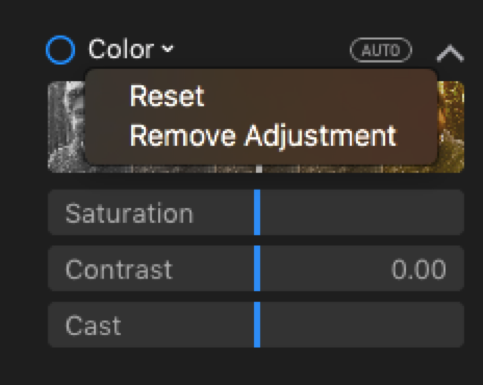
Good parameter defaults are important: not only can they save time and user effort, but they can provide guidance to novices. A typical approach to defaults is to use a neutral value, which will vary depending on the specific parameter: for a zoom slider, 100% (placed in the middle of the slider) makes a sensible default, for other controls, 0 or the maximum value might provide a neutral point. Provide an easy means to jump to the default value, such as a Reset button. This button is especially helpful if the neutral value is contained somewhere in the middle of the range (like in the zoom example before), or is not obvious (e.g., if the range is not from 0–100, or if the default value is not likely to be known by a novice user). It is also helpful to have some sort of visual indicator for default value, such as a small tick or hash mark above the slider, showing the location of the default value.
Conclusion
Detailed parameters need the right controls — that is, controls that convey some information not only about how they should be used, but also about the range of values appropriate for the parameter they represent. The control should provide easy means to explore the range of possible values and to specify a precise value. Provide users with separate but linked controls for coarse and fine values, use good defaults (and allow simple means to reset the value to those defaults), and provide keyboard focus to the fine control when the user manipulates the coarse control.
Learn more about UI controls in our day-long application-design course.




Share this article: