For good reasons, accordions are a popular UI element today: on mobile, they are an essential tool because they collapse content and make page length manageable, but even on desktop, they mitigate visual complexity and allow users to focus on the content most relevant for the task at hand (and are particularly appropriate in complex applications).
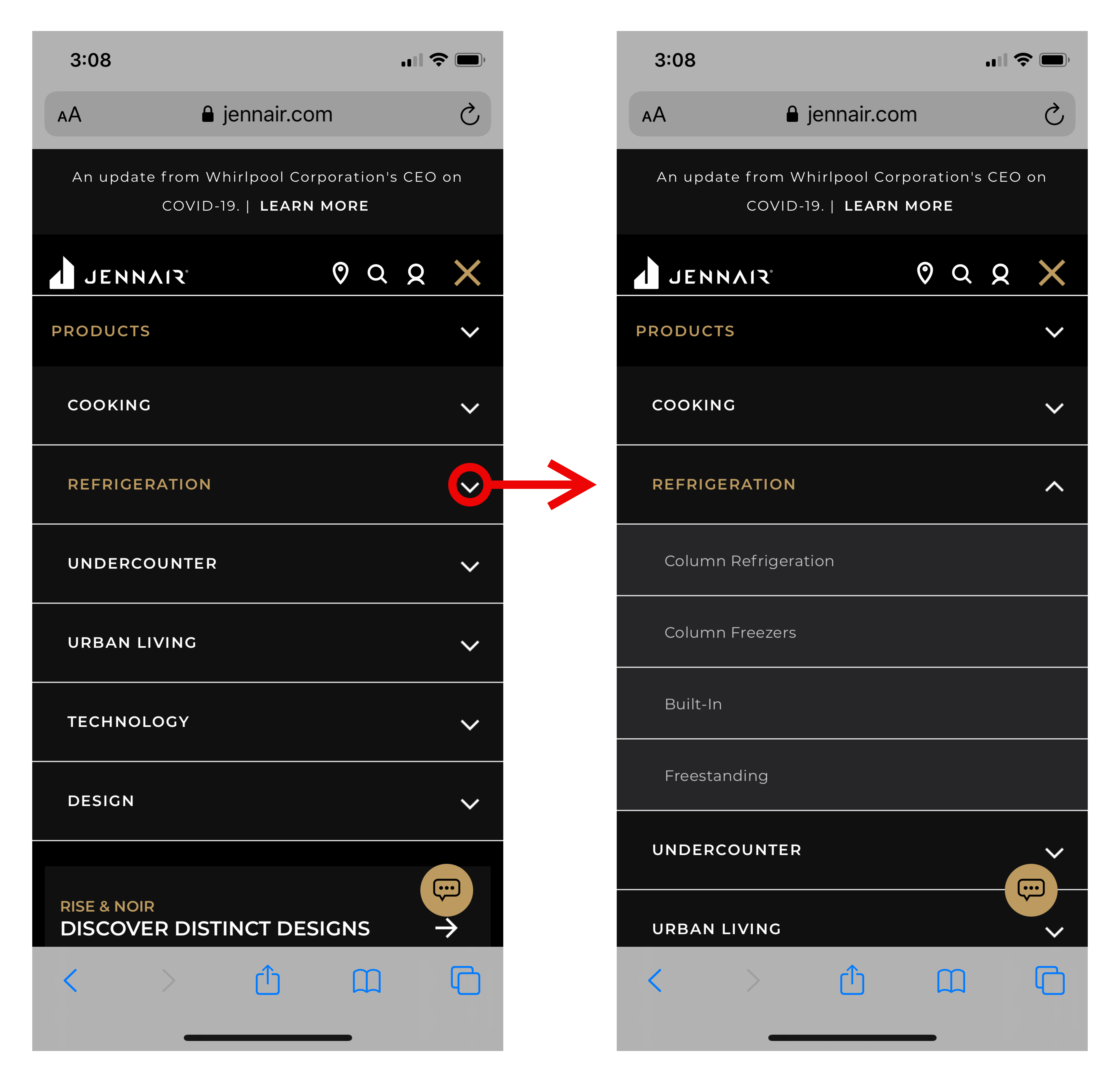
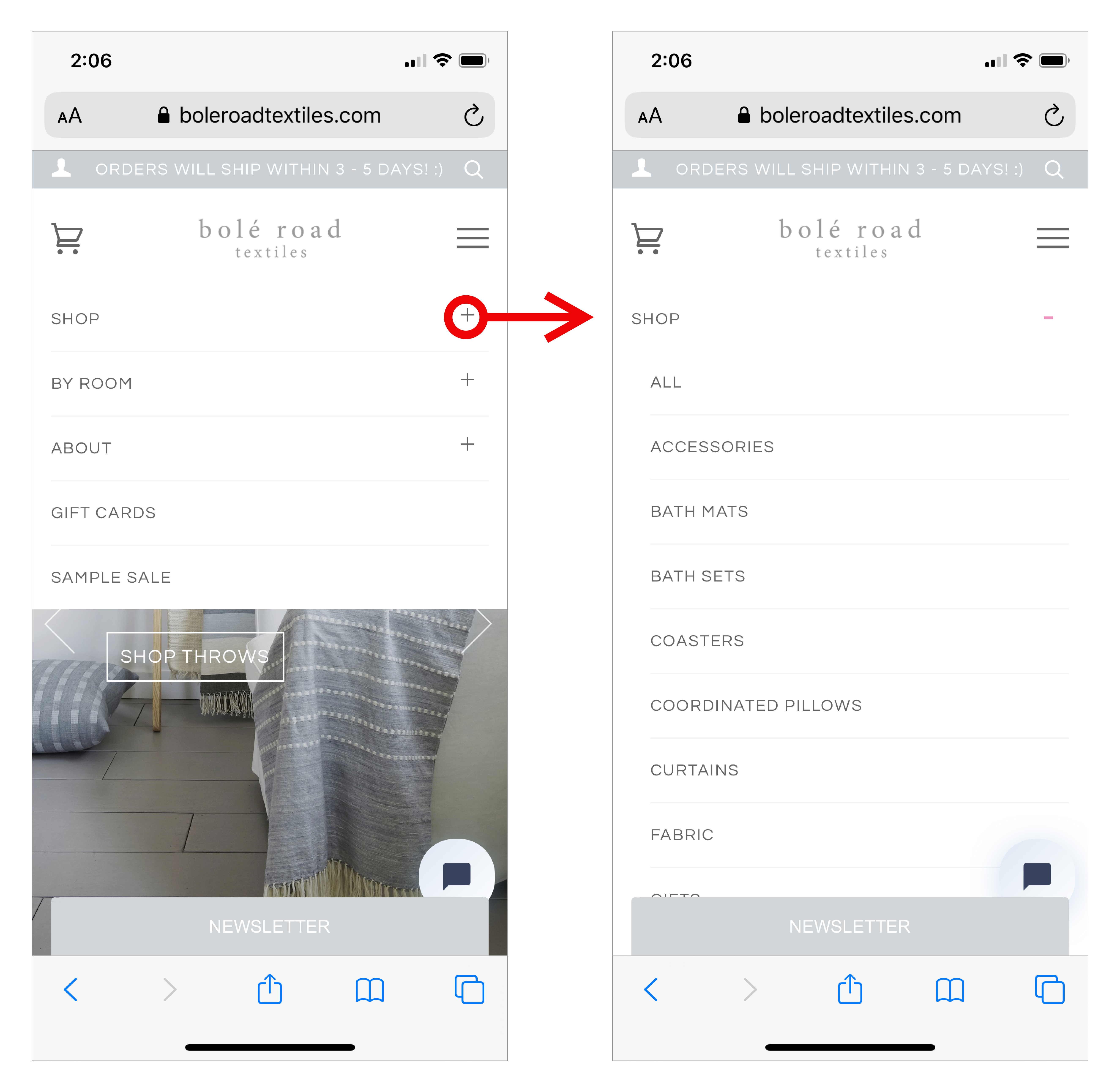
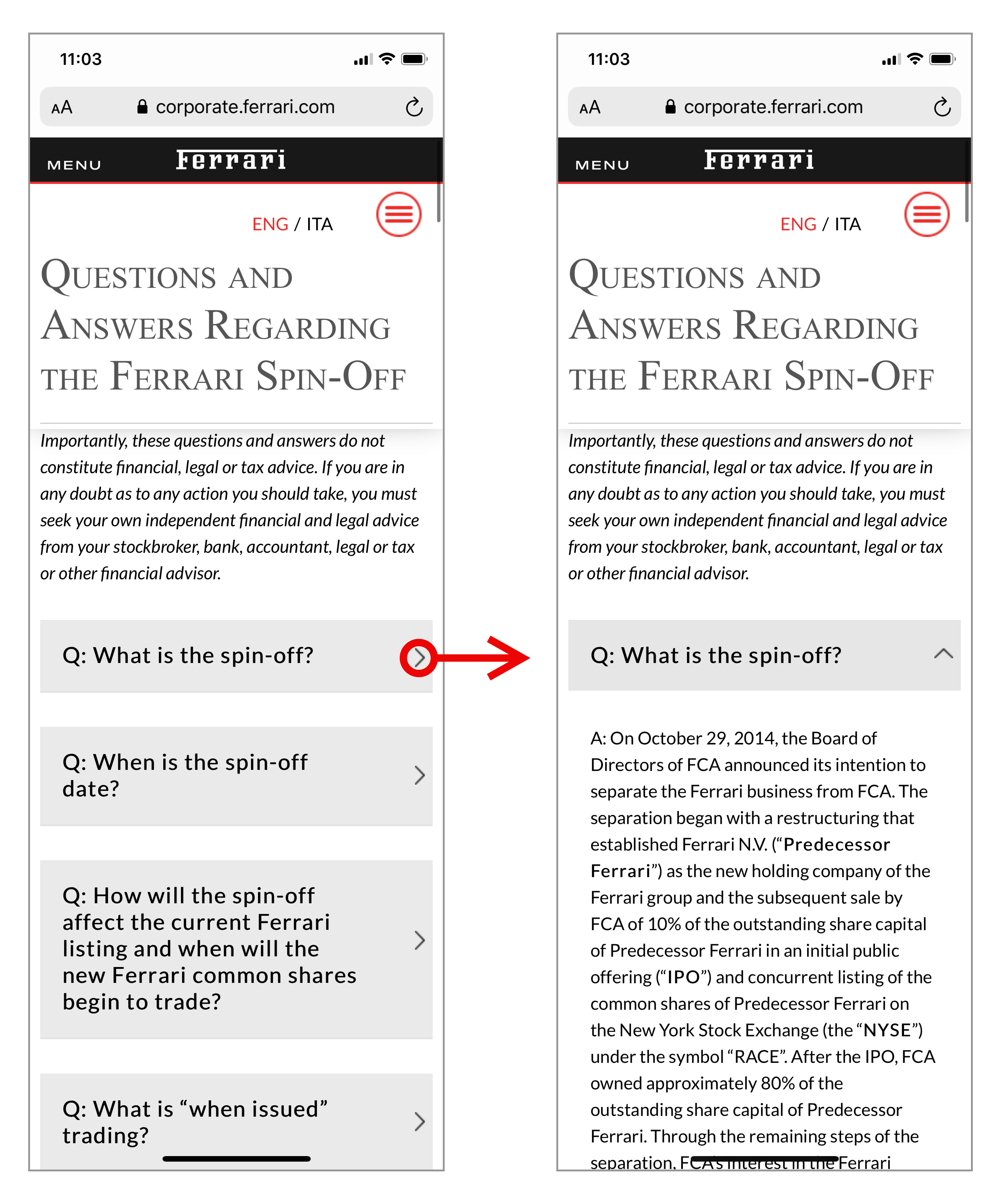
A question that is often asked in both our Mobile UX and Application Design classes is: which icon should we use to best signal that content will expand in place? In other words, what’s the best signifier for accordions?
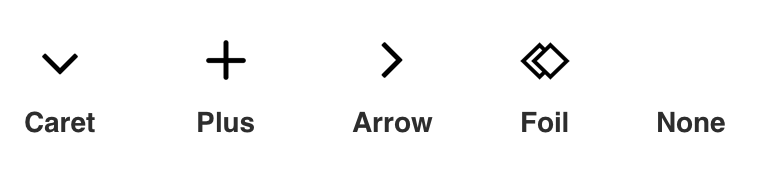
We decided to investigate this question as part of a bigger study of navigation and subnavigation on mobile. We looked at several possible icons as signifiers for accordions:
- Caret (or downward-facing arrow)
- Plus
- Right-facing arrow
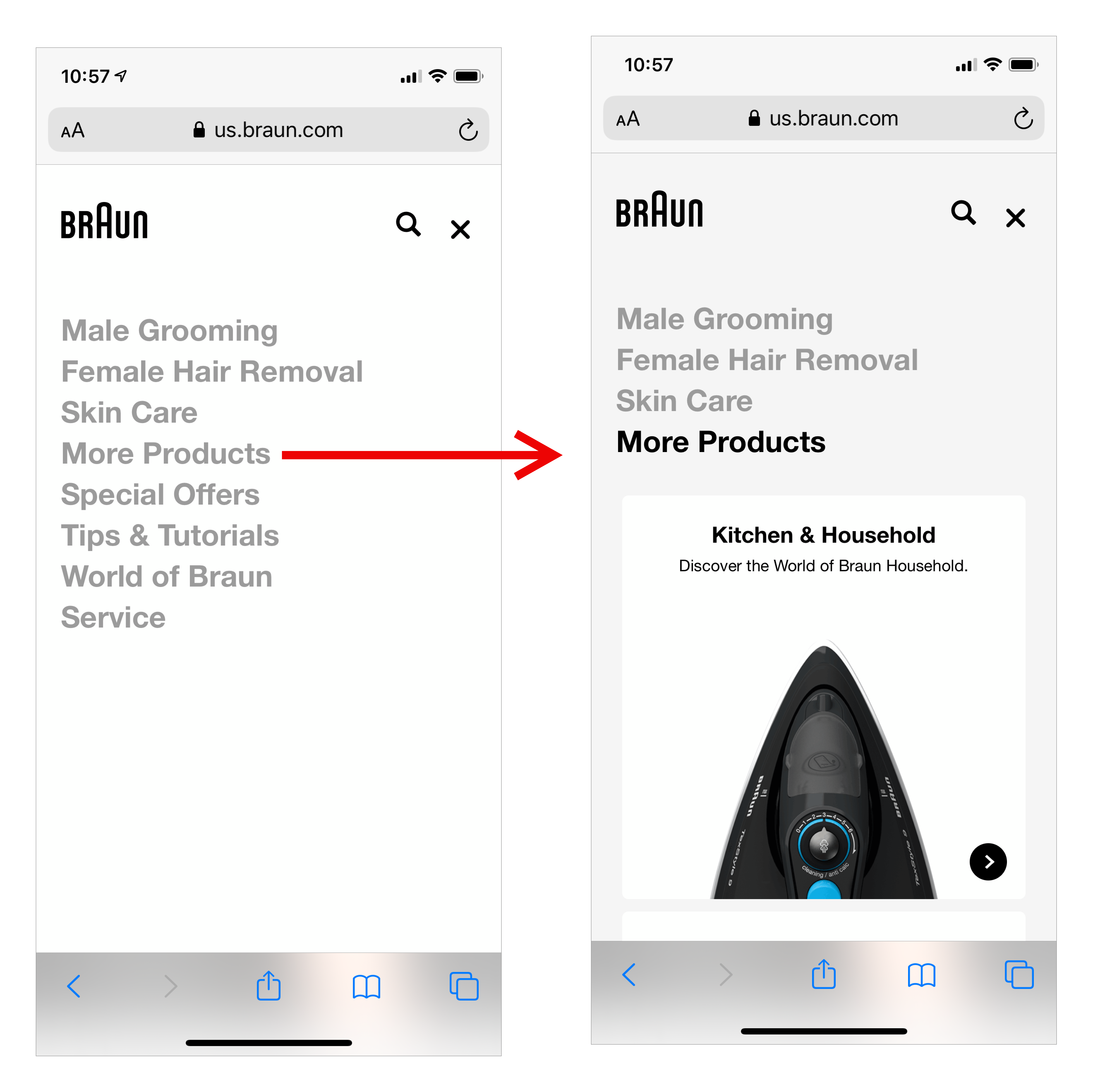
- No icon at all
There are some subtle differences in what these icons are commonly used to represent — while the caret and plus icons are typically meant to indicate that an accordion will open, designers have used the right-facing arrow icon to signal two different actions: either staying on the same page and expanding content, or visiting a different page. Also, after expansion, the caret will typically twist (maybe in a nice quick animation), and a plus sign will turn into a minus, to become a signifier for the reverse action of collapsing the newly expanded content.
We performed a quantitative study to find out which of these icons is the most effective at signaling that it will open an accordion.
Methodology
Materials. We decided to study the accordions in the context of mobile navigation so we created 11 prototypes of mobile websites, each in a different type of industry — clothing ecommerce, big-box retail, auto parts, finance, news, local government, higher education, DIY home projects, consumer-goods reviews, healthcare, and travel. The prototypes were not interactive; they were simple mockups with the menu already open and a list of categories visible on the screen, to ensure that we were only measuring the interaction with the accordions, as opposed to users’ efforts to locate the menus, look at homepage content, and so forth.
For each prototype, we created a task that involved finding information in one of the accordions visible in the prototype. For example, on a prototype of consumer-goods review website, the task was “Find reviews of dishwashers.”
We also created 5 different variations for each prototype; each variation used one of 4 possible icons (an arrow, a caret, a plus, a foil) or no icon. We created a foil icon (that had not been used before for accordions) in order to see whether the type of icon mattered at all or the presence of an icon next to the accordion name was enough to signal an accordion (but the icon itself did not matter).
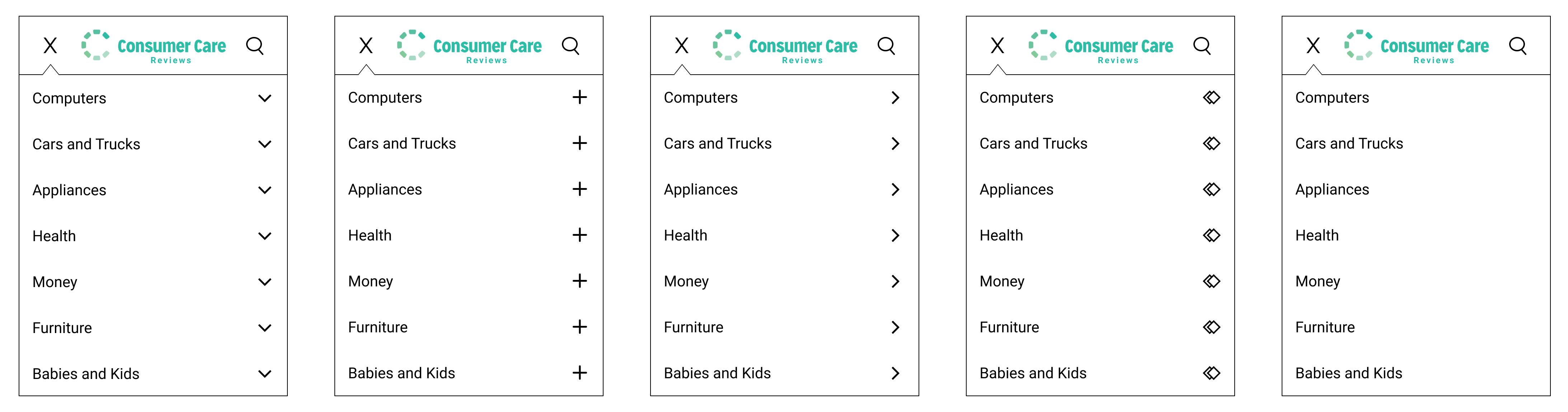
We placed the accordion icon to the right of its associated label, close to the edge of the screen and right aligned. (We acknowledge that another possible position is to the left of the label — our results may not generalize to that placement.)
As the length of the text labels might impact where users look or click, we ensured that label lengths in each prototype were distributed equally and that the “correct” answer for each task (i.e. the menu option that was likely to be chosen by users) was of a different length in each prototype.
We also ran several pilot studies to ensure that the task success rate was high (over 90%) and that people would be able to easily identify the “correct” menu category that had to be selected in order to complete each task. After each pilot study we refined the task phrasing and labels in the menu. Thus, effectively, we ran several usability studies on our prototypes’ information architecture before we collected the quantitative data. This process ensured that figuring out the right category was relatively trivial for most participants — as our study goal was to test the accordion signifiers, not the difficulty of finding the information in the tasks we gave users.
Participants. Our study had 136 participants. All participants saw instances of all the different icons (in different prototypes, and in different order).
Procedure. The test was conducted on UserZoom as a series of first-click tasks, administered on mobile devices. All participants were shown one version of each of the 11 prototypes and the associated task in a random order. After the participants indicated where they would tap to find the answer, they had to answer a multiple-choice question asking what they expected to happen (going directly to a new page, seeing additional menu options on the same page, or something else).
We collected data on:
- Tap location: Where the participant tapped (directly on the text label, directly on the icon, in the space in-between the label and the icon, or anywhere else on the prototype)
- Participants’ expectations: The response to the post-task question about expectations (going directly to a new page, seeing an additional list of links on the same page, or something else)
Where Participants Tap
Taps outside the area associated with the accordion were relatively few (5–8%), and most taps fell either on the label or on the icon associated with the accordions (and not on the space in between the two).
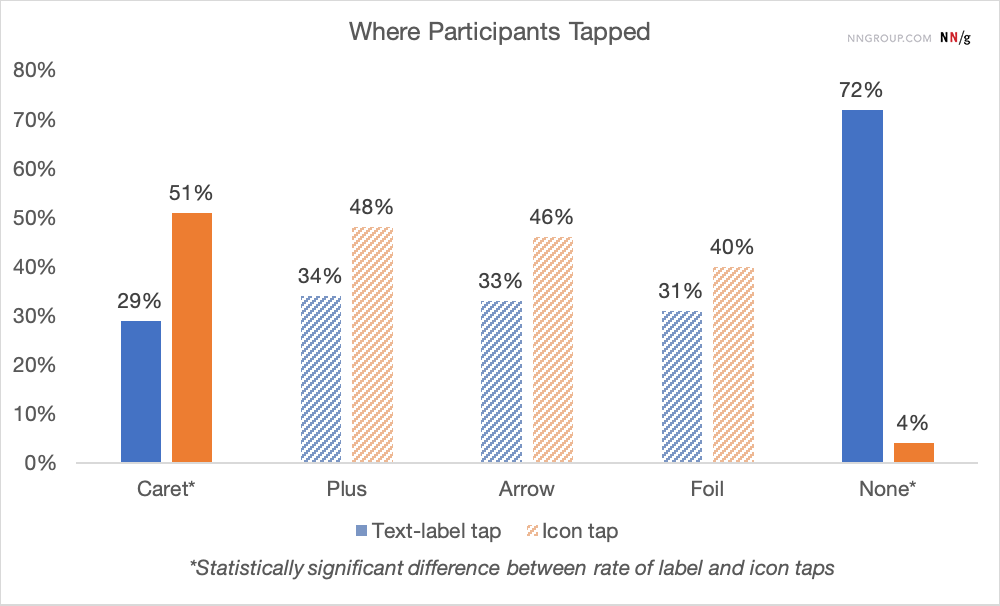
An ANOVA on the data for when users tapped on the text label found a significant effect of icon type both when participants or prototypes were treated as the random factor. Pairwise contrasts indicated that the no-icon condition was significantly different than all other conditions. In particular, there was a higher chance to tap on the label when no icon was present — a finding that is not surprising at all since the “icon area” was just empty space in this condition (we just tracked if people tapped on the place where an icon would normally be), but an important reminder that users typically choose to interact with obvious signifiers.
For none of the icon conditions was there a statistically significant tendency to tap on the icon more than on the label except for the caret (p<0.01) — in other words, when the accordion was signaled by a caret, people tended to tap more on the icon than on the label. For all other icons (arrow, foil, plus), there was no statistically significant preference for the icon.
What Participants Expect to Happen
To analyze the responses to the post-task question (regarding expectations to stay on the page) we defined the new-page expectation as a binary variable quantifying whether participants expected to stay on the same page (0) or go to a new page (1). A rate of over 50% for a particular signifier indicates that overall people expected to go to a new page. For an accordion, where we want to convey that the page won’t change, the rate should ideally be under 50%.
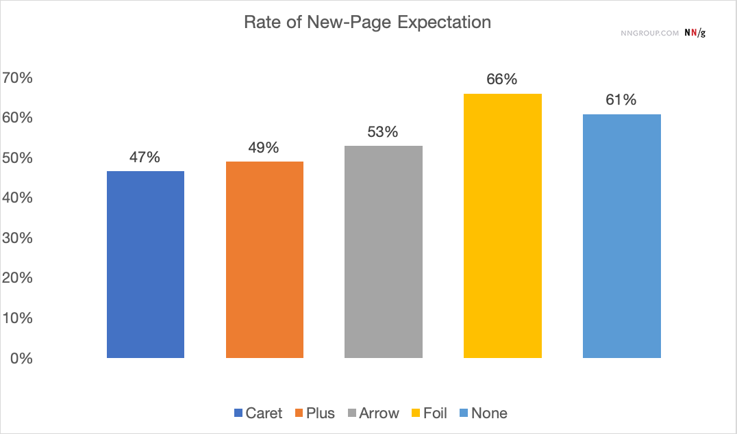
For the standard signifiers (caret, plus, and arrow), there was no strong expectation to leave the page (as the rate of new-page expectation is not significantly different than 50%, p >0.05). Among all the standard signifiers, the caret has a significantly stronger expectation to stay on the page than the foil (p<0.05) or the no-icon condition (p <0.05) and the plus is significantly better than the foil (p<0.05), but not than the no-icon condition. The arrow is not statistically different than the foil or no-icon conditions, suggesting that this icon should not be used for accordions.
Key Findings
Our hypothesis was that having no icon would cause users to expect that tapping on the menu item would take them directly to a new page, and this hypothesis held up in our study. Likewise, the foil icon was presumed to not have any association for users with opening an accordion, and this also held up.
Then, we compared users’ reported expectations of the caret, plus, and arrow icons to the foil or no icon, as a test of whether or not they were superior signifiers for an accordion. We also looked at whether people tend to tap the label or the icon for these different signifiers, under the assumption that, if indeed there is a strong tendency to tap only on one of them, we could, perhaps, separate the functionality of the two (a la split buttons).
- For accordion patterns, people tend to tap fairly equally on the icon and on the label for most standard icons. The only exception is the caret, where people tend to tap somewhat more on the icon, but still 29% of the taps fall on the label. This suggests it’s not safe to use split buttons for accordions — where the text label links directly to a landing page, but the icon opens the accordion.
- Making up new icons for accordion signifiers or using no signifiers at all is not a good idea as they violate users’ expectations (which are that they will be taken to a new page).
- None of the standard signifiers have a strong association with staying on the page. That being said:
- Using a caret is definitely better than using no icon at all or a random icon in terms of conveying the expectation to stay on the page (and open an accordion).
- Using an arrow or a plus is not better than using no signifier at all.
- When no icon was present, users tended to tap on the text label, rather than the empty space in that row. While an obvious finding, this is more evidence that users tend to interact with strong, clear signifiers.
- Interestingly, using a right-facing arrow icon (as opposed to a plus or caret) was NOT significantly associated with an expectation of going directly to a new page. While many designers might think that an arrow icon implies “go directly to a page” whereas the same icon pointing down implies “open an accordion here on the page” that was not supported in our data.
Design Recommendations
- If using accordions in your mobile menus, the caret appears to be the safest icon choice.
- Do not have icons and text labels link to different actions (i.e. label directly to page, icon opening an accordion). Our study findings further support our previous recommendations that you should not use split buttons for accordions. Our study showed that users tapped fairly equally on both the text label and the icon and did not expect them to do different things.
- Decide if your menu items will either open a submenu accordion or go directly to a category-overview page. If you choose to have your menu items link directly to a landing page, do not use a right-aligned icon.
Summary
Users tend to click fairly equally on both the accordion icon and the accordion label, so avoid dissociating those by assigning them different functionalities. Use a caret icon to designate an accordion, whether on desktop or mobile — our study found that of the standard set of icons used in this context, only the caret performed better than either no icon or a nonsense icon at indicating that than it was an accordion.


Share this article: