Imagine this: after dozens of meetings with your company's legal, marketing, and engineering departments, you finally have access to an analytics tool. Congratulations! There is a rush of excitement as the UX team dreams of conducting A/B testing on design improvements or (finally) convincing skeptical stakeholders with quantitative user data.
A few months pass and that initial excitement turns into dismay — there are so many pages, reports, and metrics to consider. The scope and robustness of analytics tools can mire any design team with information overload and analysis paralysis. What can UX professionals do when confronted with so much quantitative data? Consider using the Pareto Principle.
What Is the Pareto Principle?
Definition: The Pareto principle (also described as the "80/20 Rule") states that 80% of the results come from 20% of the causes.
In the 19th century, the Italian economist and engineer Vilfredo Pareto noticed that 80% of the peas from his garden came from just 20% of the peapods. When he began studying land ownership and wealth inequality, he again noticed that 80% of Italy's land was owned by only 20% of its people. In the 20th century, management consultant Joseph Juran rediscovered Pareto's work and popularized it as the Pareto principle to prioritize investing valuable effort on the "vital few" instead of the "trivial many."
A surprisingly wide range of contexts have demonstrated this 80/20 imbalance:
- 20% of websites capture 80% of web traffic.
- 20% of customers generate 80% of a company's revenue.
- 20% of academic papers make up 80% of all citations.
- 20% of software bugs contribute to 80% of computer crashes.
- 20% of possible openings are used in 80% of chess games.
The Pareto principle is a statistical power law describing a particular Pareto distribution, a distribution closely related to Zipf curves. In basic terms, a power law describes a mathematical relationship between 2 variables: one variable is proportional to the other variable raised to a certain power. Examples include y = x2, y = 5x3, or y = 2.5 x-5. A small increase in x leads to a substantial change in y.
The Pareto principle doesn't predict when this phenomenon happens, nor does it explain why it happens. Also, there's no guarantee your data will neatly follow an 80/20 distribution. For instance, 5% of your web pages may be responsible for 67% of all pageviews and, in many social media, 1% of users account for 90% of postings. What's important is the magnitude of the imbalance between the 2 values and not their exact numbers. Think of the Pareto principle as a helpful observation that inputs and outputs are often not evenly distributed. A large group may contain only a few meaningful contributors to the desired outcome.
How to Create a Pareto Chart
A Pareto chart is a data visualization illustrating which categories (e.g., different pages) are the most significant contributors to a given metric (e.g., number of page views).
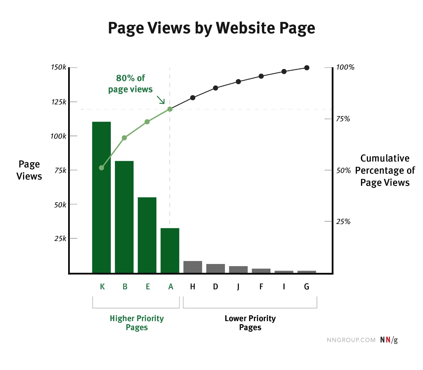
A Pareto chart contains two different plots in the same visual:
- A bar plot that graphs the metric by category (in our example, the page views per page)
- A line plot that graphs the cumulative percentage of the metric by category (in our example, the percentage of the page views due to the current page and to all the pages with larger pageview counts)
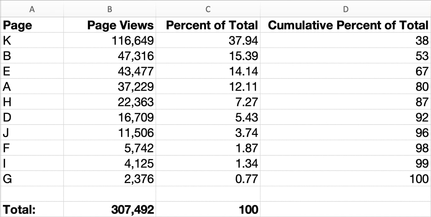
Creating your own Pareto chart requires making a simple table of categorical values, their numerical values for the metric of interest, and few calculated values. Before you begin, always start with a goal and a hypothesis that you want to investigate. Check if the required data exists, is exportable from the system storing it, and is free of redundancies or errors. You may find that a lot of cleanup and compiling of the data is necessary before creating the table below.
Here are the steps for creating a Pareto chart:
- Choose a descriptive category such as web pages, features, user segments.
- Choose a numerical metric to compare across your categories, such as cost, page views, number of clicks.
- Start with a blank spreadsheet.
- In column A, list all category values. For example, if your category is pages, list all pages.
- In column B, next to each category, list the value of the metric for that category. For example, for each page, list the corresponding number of page views next to it.
- Sum column B at the bottom of the table to get the total counts for all the members of the category. In our example, the sum would represent the total number of page views received by all pages.
- Sort the table by the metric column from highest to lowest.
- For column C, calculate the percentage that each category contributes to the total counts. To do that, take the value in column 2, divide it by the total-counts sum from step 6, and multiply by 100. This column should add up to 100%.
- For column D, calculate the cumulative percentage for each category by adding that item’s percentage with the percentages of all items above it in the table.
- On the same graph, create a bar chart corresponding to column A and B and a line chart for columns A and D. (You can also create two separate charts — one for the bar plot and another one for the line plot — or just the line plot based on columns A and D; even though technically the result will not be a Pareto chart, the information conveyed will be the same.)
Pareto charts are useful prioritization aids as they help you easily identify the biggest contributors to a metric. Microsoft Excel supports creating Pareto charts, but you can also create them in other data-visualization or spreadsheet applications.
Applying the Pareto Principle in UX
Here are two situations where the Pareto Principle can help UX professionals set priorities from their data.
Example 1: An app's customer-satisfaction rating is sagging due to accumulated technical and UX debt.
Goal: Improve the UX of the app by fixing the most significant UI issues.
X-axis category: Product features
Y-axis measure: Number of negative user-feedback submissions
Pareto analysis: Just 3 features are responsible for 86% of feedback submissions.
Key insight: Improving these 3 features should disproportionately impact the feedback submission.
Action: Persuade stakeholders to invest effort in these 3 features, despite other features having more obvious and easier to implement fixes.
Example 2: Fewer users have signed up for a free product trial since a website redesign.
Goal: Improve the free-trial rate (a micro-conversion goal), which contributes to customer acquisition (a macro-conversion goal).
X-axis category: Web pages visited by users who signed up for the trial
Y-axis measure: Number of unique page views
Pareto Analysis: 77% of this user segment visited a page describing your product's features and pricing.
Key Insight: Reducing the exit rate of the pricing page should disproportionately improve the trial rate.
Action: Prioritize a qualitative-research project to triangulate the underlying issues with this pricing-plan page, even though other pages have higher exit rates.
Reduce Scope and Increase Impact
UX teams generally have scarce resources, insufficient time, and a need to demonstrate business value to the organization. In environments with low UX maturity, just gaining access to analytics can require spending valuable political capital. By leveraging the Pareto principle's scaling effect, a UX team can quickly realize many benefits, such as:
- Filter through the volume of analytics data
- Persuade stakeholders on the potential return on investment of a UX project
- Reduce research and implementation scope
- Achieve impactful results efficiently
The Dangers of Focusing on ONLY 20%
It can be tempting to misuse the Pareto Principle and ignore 80% of your user experience. Even Joseph Juran recognized this problem and revised his original description of the Pareto Principle from "the vital few and the trivial many" to "the vital few and the useful many." Investing exclusively on the 20% for too long can lead to stagnation and overoptimization of a few metrics to the detriment of others. It can also reinforce stakeholder beliefs that just a few metrics should drive product vision and design work. Avoid this trap of all-or-nothing thinking. Reserve some bandwidth for studying other parts of your user experience, which may have a significant aggregated impact on different metrics or provide needed utility for users.
If we take the Pareto Principle literally, then there is still 20% of total UX value to be derived from the 80% less-used or less-important elements of your design. We don’t want to leave that 20% on the table; we simply want to prioritize the higher-potential gains.
Conclusion
Although analytics tools capture vast amounts of behavioral data from your website or app, not all parts of the user experience contribute equally to the bottom line. Leverage the Pareto principle by first confirming your organization's goals, the metrics that measure them, and the user data aligned to those goals. Then focus UX research and design efforts on those areas contributing significantly to those business metrics. Even minor improvements to these vital areas can generate disproportionately powerful results.
Learn more by taking our full-day course Analytics and User Experience.
References
1. Juran. 2019. Pareto principle (80/20 rule) & pareto analysis guide. (March 2019). Retrieved September 13, 2021 from https://www.juran.com/blog/a-guide-to-the-pareto-principle-80-20-rule-pareto-analysis/
2. Lada Adamic and Bernardo A. Huberman. 2000. The nature of markets in the World Wide Web. SSRN Electronic Journal (2000). DOI: https://dx.doi.org/10.2139/ssrn.166108
3. M.EJ Newman. 2005. Power laws, pareto distributions and Zipf's law. Contemporary Physics 46, 5 (2005), 323–351. DOI: https://dx.doi.org/10.1080/00107510500052444
4. Richard Koch. 2017. The 80/20 principle: The secret of achieving more with less, London: Nicholas Brealey Publishing.


Share this article: