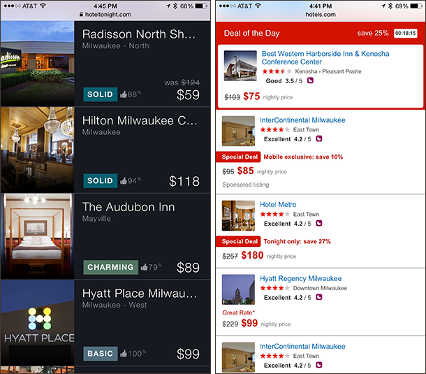
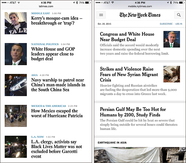
A common question we hear from clients and attendees to our training courses is whether or not to include image thumbnails in a list of items for mobile designs; and if yes, whether to place those thumbnails on the left or the right of the main text. As expected, there is no one-size-fits-all answer, but there are guidelines to help determine the best course of action for various situations.
Is the Image Helpful?
Do not assume that, just because you have images available for some or even all of the items in a list, you absolutely must display them.
Consider first whether or not the image will help users decide which item they should choose from the list. Better yet: ask yourself whether someone would be able to decide where to navigate using only the image. If the image alone would definitely not suffice (either because it is too small to distinguish relevant details or because it is a generic stock filler image), eliminate it.
For example, the thumbnail images of tea presented on the Teavana mobile site (below) are unlikely to help users decide which tea would suit their tastes, as it is too difficult to see the breakdown of tea leaves and other ingredients at such a small size. The screen space taken by the thumbnails would be better utilized for textual information such as the tea’s tasting notes or the caffeine level — content that would help users make informed navigational choices, but is currently buried on each detail page.

Conversely, if text alone would make it difficult for a user to choose an appropriate item (at least, without pogo sticking) then the thumbnail image should be included in some form. This is most often the case for the retail and the hospitality industries, where users are strongly driven by aesthetics: the difference between, say, two dresses is often explained best by images — even tiny ones. And of course, if the list content is primarily visual (e.g., videos or photographs), then the images should definitely be prioritized on browse pages to aid navigation, warranting large thumbnails or a grid-based layout depending on how much associated text also needs to be displayed.
Placement: Left or Right?
If you’ve decided to include item thumbnails, the next question you may ask is where to place them. To determine whether to position them to the left or to the right of the associated text, weigh the image against the textual information provided within the list item. Is the visual the most important piece of information for users browsing the list? Or is the image just an auxiliary tool?
If the image is essential for choosing an item in the list, place it on the left (in a left-to-right language; for right-to-left mirror this design advice), to help users quickly filter through the list of thumbnails without having to look at the text. Otherwise, if the image is secondary to the text, position it on the right of the text description.
This priority of the image relative to text should also be used to decide how large the thumbnail should be. The less important the image, the smaller it can be. However, keep in mind that, if the thumbnail is too small, it will no longer be recognizable and useful (to mitigate this issue, use a combination of cropping and scaling when reducing image size, rather than merely scaling down). On the other hand, a too large thumbnail can inappropriately distract the user from other relevant information, or cause problems for the associated text (for instance, the font size may need to be reduced to an illegible size or the description may need to be truncated — both significant dangers for the user experience). Also keep in mind that larger images take longer to load — a considerable annoyance at slow loading speeds.

Another factor that can help you choose where to place the thumbnails is whether you will always have appropriate images for all list items. If you cannot always include an image with each list item, place the thumbnails on the right to support text scanning. That will guarantee that the text is left aligned and that users will be able to move their eyes down the left-hand side of the page to determine which item is the most interesting.

Conclusion
To determine the relative importance of images, conduct attitudinal research such as surveys or interviews to gain insight into your users’ preferences. Once the priority of the images is defined, the ideal thumbnail placement will be easy to decide.

As always, be sure to use paper prototypes to test prospective new layouts, to ensure you’re heading down the right path before investing too much time and money. For more guidelines on mobile design, attend our course on Visual Design for Mobile & Tablet.


Share this article: