Back in the fall of 2019, I remember observing a group of middle schoolers interacting with computers. It was the first class in a Java course and they were supposed to install several programs in order to set up their personal laptops so they could compile and run Java programs. What was amazing to me as an observer was how little these kids knew about how to use a computer. They all owned smartphones and were masters at using those, but when it came to switching tasks on their laptops or working with multiple applications, they were completely ignorant. They seemed to have no idea that they could place two different application windows side by side and combine information from both sources and were painfully trying to move from one application to another.
Things may have changed in the era of COVID, with kids being forced to spend their school day in front of their laptops. It’s very likely that by now they have learned how to juggle multiple windows.
But their behavior back in 2019 was due to the single-window constraint on modern smartphones. Most phones today don’t allow two different application windows visible on the screen at the same time. Even on larger screens such as tablets, where technically it is possible to split the screen, it’s not very often that we see users working with two different applications side by side.
Part of the reason is that people don’t do complex activities on small screens, and simple activities rarely require two windows. But it’s a chicken-and-egg problem: do people not engage in complex activities on mobile due to the single-window constraint or do they not need the multiple windows because they perform only simple activities on their mobile devices?
In the last few years, we have started to see mobile devices that afford multiple windows side by side. A prominent example is the Surface Duo device, which runs a custom version of Android.
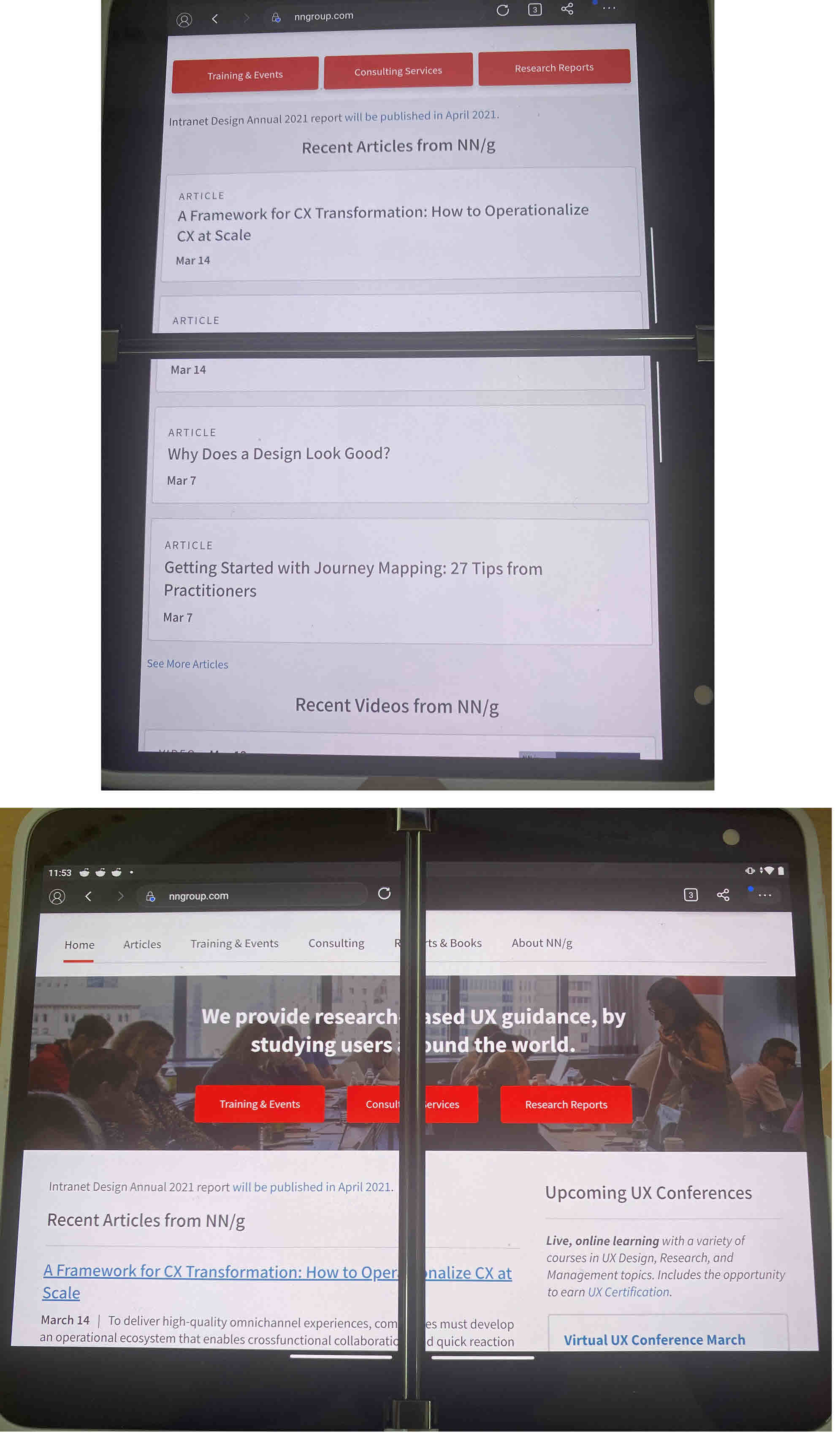
Somewhere between a phone and a tablet, the Duo opens up like a book to show two screens side by side. The diagonal of a single Duo screen measures 5.6 inches (14.2 cm); with both screens combined, it reaches 8.1 inches (20.6 cm). The Duo seems to be focused on multitasking, because, even though it is possible to show one app on both screens (and technically take advantage of the larger screen real estate), it’s practically not a great experience for the majority of the apps that have not been customized for it — when you maximize an application to take up both Duo screens, some of the content will be obscured by the spine in the middle. Whereas the lack of continuity is passable in portrait mode, it’s utterly unusable in landscape mode.
Using Multiple Apps at the Same Time
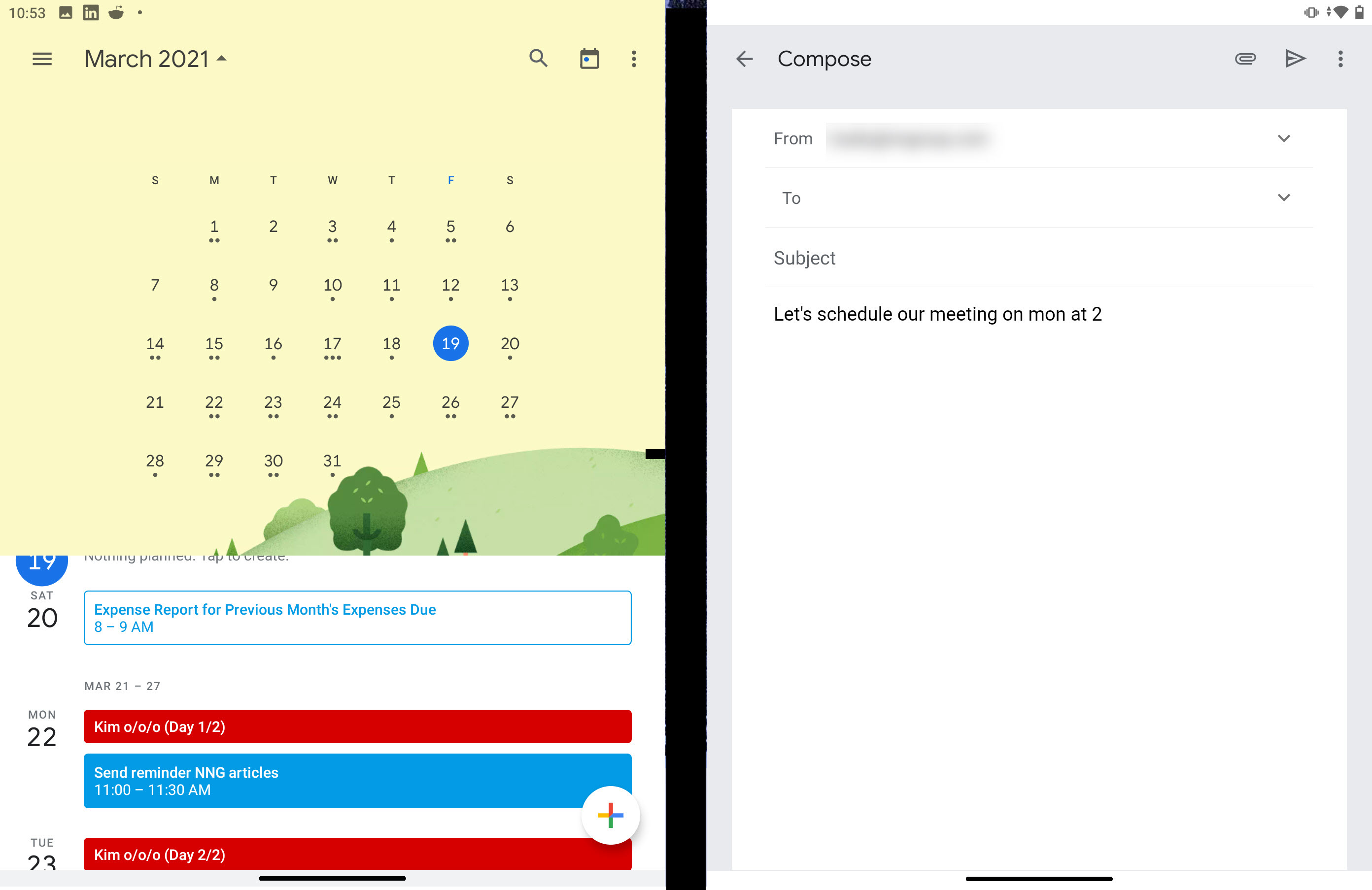
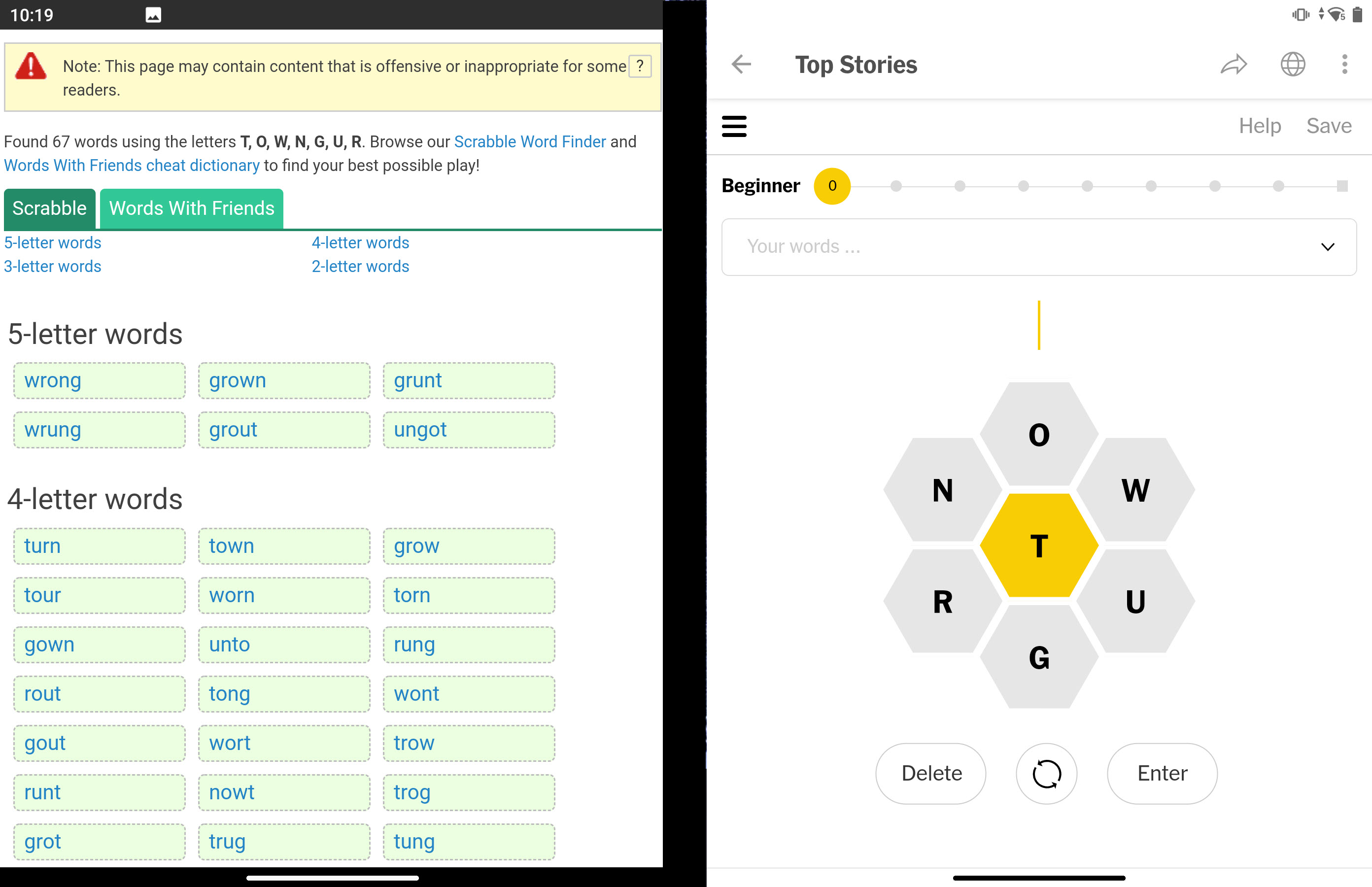
Duo seems best suited for working with multiple apps side by side. If a task requires users to refer to an external source of information, they can simply bring that on the second screen. For example, having the Calendar on one screen and the Mail app on the other allows you to easily propose a new meeting date to a coworker. Or, if you’re trying to solve the NYTimes Spelling Bee puzzle and need help from a dictionary app, you could open them side by side.
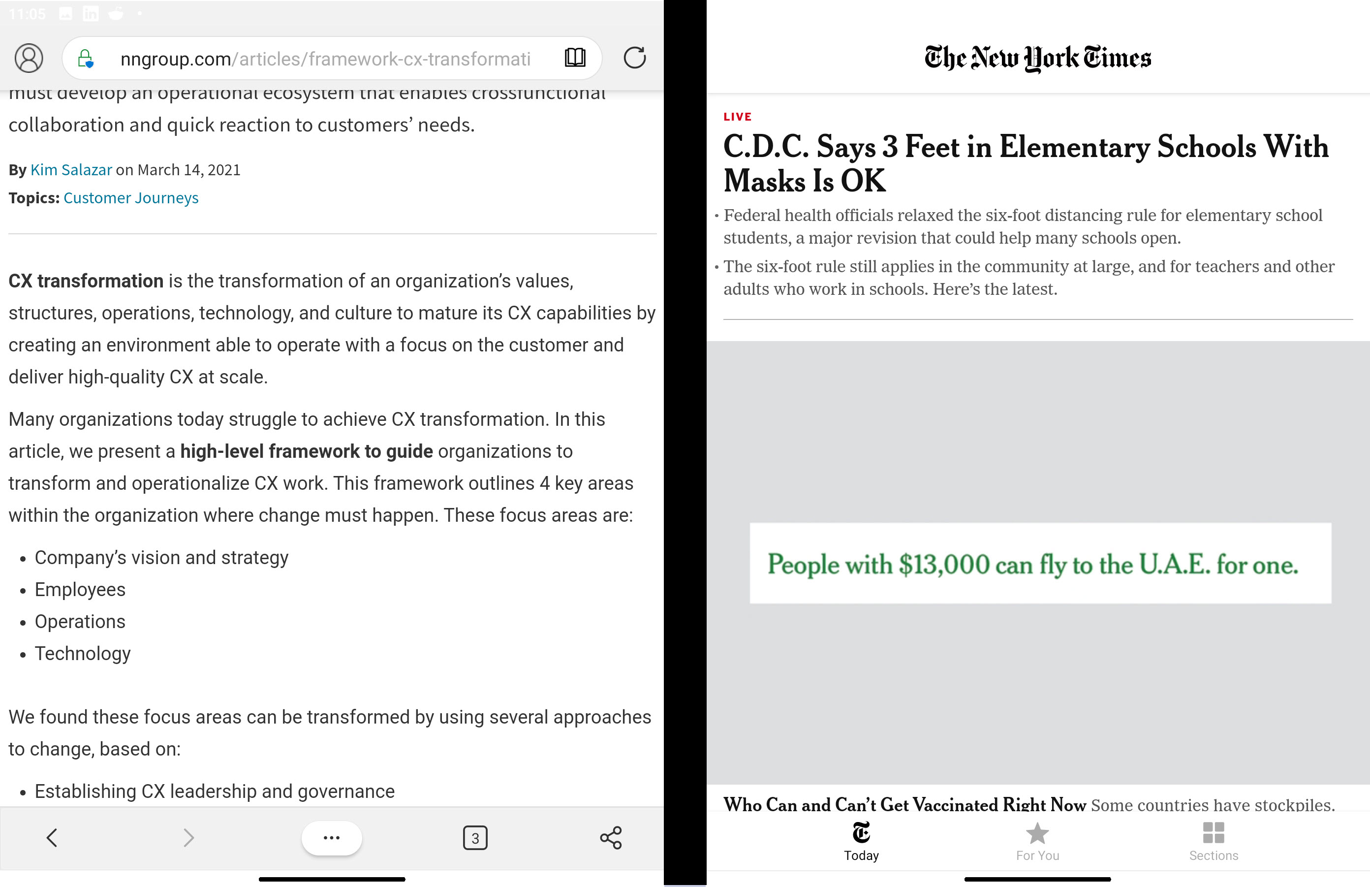
Duo even allows users to create pairs of apps that are always opened side by side. The idea is that, if a user performs a task repeatedly, they will be able to set up their workspace for that task. Unfortunately, if one of the apps in the pair is a browser, the user cannot specify which page that browser should be opened to. For example, if you wanted to pair The New York Times with the Edge browser for the puzzle use case above, you’d not be able to specify the page that the Edge app should open at. Nor would The New York Times app open at the Spelling Bee page. So, each time you’re doing that task, you’d have to navigate to the in-app page(s) of interest.
Drag-and-drop can be used to copy-and-paste text between two side-by-side apps, but it generally works only when the receiving app is part of the Microsoft ecosystem. For example, you can drag-and-drop text from an Edge window into another one or into a different Microsoft app such as OneNote or Outlook, but not into a third-party app like Gmail.
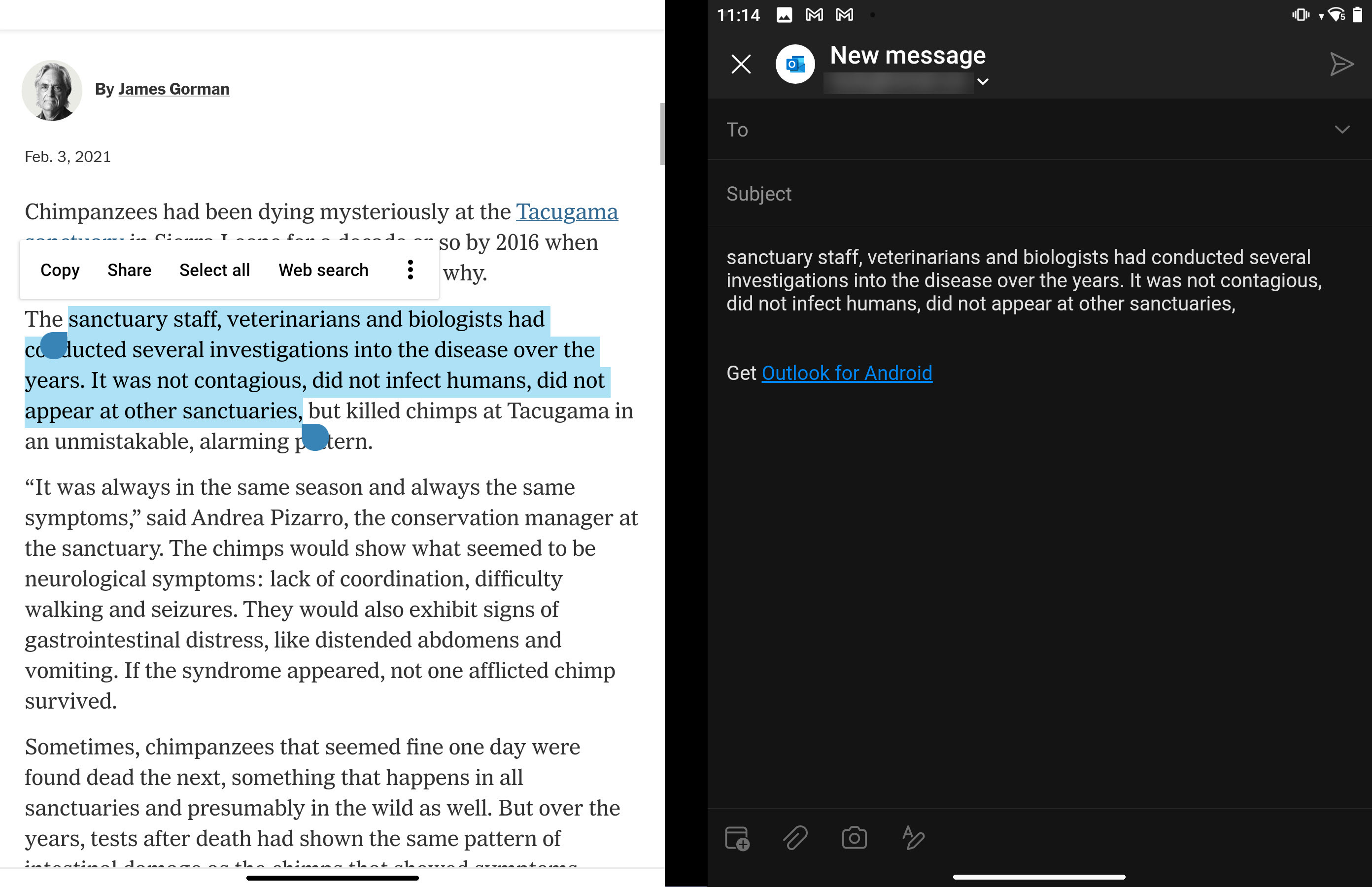
On the other hand, if you’re using the Microsoft OneDrive app, you can drag-and-drop files into Gmail to send them as attachments. However, you won’t be able to drag-and-drop a file from Google Drive into Microsoft Outlook.
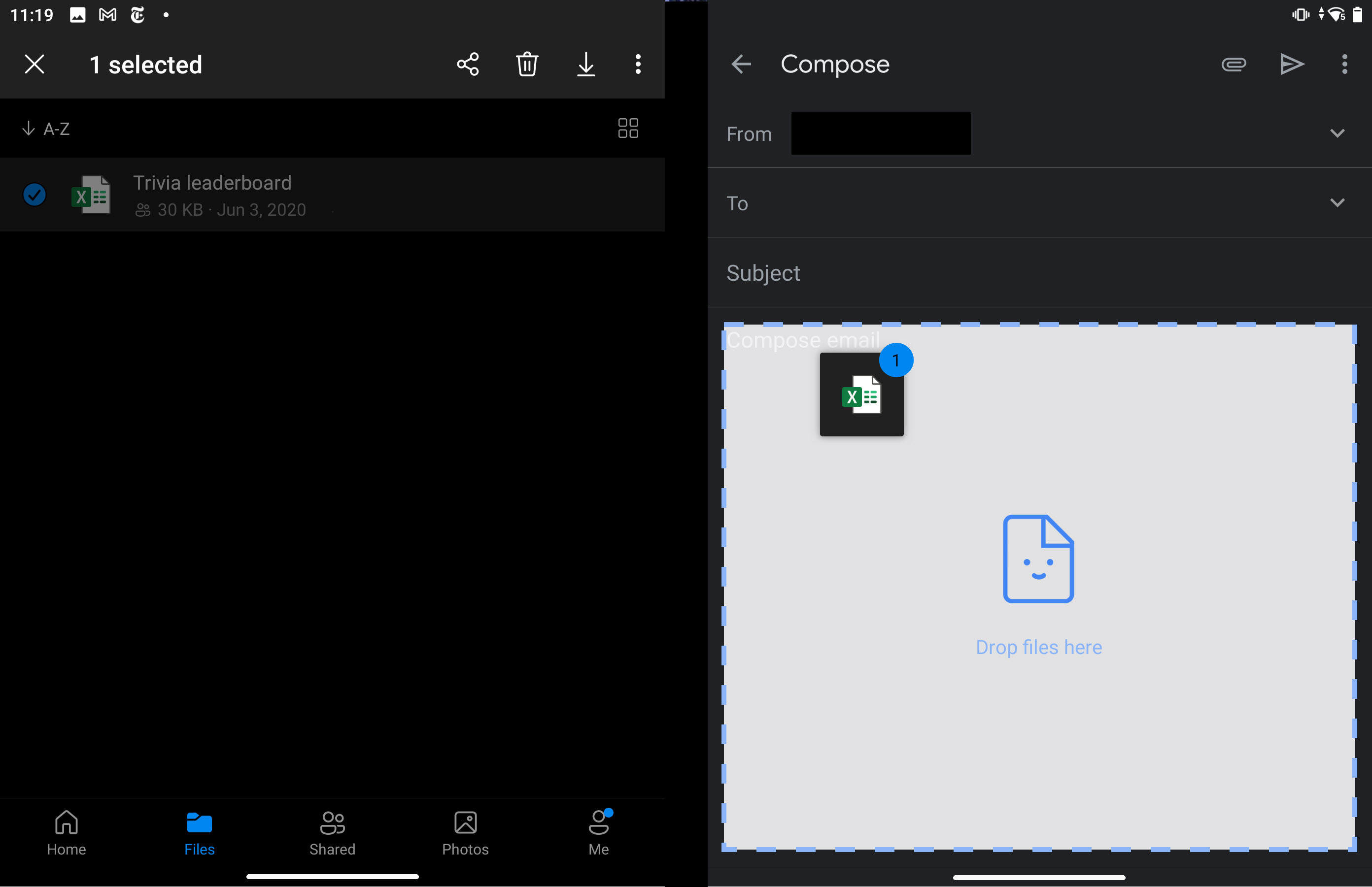
Do you see a pattern here? I don’t and it’s likely that users won’t either. It’s hard enough to remember that you can only drag-and-drop when one of the apps is a Microsoft app; but to remember that for text the destination should be Microsoft and for files Microsoft needs to be the source is probably very unlikely, unless the person is a heavy user of the Microsoft ecosystem.
So, even though drag-and-drop is a nice feature, it will probably remain largely unused, because it is available in only a few apps. The only chance for a new gesture to catch on is when most apps on the device support it.
Supporting Multitasking in the Same App
Duo apps fall into 3 classes, according to the level of support that they provide for the dual screen:
- No support at all
- Multiple windows of the same app on the two screens
- Fully taking advantage of the two screens (and minding the gap in the middle)
-
Most applications simply ignore the existence of two screens. When a user opens an application and then attempts to maximize it to extend it over both screens, responsive applications such as The New York Times or YouTube usually show the tablet version but some other apps that are not responsive (such as Amazon or Facebook) show the mobile Android version. Even though we normally recommend that all apps adapt to the screen size and show the version appropriate to the larger screen when the app is expanded, the truth is that the Duo’s spine in the middle makes the use of an app on both screens pretty unlikely, unless the app was specifically designed to take advantage of the two screens in an intelligent way (like some of the apps discussed below).

When the app is maximized to both screens, Amazon shows the mobile Android version enlarged to take advantage of the larger space. In practice, the area in the middle is obscured by the Duo’s spine. 
Responsive apps like YouTube show the tablet version when the window size is maximized. -
Some apps support multiple windows side by side. The Edge and Chrome web browsers allow users to open a new window of that app on the second screen. This feature enables people to easily combine content in the two windows or refer to one window while performing a main task in the other. Each of the two windows become visible in the list of apps, essentially behaving as if they were two version of the same app running simultaneously.

The Edge browser allows users to open two webpages in different windows and see them side by side. OneDrive also allows users to open different documents in side-by-side windows; each of these windows is present in the Recent apps list on the device. This is truly useful, as someone could work with, say, a PDF and an Excel file side by side. Unfortunately, it doesn’t seem possible to open two files of the same type (e.g., two Excel files) side by side.

Users could have a PDF and an Excel file side by side using the OneDrive app. Some other applications open new windows on a second screen — either by default or by user choice. In Gmail, the new-message view is always opened on the second screen, while in Microsoft Outlook, the user can long-press the Compose button to choose whether the new-message view should appear on the same screen or on the other screen.

Gmail automatically displays the new-message view in a second window. 
Outlook lets users select whether the new message will be displayed in a new window or in the same window. These two windows behave almost as two independent apps, but not quite. For example, the user composing a Gmail message can decide to bring a different app (an article) on the left-hand side of the screen. But the two windows (Inbox view and Compose Message view) for Gmail and Outlook do not appear twice in the list of apps and it’s not always clear how to get to one specific window once the user has moved on to another app.
There is another problem with the two-window version of an application: when a second window is open, if the user taps the Back button at the top of the right screen, then the new-message window closes — an unexpected action different from the standard Back-button behavior.

Users can bring a different app on the left when they are creating an email (top). But if they tap the Back button the new-message window is closed (bottom). -
Some apps are fully adapted to the two screens.
Most applications that run on Duo are Android apps that are in no way optimized for two screens. However, a few apps did get optimized for the Duo. Perhaps the app that works most impressively on the two-screen display is Kindle, which takes advantage of Duo’s book skeuomorphism. Using Kindle on the Duo feels, more than on any other Kindle or tablet device, like using a real book.

Kindle on Duo feels like using a real book. While Kindle on Duo is impressive, its usability is not substantially improved by the two-screen device (granted, for textbooks or other image-heavy books, there could be a large benefit of seeing two pages at once). There are other few apps (usually created by Microsoft) that are tailored to the Duo and that attempt to use its two screens to improve usability. When maximized to the dual screen, these applications will present two different views at the same time — usually a main view on the left and an additional working view on the right. For example, the left screen could be a hub page such as a list of articles and the right screen could be a detail view of one of the articles. Or, the left screen could be an inbox view and the right could show a selected message.

Microsoft News for Duo shows the navigation and a list of articles on the left screen; if the user taps on an article, it is shown on the right screen. The user cannot, however, show two different articles side by side. In general, being able to see two different pages in the same app could be beneficial to the user in multiple ways: (1) it could keep them oriented, enabling them to keep track of where they are in the app’s information architecture; (2) it could allow them to complete tasks that rely on multiple sources of information inside the same app (e.g., compose a new email while referring to an existing one or add a new calendar event while seeing the rest of your schedule).

Microsoft Calendar app allows users to see both a detail view for an event (right) and a summary view of their schedule (left). The problem with these apps is that Microsoft didn’t decide clearly when an application that is maximized to both screens should act as a single two-screen window or as two separate windows. The result is at times disconcerting.
Let’s take the example of Outlook. If users first launch the app and then maximize it, they get a single-window view that spreads over the two screens and has a single, continuous navigation bar containing the page title and a few other elements. Even when the user selects a message and inspects it in detail, the single navigation bar persists — sign that the app is in single-window mode. However, the user will actually see two separate panes: one with the detail view and the other with the list view. If, next, the user decides to compose a new message, the app will (unexpectedly and unannouncedly) move to a two-window mode: the selected message migrates to the left screen (which now hosts a one-screen version of Outlook) and a new-message window appears on the right. Closing the new-message view on the left will make that window disappear and leave the user with a single-screen app. For most users, however, the transition between the single-window mode and the two-window mode will likely stay unnoticed and they will be confused when the app suddenly decides to use only one of the two screens.

Inbox view on the right and detail view on the left are displayed in a single app window that is maximized to take up both screens. 
If the user uses the floating button to compose a new message, the app transitions to a two-window mode: a new window appears on the right and what was displayed on the right goes to the left window. The left window is the main app. If you closed the New message view the app would still show on the left half of the screen, no longer maximized (below). Note however that for the user there are practically no cues to understand when the transition from a single-maximized-window to two side-by-side windows has happened. The untrained eye can easily miss the distiction between a single, continuous navigation bar in single-window mode (above screenshot) and two navigation bars with two different titles in two-window mode. 
When the user closes the New Message view, the app is no longer in dual-screen mode and is only shown on the left screen.
Conclusion
The Microsoft Duo attempts to facilitate multitasking for mobile devices by providing two screens on which two different applications can be displayed side by side. While we are convinced this feature will improve the ability to multitask on mobile, the device provides little additional support for multitasking. Most applications are not tailored to take advantage of Duo’s two screens. While some Microsoft applications do support easy transfer of information between applications via drag-and-drop, it will be difficult for the user to remember when this feature is available and when it’s not. Support for multitasking inside the same app is also limited. Even those apps that are customized for the Duo have trouble distinguishing between a two-screen, maximized window and two separate windows, transitioning abruptly and unintuitively between the two modes and creating potential for confusion.
The real problem seems to be that it’s hard to come up with a few general principles for multiple-monitor design that will automatically improve usability across platforms with two (or more) screens. In many individual circumstances, one can design ways for specific applications to benefit from a dual display, but each such circumstance requires a separate implementation work. As long as this remains true, dual displays (or, in general, multiple monitors) will have limited usability benefits because most software providers won’t have the implementation resources nor the design talent to develop these optimized solutions.


Share this article: