Every morning, I wake up, pour water into my tea kettle, and flip the switch on. Once the water is boiling, I turn the kettle off and pour myself a cup. The switch on my kettle is an example of a toggle. If you pay close attention, you’ll notice that toggle switches are all around us, because lots of things have two simple states: they’re either on, or they’re off (but not “just a little on”). From light switches, to turning on a mobile hotspot, to the preferences page on our favorite mobile app, we interact with toggles every day.
Definition: A toggle switch is a digital on/off switch.
Toggle switches are best used for changing the state of system functionalities and preferences. Toggles may replace two radio buttons or a single checkbox to allow users to choose between two opposing states.
Sometimes deciding which user interface element to use — radio buttons, checkboxes, or toggles — can be tough. When you’re wondering which option will fit your use case, consider the number and type of options, and if there is any clear default value. The below table summarizes questions and answers about these frequently used UI elements.
| Radio Buttons | Checkboxes | Single Checkbox | Toggle Switches | |
|---|---|---|---|---|
|
How many options are available? |
Multiple |
Multiple |
1 |
1 |
| How many selections can the user make? |
1 |
0 – all |
2 (on/off) |
2 (on/off) |
| Is there a default option? |
Yes |
No |
Yes |
Yes |
| How would you describe the choices? |
Mutually exclusive |
Independent of each other |
Mutually exclusive |
Mutually exclusive |
| When does the selection take effect? |
After a user clicks a submit button |
After a user clicks a submit button |
After a user clicks a submit button |
Immediately |
When designers use the appropriate UI element for a specific scenario, it helps users predict what the UI element will do and how to control it. To avoid user frustration and ensure comprehension, follow these guidelines on toggle switches.
Deliver Immediate Results
Toggle switches should take immediate effect and should not require the user to click Save or Submit to apply the new state. As always, we should strive to match the system to the real world. Consider my tea kettle: I should not have to flip the switch off and unplug the cord to experience the change in state. Consequently, users expect the same immediate results from a digital toggle as they do from their real-world counterparts (e.g., light switches). Immediate results are a facet of toggle switches that grants users the freedom and control to update their preferences as needed.
If immediate results are not achievable or seem ill-suited, an alternative (i.e. radio buttons or a single checkbox — see chart above) should be used instead. If you’re considering including toggles in long forms where other types of form fields are present, and users will need to click a Submit button for other changes to take effect, don’t. This scenario confuses users because they can’t be sure whether their toggle choice will take immediate effect. Avoid confusion at all costs. Separate controls that produce instant results from those that require clicking a command button.
![]() Don't:
Don't:
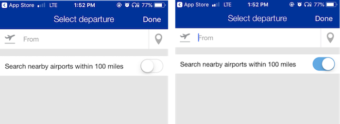
![]() Do:
Do:
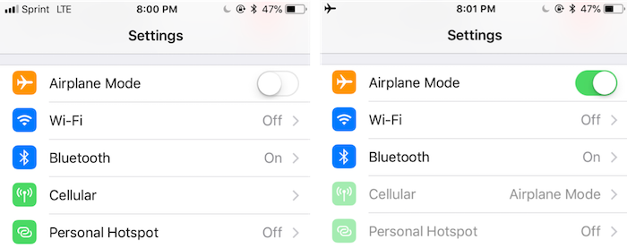
When turning airplane mode on for iOS, Apple provides immediate results by changing the cellular bars in the upper left-hand corner to an airplane icon.
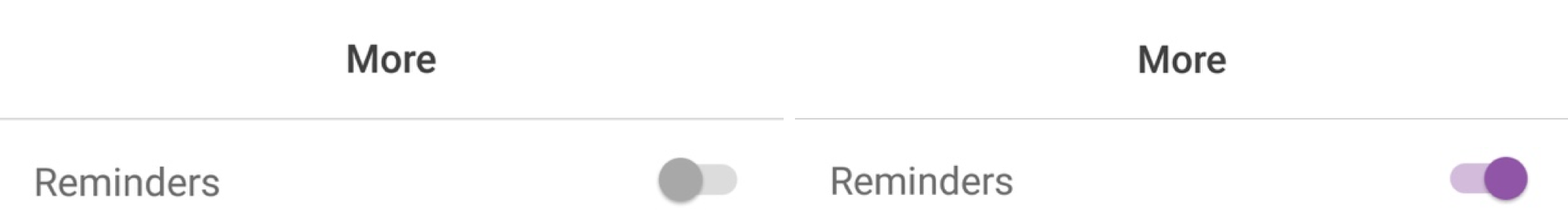
Provide Concise, Nonneutral Labels
Keep labels for toggle switches short and direct. Consider one of Tog’s Principles of Interaction Design that states, “Menu and button labels should have the key word(s) first, forming unique labels.” For example, when designing a settings page where a user can update notification preferences: do say Email notifications or Text notifications, and don’t say Do you want to receive email notifications from us? We know that users read only as much as they think they need to, so frontload your labels with keywords and remove excess phrases. Avoid asking questions and write for scannability.
The toggle labels should describe what the control will do when the switch is on; they should not be neutral or ambiguous. When in doubt, say the label aloud and append “on/off” to the end. If it doesn’t make sense, then rewrite the label.
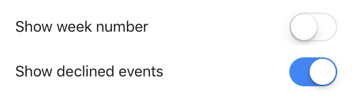
![]() Don't:
Don't:

![]() Do:
Do:
Follow Standard Visual Design
Ensure toggle switches look like sliders and utilize visual cues (i.e. movement and color) to avoid confusion. First and foremost, when a user changes the state of a toggle, the switch should change position — as it would in the real world.
Color is an important visual signifier for toggles and there are two things to keep in mind: contrast and cultural differences. When designers use low-contrast colors, it becomes difficult for users to know whether a toggle is on or off. Therefore, always use a high-contrast color to signal state change. In addition, be sure to evaluate the societal and cultural implications for your audience. For example, the color red for the on position is counterintuitive to those that associate it with stop signs or stop lights.
Additionally, state descriptors — the words On and Off next to the toggle — can provide clear visibility of the system status.
When adding state descriptors, stick to on/off to match real-world conventions and include both off and on to the left and right side, respectively, of the toggle to avoid confusion. If only one descriptor is present beside a toggle, it can be taken for a toggle label.
If you’re unsure how to balance color vs. state descriptors, evaluate and test to determine what combination works best for your users.
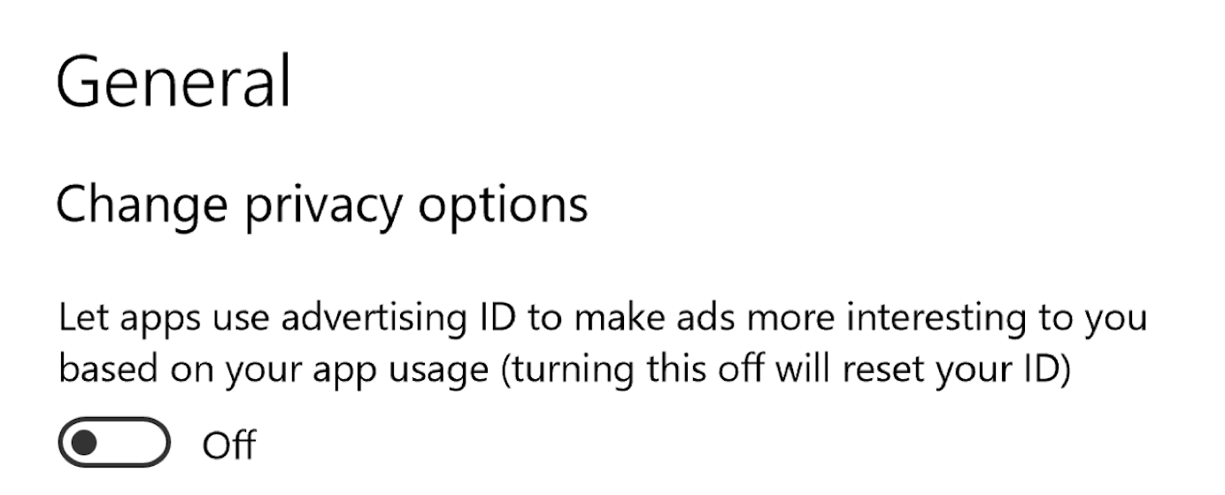
![]() Do:
Do:
Implement Consistently
Follow platform conventions and ensure that toggle switches are implemented consistently across your application. Inconsistency forces users to slow down and spend more time thinking about how to interact with components. Don’t make users wonder whether a question or statement with two radio buttons functions the same way as a toggle switch.
![]() Don't:
Don't:
Conclusion
Toggles help users update preferences, settings, and other types of information. When using toggles, provide direct labels, use standard visual design, and deliver immediate results. Keep in mind that toggle switches should only be used when the user needs to decide between two opposing states. As you review the use of toggles on your site or app, evaluate the context and ensure that they are implemented consistently. Remember, this simple user-interface component can make a big impact on user experience.


Share this article: