In ecommerce design, the checkout path is one of the most highly scrutinized parts of the user journey. And rightfully so: it directly influences brand perception, propensity for return visits, and an organization’s ability to drive revenue online. With more and more users shopping on smartphones, it’s imperative to design a mobile checkout flow that not only follows the best practices for ecommerce user experience, but is also optimized for the capabilities and constraints of mobile devices.
In this article, we’ll use findings from our recent research for the fourth edition of the Ecommerce User Experience report series to outline and discuss some of the most important design guidelines for an optimal mobile-checkout experience.
Mobile Shopping Cart and Checkout Options
Often, the checkout process begins with revisiting the shopping cart and editing it to contain only the items that will be purchased in the current session. The following guidelines ensure that the early stages of the mobile checkout are pain-free for users:
- Provide quick access to the mobile shopping cart. Tapping on the shopping cart indicates a desire to move forward, so get users to the cart as quickly as possible. Avoid performance-related delays and remove any unnecessary obstacles that may get in users’ way when trying to access the cart.
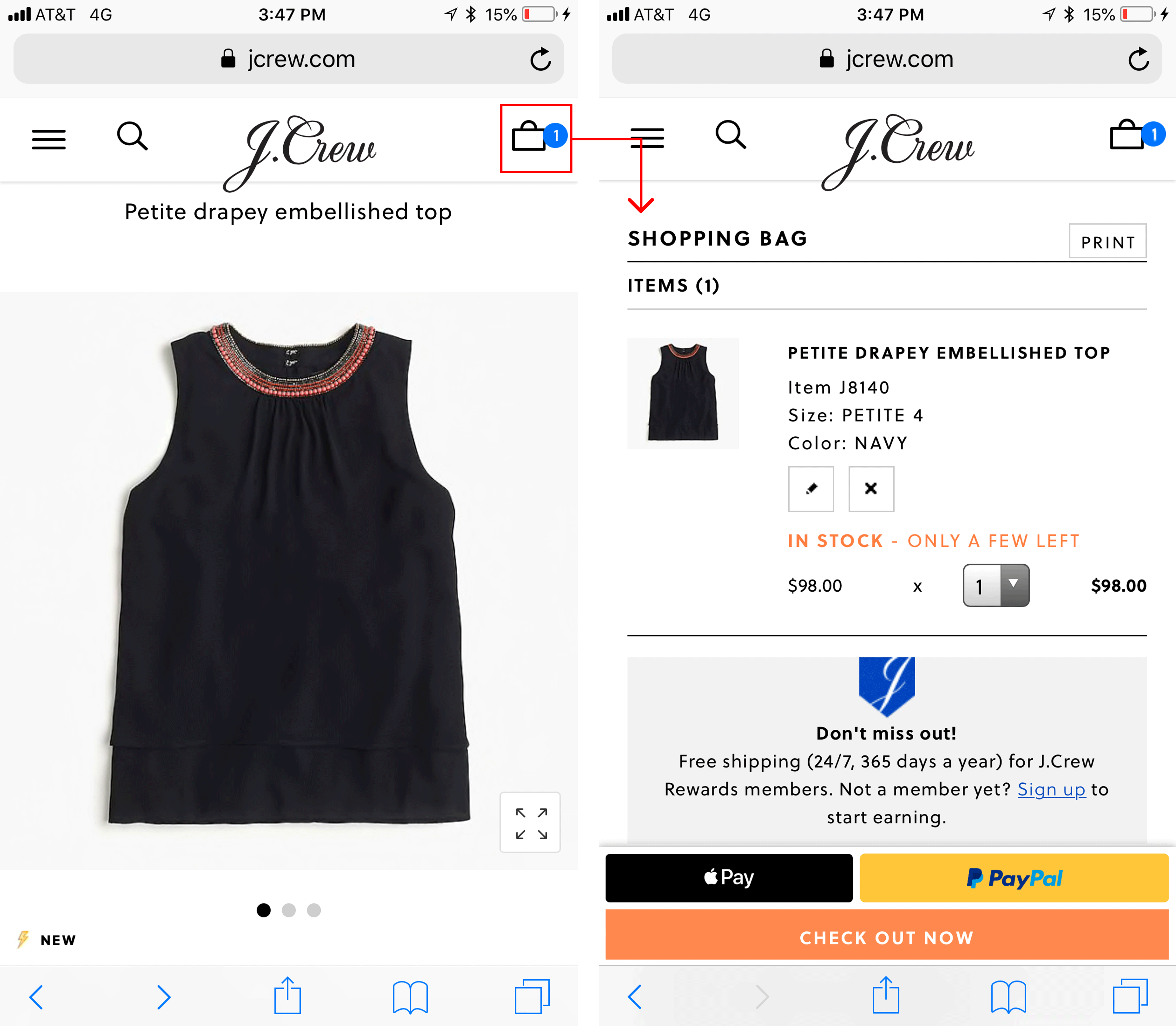
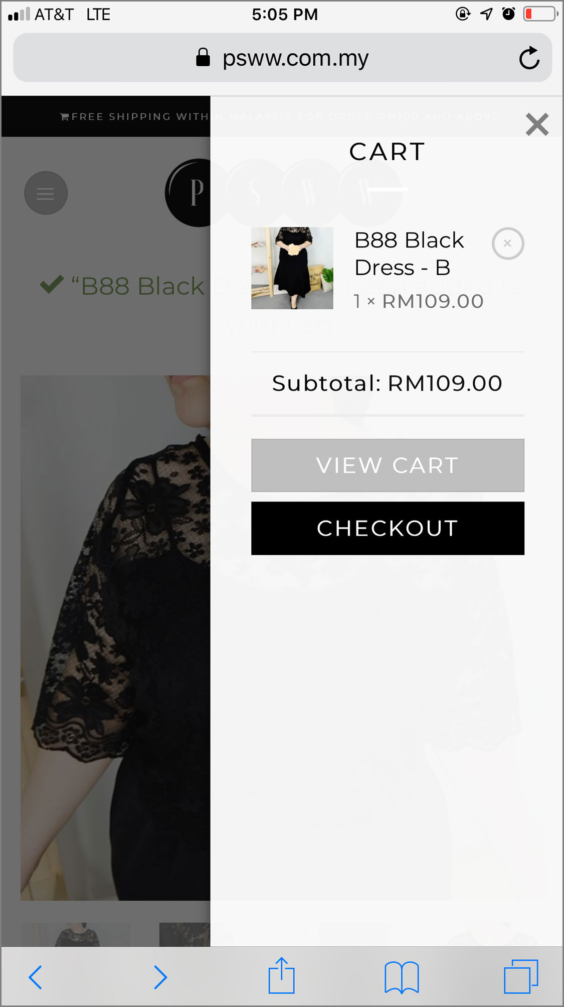
- Make it easy for users to update the contents of their shopping cart. People often change their minds about purchasing a product or accidentally add an item to the shopping cart twice. Allow users to easily change the contents of their shopping cart.
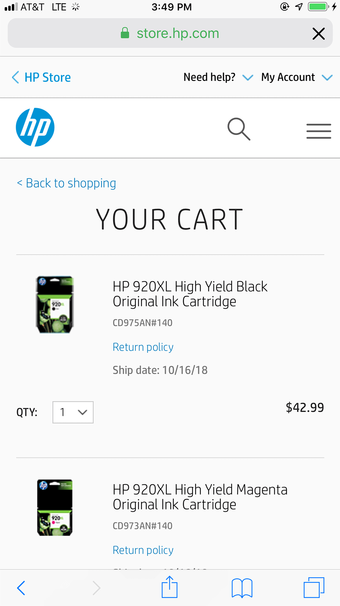
- Give users a clear Remove button next to each item in their cart. Don’t force them to change quantities to zero in order to delete a product from their shopping cart.
While shopping on HP’s site, one study participant became frustrated when she couldn’t figure out how to remove an unwanted printer cartridge from her cart (she was supposed to set the quantity to zero). As a result, she purchased the printer cartridges from Amazon instead.
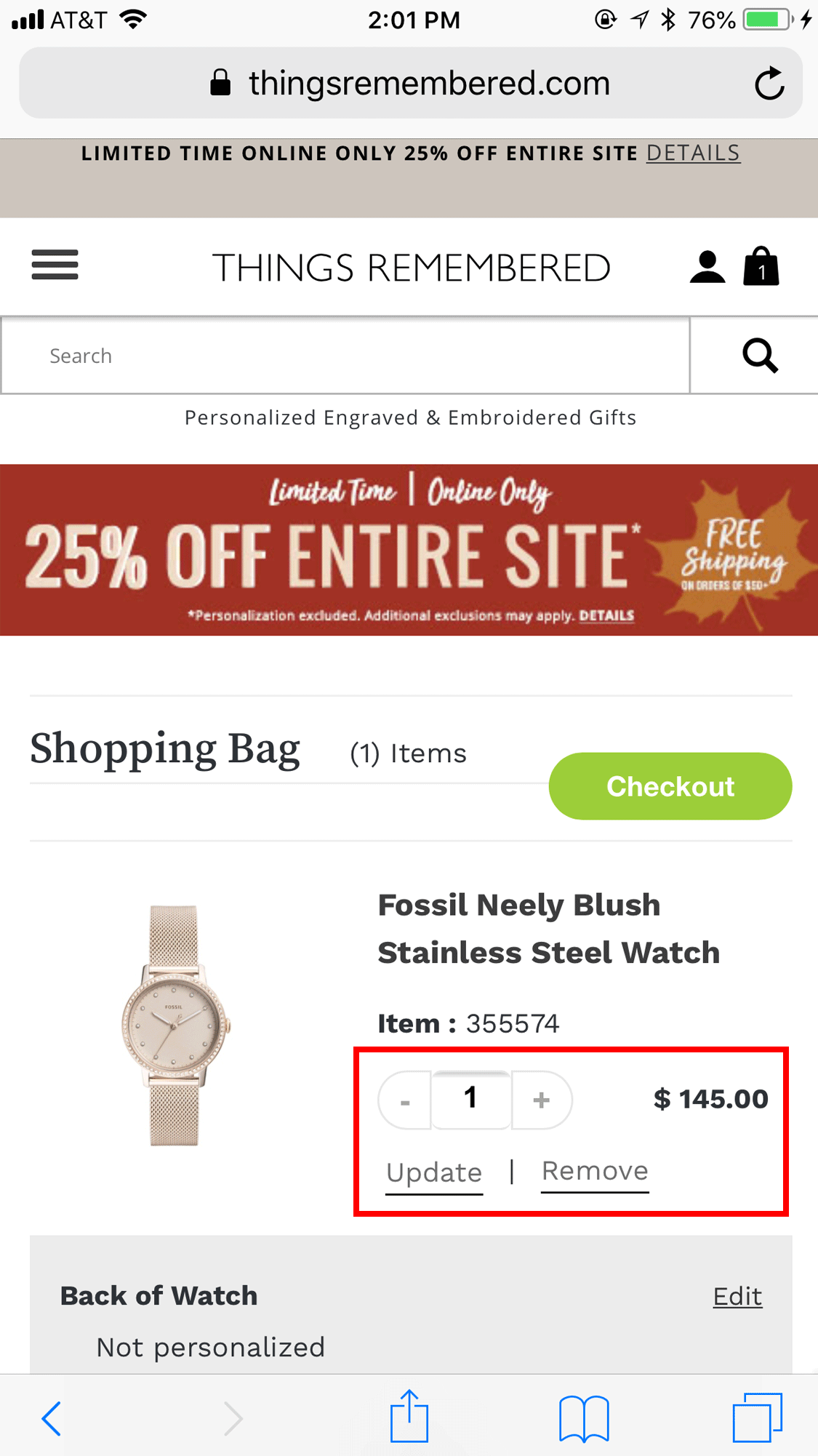
- Don’t use an Update button for committing changes to the shopping cart. Some sites force users to tap an Update button for any change to their shopping cart to become effective. Thus, someone who wants to change the quantity of an item in the cart will have to indicate the new quantity and then press Update to commit the change.
This design is suboptimal for two reasons: (1) users must perform two actions (change the quantity, then tap the Update button) to change the item; (2) people often fail to tap the Update button — either because they forget or because they don’t realize they are supposed to do so.
- Support the continuity of the shopping experience across multiple devices. As brands continue to develop across channels, users’ expectations for easy access, flexibility, and consistency while shopping continue to rise. And, because users tend to bounce back and forth between channels while shopping, it’s important to give them reliable access to their carts, on desktop, mobile web, and in mobile apps.
Users of Apple devices can benefit from a feature called handoff, which allows them to (1) use a website in Safari on their iPhone and (2) then, when they move to their iPad or Mac computer, open up the same page in Safari on that device (or vice versa).
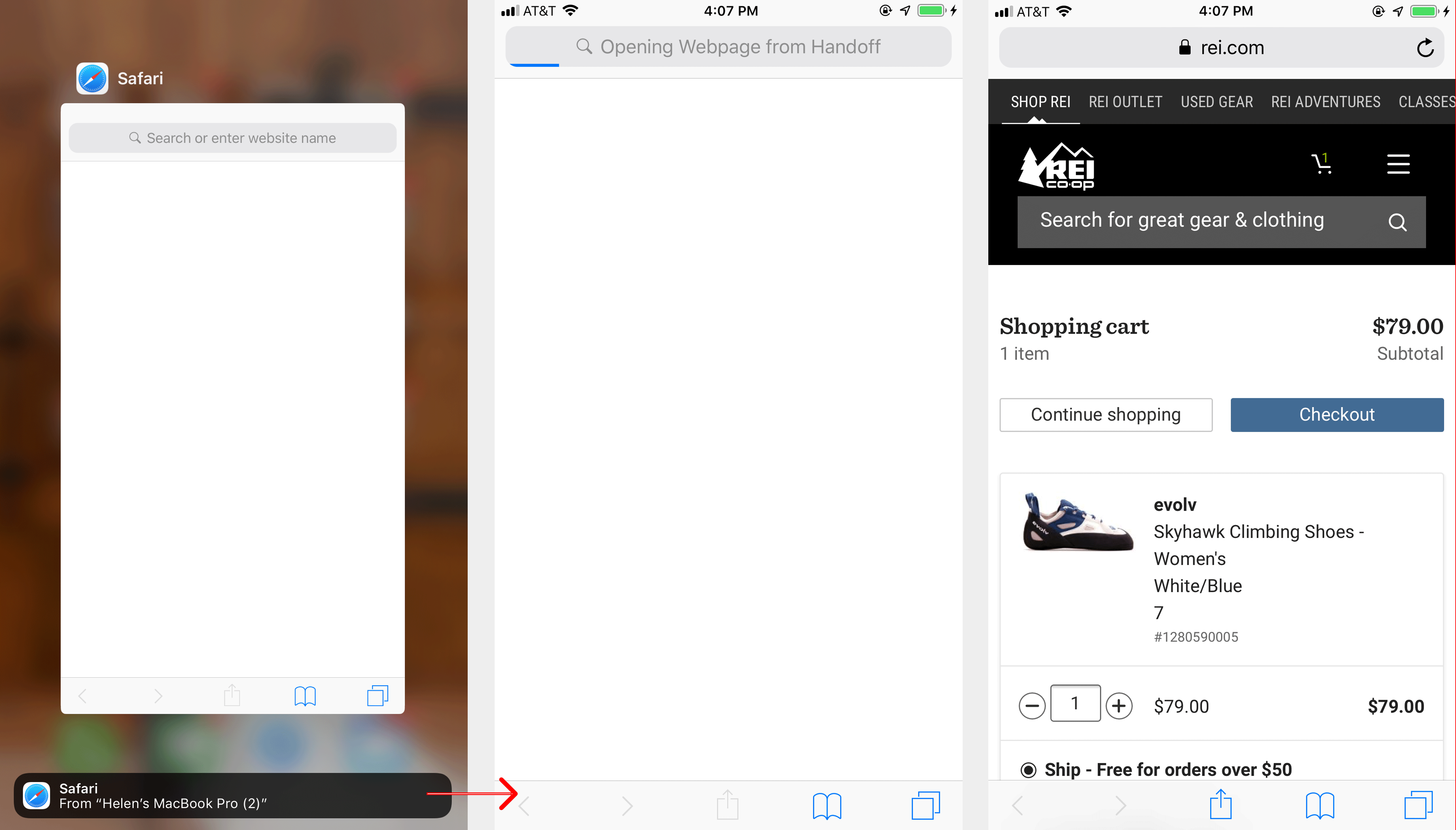
An application can also hand off the user’s session to a different device. Thus, someone checking out using an application on an iPhone could seamlessly continue the process on the iPad, provided that the developers of the app have taken advantage the handoff feature. Unfortunately, many apps (Amazon being one notable example) do not use handoff — to the detriment of their users.
To support seamless cross-device transitions for users outside the Apple ecosystem or those who are not familiar with handoff, make sure that their session can be resumed on a different device once they are logged in. However, that is not enough: users have to be aware of this feature when they first create an account. To help users remember earlier shopping sessions on different devices, consider including labels that indicate when items were added to the cart and on which device or channel they were added.
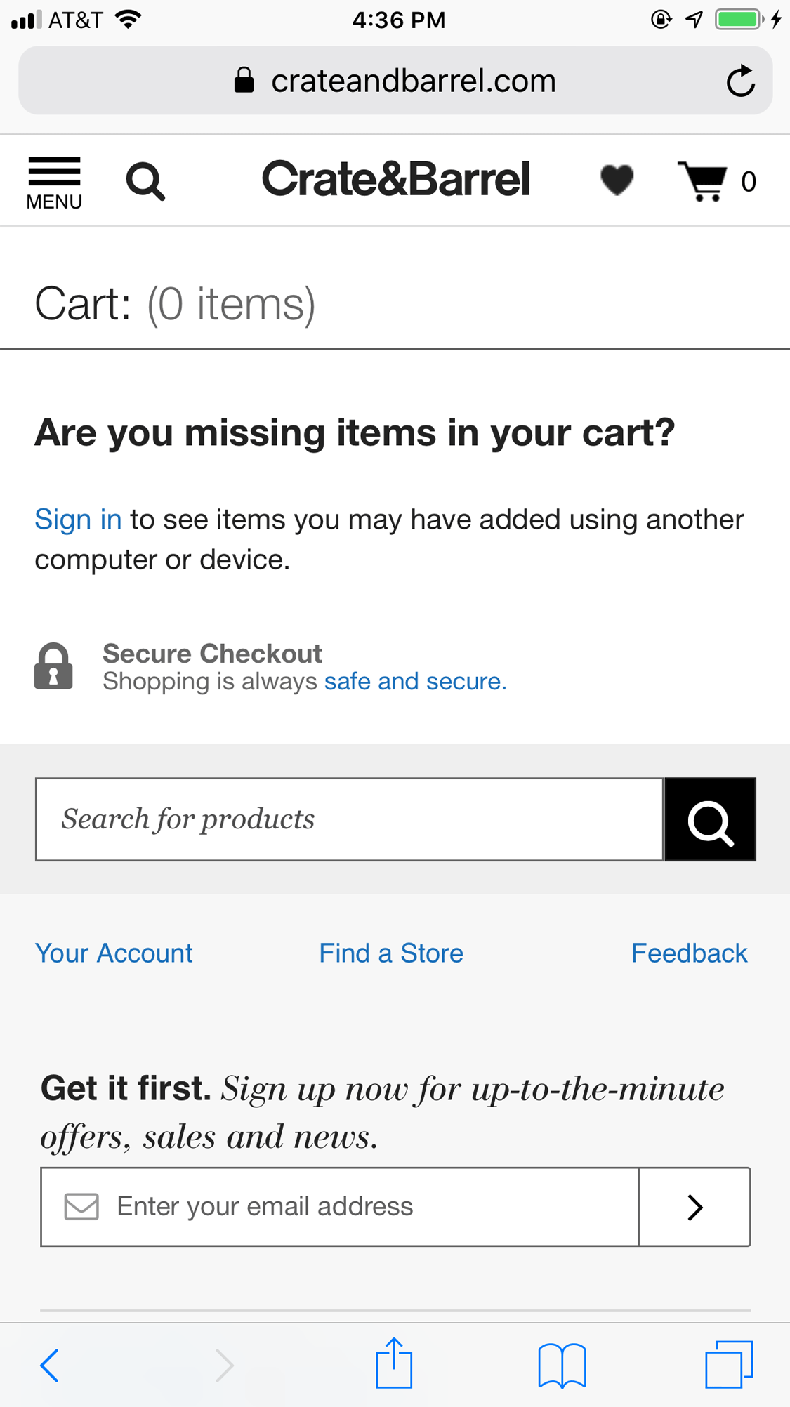
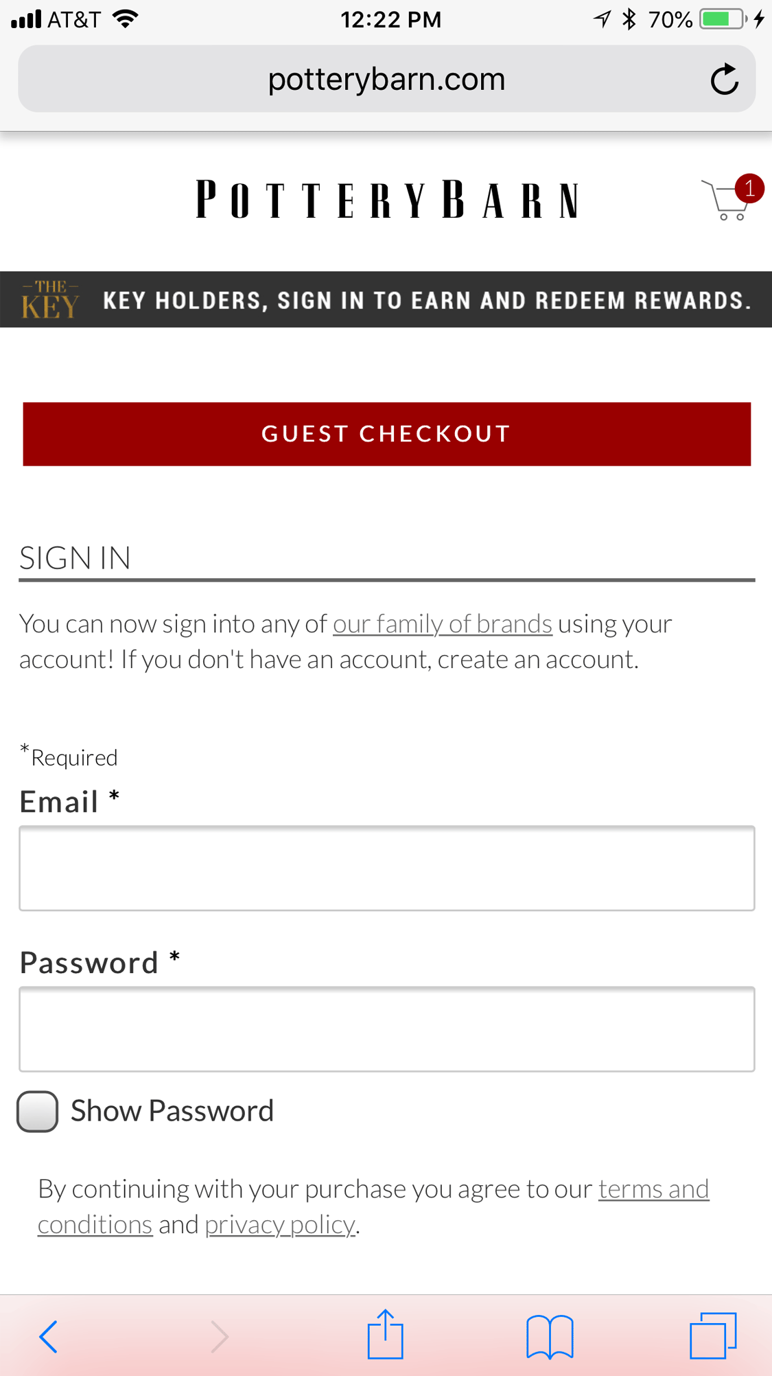
- Make guest checkout prominent and easy to find. Even people who have an account forget passwords; in many cases, it will be easier for them to check out as guests than to recover their password on their mobile device. Make guest checkout the most salient of your checkout options by placing it above the fold and above the options to sign in or create an account.
Order Summary and Pickup Options
Shoppers do not appreciate inaccuracies or unclear prices and grow frustrated when costs unexpectedly increase during the checkout process. Often when this happens, users will abandon their carts and seek out the items elsewhere to avoid excess fees, particularly when it comes to shipping and delivery charges. Two important details ensure that users can see and understand the information in the order summary on mobile:
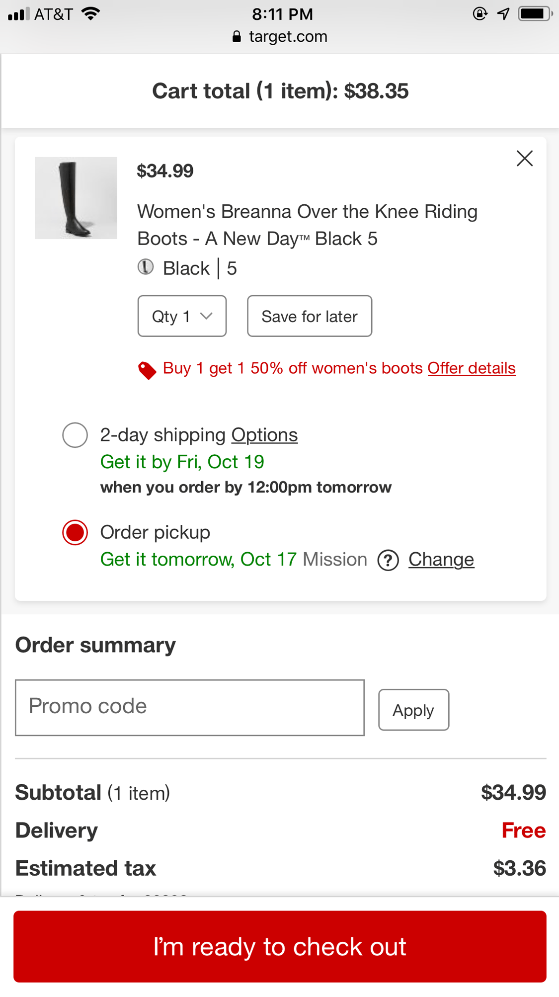
- Make the order summary easy to find in mobile layouts. While the details we display in the order summary, (including subtotal, taxes, fees, discounts, and shipping charges) are important for any checkout flow, we must pay extra attention to the placement of the order summary for mobile checkout. Due to limited screen space, these extra fees may appear low on the page and may be ignored by users. To avoid unpleasant surprises later in the flow, show the order summary prominently at the top of the checkout pages. Don’t make shoppers scroll to the bottom of the page to find this information.

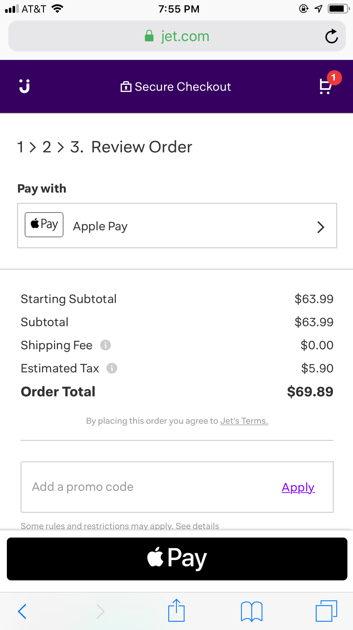
- Use the user’s current location to determine sales tax, delivery costs, and any pickup options available. Shipping costs and tax usually depend on the shipping address associated with the order, which is typically entered late in the checkout flow. Whenever possible, retailers should use their customers’ current location to estimate the delivery fees and the tax before the users have entered their shipping addresses. The current location can also serve to locate the closest physical locations where users could pick up their orders, if desired. Always ask the user for their permission to use their current location and allow them to easily change or update their location.
Form Fields and Input Interactions
Filling in forms on mobile can be time-consuming and error-prone. Reducing the total number of form fields and automatically filling in fields for the user (based on the knowledge that the system has about that particular user) can dramatically ease the checkout process. Here are a few guidelines for checkout forms:
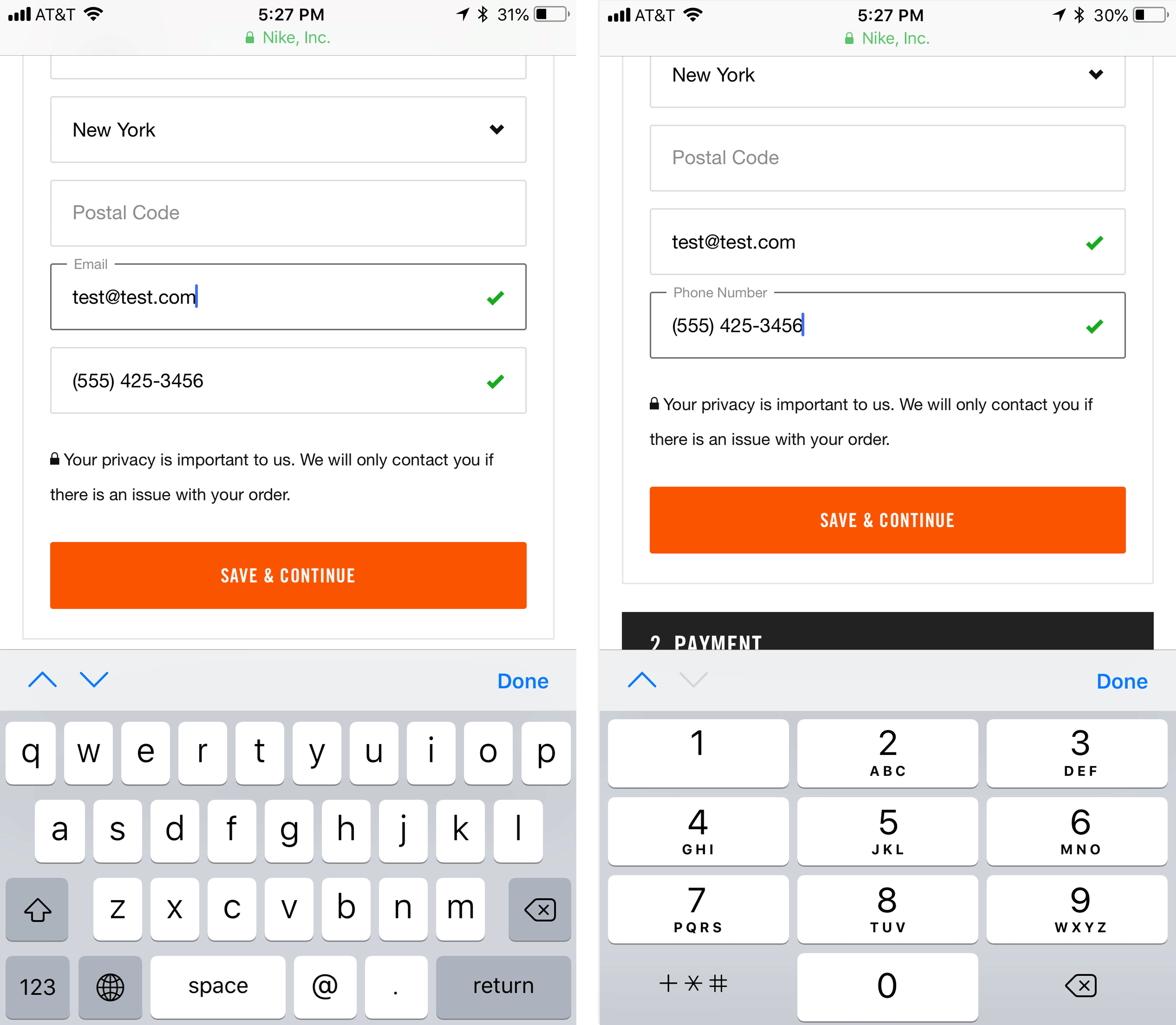
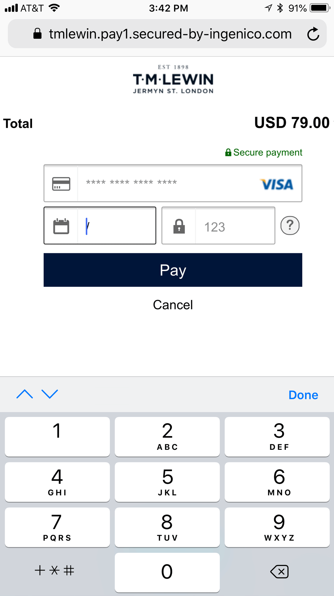
- For each field, present the correct keyboard. Use a numeric pad for numeric data such as credit-card numbers or phone numbers. For email-address fields, use a keyboard optimized for entering email addresses, which prominently features email-specific characters like “@” and “.”. Keyboards should also include up and down arrows to facilitate quick transitions to the next (or previous) form field.
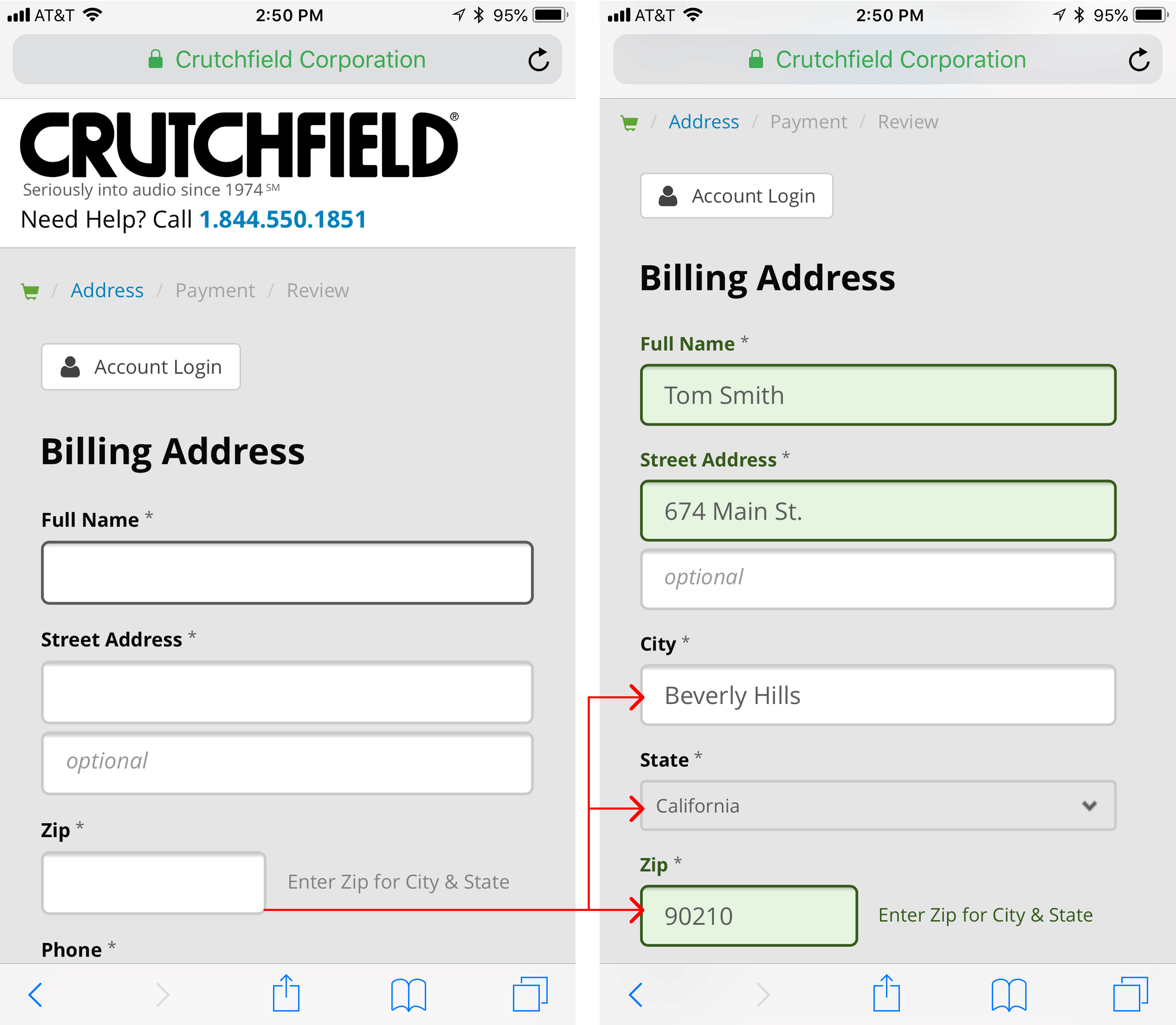
- Calculate fields automatically based on users’ prior inputs. Fields such as credit-card type, address, city, or state can be automatically calculated based on other data entered by the user (the credit-card number and, respectively, the ZIP code). Instead of asking users to type this information explicitly, do the work for them. Our research showed that asking for a user’s ZIP code and then populating the city and state, while still allowing the user to correct the occasional error, worked well.
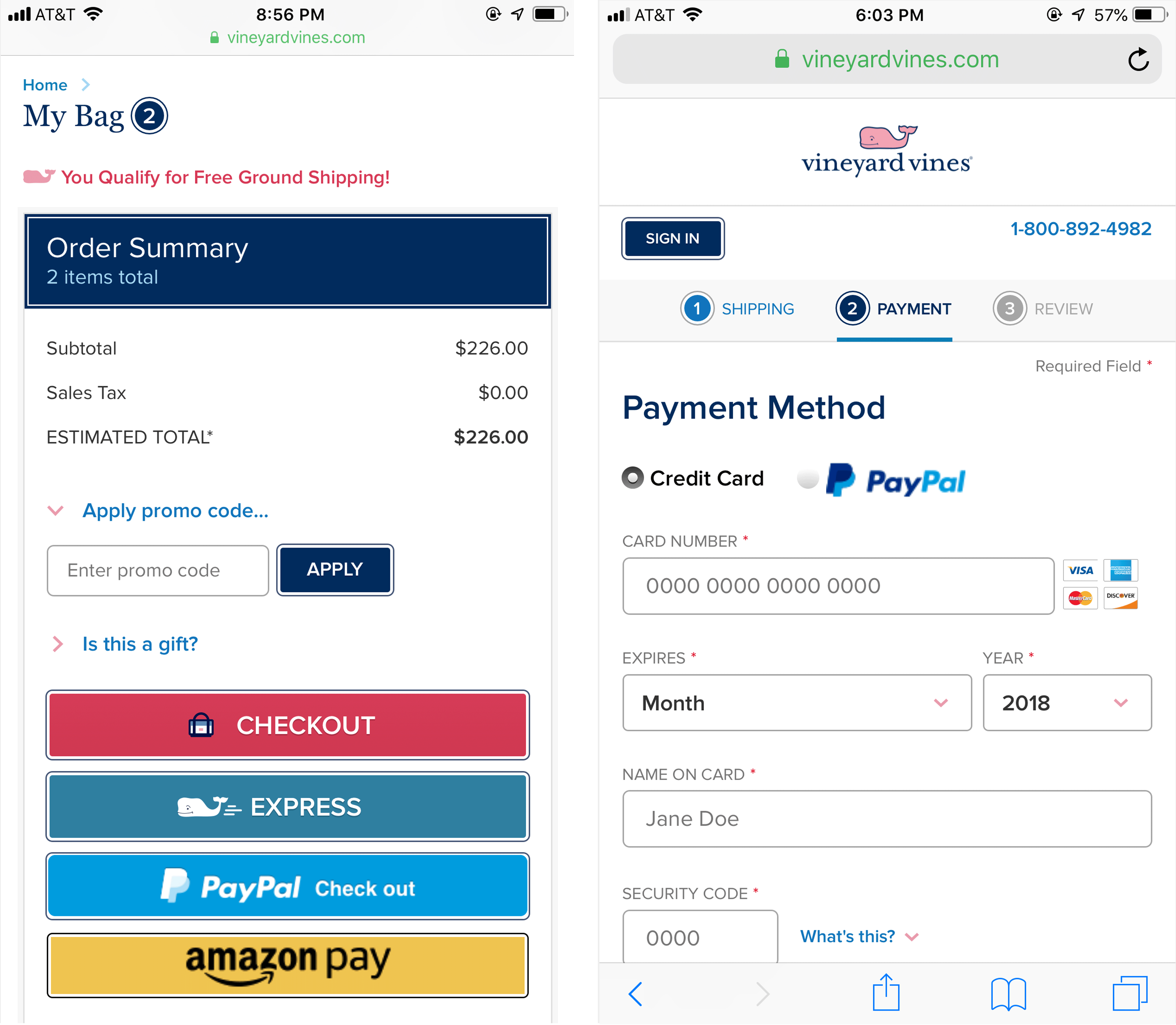
- Browser autofill and saved data should work on form fields such as name, address, email address, phone number, password, and credit card. Usability-testing participants appreciated that they could use browser autofill while checking out on Tiffany’s mobile site. The form worked flawlessly with Safari’s AutoFill Contact feature, which delighted a user who was not looking forward to typing out her contact info. She said, “It autopopulates. Thank you, Apple. Apple autopopulated my information.” This remark sums up most users’ feelings about autofill: a poor autofill experience is blamed on the website, whereas a properly working experience is attributed to the phone manufacturer. Ensure that your site is coded to work properly with browser autofill functionality.
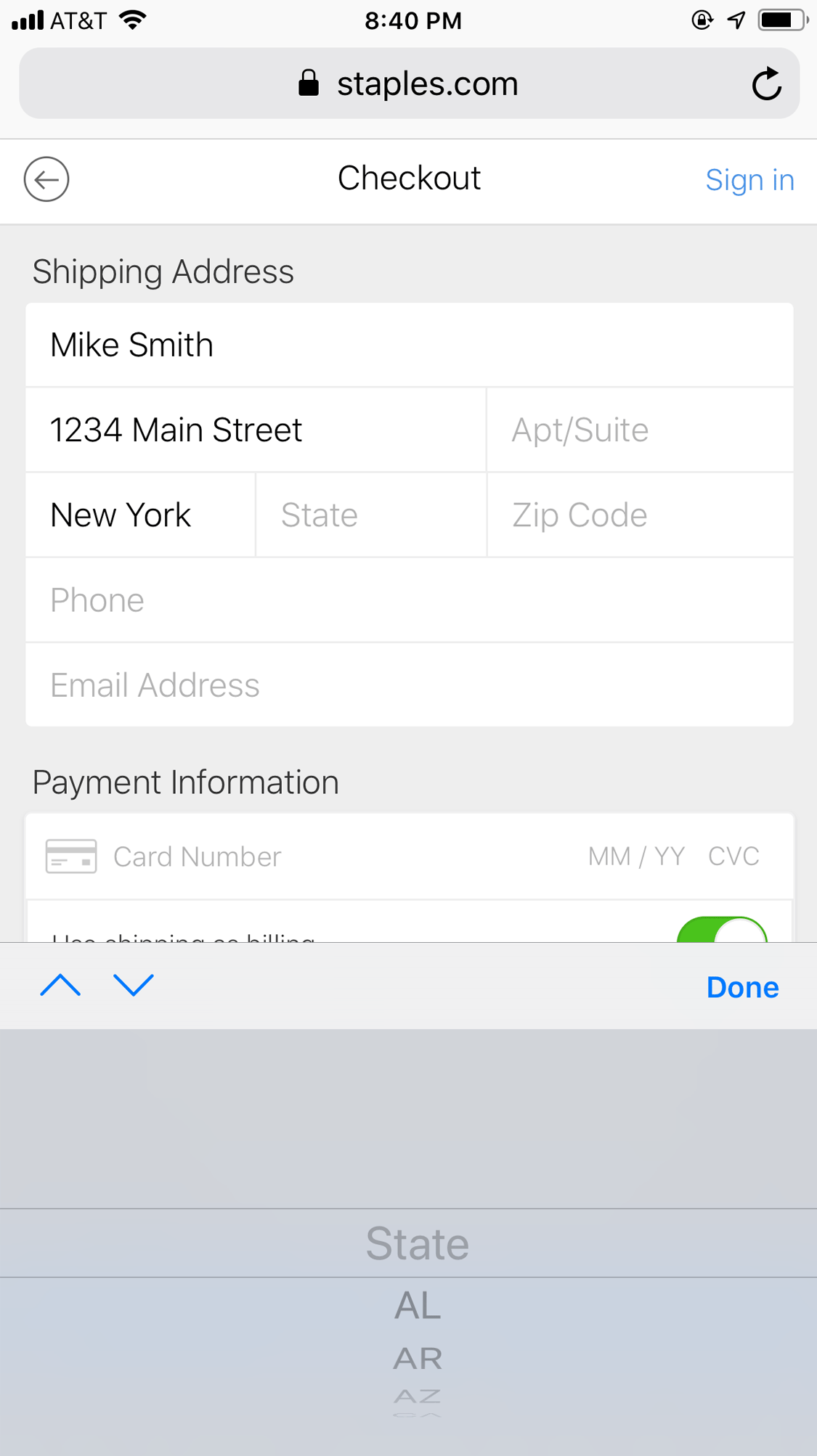
- Use an open form field, not a selection list when asking users to enter their state and credit card expiration date. Long dropdown lists are especially difficult for mobile users, particularly those on iOS. The iOS picker control (which is used for implementing dropdowns) occupies half the screen and displays only a few items at a time. If the list is long, users have to scroll many times before getting to values at the end of the list. In our studies, users frequently struggled with selecting the correct item from these lists, making lots of errors that required repeated attempts. While it usually makes sense to reduce the amount of typing that users must do on mobile, a dropdown for a long list is the wrong solution. It’s faster for users to type the two letters that stand for their state and the 4 digits of credit-card expiration dates.
Easy Payment on Mobile
Entering credit-card details is labor-intensive, annoying, and, especially on mobile, error-prone; moreover, users on the go may not always have their credit card handy. Many of our study participants took advantage of easy-payment options such as PayPal or Apple Pay. Not only did these services save users from the trouble of typing in their credit-card information, but they were also perceived as more secure and trustworthy than providing their credit-card number directly to the site.
- Offer mobile-friendly payment options, but don’t overwhelm users with too many options. Recognizable third-party checkout options such as Paypal or Apple Pay can be helpful, but too many options can cause choice overload. For each payment option offered, make the distinction between each one clear. The most common checkout process should be the most prominent on the page, or listed first among the other options. It’s also important to signal to users that they will be taken away from the site temporarily to enter their payment-service details before being brought back at the end. Use verbiage such as Checkout with Paypal, together with the standard branded buttons for those services. To minimize the information entered by the user, offer these options at the very beginning of the checkout flow; however, make sure you repeat them also on the payment page for those users who may have missed them in the beginning.
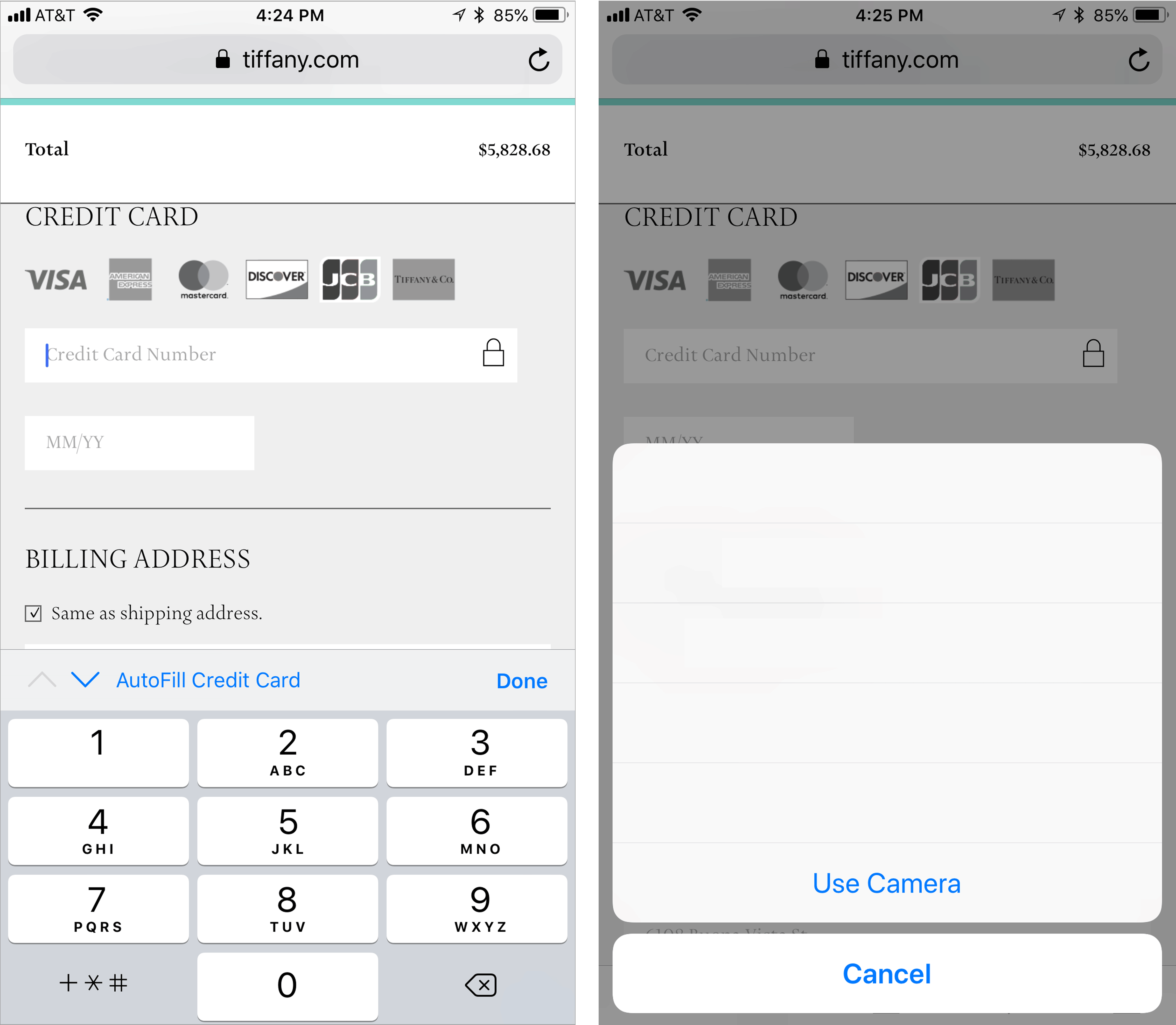
- Allow users to take photos of their credit cards to populate information. Several people in our study used the AutoFill Credit Card feature that’s offered in Safari, instead of typing in their credit-card information. This option enables users to take a photo of the credit card; the details are scanned and the information is then added to the website’s credit-card field.
While checking out on Tiffany’s mobile website, one user complained when she noticed that the site didn’t offer a PayPal or Apple Pay option. “I’m like, ‘ugggggh’ why is there not a PayPal or Apple Pay associated with this?” Then, she noticed that the site supported the built-in, AutoFill Credit Card option and, though she still had to get her credit card out of her wallet, her frustration decreased after she was able to scan her credit card to input the details.
Conclusion
What distinguishes the best mobile checkout experiences from standard ones is the extra attention to detail. Mobile-focused, user-centered UI elements can help move your users through the experience with speed and ease. Though often overlooked and easily forgotten, these seemingly small design details in your mobile checkout will create an experience that delights your users.
For more on how to design an optimal ecommerce shopping cart, checkout and registration process, explore our report, Vol. 04: Shopping Carts, Checkout and Registration, part of the recently updated fourth edition of our Ecommerce User Experience report series.


Share this article: