WeChat, the most popular social application in China, had 1 billion monthly active users as of March 2018. WeChat’s integrated services cover all aspects of daily life in China, including social communication, shopping, bill payments, news, and booking services. A product update at the end of 2017 introduced a new major function in the app: WeChat mini programs (including mini games). Mini programs are similar to apps, but they are built within WeChat: they feel like apps within a larger app. Thus, a Chinese company can interact with users of mobile devices on four distinct channels:
- mobile website
- native app
- WeChat official account for that company
- WeChat mini programs [the main focus of this study]
We wondered how people perceive the difference between these different channels and whether certain tasks are better suited to one channel than to another. To find out, we conducted a usability-testing study with 10 WeChat users in Beijing.
Even if you won’t be designing a WeChat mini program, the user-experience implications of this type of extensible user interface are interesting. Traditionally, websites and software applications are closed packages that can’t be extended by users or third-party providers. In contrast, the WeChat mini programs are a different experience architecture, related to products such as:
- Add-ins for broad software packages, such as browser toolbars and spreadsheet toolpacks (e.g., statistical analysis features that can be added into Excel for those few users who perform ANOVAs, without confusing the vast masses)
- Facebook Messenger App, which supports third-party games, news, and shopping services within the Games and Discover sections of the app.
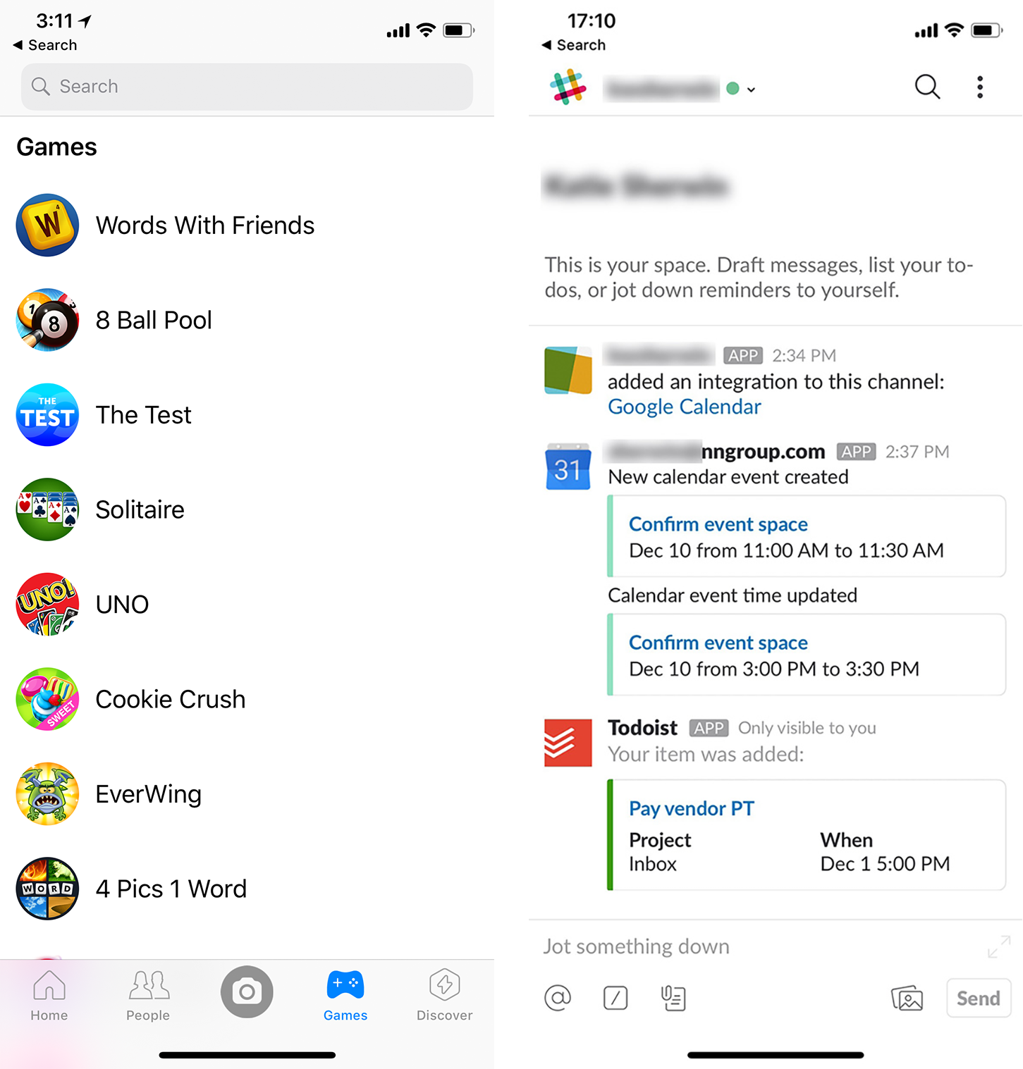
- Integration apps offered by SaaS (Software as a Service) companies (For example, Slack users can install integrations that allow them to link to a Google Calendar event or a Trello card directly from within the Slack application.)
Introduction to WeChat Mini Programs
For those not familiar with mini programs, below are a few examples of what they are and how they work.
- Mini programs are mobile apps built for and within the WeChat platform. There are mini programs for games, food delivery, shopping, ticket sales, home services, image editing, and more.
- Users don’t need to install (or uninstall) a mini program. In our research, many users mentioned this feature and believed that it would help save storage space on their phone.
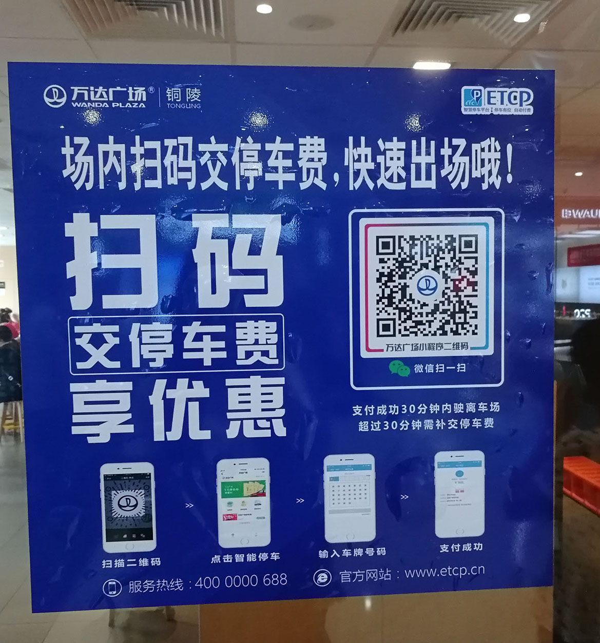
- Discovery happens primarily from online social sharing and offline QR-code scanning. Many mini games encourage users to share the game with other users in order to earn rewards in the game (e.g., extra lives or bonus points). Offline, ads with QR-codes promote mini programs. For example, a shopping mall advertised a mini program for prepaying parking fees.
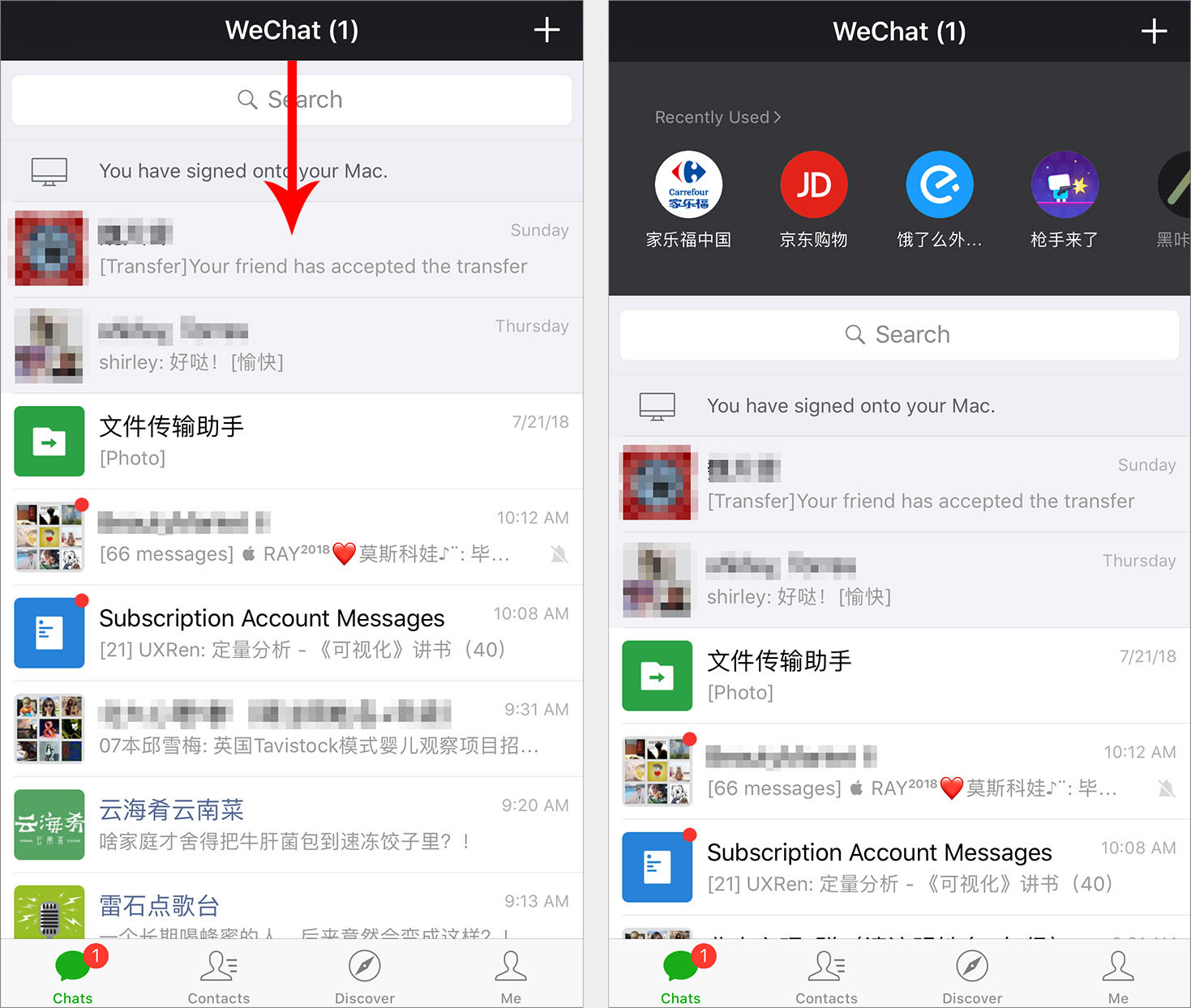
- Mini programs can be accessed from the WeChat home screen, but they’re hidden by default. Because WeChat’s primary function is chatting, the home screen is dedicated to recent conversations. To see mini programs, users need to swipe down from the top; this action reveals a list of recently used mini programs. Although swiping was easy and convenient for regular mini-program users, new or infrequent users weren’t likely to discover programs on their own unless they accidentally swiped down or someone shared a program with them.
Our study revealed insights that designers can apply when developing apps within apps, or in other limited-platform scenarios similar to WeChat’s integrated model.
5 UX Lessons from WeChat Mini Programs
1. Maintain the core functionality and content that users expect.
People who have already used your company’s (full-sized) app have mental models and expectations about the content or services you provide. If a mini version of an application makes it hard for users to find the core content that they want, people will use the app they’re familiar with instead.
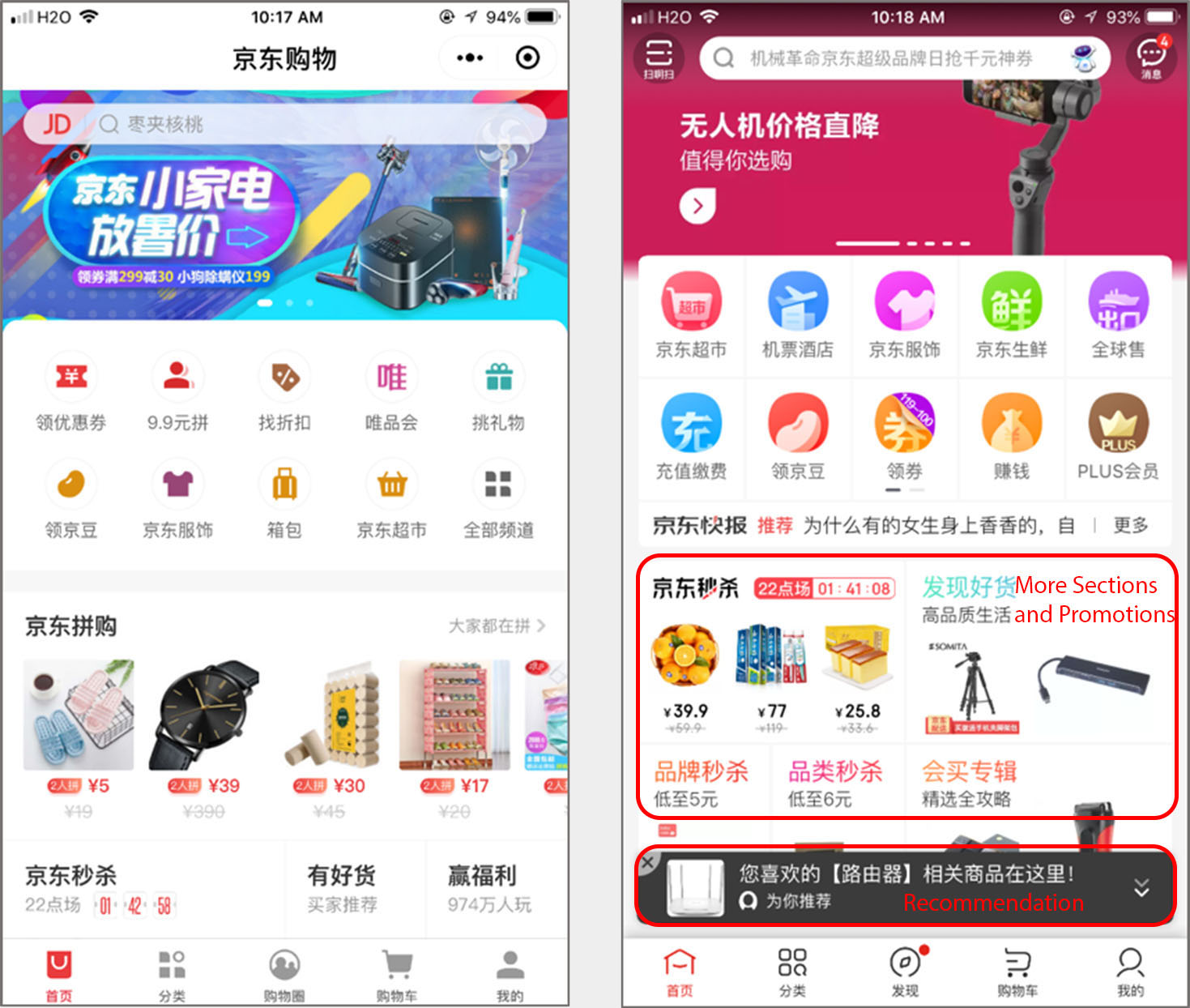
During our testing, a 36-year-old female user complained that the homepage of the JD shopping mini program was not as informative as the JD mobile app: “On the [mobile app’s] homepage, I can browse for discount information [she swipes through the carousel of images at the top]. It also displays whatever I have viewed and bought, and recommends more similar items. All that info will NOT be shown in the mini program.” She felt that the mini program had less content, and therefore she didn’t want to shop on it.
Another user, a 24-year-old female, had a similar problem with a mini-program version of a food-delivery service called Meituan. “The first thing I do when I open the delivery app is getting some coupons. That app will automatically show some coupons every time you log in, and I don't know if the mini program will do that.” She opened the mini program and was disappointed: “No, there aren’t any [coupons]. This is all expensive. Also, there aren’t as many promotions displayed [in the carousel] as in the company app.”
If a mini program can’t do everything that the mobile app can, it should support a handoff solution—an easy way for users to move between the mini program and the mobile app or website to view the full content.
2. Always consider the context of use. On mobile, support quick activities and design for interruption.
During our study, many people complained that if a WeChat message arrived while they were in a mini program, they couldn’t easily check the message and then resume their task in the program. Instead, they had to quit the program to view messages. Unfortunately, some mini programs didn’t save users’ progress, forcing them to start over again. Since, at its core, WeChat is a social-communication tool, mini programs should be designed to accommodate multitasking. To minimize the chance of interruption, flows should be efficient and have minimum interaction cost. Here are some suggestions for implementing these principles:
- Save users’ progress so they can return to a task later. A racing mini game called Happy Ball allowed users to save their progress and come back to it later. A 20-year-old male user complimented this feature: “I play it mainly on public transport and in class when I am bored. It’s all fragmented time. This allows me to stop and go back to it without losing my place, which is good.”
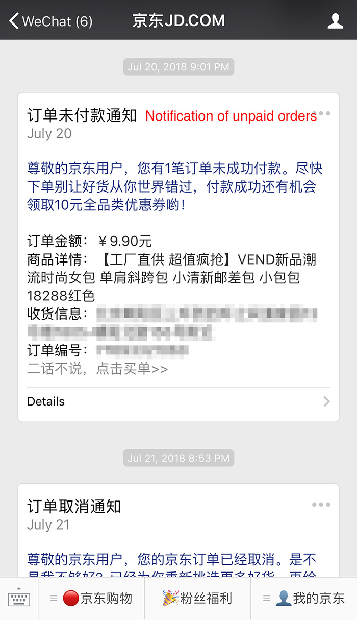
- Send reminders for users to continue where they left off. Knowing that users may be interrupted during checkout, JD will send a WeChat notification in about half a day if a user left the payment page of the JD mini program without completing the task. This type of reminder can help users who forgot that they’d left something in their shopping cart.
- Minimize user effort by having good defaults based on WeChat-account data. For example, the JD mini program could automatically fill in users’ information (address and telephone number) on the payment page, because JD accounts are connected to users’ WeChat accounts. Thus, even users who open the JD mini program for the first time could enjoy “one-click payment” and not have to input their details.
3. Take advantage of the platform’s core functionality.
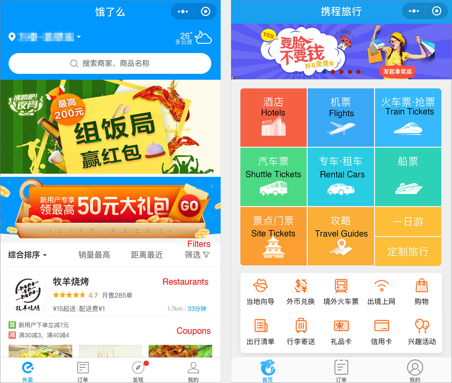
Many users mentioned that they learned about most mini programs and mini games from group chats or from friends. Good mini programs take advantage of the WeChat’s core functionality, which is communication. For example, JD’s mini program promoted group purchases on the homepage even more than the mobile app did. (Group purchases work by offering a discount on a product if enough people agree to purchase the item. If an item doesn’t get enough orders, no one gets the product.) The emphasis on group purchases makes sense in the WeChat context, because the platform makes it easy for users to share a link to their WeChat friends and invite them to participate in a group purchase.
Encouraging users to share is good for your business. However, don’t overdo it! During our testing, many users complained that mini programs, especially mini games, forced them to share content with others. Participants explained, “If I need to share a game to get rewards and keep playing, I’d rather not even get the rewards,” and “Compulsory sharing is the worst.” A 20-year-old male user said, “People will share on their own if you have really good content — Don’t force me to do it like a pyramid scheme.”
4. Design mini programs with infrequent users in mind.
Many of our research participants said that they prefer mini programs for services that they only use occasionally, to save space on their phone. For example, a user explained, “If I only have to use the function once a month, I'd use the mini program. For example, dry cleaning. I don’t need to download an app for dry cleaning. I could just use the mini program.” Designers should figure out the needs of occasional users and address them in the mini program directly.
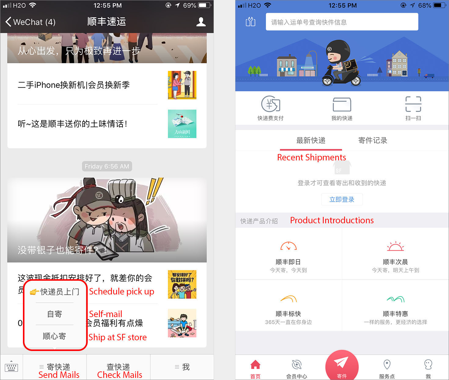
A good example is the SF Express mini program for postal shipments. Compared with the more comprehensive mobile app, this mini program addressed occasional usage by centering the design around the most common user task, Schedule pickup.
Infrequent use requires extreme usability and an emphasis on quick learning, because you can’t assume that users will accumulate knowledge about the design with extended use. Traditional usability guidelines also apply to mini programs. Here’s an example from our study:
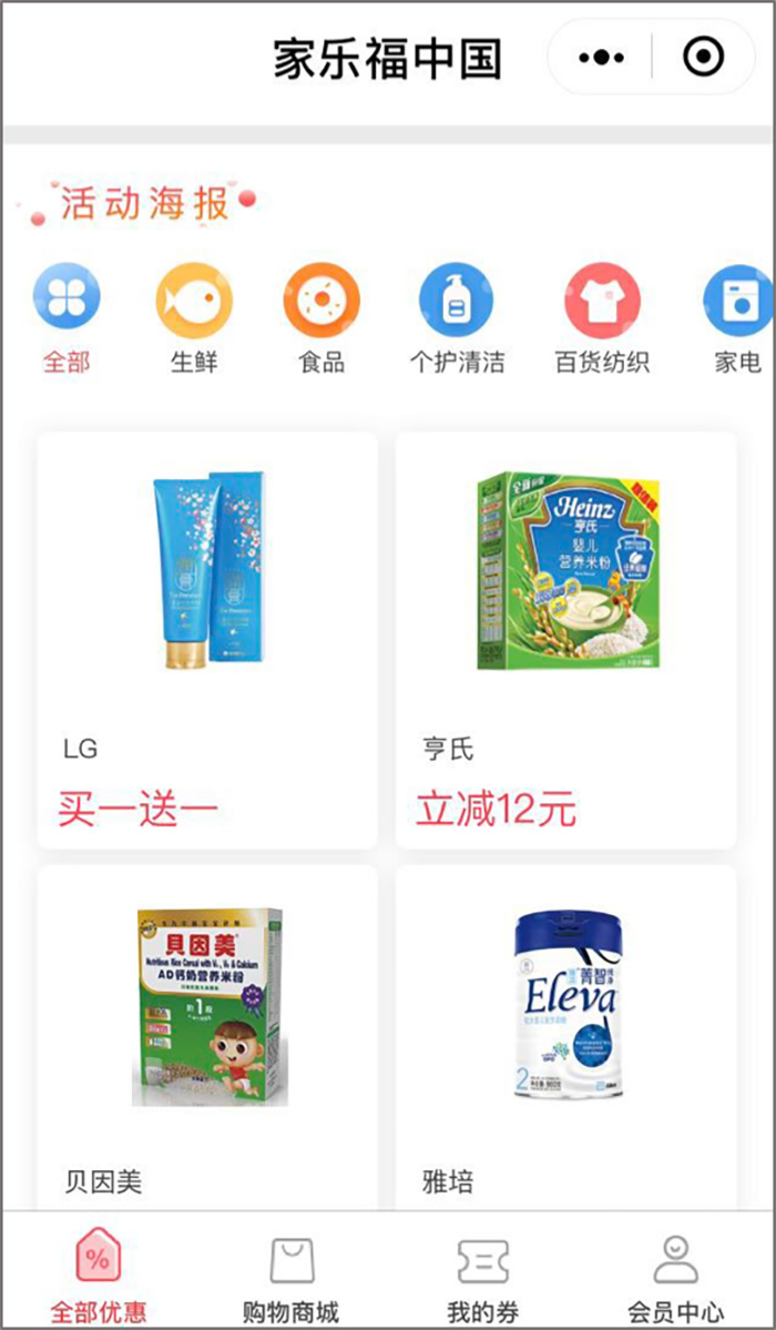
- Design simple navigation for learnability. For example, Carrefour’s mini program used icons and texts in the navigation bar, which was friendly for older adults. A 55-year-old male user who didn’t even know how to search for a mini program could easily browse different categories and items in this program, because it was simple and intuitive enough.
5. Support seamless cross-channel transitions.
A customer can interact with an organization on many different channels: the mobile app, a mobile website, a desktop website, a WeChat mini program, a WeChat official account, and so on. Designers should consider the entire customer journey, offering a seamless user experience across channels.
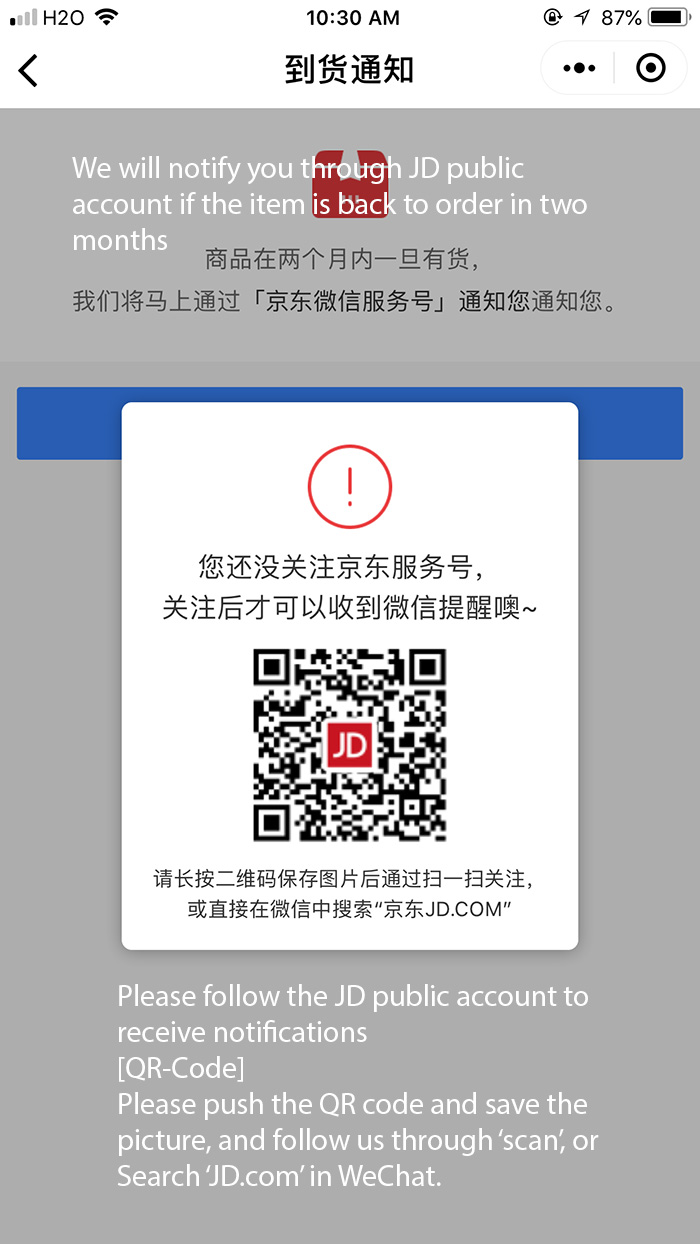
- Simplify channel switching. A good example is how JD shopping notified users when the item they wanted was back in stock. Since, unlike WeChat official accounts, mini programs are not able to send notifications, the JD mini program offered a QR-code of the corresponding JD WeChat official account; following this account allowed users to receive messages from JD and find out when their item became available. During our testing, a user followed this process and got a notification for the VR glasses he wanted to order. He commented, “It is very considerate of this company.”
- Deliver some content before asking users to switch to another channel. Switching between channels has a high perceived cost: users need to believe that the transition is worth the effort in order to make it. During our testing, one mini program required a user to follow the company’s WeChat account to get more information about its products. Because this request was too much too soon (she’d barely opened the mini program and clicked a button), she left the program immediately.
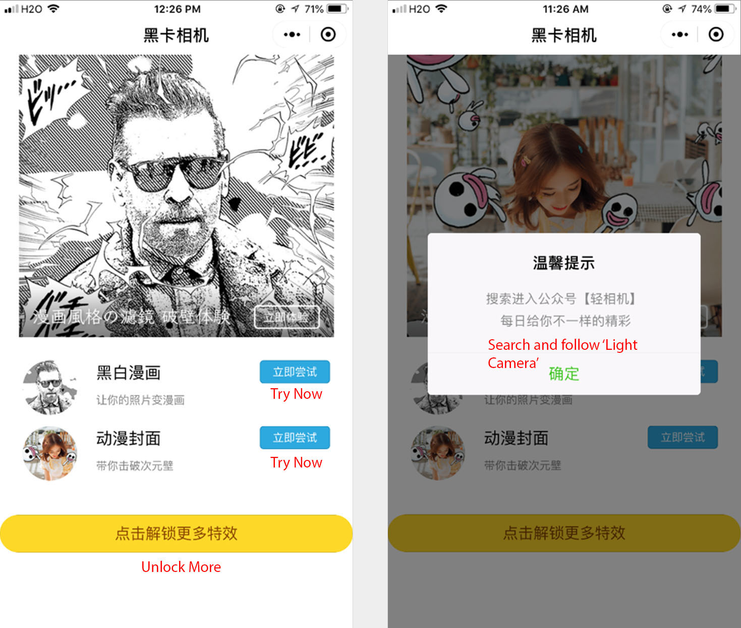
- Offer easy paths for switching channels. During our study, a 37-year-old female user really liked a mini program, Heika Camera, which could beautify pictures of hercat. She wanted to download the mobile app, but she browsed and couldn’t find any way to access the mobile app from the mini program.
Conclusion
WeChat mini programs are a new interaction channel; such new channels can be expected to arise anywhere, any time. Designers must be nimble and adapt their products to such new ways of interaction.
To take advantage of these new opportunities, it is important to understand their strengths and limitations. If you find yourself designing an app within an app or designing for limited-functionality channels (e.g., a smartwatch, a voice assistant), keep these points in mind:
- Add value to the product based on the context and frequency of use.
- Consider the cost of switching channels and how to make transitions seamless.
- Deliver content and visuals for that platform’s users.


Share this article: