Introduction
One of the readers of our newsletter recently sent an email to share that his company was considering a switch to all-lowercase letters throughout its website and asked about any studies proving the superiority of lowercase text.
His case is not unique; in fact, it is symptomatic of a larger design trend towards ‘simplified’ typefaces, which includes fonts that are slim, small, in light or thin weights — a notable example being the fonts used in the newer versions of Apple’s iOS.
This trend toward simplified fonts coexists with shorter and shorter sessions on devices such as smartphones and smartwatches. 40% of the sessions on a phone are microsessions: they last less than 15 seconds and usually involve quickly glancing at a notification. Smartwatch sessions are equally short and involve fast consumption of information. And technologies such as augmented- and virtual-reality often show text superimposed over a complex scene — being able to quickly glance at the text and act over the surrounding environment is critical in many of the tasks carried out on these devices.
Definition: Glancing refers to quickly reading short text (often just 1 or 2 words long).
Glancing usually happens while the person is engaged in other complex tasks, such as quickly looking at a smartwatch to see a prediction of temperature and precipitations over the next hour (e.g. “RAIN 50%, 20ºC) to grab an appropriate jacket on the way out the door. Critically, glancing at 1–2 words in isolation is a different reading behavior than skimming a longer passage of text.

To support micro reading sessions that involve quick glances at short text, we need to create content that is highly legible (under a variety of light conditions) and also easily readable and comprehensible. Which fonts are best for glancing? This is the question explored in this article.
Study of Glanceable Reading and Typography
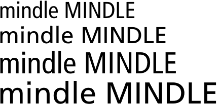
A recent study from MIT’s Agelab/Clear-IP researchers led by Dr. Ben D. Sawyer investigated whether typeface size, case, and width affected the speed of identifying words. Researchers presented study participants with character strings displayed in different fonts and measured how fast they recognized whether these strings were words (such as “spindle”) or nonwords (such as “mindle”). (This task is called lexical decision and is widely used in cognitive psychology.)
The independent variables in their study were:
- Text size: either small (3mm) or bigger (4mm)
- Text case: either all uppercase or all lowercase
- Text width: either condensed or regular
The dependent variable was essentially a measure of reading time. (For more details on this measure and for a description of the procedure used in this study, see the sidebar).
In all cases, they used Frutiger as the typeface, as it had performed very well in previous typography and legibility studies that the team had carried out.
Larger, Wider, and Capitalized Text Outperformed Smaller, Narrow, and Lowercase Text
The team discovered that for glanceable reading, bigger text is better, irrespective of the dimension being increased:
- Larger sizes outperformed smaller sizes.
- Regular width outperformed condensed width.
- Uppercase outperformed lowercase.
All these effects were statistically significant (at the p<0.01 level). While it’s been known for some time that larger-size text is more legible, this study showed that weight and case matter too. Lowercase lettering required 26% more time for accurate reading than uppercase, and condensed text required 11.2% more time than regular. There were also significant interaction effects between case and size, suggesting that the negative effects of lowercase letters are exacerbated with small font sizes.

These results show that characters that occupy a larger area (whether because the font size, width, or case is bigger) are more legible for quickly glancing at a word or two in isolation. However, these findings don’t necessarily apply to scanning or reading longer text. We generally don’t recommend using all-caps text for longer passages where users consume multiple words. When users are skimming longer passages or reading full sentences, all-caps text can indeed contribute to reduced legibility and greater letter confusion.
Applying These Findings to Your Designs
As interaction designers, it is easy to forget that people don’t devote their full attention to our products, nor do they use them in neutral, quiet environments. They are often distracted, stressed, or multitasking. Typographic designs that are legible even in suboptimal conditions can help users greatly. For example, while we all know that it is dangerous to use a smartphone while driving, we also are aware that users do it anyway. While self-driving cars may one day free us from the necessity to keep our eyes on the road and will afford unlimited smartphone browsing while driving, we’re not there yet. If we can design mobile applications (such as GPS driving directions) that allow quick, effortless reading of important text at a glance, we can potentially save lives! Furthermore, in augmented- and virtual-reality environments where the context rapidly changes, presenting information contextually will require easily legible text that is glanceable, enabling users to keep their attention focused on the world around them.
Here are some key ways to apply this research:
- Use larger font sizes for anything that needs to be glanceable.
- Avoid all-lowercase text for anything that needs to be glanceable.
- Use larger-heading text in wider variants. Avoid the newer trend of all-lowercase text for headings and titles.
- Avoid condensed or thin typefaces, especially for applications that may be used in distracting environments (such as GPS navigation).
- For notifications, toasts, and feedback presented to users, use larger fonts in noncondensed variants to promote quick readability. Avoid all-lowercase.
- Especially when using small sizes (and typefaces that inherently have a small x-height), avoid all lowercase, as the combination of lowercase and small size exacerbates the problems inherent in either attribute.
All-Caps Readability and This Study’s Limitations
At this point, you might be asking: if this study indicated that all-caps outperformed lowercase, why haven’t we recommended that you use all-caps text? What this study really shows is that larger text is more legible when glancing at a single word in isolation, out of the context of a sentence. In fact, larger lowercase text (at 4mm, where the letterforms were roughly the same height as the 3mm all-caps text) performed very similarly to all-caps. These findings suggest that, for readability at a glance, bigger is better, whatever the dimension. Coincidentally, in the Frutiger typeface used in this study, the lowercase letterforms are roughly ¾ of the size of their capitalized equivalents, making the 4mm lowercase letters roughly the same size as the 3mm uppercase letters.
Much traditional typographic theory has focused on how the ascenders and descenders of lowercase letters guide the eye and promote legibility (by making it easier to differentiate between letters). In fact, the authors of this study acknowledged that “uppercase letters are more prone to crowding and letter confusion.” Traditional research (notably Miles Tinker’s groundbreaking work in the 60s on the legibility of type in print) indicates that all-caps lettering is more difficult for readability (and legibility) than mixed-case letters, so on its face, this study seems to contradict these older findings. However, this is not the first study to suggest that there may be a readability advantage to all-caps text, but only in certain conditions (such as very small font sizes, and typefaces with a small x-height). For now, these studies don’t necessarily upend decades of typographic theory and cognitive research; they simply show that, for smaller font sizes, all-uppercase can reduce the legibility deficit that occurs with small size text when the words are presented in isolation.
One of the major limitations of this study is that it did not look at mixed-case words in which the first letter is capitalized. This study also did not examine words in traditional sentence context, it only looked at isolated words. Context in sentences is a critical component of readability, and the effects of poor legibility might, in theory, diminish as context accumulates in a sentence.
More Research Is Needed
As I often say in the UX Deliverables seminar when talking about presenting usability study results, good research answers some questions, but also suggests many more new questions. Of course, no single study tells the full story, and further research is needed. Most obviously, testing a mixed-case condition (such as first-letter capitalization) would be an obvious next step in the research. Ideally, future studies will look at other typefaces, including serif vs. sans-serif fonts, and vary other typeface characteristics such as tracking, kerning, and weight. Finally, studies that look at typeface variations in context (such as in realistic reading scenarios) can help us to understand how much these legibility effects affect usability.
Conclusion
To make very short text (just a few words in isolation) glanceable and quickly legible, bigger is better: whether using larger font sizes, uppercase or regular-width text over condensed. However, the use of all-caps text for longer passages of text (such as titles, subheadings, and full paragraphs) is not recommended, as there may still be a readability deficit.
References
Aries Arditi and Jianna Cho. 2007. “Letter case and text legibility in normal and low vision.” Vision Research.
Ben D. Sawyer, Jonathan Dobres, Nadine Chahine, and Bryan Reimer. 2017. “The Cost of Cool: Typographic Style Legibility in Reading at a Glance,” Proceedings of the Human Factors and Ergonomics Society Annual Meeting 2017.
D. Ferreira, J. Goncalves, V. Kostakos, L. Barkhuus, A. K. Dey. 2014. “Contextual experience sampling of mobile application micro-usage”. In MobileHCI '14.
Miles Tinker. 1963. Legibility of Print. Iowa State University Press


Share this article: