Desktop sites with a rich information architecture often use both mega menus and category landing pages to implement navigation. Mega menus usually present a set of subcategories for a main navigation option, while the category landing pages contain a list of those subcategories plus additional content to better define the category for the user.

In many desktop designs, hovering with the mouse on a primary category often exposes the menu, while clicking the category takes users to that category’s landing page. But hover is a gesture not available on touchscreens, so designers must address this asymmetry when they scale their navigation UIs to work across many devices.
To reiterate, the challenge on touchscreens is to allow users to access both the category landing page and the menu in an environment where a single gesture is available to the user: the tap.
Split Buttons for Navigation
The split button is a UI element familiar to desktop-application designers; it essentially amounts to having two buttons inside one. A split button consists of a label and a graphical element (most often, a downward-pointing triangle or “arrow”): clicking the label usually performs a default, frequent action, and clicking the arrow displays a dropdown with a set of choices for that action. For example, in Microsoft Word, the underline button is a split button: clicking on the label U underlines the text, and clicking on the arrow allows you to pick a different style for the underline.
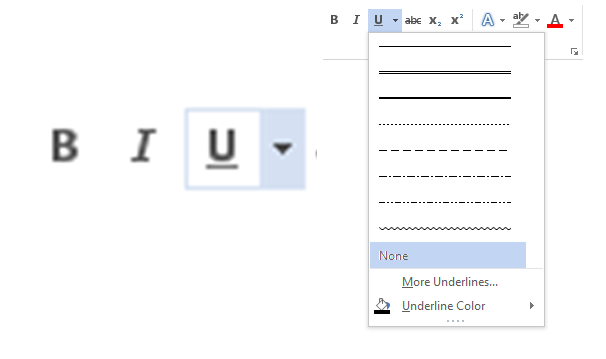
This design works reasonably well in applications. Even though novices may not understand the distinction between split buttons and regular buttons at first, as they continue using the application, they will eventually learn it. Plus, if the application is well designed and the default action associated to the button label is well chosen, most users may never need the choices provided in the dropdown menu. For example, regular underlines are used vastly more than double or stippled underlines, so the button for underlining in Microsoft Word will satisfy those users who don’t discover that it’s a split button.
After this short detour through the world of desktop-application design, let’s come back to our initial problem: providing access to both category landing pages and mega menus in the absence of hover. It may seem that split buttons provide an ideal solution to this problem: after all, they allow designers to provide two functionalities within the same design element. And indeed, this is exactly the solution employed by quite a few sites.
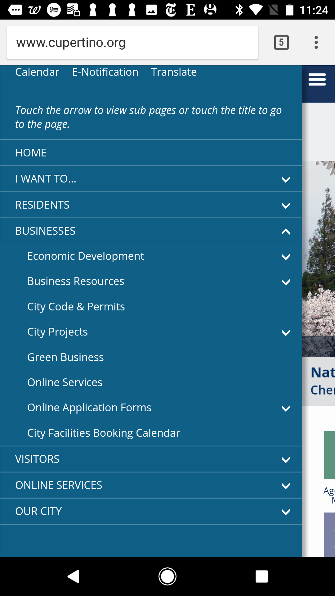
For example, on the mobile version of City of Cupertino responsive website, tapping the arrows in the main-navigation menu expands that category, while tapping the label takes people to the category landing page. (The mobile site contains explicit instructions within the menu, to alert users to this behavior. Such instructional text is usually a warning sign that usability problems may be present.)
Why Split Buttons Don’t Work for Navigation
Unfortunately, split buttons are not a good solution to the problem of making both the category landing page and the menu available. There are several reasons for that:
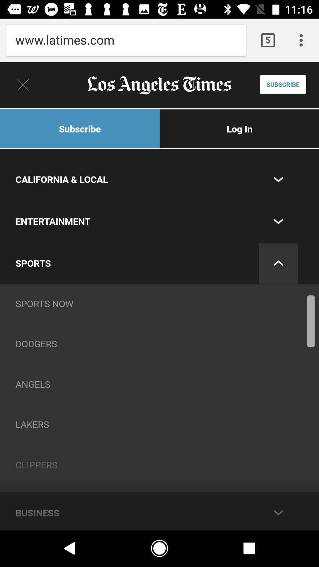
- Users are unfamiliar with split buttons for navigation. This pattern is rare on the web, where people don’t expect menu labels to do two different things. Moreover, in many mobile implementations (like in the LA Times and City of Cupertino examples above), the split button looks like an accordion: a standard UI element with well-known behavior. There is no reason to expect that one particular instance will behave differently than all the others on the web.
Even though users of desktop applications eventually learn to use split buttons, most websites don’t have the same level of repeated use, so if your site is one of the few that use this pattern, chances are that people won’t discover it.
To make the split button more discoverable, some sites use a dividing line between the menu label and the arrow, as in the World of Tanks screenshot below. Although it may seem like a reasonable solution, the two targets (the menu label and the arrow) are too close together for touchscreen use due to the fat-finger problem.

Increasing discoverability by adding explicit instructional text (as in the City of Cupertino example above) does not work either: most users don’t bother reading explanations inside a menu. After all, they’ve already seen hundreds of menus and know how to use them!
- Split buttons make the interface seem unpredictable. We’ve established above that users don’t expect labels and accompanying arrows to have different behaviors (in the same way that they don’t expect the Move icon to do something else than the associated label). Still, you may think that there will be no harm done if people don’t discover the dual functionality of these buttons. Most of the time category landing pages and menus contain roughly the same information, and getting to any one of the two will likely be good enough.
Wrong! Although users will probably be able to achieve their goal whether they use the menu or the category landing page, they will be unpleasantly surprised when the site won’t behave as expected. When it comes to touch gestures, users are rarely precise or consistent: sometimes they will tap the arrow and sometimes tap the label, looking for the same result. If the interface does different things after two instances of (seemingly) the same user action, it will seem buggy and erratic.
- Close targets are hard to hit on touchscreens. Even if people recognized the split buttons in a navigation bar, chances are that they won’t be able to select the two functions reliably on a touchscreen. Whereas on mouse-driven interfaces split buttons may be fairly usable, it is too easy to make mistakes and accidentally tap the wrong thing when the label and the arrow are too close to each other.
What to Use Instead of Split Buttons?
If split buttons are problematic, what should designers do to support access to both category landing pages and menus on touchscreens? Here are a few alternatives:
- Tapping a main category exposes the menu, but access to the category landing page is removed on touchscreens. Does the category landing page contain significant information, or does it simply replicate the contents of the menu? In the Nordstrom’s example from the beginning of the article, the category landing page does not bring any extra content that is not available elsewhere on the site. In situations like these, it is okay to simply not include a way to access this page in the navigation menu for touchscreen devices. (The link may be available elsewhere on the site.)
Note that we don’t recommend the counterpart to this solution, which is to remove access to the menu on touchscreens. In theory, when users tap on a category item, they could simply be taken to the category landing page. From there, they could select the subcategory of interest. Although this pattern is encountered on the web (see the American Lung Association example below), we normally do not advise using it because it significantly slows down site navigation: each time people tap on a main category, they will have to wait for the corresponding category landing page to load before being able to select a subcategory of interest.

Lung.org: Hovering on a category in the top navigation bar exposes the corresponding menu. This menu is not accessible on touchscreens. Instead, when tapping the category, users are taken to the category landing page. - Tapping a main category exposes the menu; to access the category landing page, provide a link to it inside the menu. This design allows users on all devices to access the category landing page.
This is the solution adopted on HBO’s site. On a mouse-driven device, users can hover on the main categories to see a list of subcategories and can also click on them to go to the category landing page. On a touchscreen tablet, tapping on the items in the main navigation bar simply exposes the menu, allowing users to see the subcategories anywhere on the site. The section’s home is still available through a separate link available in the menu.

HBO.com: On desktop, hovering over a main navigation categories such as Sports shows the corresponding subcategories. Clicking on the category leads to that section’s landing page. On touchscreens, tapping on a main category exposes the menu. On both desktop and tablets, the category landing page can be accessed through the link labeled Sports Home inside the menu. One advantage of this pattern is that designers can get rid of the hover on the desktop as well (displaying the menu on click instead) and can use a single design for both mouse and touchscreen devices. (Hover on desktop can also be problematic — for example, users may trigger menus accidentally while moving the mouse on the screen, or they may accidentally close a menu as they are trying to reach an item inside it.)
If you’re using this pattern, make sure that the link leading to the category landing page has a descriptive name such as All Sports or View all and avoid calling it simply Home (since that name is typically reserved for the site’s homepage).
- Use two taps: first for menu, second for category landing page. This third solution is used more and more and has a good chance of becoming a new standard for touch. When users first tap on a primary category, they see the submenu; when they tap again, they are taken to the category landing page. (This interaction style is very similar to the use of double-click in mouse-driven user interfaces, which works reasonably well.)

Delta.com: On a tablet, tapping once on Traveling with US expands shows a pull-down menu; tapping again takes users to the category landing page. This design pattern is a good example of a mode: the same input (tapping on a category) produces two different outputs depending on the state of the system (it expands the menu if the menu is not already expanded, or it loads the category landing page if the menu is expanded).
However, in spite of its popularity, this solution has some flaws:
- Lack of discoverability: Users may not realize that they can access the category landing page by tapping again on the same primary category.
- Conflict with another touchscreen pattern: Tapping the label of an open menu usually closes the menu. Users will be upset if, instead of dismissing the menu, they will need to wait for the site to load a category landing page that they don’t want.
Conclusion
If you’re struggling with making both the category landing page and the corresponding subcategories available on touchscreen devices, don’t go for the split menu button. While the solution may seem elegant, it doesn’t work well on touchscreens. Instead, you have three viable alternatives. The preferred and the most straightforward one involves including a link to the category landing page inside the associated menu. Or, show the menu on the first tap on the primary category and then load the category landing page on a second tap. Last but not least, if the category landing page is redundant with the menu, you can remove access to it on touchscreens.
Backstory
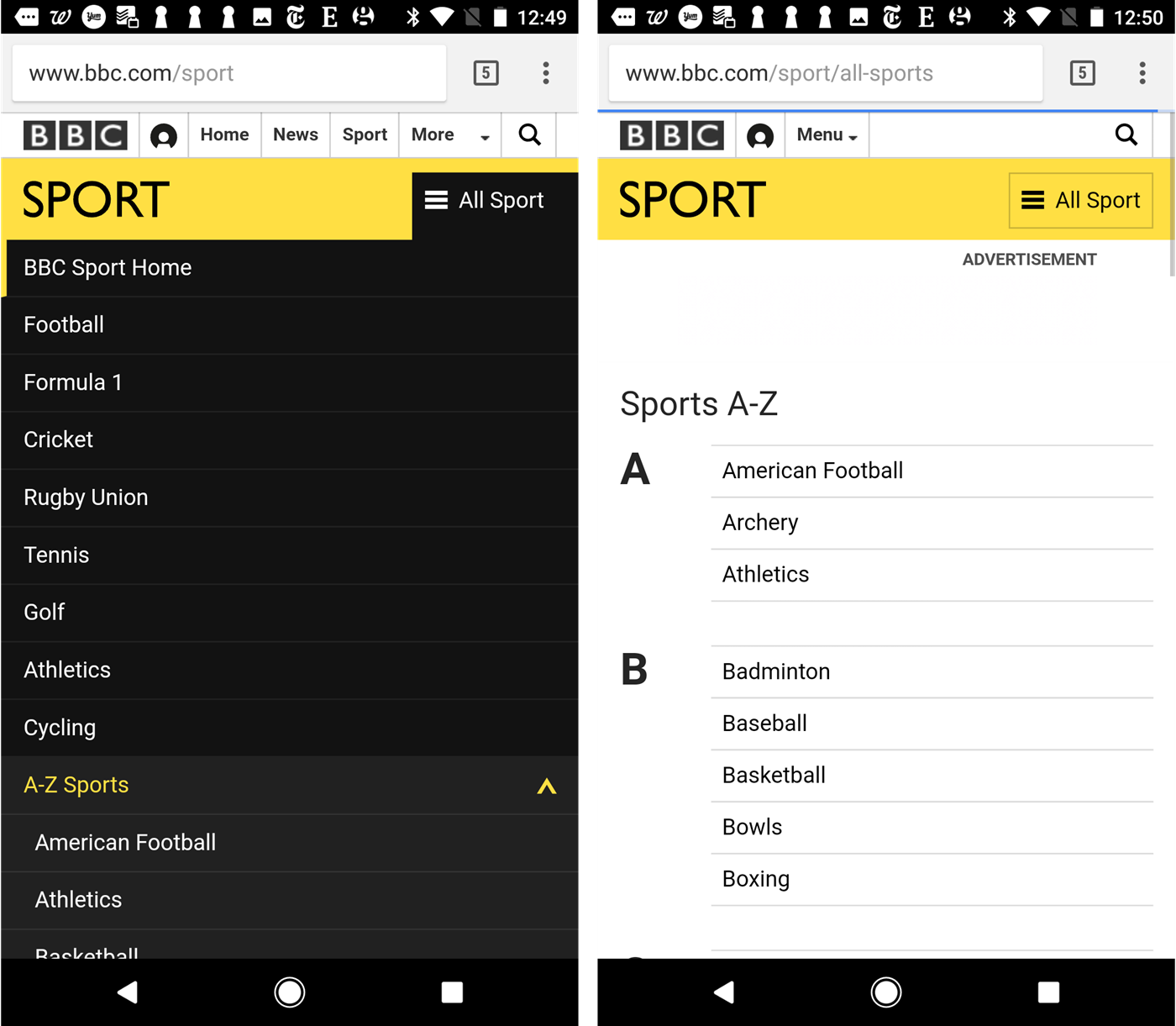
The idea for this article was inspired by the BBC Sport website: tapping on the section menu on that site sometimes exposes the menu content and sometimes takes users to the Sports A–Z page. We initially thought that this behavior was an example of split menu, with the icon expanding the menu and the label linking to the category page. Yet the behavior seems to be quite erratic — sometimes clicking on the label actually expands the menu. We’re not sure if the current design contains a bug or was intended as such, but if the All Sport menu is indeed a split menu, we strongly recommend against replicating it.


Share this article: