Any broken promise, large or small, chips away at trust and credibility. A suitor asks you on a date but doesn’t show up. A parent says she’ll play a game but never does. A link on a website says Products & services but opens a registration page instead. These damaged promises make a person feel baited, annoyed, disrespected, disappointed, and duped. In short, nothing good. On the other hand, when a link does fulfill what it professes, people move through the site seamlessly and confidently.
Links Should Stand Alone
When conducting eyetracking research, I often observe how people attempt to scan the minimum amount of content that gets them enough information to proceed. Humans are programmed to seek efficiency and minimize the interaction cost: They economize on their fixations (how many things they look directly at). Often they scan first only the text and those UI elements that they believe will help them to quickly understand content and to progress in their task.
In one frequently-observed page-scanning pattern, the Spotted Pattern, people scan in a seemingly random manner, that, when analyzed carefully, reveals that they look at items that seem to relate to what they want, or that are perceived as important or different than the bulk of the content. These items include:
- Headings
- Bullets
- Content (words) that are shaped like what users are looking for
- Digits when they are looking for a value that contains a number (such as a temperature or weight)
- Capital letters when they are looking for items that often contain them (such as abbreviations for countries and states)
- Buttons, when they have visible signifiers such as a rectangular frame and shadowing
- Links, when they look different from normal text (for example when they have a different color, are underlined, or bolded)
Thus when links and buttons are formatted differently than the surrounding text, they attract user attention. As a result, many users don’t actually read the adjacent content and treat links as standalone items. So the terms used in links should be understandable when taken out of context and read alone. (This practice will also benefit screen-reader users.) For example, trade words such as go, more, and read more, for descriptive phrases such as Chat with a specialist, Products and services, or Baby born on airplane.
The best links are salient and descriptive. People should be able to read an expressive link or button term, determine the strength of the information scent, decide if they want to click the link, click it, wait until the next page loads, scan the page when it does, and immediately confirm that they are in the right place. In many cases, websites confirm the user’s assumptions and the person confidently continues scanning or reading.
Confirm the Person's Assumption
Once users click a link, the onus is on the site to meet or break the link's promise. Ideally, the destination page should offer cues to tell the users that they have arrived in the right place, and how to move further ahead. Effective ways to confirm the users’ assumption include:
- Positioning the expected content in the default viewable area, and not forcing users to scroll, click, or tap to display it
- An understandable and visible page heading
- If linking to an applet, displaying the applet, or at least the first step in the applet's workflow
- If linking to a form, displaying some fields by default
- An image that very much relates to the topic at hand
Incorrect Page with a Vague Description
Sometimes link and button text sets an expectation but instead links to a place other than what the user anticipated. Worse, it may not even be completely clear what the page is about. In these cases, users are forced to make assumptions and hunt for the right path. For example, the Canadian university McGill’s website provides a link to Programs, costs & more in the Graduate &
postdoctoral studies section. People who are looking for tuition information and click the link will find a page that offers no tuition information, or even any hint of links to pages that have tuition information.

Programs costs & more leads to a page about McGill being one of the Top 25 universities. Users probably expected to see a table of tuition costs and other estimated costs, but instead are greeted with a dead end page with no links to tuition costs, and no suggestion in the IA.
In another example, consider an email from GoDaddy.com to a person who wants to buy a web domain. The call to action is a large green button named Click to Enter Min/Max. It strongly suggests that clicking it will lead to a form to enter a bid for the domain. However, clicking it opens a login page (which, although customary, it still does break the users’ train of thought and increases the chance of them leaving the site) and then leads to a page that includes a table with two domains, including one that the user owns. This page is not the place to enter the minimum or maximum bid for the domain. Rather, the person has to scan this page, see the Domain Buy title (which is not easy to see because it is positioned such that it seems like part of the promotional banner at the top of the page), read the Waiting for Customer Min/Max Offer message that appears with the second domain, and click the link that is the second domain name. Only then does the site open the Set up domain service for xxx.com lightbox where the user may enter the minimum and maximum bid.
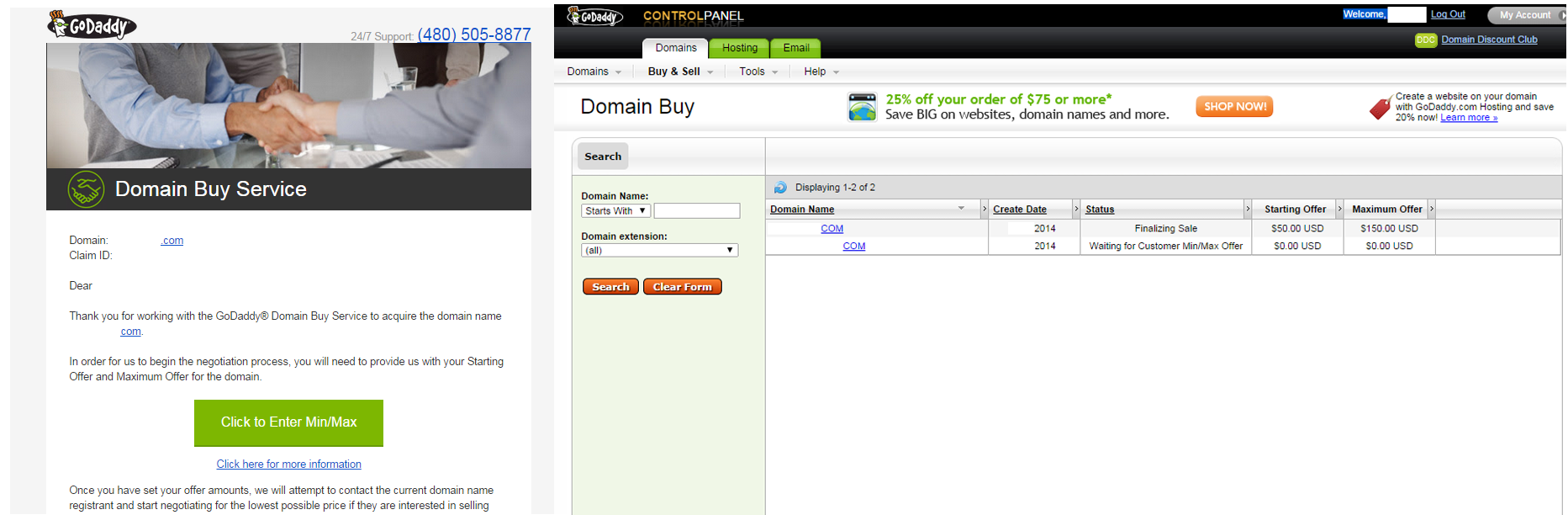
The button text suggests it will link to a form with fields to enter the minimum and maximum bids, but it instead loads: a login page, the need to sign in, a table listing multiple domains, the need to locate a message and link to the domain, then finally a form to enter the minimum and maximum bids.
Expected Page with Evident Confirmations
Some link names clearly describe where they lead, and the page that follows makes it obvious to the users that they are where they expected. For example, a story title in the carousel on the US Food and Drug Administration’s website reads Three Encouraging Steps Toward New Antibiotics. When that story is clicked, there is no surprise. The page loads with the right article about antibiotics. The title appears at the top of the page and the article immediately follows.
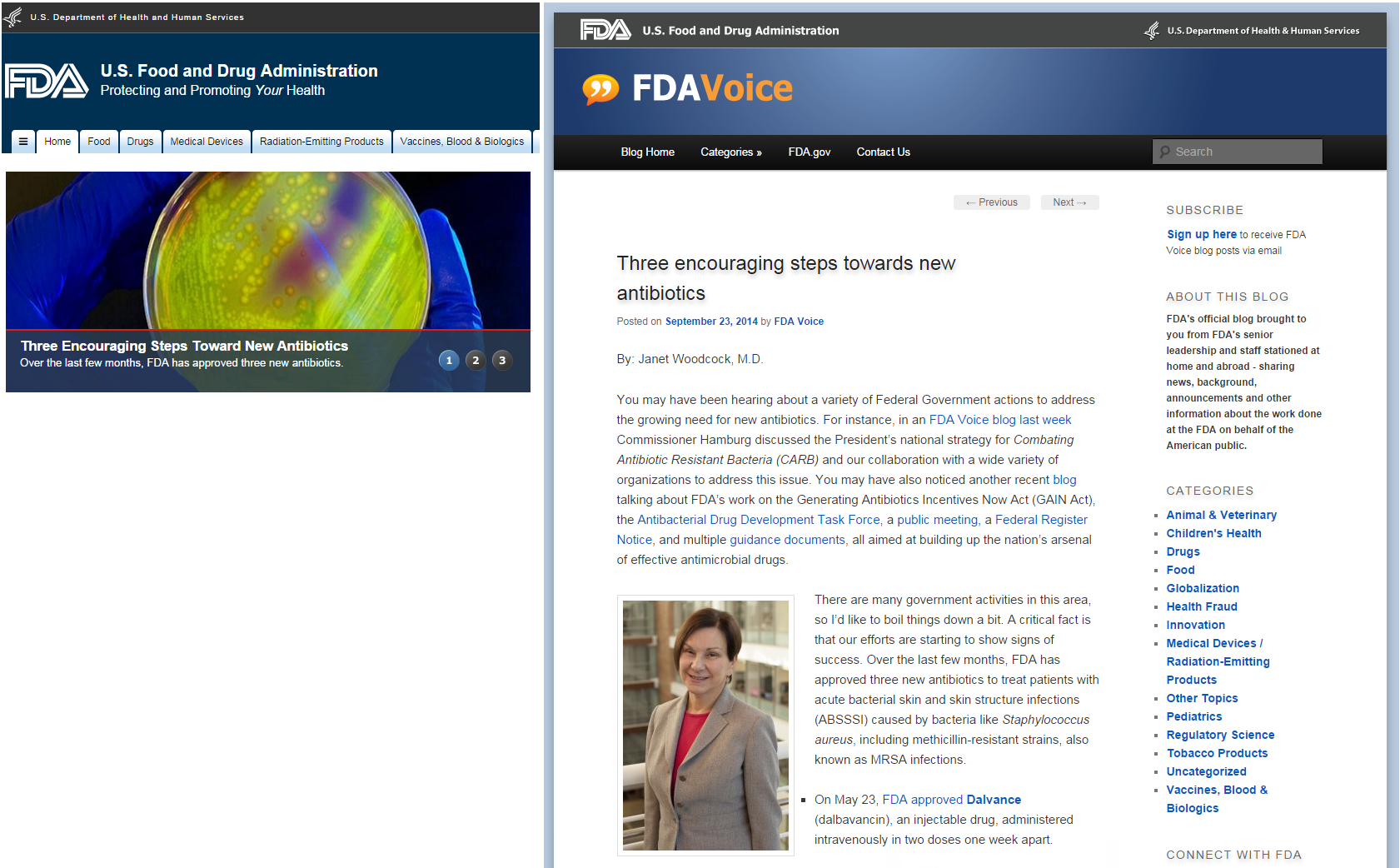
The link text is the same as the title on the page it links to, which is a strong confirmation for the user.
In another example, on ISoldMyHouse.com, the user is viewing the property listing for the house she plans to sell and wants to schedule an open house. After clicking the blue Schedule Open Houses button, a form with several items appears that confirm to the user that she is on the right track, including:
- a bold, orange title that includes the key words Open Houses for…
- the same title also confirms the specific number associated with the listing. (Note: For people listing multiple properties, it would help to display the property address here too so they don’t need to recall the number associated with each property.)
- the form with fields such as date and time for the open house plus a button to submit the form labeled Add Open House, which also confirms the specific action associated with this page.
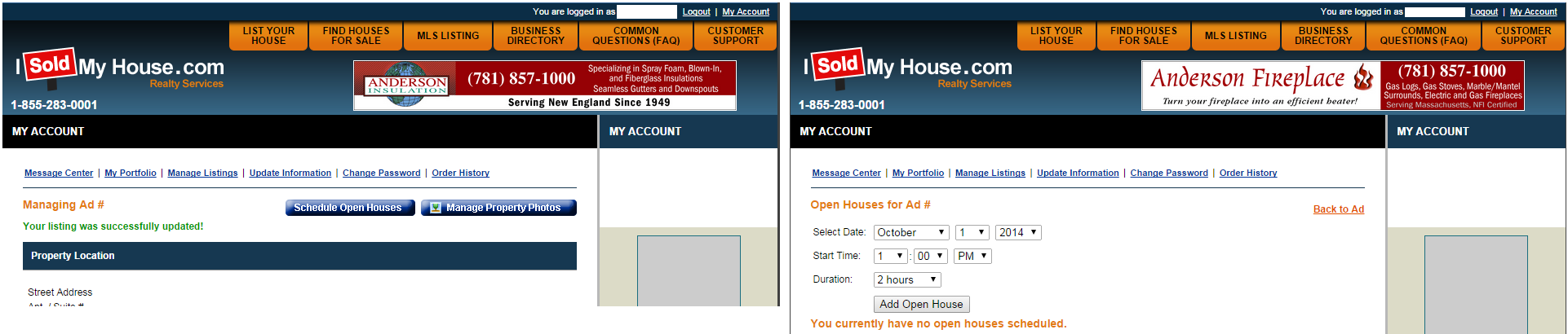
The button implies action on the next page, and leads to an expected form that people can interact with.
Summary
Whether it’s a date not kept, a ball never tossed, or a product page not loading when requested on a website, bailing out on your promises is impolite, bad practice and will hurt your organization in the long run. So think twice before you make a promise that you don’t plan to keep. Instead follow this simple, two-step plan:
- write descriptive, true link text, and
- immediately display what the user expects to see — right on the link’s destination page.


Share this article: