At some point in your life, you’ve likely been told not to judge a book by its cover. And yet, on the web, people commonly do it: we judge a website — and the products or services it contains — by what we see on the first page we visit. A negative emotional reaction to some aspect of the design lowers the perceived value of the site and makes people abandon the site — often within a few seconds. On the other hand, if we like what we see and the page matches our expectations, we assign a high value for the website and its products or services.
Definition: Perceived value is the subjective worth attributed to a product or service in relation to a goal. It varies from user to user and from task to task: for example, if the goal is to read the latest world news, an e-commerce site selling shoes will have a zero perceived value in relation to that goal (however, it may have higher value if the goal was to kill time). Perceived value is based on user opinion and not necessarily on data or logic.
Expected Utility: Perceived Value vs. Perceived Cost
Ultimately, what determines whether users will engage with your site is their assessment of the site’s expected utility: perceived value vs. the perceived cost of interacting with the site. According to the information-foraging theory, people behave on the web like animals in the wild: they assess the perceived value of a new foraging patch against the perceived cost (effort) of obtaining that food. On the web, each new page is a patch, and the food is the information. The effort of obtaining the information is the interaction cost. Thus, people derive the expected utility of staying on a site by weighing the value that the site is likely to deliver against the effort needed to engage with the site.
By improving a site’s usability, we reduce the interaction cost, and thus increase the expected utility. But remember that the perception of the interaction cost (that is, users’ assessment of how hard it will be to use the site) is almost as important as the actual interaction cost (i.e., the real effort required to use the site): the perceived cost drives the initial assessment of the site’s expected utility. Thus, to convince people to stick around and explore deeper into the website, it is important to accurately reflect the quality of the organization and convey ease of use. If, at a glance, users do not believe that the site is worth their time and effort, then they have little reason to stay.
Most of the articles on our site are devoted to increasing the expected utility by decreasing the interaction cost. In this article, however, we focus on the other component of the expected utility: the perceived value of the site.
What Affects Perceived Value
There are many factors that influence the perceived value of the site; some pertain to the UI itself, but others are related to marketing, brand perception, or the specific offering of the company. For example, if the only bank that will extend me a credit card has a poor interface, I may engage with the bank’s site regardless of its UI or visual-design qualities. Or if all my friends use a certain social network, I will attach a higher perceived value to its site or app whether it makes a positive first impression or not.
In the physical world, we often assess the value of a shop based on the storefront: displaying many items in the front window may signal cheaper prices and lower quality, while a few products in a large window may convey exclusivity and higher value. (This assessment is related to people’s scarcity bias: many items crammed into a display appear easy to obtain, while a single object seems more elusive.)

On the web, visual characteristics such as the amount of content or graphical elements on the page, quality and subject matter of photos, and the colors used in the design tend to make the most impact on the overall perception of the site.
Just as with the physical storefront, a cluttered webpage lowers the perceived value of the organization. Clutter and disorganized content suggest a lack of attention to detail, or an inability to distill information into a meaningful summary that, due to the halo effect, people assume reflects the overall character of the business.
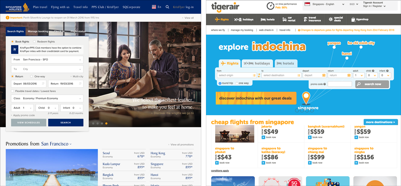
The most important thing to remember is that the initial perception of the site must actually match the business — not every website needs to strive to create a perception of luxury and sophistication, as what is valuable to one user may be at complete odds with another. The “budget” impression communicated by Tigerair’s bright colors and dense presentation of deals works well because the company’s value proposition is low price, not exceptional service. If a flight with Tigerair was more expensive than a seemingly higher-end Singapore Airlines’ flight, for example, the user would likely not purchase because such a disparity does not match the expectation set up by the website design. On the other hand, users who care about hospitality and service will prefer the sophisticated design of Singapore Airlines to the cute graphics of Tigerair.
The importance of perceived value communicated through a website came up during a recent usability study for a client. In this study, details such as color combinations, imagery, and displayed awards communicated sophistication and the promise of excellent service. In contrast, several competitor sites with less compelling visual design were judged to belong to discount brands or to organizations devoting less attention to detail. These initial impressions primed the remainder of the participants’ visits: on sites where users perceived the brand was too “discount” for their tastes, they only half-heartedly proceeded with the given task and stopped as soon as they found the smallest amount of relevant information rather than exploring more deeply. (And it’s likely that they would have stopped even sooner if they were by themselves at home: people tend to work harder in a test session.)
Perception Is Reality
Users’ initial impression of your website plays a big role in the perceived value of that website and can determine whether they will engage with the site. Users who decide to stay on your site will view everything else they encounter from the lens of that first impression. You can increase the expected utility of your site by making sure that it conveys the right message and that it has good usability (that is, it requires little effort to interact with it).


Share this article: