The original iPhone was released in June 2007. In late 2008, when we started the research for the first edition of our mobile report, most people still had primitive mobile devices with horrible user experience. At the time, anything that was half-way decent was a pleasant experience compared with the misery caused by most mobile devices and most mobile sites.
Three years ago, when the third edition of the mobile report came out, we did a thorough evaluation of the state of mobile usability. At the time, we were happy to report that mobile usability was no longer an oxymoron — and we finally saw many sites and apps with decent usability. With the new fourth edition of our mobile-UX research report, we continue to see progress.
Today, most mobile sites and applications offer a good user experience. There are still the occasional glitches and sacrifices of usability in favor of aesthetics, but we can confidently say that the field has progressed in the past two years since the last report. Most of the egregious errors are not there anymore. When we tried to update the examples for many of our mobile guidelines, we discovered that the companies had fixed their problems and some of the issues that we discussed were no longer common. Yet we also encountered revivals of problems we thought almost extinct two years ago. In the business of usability, mistakes (like trends) tend to be cyclic: one generation identifies them and creates design patterns that avoid them, but later generations, no longer having witnessed the UX problem, make the same error again in their quest for refreshed designs. It’s always two steps forward and one step backward.
Content vs. Chrome
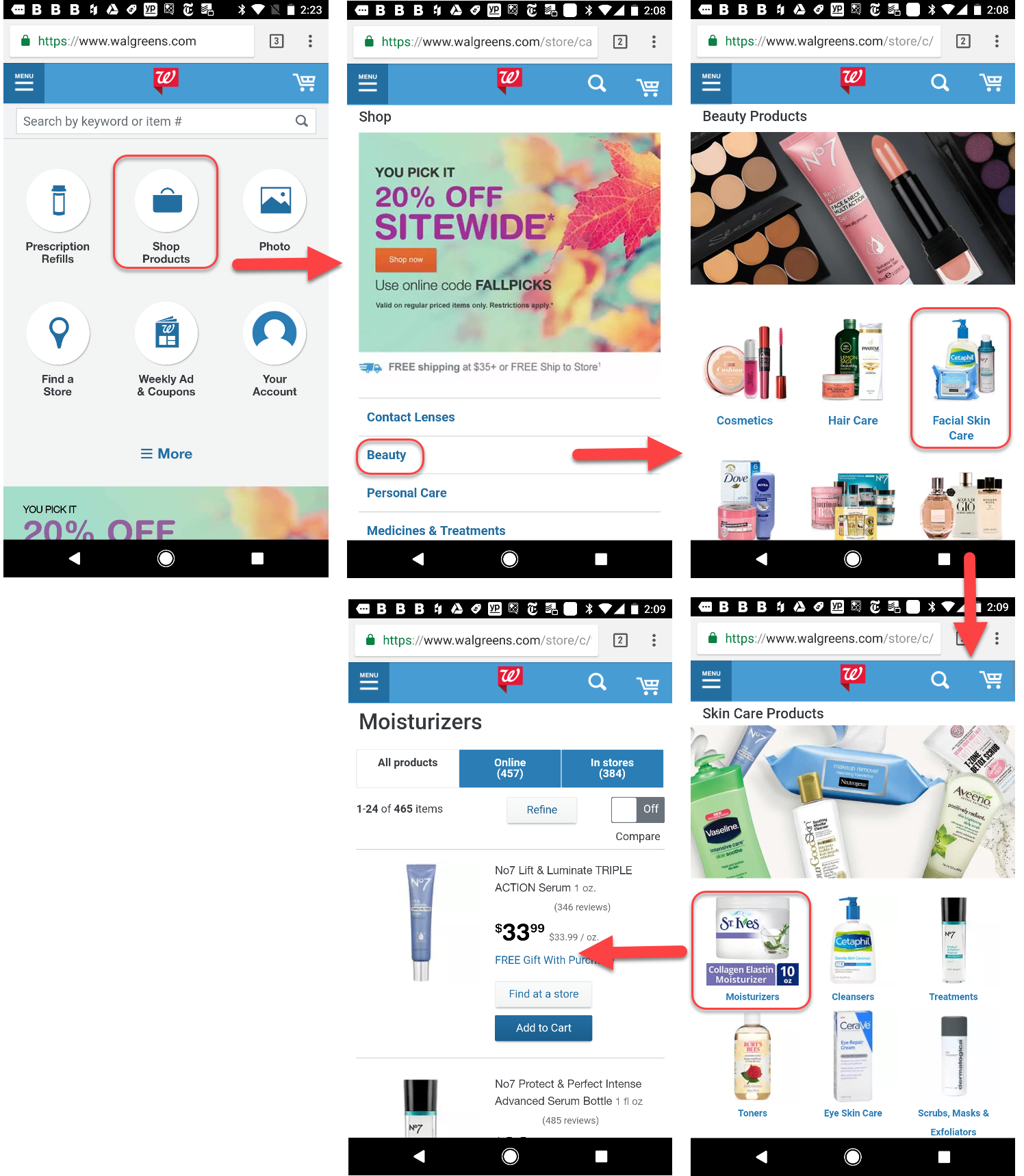
The importance of prioritizing content over UI elements (that is, chrome) was one of the lessons learned from responsive design. The hamburger-menu trend was a consequence of that lesson: designers were trying to minimize the number of UI elements visible on the screen because these took away precious content space. Two years later, designers continue to value the screen real estate on mobile devices — but they’ve reached measure in hiding the chrome. A break has been put on the hamburger trend. It’s still very widespread (as we argue elsewhere, hidden navigation is the only option for some sites), but many have understood that it should not be used if a better pattern (such as a visible navigation bar) is available.
Prioritizing content over chrome has trickled in other design areas: for instance, we no longer see results pages headed by fat filters that occupy half the page. Or, the nested-doll pattern, which involved having users make a sequence of selections through multiple pages before encountering content, is no longer as popular as it used to be. At least some companies have started to understand that it’s better to flatten the navigation structure on mobile: show people a variety of content right away and allow them to later narrow it down to a specific category of interest.

Use of Gestures
Gestures solve the problem of too much chrome on a too small screen, but they are notoriously hard to discover and learn. Some of the original gesture enthusiasm (embodied by gesture-only apps such as Clear Todos) has dampened down, but gesture use is still one of the more promising directions in mobile design.
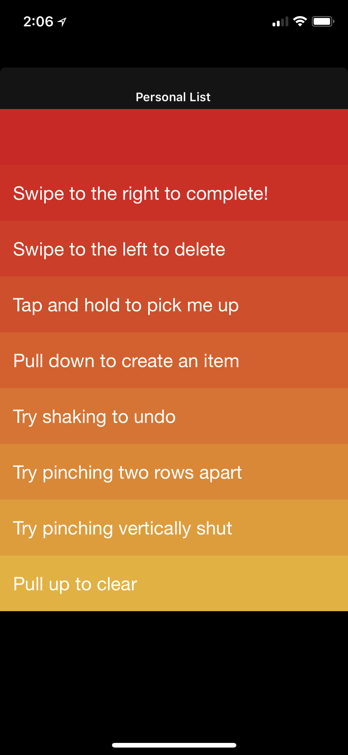
Unfortunately, gestures are a chicken-and-egg problem: they won’t become easy to learn and use until a standard vocabulary of gestures used across apps and websites is built, and all applications and websites use these gestures consistently. But, on the other hand, designers are forced to stay away from gestures because they have so little familiarity among their user base.
Apple has had multiple attempts to expand the standard vocabulary of gestures (with the introduction of 3D Touch for iPhone 6S) and to delegate some of the visible chrome to gestures. Their attempts have culminated with the iPhone X — which got rid of the iPhone’s only physical button to replace it with a series of swipe gestures. The result has been a more effective use of the screen at the expense of some initial learning hurdles for people used with the old Home button.
3D Touch was a promising direction, but it is still relatively rarely used by applications. However, two other (old) gestures are increasing in popularity to the point of being added to that basic gesture vocabulary: the swipe-to-delete for exposing some contextual actions including delete, and the two-finger scroll for moving around a map embedded on a webpage. While the swipe-to-delete simply adds a convenient way to perform contextual actions on a list element, the two-finger scroll solves the problem of swipe ambiguity, often encountered when maps are embedded in web pages. These gestures are becoming more and more familiar to users, although we still recommend that designs which use them add other redundant ways to perform the same actions or at least have good contextual tips to guide users.

Better Integration Between the Mobile Web and the App Web
Transitioning from the web to an app used to require a specific user action: on iOS, people had to explicitly choose to open an app and then perform a search inside it. From iOS 9 on, it’s become possible to easily transition between the mobile web and the app web — if I search for a movie in a search engine, some of the search results will seamlessly open corresponding application pages (when users have these applications installed).
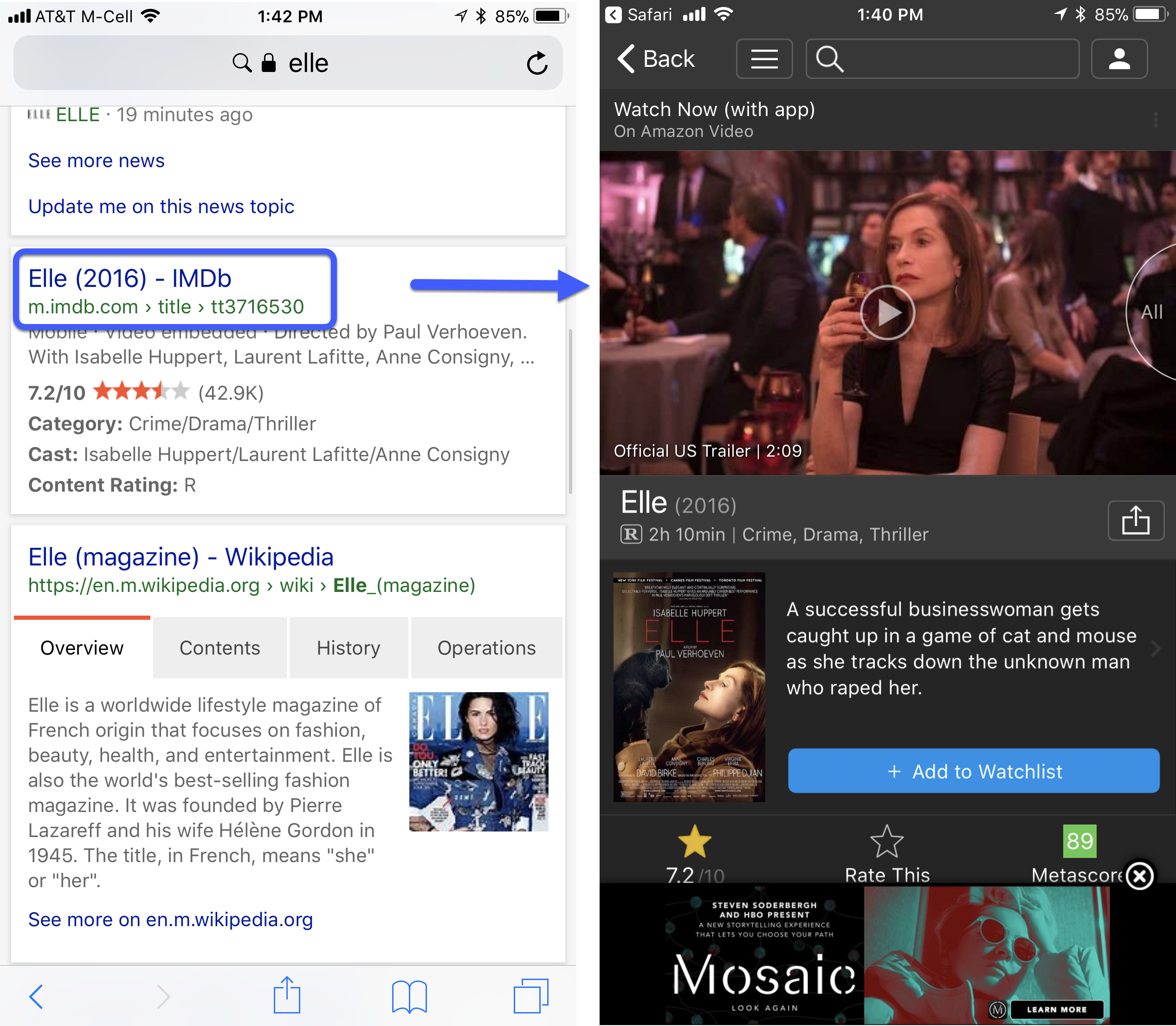
This seamless transition from browser to app, or, more generally, from one app to the next ensures that the experience of consuming content is optimal — because, most often, applications will have a better user experience than sites (simply because they are closer to the mobile platform for which they were designed).
Unfortunately, with this design we also see a new burden placed on users: that of keeping track of where they are and knowing how to navigate back. Applications still have to accommodate that need — for example, we still notice that many apps (like iMDb above) do not include logos on their deep pages, which makes it more difficult for users to orient themselves in this new expanded app-plus-web universe.
A notable improvement, possibly related to the increased ease of switching from browser to app, has been a lower number of interstitial app ads. (Almost) gone are the days when navigating to a new site was preceded by an interstitial inviting the user to download the app. Most of the time, the app is simply advertised in a banner at the top of a web page.
Better Use of Phone Features
Although not perfect, more and more sites and apps take advantage of basic phone functionality. Checking out on many ecommerce sites has become a breeze due to integrated systems like Apple Pay and Android Pay. And most sites and apps take into account the user’s current location. Biometric authentication promises to get us closer from the problem of remembering passwords, and can even make desktop login easier by allowing users to easily transfer information (and thus automatically log in) across devices.
Fewer Tutorials: Stagnation
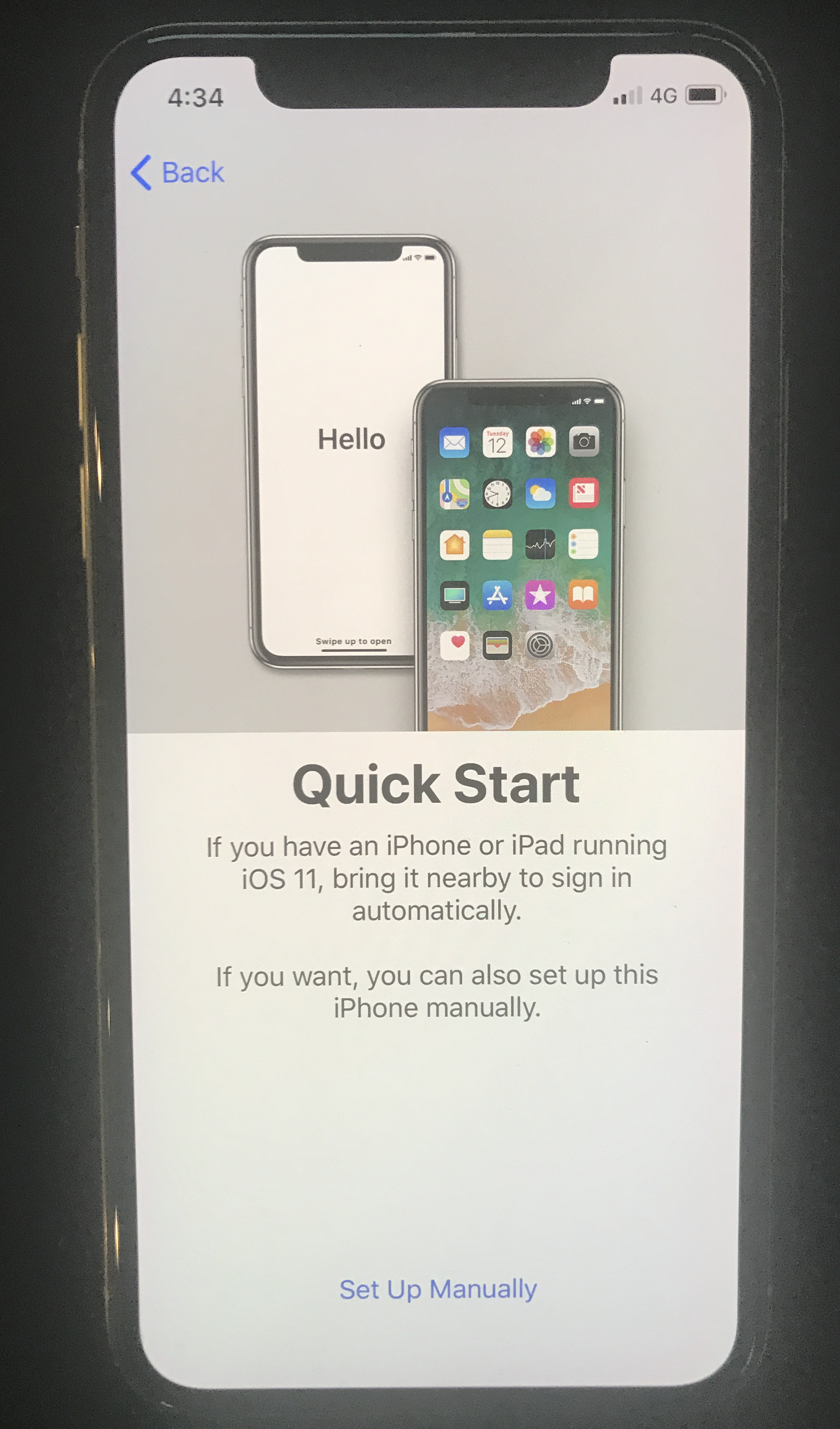
A few years ago, any respectable app started with a lengthy tutorial that catalogued all the different features available in the app. These tutorials were at worst annoying and at best ineffective — no user could remember the plethora of commands listed in a lengthy tutorial. Nor were they motivated to remember any of them — after all, who could say in advance what features would be actually useful?
Today, those tutorials have been largely replaced with general overviews of the apps, meant to convince the user to go beyond the login wall and create an account. Ideally, these login walls should disappear completely and users should be able to experience the app without having to register at all. The initial app overviews play the function of an ad — and most people hate to have to sit through an ad, especially if they’ve already spent the effort to download the app.
Steps Backward
Although overall the responsive-design trend has been a positive influence, the quest for building across multiple interaction modalities has pushed some towards strange solutions like using a split-button for menus or accordions. The intent behind the split-button menu is to replicate desktop’s hover-plus-click interaction for categories in the main navigation — that is, to allow access both to a category landing page and to a submenu. Yet it is a highly unusable solution — not only because it crams two targets in a small space and makes the job of acquiring each of them more difficult for human fingers, but also because it violates users’ expectations and the mobile patterns that they have learned so far.
Another somewhat surprising development has been the disappearance of guest checkout. Sites and apps that used to offer this functionality in the past have eliminated it — some rely on Check out with Apple Pay or Check out with PayPal to compensate for the lack of guest checkout. But many still force users to create an account although they may be one-time purchasers. On the plus side, registration has been simplified in many designs — it is fairly common nowadays to be asked only for an email and a password in order to create an account.
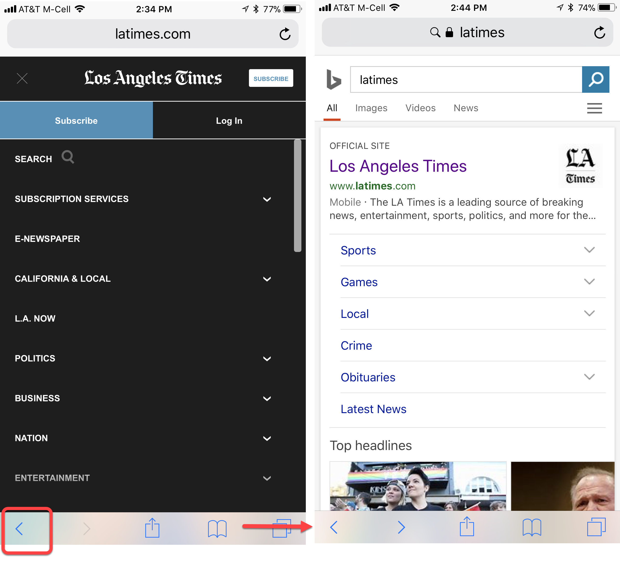
The popularity of the overlay has increased, with many sites implementing menus as overlays. Two years ago, many mobile overlays were buggy and created funny effects (such as content behind the overlay suddenly appearing on top of it). Today’s overlays are much better. But they often look like full pages, and people treat them as such — expecting to be able to use the Back button to close them and navigate back to the previous view. Often, they get disoriented when that does not happen and instead they are spit out of the site. When an entire flow is moved in overlays (as it is the case with the increasingly popular sequential menus), the opportunity for errors increases even more, with people forgetting to use the menu’s Back button to ensure correct navigation in the overlay and instead using the browser or the phone’s Back button.
Conclusion
Ten years from the first iPhone, the field of mobile user experience has finally reached a reasonable level of maturity. It was about time — according to a recent report by comScore, in many parts of the world, more than half of the online time is spent on mobile. So it’s only right that mobile usability catches up with desktop usability. It doesn’t mean that mobile sites and apps have reached a state of usability perfection: there’s no such thing as a perfect design. It simply means that a lot of them offer a decent user experience, and that many flagrant errors of the past have been fixed.
New Research Report
Our mobile-usability findings and guidelines are captured in the new edition of our report Mobile User Experience. Many guidelines reflect the current mobile patterns and interactions; old guidelines that were still retained were revamped with new examples.
Reference
comScore. 2017. The Global Mobile Report.


Share this article: