The popularity of flat design in digital interfaces has coincided with a scarcity of signifiers. Many modern UIs have ripped out the perceptible cues that users rely on to understand what is clickable.
Using eyetracking equipment to track and visualize users’ eye movements across interfaces, we investigated how strong clickability signifiers (traditional clues such as underlined, blue text or a glossy 3D button) and weak or absent signifiers (for example, linked text styled as static text or a ghost button) impact the ways users process and understand web pages.
About the Study
Webpages Used as Stimuli
There are many factors that influence a user’s interaction with an interface. To directly investigate the differences between traditional, weak, and absent signifiers in the visual treatments of interactive elements, we needed to remove any confounding variables.
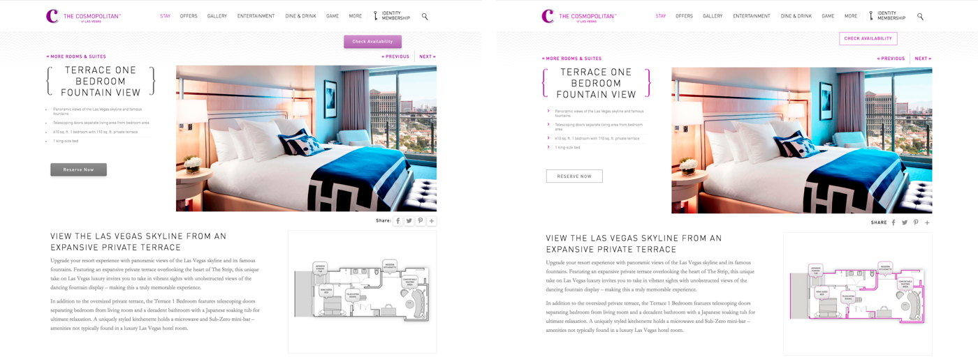
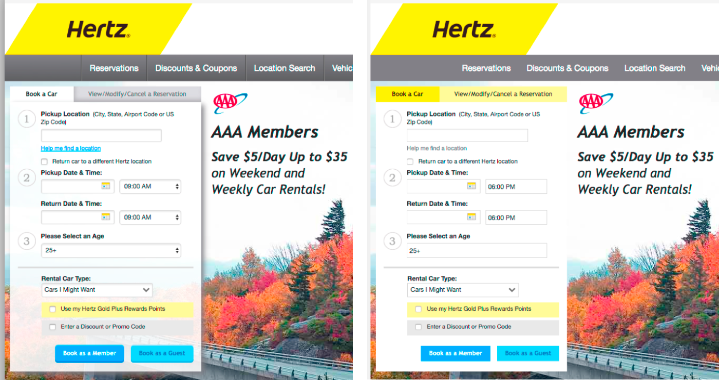
We took 9 web pages from live websites and modified them to create two nearly identical versions of each page, with the same layout, content and visual style. The two versions differed only in the use of strong, weak, or absent signifiers for interactive elements (buttons, links, tabs, sliders).
In some cases, that meant taking an already flat page and adding shadows, gradients, and text treatments to add depth and increase the strength of the clickability signifiers. In other cases, we took a page that already had strong, traditional signifiers, and we created an ultraflat version. We were careful that the modifications we provided were reasonable and realistic.

We chose these interfaces as study materials because, for the most part, they’re decent designs that are representative of the better sites on the web. We set out to isolate the differences between signifier-rich and signifier-poor interfaces, not to evaluate the design of these sites.
We selected 9 sites from 6 different domains:
- Ecommerce (bookstore, sunglass retailer, fine jewelry)
- Nonprofit
- Hotel
- Travel (car rental, flight search engine)
- Technology
- Finance
For each of the stimuli pairs, we wrote a short task to direct the user’s attention to a specific interactive element on the page. For example, for the hotel site, the task was: “You will see a page from a hotel website. Reserve this hotel room. Please tell us when you have found where you would click.”
All 18 page designs and the wording of all 9 tasks are available in a sidebar.
Methodology
We conducted a quantitative experiment using eyetracking equipment and a desktop computer. We recruited 71 general web-users to participate in the experiment. Each participant was presented with one version of the 9 sites and given the corresponding task for that page. As soon as participants saw the target UI element that they wanted to click to complete the task, they said “I found it” and stopped.
We tracked the eye movements of the participants as they were performing these tasks. We measured the number of fixations on each page, as well as the task time. (A fixation happens when the gaze lingers on a spot of interest on the page).
Both of these measures reflect user effort: the more fixations and time spent doing the task, the higher the processing effort, and the more difficult the task. In addition, we created heatmap visualizations by aggregating the areas that participants looked at the most on the pages.
The study was conducted as a between-subjects design — each participant saw only one version of each page. We randomized assignment to either version of each page, as well as the order in which participants saw the pages. (See our course on Measuring User Experience for more on designing quantitative studies.)
All participants began with a practice task on the same stimulus to make sure they understood the instructions before they began the real tasks. Especially with quantitative studies like this one, it’s a good idea to use a practice task to ensure that participants understand the instructions. (It’s also best to conduct pilot testing before even starting the real study to iron out any methodology issues.)
This experiment was not a usability study. Our goal was to see how users processed individual page designs, and how easily they could find the target elements, not to identify usability problems in the designs. (Usability studies of live sites rarely involve a single page on a website; most often, people are asked to navigate through an entire site to accomplish a goal.)
Results
Number of Fixations and Time on Page
When we compared average number of fixations and average amount of time people spent looking at each page, we found that:
- The average amount of time was significantly higher on the weak-signifier versions than the strong-signifier versions. On average participants spent 22% more time (i.e., slower task performance) looking at the pages with weak signifiers.
- The average number of fixations was significantly higher on the weak-signifier versions than the strong-signifier versions. On average, people had 25% more fixations on the pages with weak signifiers.
(Both findings were significant by a paired t-test with sites as the random factor, p < 0.05.)
This means that, when looking at a design with weak signifiers, users spent more time looking at the page, and they had to look at more elements on the page. Since this experiment used targeted findability tasks, more time and effort spent looking around the page are not good. These findings don’t mean that users were more “engaged” with the pages. Instead, they suggest that participants struggled to locate the element they wanted, or weren’t confident when they first saw it.
22% longer task time for the weak-signifier designs may seem terrible. But remember that our metrics reflect time spent while looking for where to click. The tasks we measured were very specific and represent just a small component of real web tasks. In regular web use, people spend more time on other task aspects such as reading the information on a page. When you add in these other aspects, the slowdown for a full task (such as shopping for a new pair of shoes) would often be less than the 22% we measured.
On the other hand, the increased click uncertainty in weak-signifier designs is likely to sometimes cause people to click the wrong thing occasionally — something we didn’t measure in this study. Recovering from incorrect clicks can easily consume more time, especially since users don’t always realize their mistake immediately. Beyond the actual time wasted, the emotional impact of increased uncertainty and decreased empowerment is an example of how mediocre experience design can hurt brand perception.
Heatmaps
Heatmaps are quantitative visualizations that aggregate the number and duration of eye fixations on a stimulus (the UI). They can be created from the gaze data of many participants, as long as they all look at the same stimulus with the same task.
Heatmaps based on all participants’ data convey important information about the page areas that are relevant for the task (provided that the number of participants is high enough). In our color coding, the red areas were those which received the most and longest fixations. Orange, yellow, and purple areas received less attention, and areas with no overlay color were not viewed by any of the test participants.
When comparing the two versions of each page pair (strong signifiers vs. weak signifiers) we found that the pages fell into two groups: those with nearly identical user gaze patterns for the two versions, and those with different user gaze patterns (as indicated by the heatmaps).
Page Pairs with Different User Gaze Patterns
Of the pages we tested, 6 out of the 9 pairs had different user gaze patterns. With the exception of the signifier strength, we eliminated all other variations in page design within a given pair, so we can conclude that the signifiers changed how users processed the page in their task.
One major overarching difference emerged when comparing the 6 pairs of page. The weak-signifier versions of the pages resulted in a broader distribution of fixations across the page: people had to look around more. This result reinforced our findings that weak-signifier pages required more fixations and more time than strong-signifier ones.
We never saw the reverse pattern: no strong-signifier version had a more outspread distribution than its weak-signifier counterpart.

This difference suggests that participants had to consider more potentially interactive elements in the weak-signifier versions. Because the target elements (links, tabs, buttons, sliders) lacked strong, traditional signifiers, they didn’t have the same power to draw the participants’ attention or confidence. In many cases, participants fixated on the target element, but then moved on to other elements on the page — presumably because they hadn’t immediately recognized it as the solution to the task.


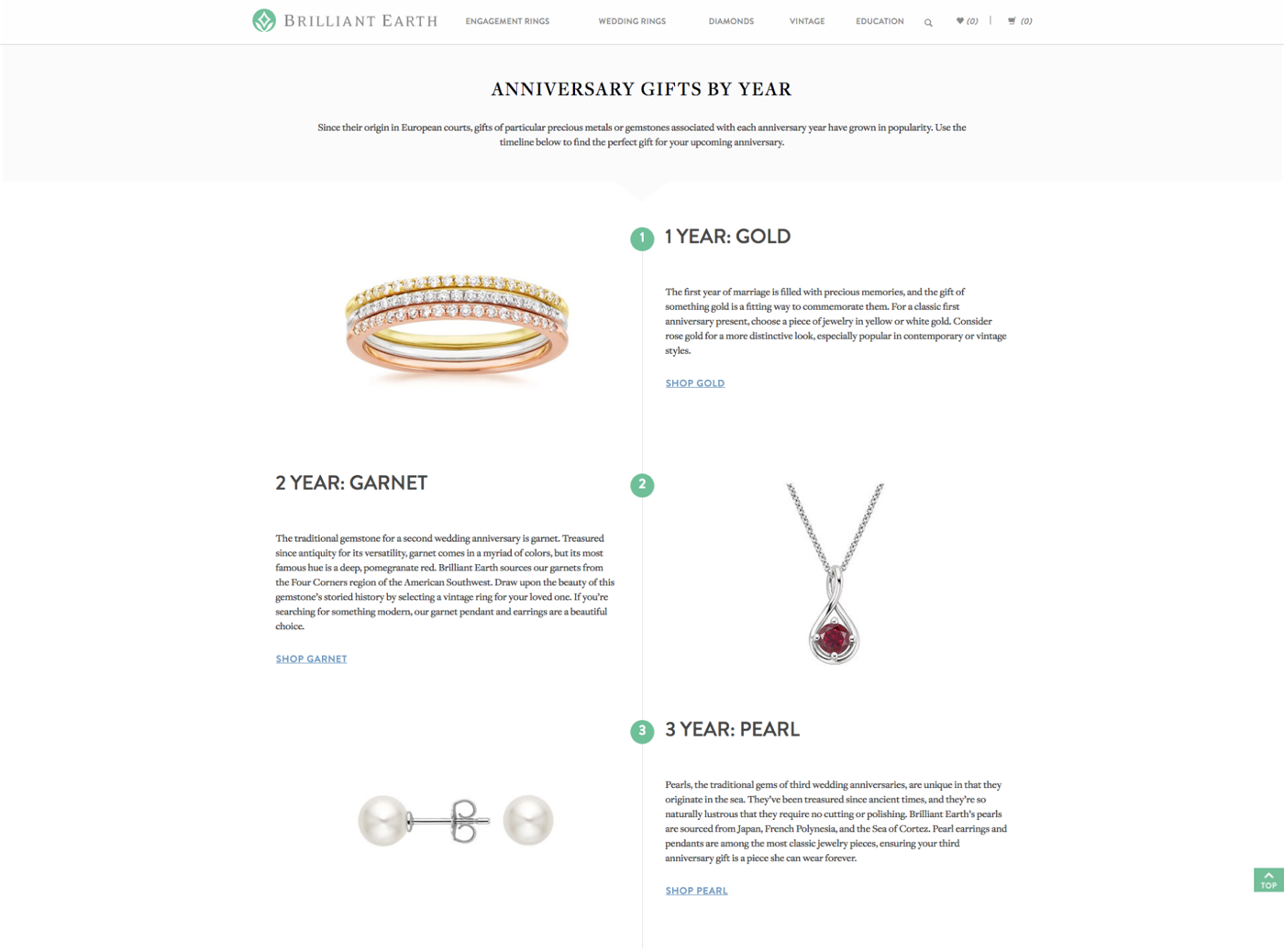
Of the six sites, one page pair displayed a particularly dramatic difference in the heatmaps. The original interface used to create the stimuli was a zig-zag layout from a fine-jewelry website. The page layout featured three sections, each with a heading, short paragraph of text, product image, and text link.
To create the strong version of the page, the text links were given a traditional link treatment: blue color and underlined text. To create the weak version, we took inspiration from a common tactic of ultraflat designs, and made the text links identical to the static text. The placement of the text links (below the paragraphs) was left the same in both stimuli.

Participants were asked to find the pearl jewelry on the site. The intended target was a Shop Pearl link at the bottom of the page.


The weak-signifier version showed red areas on the primary navigation, as well as on the 3 Year: Pearl heading. In contrast, the target link received most fixations in the strong-signifier variant. When we inspected the individual-participant data, we discovered that many users (9 of the 24 participants) who saw the weak signifier version stopped at the subheading, and never looked at the text link. They believed they could click on that subheading to reach the pearl jewelry and didn’t continue down to see the link.
In the strong signifier version, 86% (25 out of 29) participants first fixated on the heading, and then moved to the Shop Pearl target link. In the weak version, only 50% (12 out of 24) followed this pattern. (This difference is statistically significant; p < 0.005.) The links styled like static text didn’t draw users’ eyes down from the subheading, while the strong, traditionally styled links did.
Page Pairs with Nearly Identical User Gaze Patterns
3 of the 9 sites resulted in no differences in the gaze patterns between strong and weak signifiers. Why are these three page pairs nearly identical, while the other six pairs showed substantial differences?
The answers give us some interesting information about when flat UIs can work without damaging interaction.
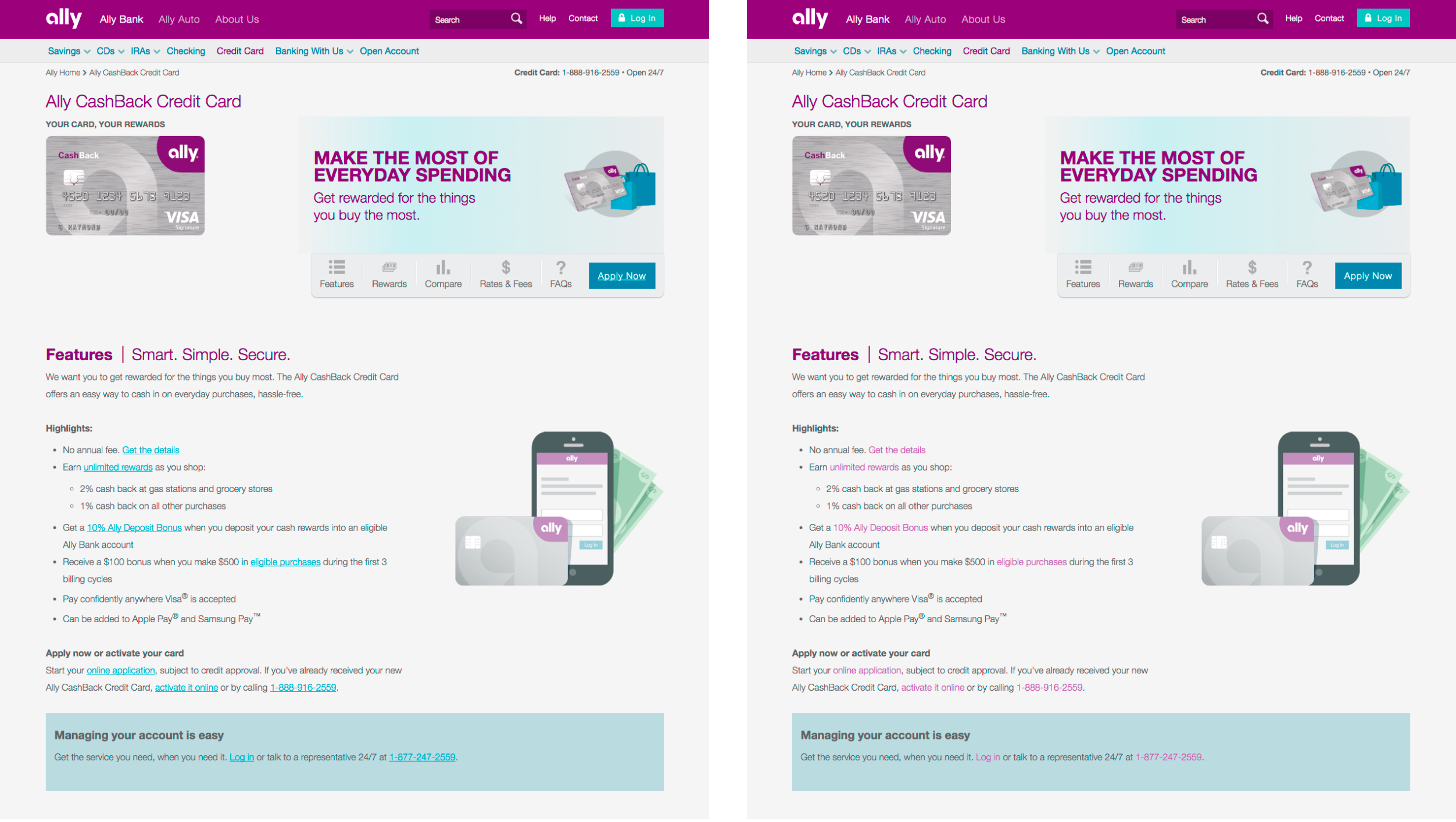
One of the stimulus pairs had in-line text links as the target element: light purple, nonunderlined links vs. traditional blue, underlined links. In this pair, the weak-stimulus heatmap only showed a very slightly wider distribution of fixations on the paragraph containing the target link.

This suggests that the low-contrast presentation of in-line links, compared with regular text, may be a slightly weaker signifier, but not perceptibly so. In the case of Brilliant Earth, the lack of contrasting color for links, however, had a big impact, as shown above. We can speculate that there is a contrast continuum: the stronger the color contrast between links and surrounding text, the higher the chance that users will recognize them. If we had used a light grey highlight color in the weak version of Ally Bank, we might expect to the see a more dramatic difference in the gaze patterns. As long as in-line text links are presented in a contrasting color, users will recognize their purpose, even without an underline.
The other two stimulus pairs with no discernible heatmap differences between the weak and strong versions had some traits in common, when compared to the rest of the stimuli:
- Low information density. The pages contained relatively little content and ample white space, meaning that even things that didn’t stand out much still did stand out, because they weren’t competing with many other page elements.
- Traditional layout. Elements (buttons, links, navigation) were located in standard positions, where users typically expect them to be.
- Salient, high-contrast targets. The target elements were high-contrast compared to the items around them, and had plenty of space to separate them from those elements, making them more noticeable.
Weak Signifiers Increase Interaction Cost
We want our users to have experiences that are easy, seamless, and enjoyable. Users need to be able to look at a page, and understand their options immediately. They need to be able to glance at what they’re looking for and know instantly, “Yep, that’s it.”
The problem is not that users never see a weakly signified UI element. It’s that even when they do see the weak element, they don’t feel confident that it is what they want, so they keep looking around the page.
Designs with weak clickability signifiers waste users’ time: people need to look at more UI elements and spend more time on the page, as captured by heatmaps, average counts of fixations, and average task time. These findings all suggest that with weak signifiers, users are getting less of that feeling of empowerment and decisiveness. They’re experiencing click uncertainty.
When Flat Designs Can Work
These findings also confirm that flat or flat-ish designs can work better in certain conditions than others. As we saw in this experiment, the potential negative consequences of weak signifiers are diminished when the site has a low information density, traditional or consistent layout, and places important interactive elements where they stand out from surrounding elements.
Ideally, to avoid click uncertainty, all three of those criteria should be met, not just one or two. A site with a substantial amount of potentially overwhelming content, or radically new page layouts or patterns, should proceed with caution when adopting an ultraflat design. These characteristics echo our recommendations for adopting a flat UI without damaging the interaction on your site.
Notice that those characteristics are also just good, basic UX design best practice: visual simplicity, external consistency, clear visual hierarchy, and contrast. In general, if you have an experienced UX team that cares about user research, you’ll do better with a flat design than other product teams that don’t. If your designs are already strong, any potential weakness introduced by flat design will be mitigated. If you’re conducting regular user research, any mistakes you make in implementing a flat UI will be identified and corrected.
Limitations of the Study
To get comparable, interpretable results from this experiment, we had to ask users to do very focused, short tasks on a single page. In real life, users don’t do tasks that way. They arrive to your site, and don’t know who you are or what you do. They navigate to pages, and don’t know for sure that they’ll find what they’re looking for there. They explore offerings and options.
Remember that there’s a difference between findability and discoverability. Strong signifiers are helpful in situations where users care about finding something specific. They’re absolutely crucial in situations where you care that users discover a feature that they didn’t know existed.
Note: This article's publication generated a significant amount of debate about flat design. I've written responses to some of the questions and concerns I heard about the study.


Share this article: