In our interviews and usability tests with domain experts, we learned that scientists and researchers have different expectations for content as compared to a general audience.
To create compelling digital content for a specialized, highly educated audience, we can take inspiration from the writing form they often spend the most time with — traditional scientific papers. However, when presenting scientific content online for such audiences, simply providing the PDF of an existing scientific article isn’t good enough. Adapt research findings for online reading by keeping what works well in scientific papers, and improving on what doesn’t.
We conducted usability testing with scientists, researchers, and experts such as clinicians and engineers who use research findings in their work. We found that the following writing techniques work well with these audiences:
- Shorten titles as much as possible.
- Use subsections with clear headings to create structure.
- Provide succinct summaries.
- Remove or layer introductory content.
- Include charts and figures.
- Don’t overdo the visual design.
Accurate, Succinct Titles
Resist the urge to write flashy or hyped-up titles and links. Researchers are attracted to material that offers new or contradictory findings that they’re unfamiliar with, but if the actual findings don’t back up the title’s claims, you’ll lose credibility.
Scientists want facts, not loose interpretations or extrapolations. Accurately and specifically describe what the research really says.
If you adapt a scientific paper for online presentation, you’ll likely have to shorten the title. (Academic paper titles can be both wordy and overstated, as documented in the tumblr account lolmythesis.)
Abbreviating titles can be tricky, and it can feel like you’re oversimplifying complex content. Try to focus on the main takeaway or on the point of the study that would bring researchers to this page and set their expectations appropriately. In particular, make sure that the title will make sense when read in isolation on a search-engine results page (SERP) without the supporting context provided when the full page is seen on your website.
Sections with Subheadings Support Nonlinear Reading Patterns
Researchers read even complex academic material (in print or on the web) incompletely and nonlinearly — at least initially.
Domain experts reported preferring to first scan scientific papers, to get a high-level overview of the content and decide if they need to read it in detail.
(We know general users apply a similar content-consumption strategy when they browse online. Nobody wants to waste time and energy reading something irrelevant to them — a basic tenet of information foraging.)
“It’s really about energy. I like to spend as little as possible, especially when things are supplementary knowledge for me.” – Associate professor
One of the researchers who participated in our study explained his scanning process:
“The way scientists read articles, is they read the abstract, look through the figures, read the conclusion and the introduction, and then decide if they’ll read the middle. Almost nobody starts by reading the whole article. […] Why should I read all of something that I’m not terribly interested in?” – Research oceanographer
Scientific papers follow a very specific structure, and each section is labeled with a subheading. While the exact structure depends on the field of study, most such articles will have an abstract and a bibliography. For example, a typical scientific paper in psychology will include:
- Abstract
- Introduction
- Methods
- Results
- Discussion
- Conclusion
- Literature cited
Clearly labeled, predictable subsections like abstracts and conclusions are helpful because they allow researchers to engage in efficient nonlinear reading. While you don’t necessarily need to follow the exact subsection structure when presenting scientific content online, do use subheadings in your content to create chunks and support scanning preferences.
Abstracts Are Just Fancy Summaries
In a traditional scientific paper, the abstract summarizes the main points of the content in a single paragraph. That usually involves covering the purpose of the study and how it was conducted, as well as major findings and brief interpretations.
Together with the title, the abstract is the most important piece of content in scientific papers for researchers. It acts to clarify the themes addressed in the title, which can’t always accommodate the full complexity of the content in just a few words. The abstract is also the author’s chance to hook readers and convince them the article content is worth the effort of a linear, detailed read.
Abstracts are to scientific papers what summaries are to online articles. All long-form web content can benefit from a succinct summary at the top of the page. Give your readers a quick and easy overview of the main topics, and help them decide whether or not to dive deeper.
When adapting a traditional scientific paper or journal article for online reading, you’ll be able to use the paper’s abstract as a summary. You’ll likely need to edit for concision, however: an abstract can be up to 300 words, but a summary should only be 1–3 sentences.
Skip the Introduction
In the structure of a traditional scientific paper, the introduction typically uses a more narrative style than the other sections. An introduction’s purpose is to identify the topic, discuss the purpose of the research, and set up the context of the work. It usually includes an analysis of the current state of knowledge on the topic being researched.
One of the researchers who participated in our study explained that when she was reading research studies on specific diseases, she’d often skip over the introduction.
“I won’t usually read the entire article. I’ll usually read the abstract, and if it seems like I want to go more in depth… I’ll typically skip the introduction, depending on what it is. If it’s just talking about what the disease is, current treatment, the statistics and all that, I’ll skip it. I don’t need that information. If it’s comparing certain treatments or preventative methods or procedures or whatever, I might read and see what the comparisons are, if I don’t know it.” – Clinical research coordinator
This researcher’s description of her information-seeking strategies again highlights the value of chunked content with clear subheadings that help users easily decide which pieces of content are relevant to them.
But there’s another lesson to be learned from this example. The introduction tends to offer less “meat” — less new, valuable information. That’s why researchers look to the introduction only after they’ve scanned the abstract and the other sections, if they choose to read it at all. Like other web users, scientists just want to get to the point when they read online. They’re not interested in fluffy content if it doesn’t provide valuable information.
Consider four strategies for helping your readers avoid the fluff:
- Cut out introductory or background content altogether.
- Clearly label it with a descriptive subheading like Introduction or Background, so uninterested readers can opt out.
- Use the inverted pyramid writing structure. Place the most important information at the top of the article, and then add extra details further down the page. This approach is efficient because it gives readers what they want up front. (If we were to revise the structure of the traditional scientific paper to fit this approach, we might end up with the introduction at the end, next to the list of references.)
- Layer your content. Link to background or introductory information on another page, so the information is available for people who need it, but does not slow down those who don’t need it.
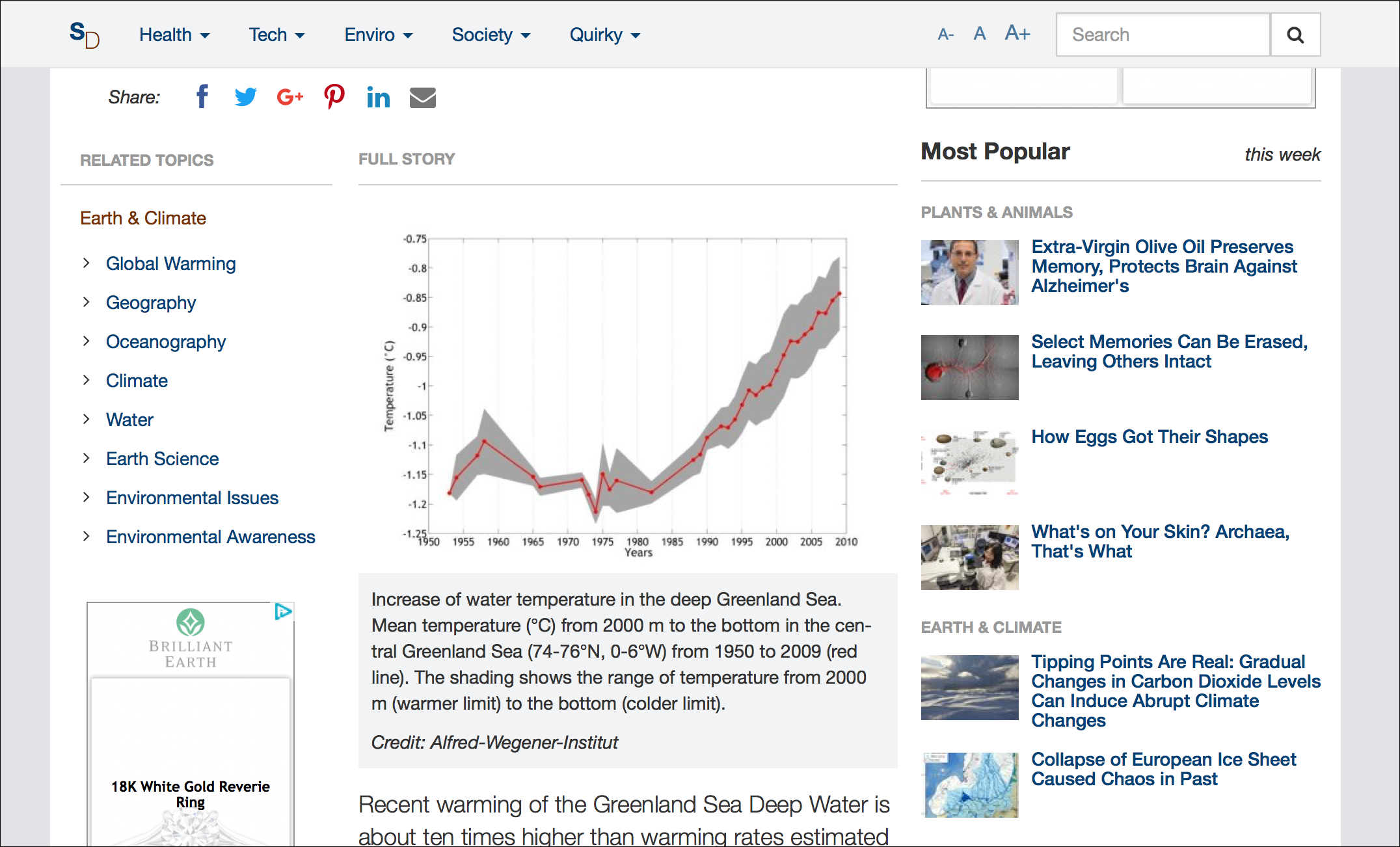
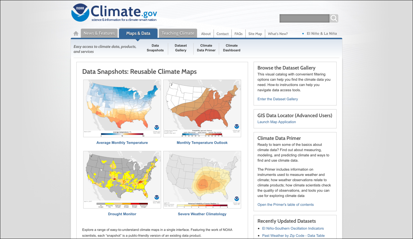
Include Charts and Figures
General web users often struggle to understand any but the simplest charts. In contrast, researchers are not only comfortable with complex charts and graphs, but they prefer to see them. When researchers are scanning a piece of content to decide if they want to read closer, they often pay attention to figures. Presenting complicated information in a chart can help scientists understand the findings described in the article.
Unlike general web users, researchers can handle advanced data-visualization techniques, and can interpret things like correlations and error bars. Allow users to click on the charts and figures to see them full screen. Consider placing any large or unwieldy data tables on a separate page linked from the main text.
There’s a “Scientific” Look
Take a look at a scientific paper. Most are very plain. Boring, even. Walls of text, little highlighting, Times New Roman, black text on white background.
You don’t need to style your website like an academic journal — actually, please don’t do that.
But be aware that, when determining if the content is meant for them or a general audience, experts look at the visual design of the sites they visit. If the visual design looks too polished or flashy, it might turn them off.
Conclusion
Overall, the structure and level of detail provided in traditional academic writing works well for researchers when presenting scientific content online. The wordiness and fluff, however, does not work well. When adapting scientific papers for online reading, keep your content organized, scannable, and succinct.

Share this article: