Your users rely on link text to navigate through your site. These small and unassuming bits of UX copy contribute substantially to the findability, discoverability, and accessibility of your content.
The links that best fulfill those roles are:
- Specific
- Sincere
- Substantial
- Succinct
Specific
A link’s primary purpose is to communicate to users what they’ll find on the other side of a click. Vague or repetitive language fails that purpose.
One of the most common link failures is the generic and unhelpful Learn more.
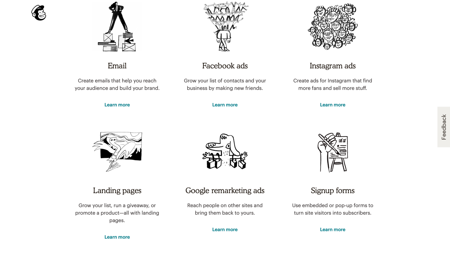
I’m generally impressed with Mailchimp’s copy. (I even use it as an example of good writing in the Writing Compelling Digital Copy seminar.) Unfortunately, its strong subheadings and taglines fall flat due to weak links.
Learn more is the new Click here. Some of its popularity is likely due to a misunderstanding about how people read online. Mailchimp might justify using a vague link (Learn more) because it follows a very specific and well-written tagline (Make your life easier with automation). However, Mailchimp’s prospective subscribers aren’t likely to read that page in its entirety. On web pages, people scan rather than read. Additionally, colored links attract more attention than other text on pages. If users scan just the links on Mailchimp’s page, they won’t get any compelling information scent.
When confronted by a list of vague links on a site, one usability-study participant complained:
“These Learn more links… It’s just not very specific. When I click Learn more, what is that going to tell me? I want specifics. […] I have no idea what to expect, that’s why I never click those.”
Vague or repetitive links make it difficult for users to anticipate what these links lead to. That’s bad for users, but it’s also bad for companies, who usually want to entice users to learn more about their features or services.
Users allocate a minuscule click budget to spend on your site, so don’t force them to spend those clicks in vain. Especially since high-payoff clicks (to content that users want) can lead people to increase their click budget.
Sincere
A link is a promise. To function properly, it must set expectations that are not only specific, but also accurate.
A study participant found a tour she wanted to book on the travel site Combadi. On the right side of the screen, she saw a link presented as a button, with the label MORE INFO & BOOK.
She clicked the button, but was disappointed to find a popup with a contact form.
“Oh. Ugh. I don’t like that. How do I get out of this?”
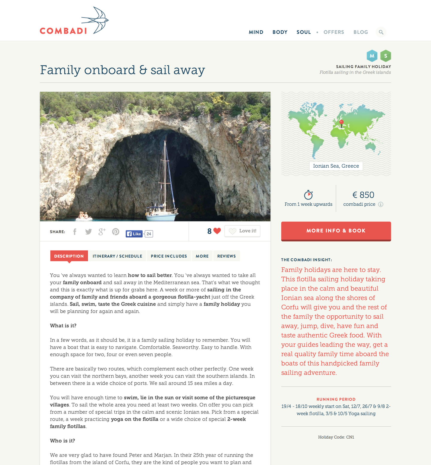
It’s likely that Combadi’s design team understood that users at this stage of their journey are ready to look at details and then book the tour. The team probably didn’t feel dishonest when writing that label — filling out the contact form did lead to more information and booking. The problem was that it did not immediately lead to those things. Link and button labels must set expectations that will be instantly met as soon the user clicks or taps on those targets.
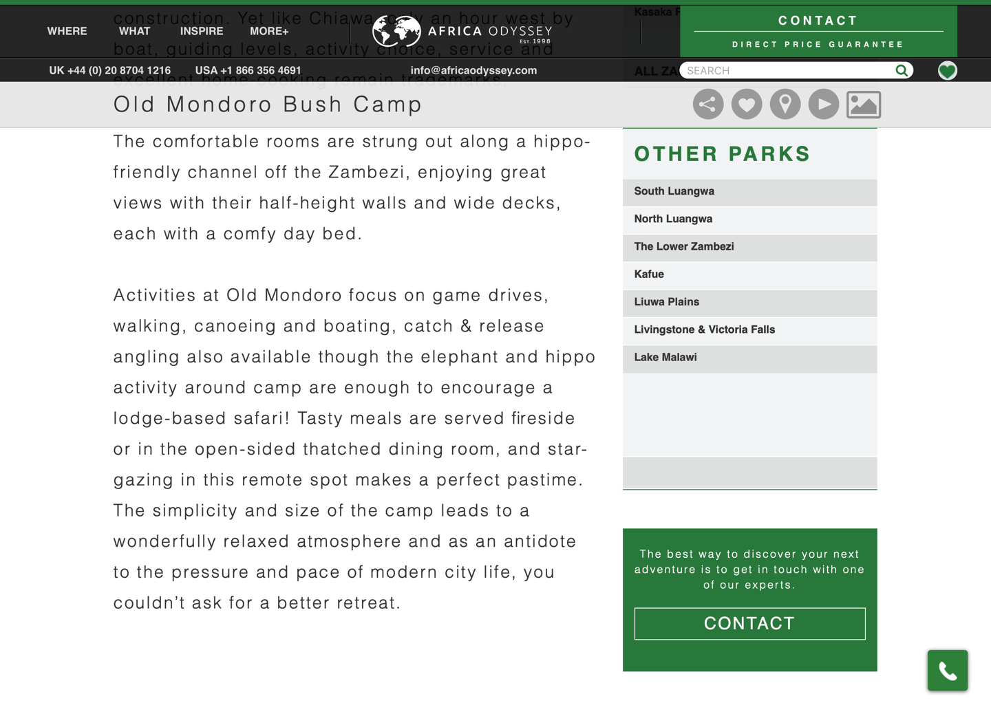
Since that study, Combadi has merged with another travel company, Africa Odyssey. Its tour-description pages feature buttons labeled CONTACT. In contrast to Combadi‘s labels, these do a much better job of setting appropriate expectations.
When links set expectations that aren’t met, they slowly corrode the user’s trust in the site and the organization it represents. Wasted clicks rapidly make users cut their click budget for your site or even leave your site.
Substantial
Remember that users scan rather than reading the UI in its entirety. We know from eyetracking research that people tend to pay more attention to salient elements — links that are styled differently (as they should be) from the static text surrounding them are likely to draw eyes.
In our eyetracking studies, we often observe users who look at links without reading any surrounding text. That behavior is even more likely on routing pages (SERPs, landings pages, category pages, etc.), when users are trying to move forward to achieve a goal or answer a question.
As a consequence, links must be able to stand alone. Imagine your users might read only the link label, and none of the surrounding text. Would they still fully understand what they’ll find at that link?
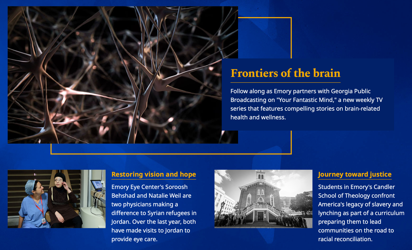
For example, one link from Emory University’s homepage reads, Restoring vision and hope. What does that mean? Hope for what? Vision for the future? The meaning only becomes clear when the text below the link is read. That descriptive text is necessary for the reader to understand that the link leads to information about a program that provides eye care to Syrian refugees.
In contrast, consider the comprehensive links from a page on gov.uk that organizes all important links related to births, deaths, and marriages in the United Kingdom.
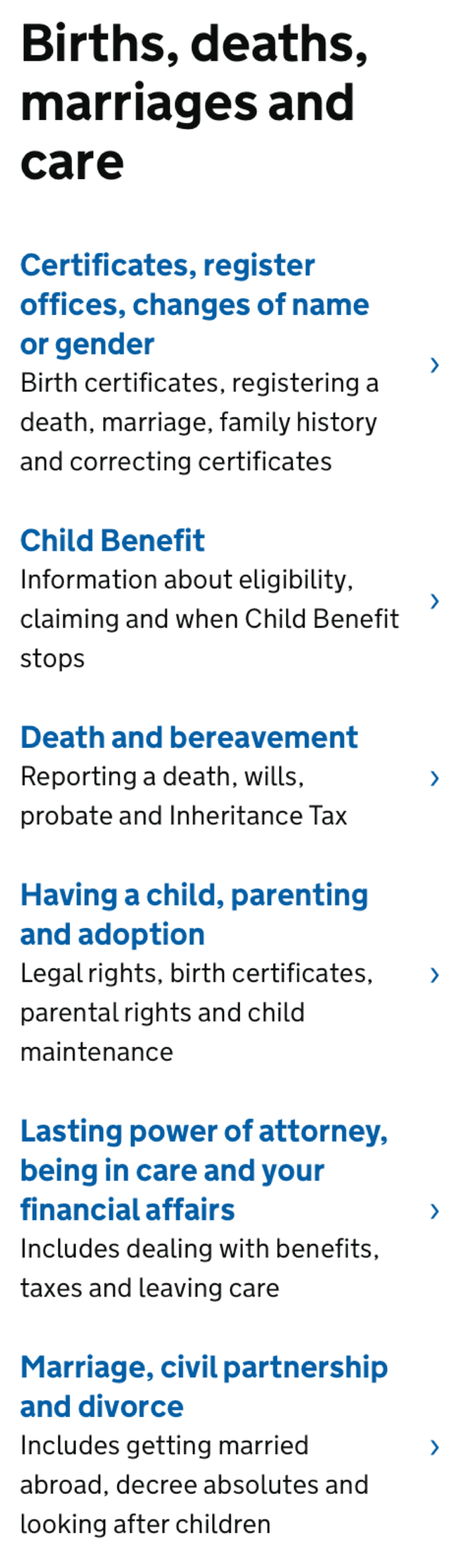
Each link in this list fully contains the most important content that users will find if they select it — for example, Marriage, civil partnership, and divorce. The descriptive text beneath this link is useful, but entirely supplementary: Includes getting married abroad, decree absolutes, and looking after children. The text is useful because it clarifies and expands the range of topics that will be found at that link. However, it is not necessary to read the descriptive text in order to understand where the link will lead.
Succinct
When composing links, don’t waste words. Get to the point as quickly as possible, to increase the likelihood that users will quickly understand the link as they scan and process the page.
Notice that this quality of good links is last in the list. Concision is important, but it must be balanced with the other priorities (specific, sincere, substantial) in link-label writing. There is no maximum word count for links. They can be as long as they need to be to achieve those other three priorities — but no longer than that. Each word included in the link should support those goals.
Consider the links in the uk.gov example above. Some of them, like Lasting power of attorney, being in care, and your financial affairs, are quite long (that one is 11-word long). Despite the length, the links work, because they set concrete, accurate expectations, and can stand alone. In contrast, Learn more is only 2 words, but doesn’t fulfill any of those goals.
The first few words are particularly important due to users’ tendency to scan web pages instead of thoroughly reading every word. To maximize the chance that they will find what they need, frontload links with information-carrying language. Then, the rest of the label text should work to increase users’ understanding if they are persuaded to consider the link and read all of the words. Reading in place has much lower interaction cost than moving to a new context (i.e., clicking through to a new page).
Conclusion
When composing links, remember the 4 Ss. Write specific links that set sincere expectations and fulfill them, that are substantial enough to stand alone while remaining as succinct as possible.


Share this article: