Typography is a key component in almost every digital experience. However, its complexity and industry-specific language makes it a common source of misalignment and confusion. You don’t have to be a typography expert to design digital interfaces, but it’s important to know some of these terms in order to have meaningful conversations with others on your team. Communicating clearly with team members about typography can help teams:
- increase legibility (and therefore usability) of an interface,
- improve visual polish and professional appearance,
- create a more consistent brand identity, and
- cut down on costly revisions and iterations.
Here is a list of terms we have selected based on how commonly they are used in UX design, or how often they are misinterpreted or confused with other terms.
Typeface (also known as font family): a family of letters and characters that are designed to be presented together to form words and numbers
The typeface is the group to which a specific font belongs. Arial, Calibri, and Helvetica are examples of typefaces. The word “typeface” refers to the face of physical letter blocks which printers used to set into printing presses to create publications. A printer would have a vast range of letter blocks in each typeface, and subsets of fonts within that typeface from which to pick.


Some typefaces must be purchased from a type foundry, while others are available in the public domain. When deciding between typefaces for your designs, it is important to consider whether it is web-safe or not. If a typeface is not web-safe, the text may not load as desired, which typically results in the designer creating an image using the desired font (if no concessions are made) in order for the font to appear correctly. This solution can be acceptable for things like logos, but otherwise, text on images cannot be read by screen readers, indexed by search engines, or used in a CTRL+F function, further impeding accessibility, SEO, and usability. Web-safe fonts, on the other hand, make these things possible.
Font: a specific set of distinct, stylized letters within a typeface, such as:
- Garamond Regular, bold, 12px
- Arial, italic, 6px
Font should not be confused with typeface or font family (see below). Although these terms are often used interchangeably, technically, these are not the same. A font describes the specific size, style, and weight of text, which designers can use. A typeface is the group to which a specific font belongs.

Font decoration (also known as text decoration): embellishments to lines of text including overline, underline, and strikethrough text
Font decoration is different from font effect (e.g. shadows), font style (e.g. italics, uppercase), font weight (e.g. thin, bold text), and font width (e.g. narrow, extended).
Font effect: modification which can be made to letters or lines of text in order to increase their prominence
Common modifications include bevels, inlines (borderlines inside the boundaries of each letter), outlines (borderlines outside the boundaries of each letter), and shadows. These are typically applied to word art or to text with a very large display size (like titles or headings).
Font style: the specific variant of a typeface’s appearance (e.g. the “Roman” of the typeface “Times New Roman”)
Some examples include: case (uppercase, lowercase, small caps) and skew (roman, italic). This is often separate from font weight, font width, and font size (see below). The font style is often identified within the font name.
Serif: the small hook-like element, which resembles a foot, found on the end of lines in some typefaces
A serif font is a font in which the letters have serifs on the ends of the lines on each letter.
Sans-serif: without serif or any extra elements at the bottom of the letter
A sans-serif font’s letters do not have serifs.
Before the digital age, serif fonts were deemed more legible, and easier to read than sans-serif ones, but in modern days, sans-serif fonts have comparable and sometimes better legibility, especially on digital screens. (The issue was that the serifs didn’t render nicely on low-resolution screens, but this problem is happily behind us on modern computers and mobile phones.)
These two styles of font also have an impact on the tone of a website. Sans serif fonts can often carry the following connotations: modern, hip, cold, and impersonal; while serif fonts may carry the following connotations: traditional, warm, expensive, and old fashioned. That said, this can vary, depending on the typeface.

Font weights: the thickness of the lines in each letter
Some examples include: thin, ultrathin, light, regular, medium, semibold, bold, extra bold, black, and ultrablack.
Font width: the width of each letter, as determined by the widest point of the outermost lines of that letter (not to be confused with font weight, see above), or kerning — see below)
Examples include: condensed, extra condensed, narrow, extended, ultraextended, and expanded.
Font widths may be specified within the font’s name, but not always. For example, Helvetica Neue Thin is more condensed by nature than Helvetica Neue Regular, however, the word “condensed” is not in the name. On the other hand, type foundries may purposefully condense a font for stylistic purposes. For example, Helvetica Neue Condensed Bold has the same font weight as Helvetica Neue Bold, but is explicitly and noticeably condensed.

Hanging Indent: when the first line of text in a paragraph has a leftmost margin that is further to the left than that of the lines in the paragraph that follows
A hanging indent is often used to help make key phrases or terms prominent and can sometimes aid in scanning lists. These definitions are examples of hanging indents.
Letter Spacing (also known as tracking): the space between the widest points of each character, not to be confused with kerning (see below), which is often applied to the entire word, line, or paragraph.
Kerning: the negative horizontal space between consecutive characters, often applied to a specific group of letters.
Sometimes, it may be referred to as the “breathing room” between letters. There is usually an automatic or standard spacing associated with each typeface, however, this may be altered to achieve a visually-balanced appearance.

Leading (also known as line height or line spacing): the negative vertical space between text lines, measured baseline to baseline
The baseline is the base of each letter not including downstrokes (such as those seen in lowercase ‘p’ and ‘q’).

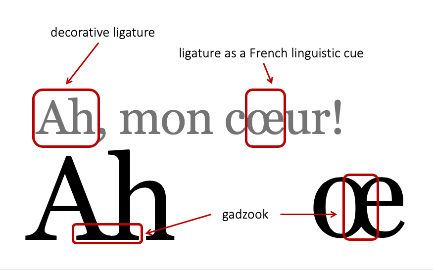
Ligature: two or more letters touching to form a single character;
A ligature might be a decorative choice for branding or aesthetics purposes or a cue for linguistics purposes.
Gadzook: the decoration or adornment which connects the two letters of a ligature


Orphan: a very short line of text (usually a single word) appearing on its own line after a line break

To avoid orphans, consider inserting a line break, and not a paragraph break (see below) earlier in the sentence so that the word does not “live alone,” on the line so to speak. It is better to have more than two words on the last line, if possible, for a more comfortable, visually balanced appearance.
Line break: a point in a block of text which designates the end of one line of text and the beginning of the next line; not to be confused with paragraph break (see below)
Line breaks are often found in HTML as the tag <br/> to a “soft” enter/return on the keyboard.
Paragraph break: a point in a block of text which designates the end of one paragraph and the beginning of another, often including a larger vertical space between the two paragraphs than what between the lines of text within a paragraph
Paragraph breaks are often written in HTML as the tag <p> </p> to indicate a “hard” enter/return on the keyboard.

Conclusion
Typography terms can seem obscure, but they don’t have to be. Share this cheat sheet (and our other cheat sheet on Visual Design Terms) with your team to help demystify these terms and enable clear and informed discussions. Better communication leads to better discussions, iterations, and ultimately, better design implementation overall.
Resources
Fast Company: What’s the difference between a font and a typeface? (link)
Canva: A beautifully illustrated glossary of typographic terms you should know (link)


Share this article: