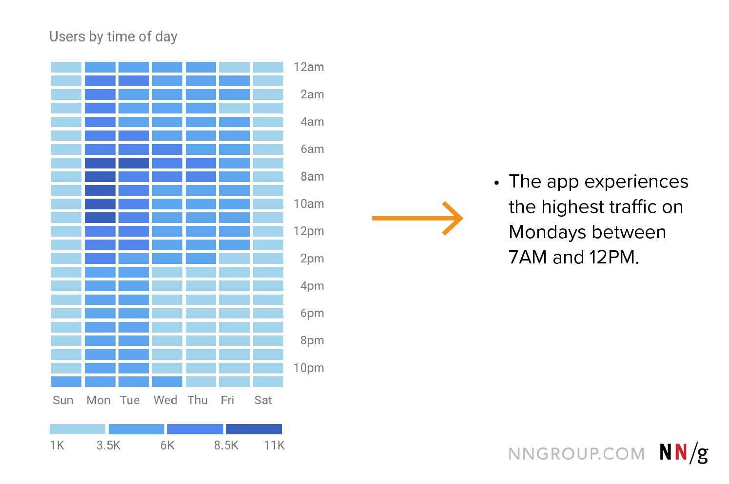
You’ve run your research, collected your findings, now how do you present them to others? Researchers love data — facts, figures, quotes, and charts are what we thrive on. However, our stakeholders and team members are not always as drawn to this data as we are, so it’s our job to make hard facts compelling for others in our organization. Storytelling can accomplish that purpose.
Turning an overwhelming amount of data into a cohesive and engaging story can be difficult. This article discusses a 5-step process for turning data into compelling stories.
Step 1: Do the Research
We’re not in the business of making up fairytales, and, therefore, our stories should be based on real data collected from research. The research you conduct should originate in solid questions. These questions are a great starting point for your stories. For example, consider the following research questions for a hypothetical app selling cat supplies:
How do people research, purchase, and use cat furniture?
What are the pain points and areas of frustration that our customers currently experience when researching, purchasing, and using cat furniture?
What additional products are our customers using that we do not currently offer?
Once your research questions are established, you can start collecting data. Revisit your research plan, where you originally laid out the scope of your research and defined your research questions. Review any notes you took during initial meetings with stakeholders and remind yourself of the important business questions that were brought up.
The story that you’ll end up telling is not about the research itself, but about the answers to your research questions. While the methodology behind the research is interesting to us as researchers, the insights you collect are the most compelling to stakeholders and team members.
Using the cat-supply app from above, we could frame our research as a story in the following way:
We know based on analytics and user interviews that customers are looking for unique and functional ways to provide cat furniture in their homes. What we didn’t know was how they approach the buying process and ultimately end up choosing the best product to fit their needs. We decided to conduct research into this process by interviewing and observing our customers and deciphering analytics data from our app’s product pages and shopping-cart flows.
This is only the beginning of our story, but this setup will remind our stakeholders why we collected this data and what we were hoping to accomplish by gathering it. And because the data will often take us in multiple directions, revisiting the original research questions will keep us on track.
Step 2: Create a List of Research Findings
Now that you’ve conducted research, lay out all of the findings in a list. Your data will come in many forms — quotes, analytics, survey responses, and so on. It’s helpful to think of this data as bullet points. Some of your data may already be in bullet-point form, but other data may be in the form of charts and visuals. Keep these various visuals to use as evidence in your final report but translate these findings into words in this step.
Step 3: Cluster Your Findings into Themes
A common mistake made by researchers is organizing their deliverable — whether it’s a report or slide deck of findings — in a chronological order that matches what happened in the research study (e.g., findings from task 1, followed by findings from task 2, followed by the results of a survey or interview). When you’re running through your data chronologically, your artifact becomes an account of what participants did in the study instead of a story of the central questions that your audience cares about. Instead, think of the themes of the story along with the research questions you set out to answer. Group the different findings into bigger themes that are coherent with each other or make the same point.
If you come across findings that aren’t related to your original research questions, don’t throw them out. Instead, collect these in a separate category off to the side so you can revisit them later. They may not be directly related to what you set out to discover, but they may still be insightful. Using our cat-app example, you may have originally set out to learn about the furniture buying process, but during your study you find that customers spend a lot of time looking at the user-submitted cat photos. This data can inform future research questions or even take your story in a new direction.
Step 4: Think About What You Left Out
When you clustered your findings into themes in step 3, you may have collected insights that weren’t directly relevant to your research questions in a separate category. This is where you’ll revisit these findings and think about where they belong.
Findings That Invalidate Themes or Are Contradictory
When you’re crafting stories for your audience, it’s important that you don’t purposely omit facts or distort evidence. To maintain your credibility, stick to the data, even if it doesn’t fully support your recommendations or hypotheses.
If the findings contradict your recommendation, it’s likely that you’re going to spend time creating the wrong solution anyway. Moving forward, it’s best to acknowledge the discrepancy and formulate a new research question to learn what’s going on.
Research findings aren’t always straightforward and sometimes you’ll come across contradictory findings. Figure out if there are any possible reasons for that and own that there may be methodology issues behind your studies that led to these inconsistencies. Sometimes the answer may simply be that you don’t know yet or that you need to do more work to find the answer.
Unrelated, but Still Insightful Findings
We don’t have control over all of the different data we’re going to get throughout our research. A user may say something that isn’t directly related to our current research questions, but sparks interest in future research. We may observe behavior that we didn’t anticipate, but is still insightful for the overall project.
Keep track of these findings, whether in a research repository or a knowledge board, so that you can revisit them. You can add these details at the end of your story when you discuss your next steps, which will introduce the next research project to your audience and continue the cycle of research in the organization.
Step 5: Translate Themes into Words
This is where you get to formulate and write your story. Start by writing a one-sentence headline that captures each theme you clustered in the last step. This sentence should be user-focused, emphasizing what they think or do.
Here are some examples of good headlines from our recent User Experience Careers report, contrasted with less-descriptive headlines that are typically used:
|
Descriptive |
Less Descriptive |
|
Most UX Professionals Are Satisfied with Their Careers |
Career Satisfaction |
|
As You Gain More Years in the Field, Satisfaction Increases |
Reasons for Career Satisfaction |
|
UX Practitioners Come from Many Different Backgrounds |
Backgrounds of UX Practitioners |
|
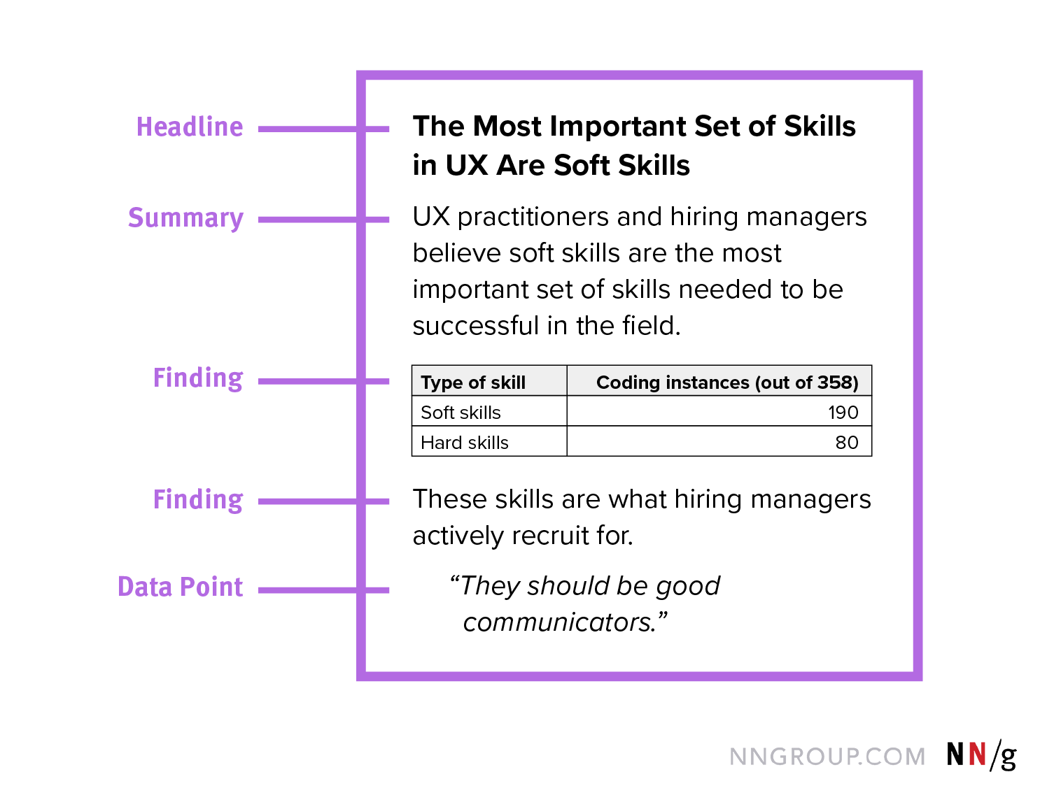
The Most Important Set of Skills in UX Are Soft Skills |
Important Skills in UX |
One of the main benefits of writing descriptive headlines is that your audience — the people consuming your report or slide deck — can still gain insights from scanning a report and only reading the headlines. Good section titles cater to the needs of our audience, one of the six rules of persuasive storytelling, because we can’t assume that our audience will consume every detail (and we should expect that it won’t).
Once you have your headlines, you can write supporting statements about what the data within those headlines indicate.
Let’s look at an example. Let’s assume that one of the themes you identified in your research is the need for style and there are several findings associated with that.
|
Theme |
Findings |
Supporting evidence |
|
Style |
Several users commented that they need a cat tree that matches their décor and looks pretty. |
“I want a cat tree that doesn’t look like a cat tree, does that make sense? It should match the rest of my home’s décor and be stylish.” “So many cat trees are ugly. I wish I could find something that was modern like my furniture.” |
|
|
78% of participants rated ‘furniture style’ as one of the top 3 reasons for shopping on our site. |
Quant survey |
|
|
Products with a high style rating have higher sales. |
Style survey & analytics |
You could have a headline that says:
Shoppers Need Stylish Cat Furniture
Inside that headline, you can document the different findings. Start at the high level and add the full quotes and metrics as evidence to back it up.
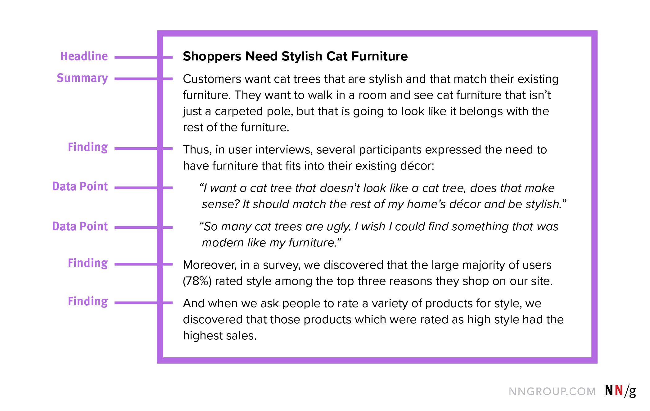
The wording of this paragraph puts the audience — our stakeholders, team members, and so on — into the shoes of users and reminds them that they are not the user.
Continue wordsmithing further until you feel the story is complete. If you were to only read the headlines strung together, you should still understand the story that is being told. If your headlines together don’t tell the full story, reword and rearrange them until they appropriately communicate the top insights.
Each headline will have a summary explanation to back it up, and each paragraph could have one or more findings or data points offered as evidence.
Continue to reorganize sections and sentences as needed to help communicate the story to your audience. Think about what is most compelling to your audience and try to anticipate what they will take away from the findings you’ve collected. You can even think of your audience members as personas to better anticipate their needs and frustrations when it comes to data.
Conclusion
Storytelling with data is difficult to master, but when done effectively, can clearly communicate important information to the right people. Don’t just put all of the data in front of your audience and expect them to come to your conclusion. Take your audience on a journey through the data by using stories.
Learn more in our full-day course on Storytelling to Present UX Work.


Share this article: