Digital-product teams often overestimate the technical abilities and information-seeking skills of their users. In 2016, the OECD found that only one third of adults could successfully complete medium-complexity tasks. To complete these tasks, users had to navigate across pages and between applications. The tasks involved multiple steps, as well as the use of tools and software features (e.g. a sorting functionality) to progress towards the solution. In addition, the activities required inferential reasoning and evaluation of information for relevance.
In other words, the activities were not straightforward. Two-thirds of the study participants could not complete activities at this level of difficulty.
Americans use the internet heavily for complex, research-based activities. In a week-long diary study, we asked participants to report the important activities that they performed online. Twenty-one percent of the online activities reported were categorized as research-based. That type of activity was reported more frequently than any other type of activity (including finding a specific fact, online shopping, selling, etc.)
In our recent Life Online research project, we observed many instances where people struggled to perform complex information-synthesis tasks. Similar to the medium-complexity tasks defined in the OECD study, these research-based activities often required users to locate and synthesize information across various sources and use tools to reach a conclusion. In the study, participants struggled with tasks such as:
- Planning a vacation in Paris
- Finding the best price on a rental car to fit a family of 5
- Identifying the requirements to register for a driver’s license
(These were personal tasks brought to the session by the participants, rather than being assigned by the researchers. They are all perfectly reasonable activities, and completing them shouldn’t require an advanced degree.)
When users struggled to complete their research tasks, it was often due to a website or application’s failure to support those activities. As a consequence, users often turned to Google, looking through multiple sites (and at times, several competitors) before answering their questions or giving up. In some cases, the failure was shared across multiple sites or apps.
At the heart of those failures was a lack of understanding of users’ goals and information needs. In particular, these failures were a result of the website or app providing:
- Insufficient information, or
- Sufficient information, but in the wrong structure or delivery.
Insufficient Information
Some sites failed to fully anticipate their users’ knowledge gaps and provide enough information to fill those gaps. When users need a piece of information that is not provided within their current workflow, they have to go elsewhere to seek answers (for example, by opening a new tab to track down additional detail). In many cases, that missing information derails tasks that would otherwise be completed or makes critical decisions difficult.
Missing Information Causes Task Abandonment
One participant, a graduate student in our Raleigh study, was planning on redoing his backyard. He read a do-it-yourself article about backyard landscaping that involved buying pea gravel.
“Huh,” he said, “How do you even buy pea gravel?” At this point he did a web search for ‘How to buy pea gravel’ and found various shopping results at the top of the page. Seeing wildly variable prices, he asked, “Why is this one so much more expensive?”
On Home Depot’s site, the participant saw that 5 Yards Bulk Pea Gravel was offered for $575. “How much pea gravel do I need?” he wondered aloud. “If you have X amount of pea gravel, how much area will that cover?”
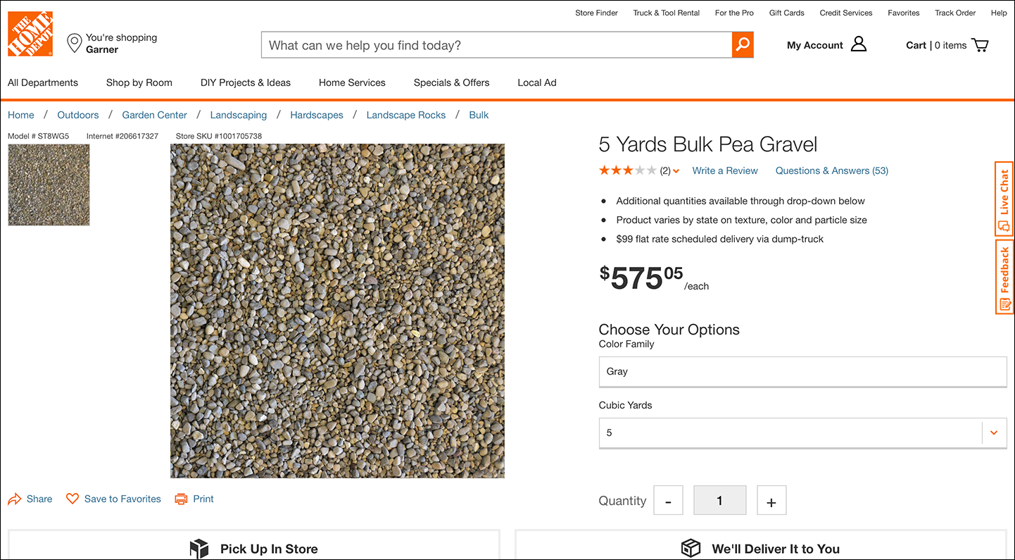
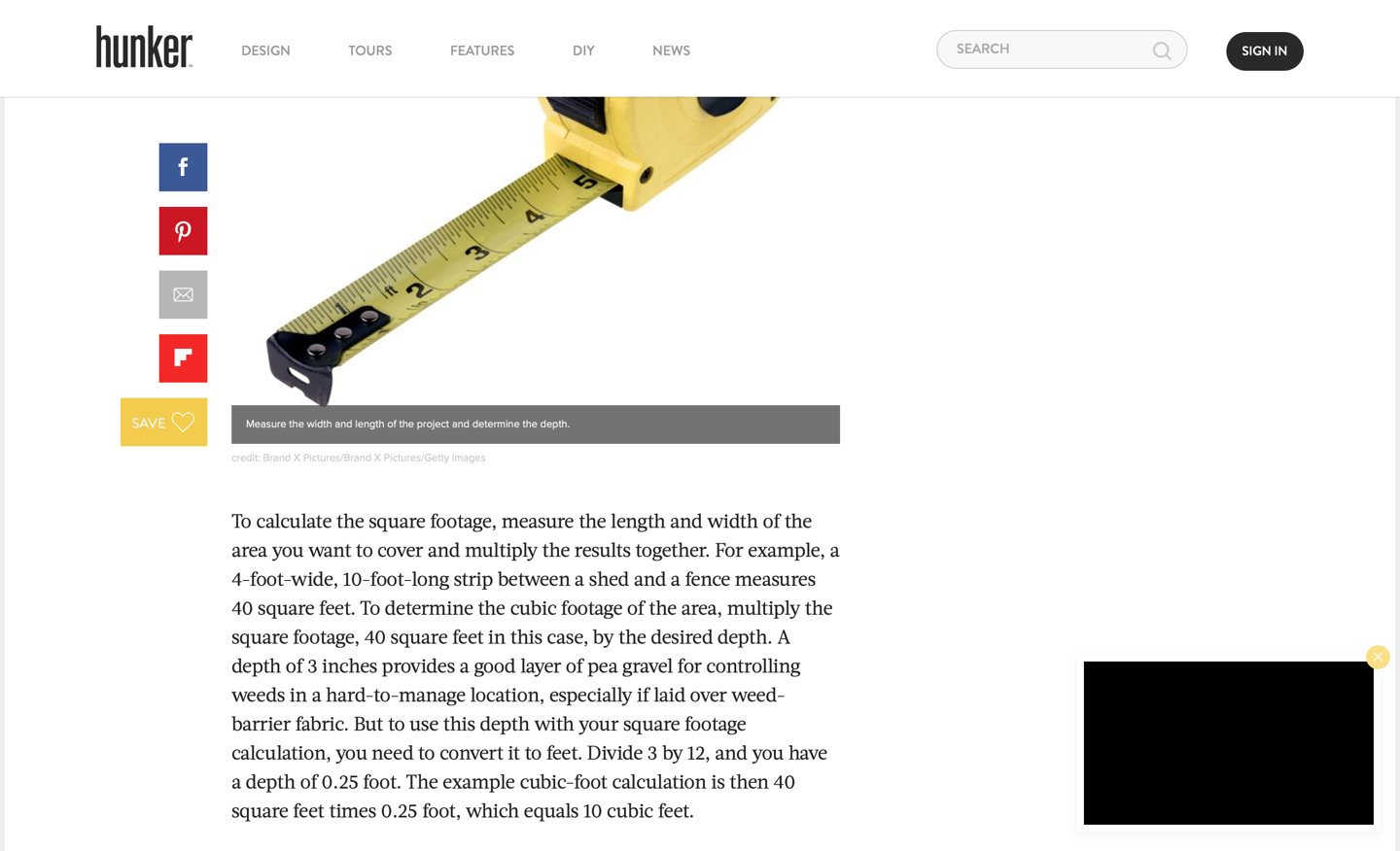
The page didn’t contain any information to help him determine how much gravel he’d need. The participant opened a new tab and kept searching. Eventually he found an article from hunker.com, titled, “How much gravel does 50lb cover?” The article provided instructions for calculating the quantity of gravel needed, but those instructions were confusingly presented in an unformatted paragraph.
Even this highly educated participant struggled to combine the information on Home Depot’s page with that found on other websites to determine the right amount of pea gravel necessary to cover his backyard. Eventually, he ended up on a description page for pea gravel on Walmart.com and he decided to purchase it there.
This instance represented a substantial lost opportunity for Home Depot. If its site had been able to anticipate and answer the user’s question, Home Depot wouldn’t have lost that sale to Walmart. This experience could have also negatively influenced this user’s perception of Home Depot.
Home Depot did in fact offer a calculator tool for this type of information need. Users could input the material, the dimensions of their space, and the desired depth, to find out exactly how much material they’ll need.
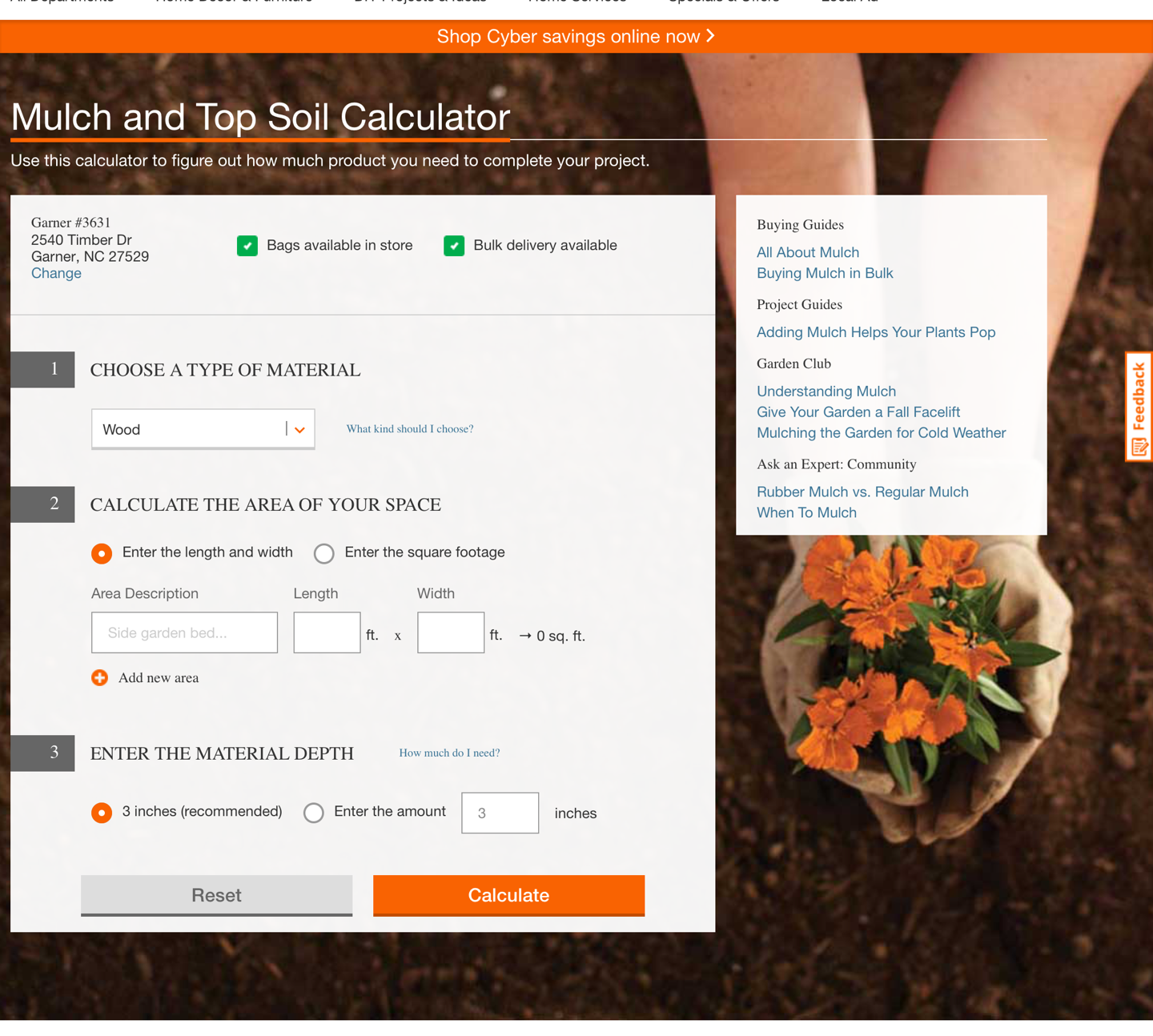
This tool would’ve been exactly what the new homeowner needed to solve his problem. Unfortunately, he never found it. It was not linked to from the gravel detail page — likely because this calculator didn’t have a gravel option for the type of material.
The calculator is an excellent example of understanding what users don’t know, and providing the tools and information to fill in the gaps. Home Depot could’ve simply included a paragraph of explanatory text on the page, or a formula for users to calculate themselves. But an actual calculator tool saves users substantial mental effort. (Too bad it was not available for gravel as well.)
In this case, the missing information (how much is needed for a given area) prevented this user from moving forward in the process (buying pea gravel).
Missing Information Causes Uncertainty in Decisions
We also noticed many instances where users struggled to complete complex tasks because they lacked a critical piece of information that was necessary to make a decision.
A participant in Kansas City was looking into purchasing a ticket to a show at the local theater, the Kauffman Center. She shopped for tickets on the theater’s website, but had a hard time deciding what seat she preferred. The site provided seat maps, but didn’t really answer the user’s core question in this context: What will my view look like from this seat?
Since the site failed to provide that information, the participant turned to Google to try to answer her question, using the following steps.
- She opened a new browser tab and did a Google image search for “Kauffman Center Seating.”
- She looked through the photos of the inside of the auditorium trying to locate an image that seemed to be taken near the area of the seats she was interested in purchasing.
- She then tried to imagine herself sitting in those seats.
She repeated this process for multiple sections of the theater before she felt informed enough to make a selection.
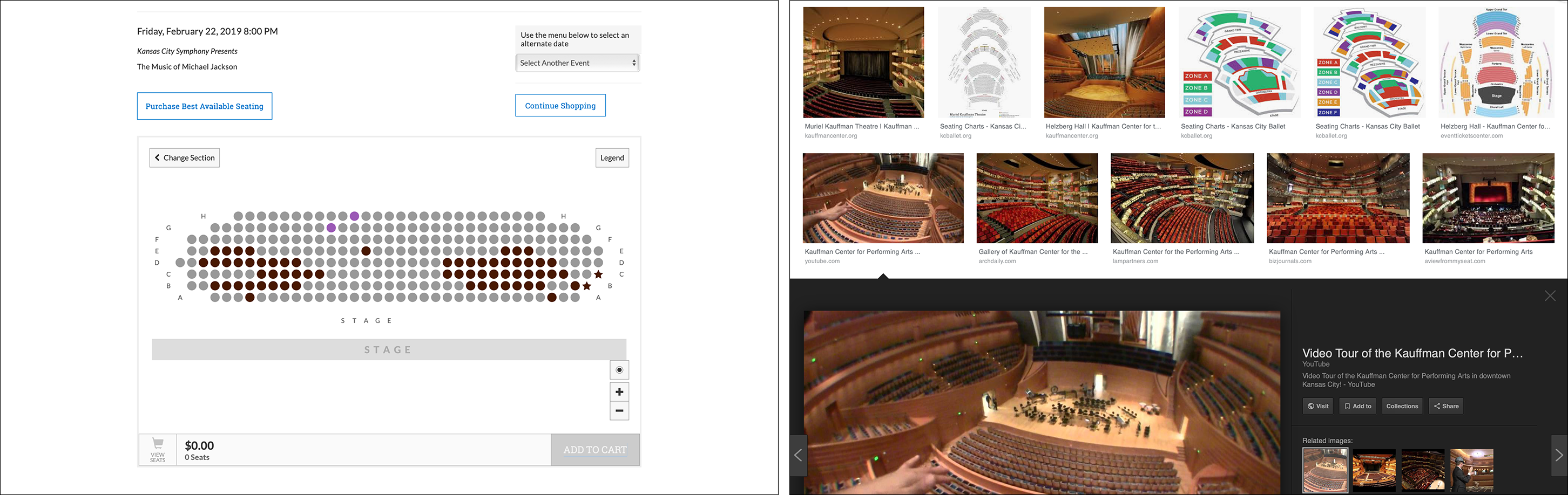
The participant told us, “I wish it would show me what the view was like from my seat. I’ve had that on other sites where I bought tickets, and it helps you know if that’s really the seat you want.”
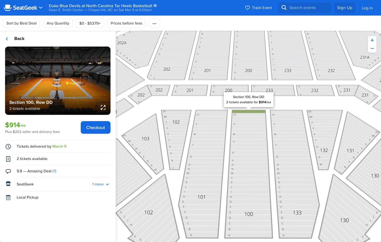
In contrast, SeatGeek did a much better job anticipating the users’ need to understand how the stage will look from the seat they are selecting. The website used a split screen to list, on the left, available seats and the corresponding view and, on the right, the position of those seats in the entire arena.
The SeatGeek tool gave users all necessary context on one page. It did the work for the user by understanding and tying together all the different types of content needed to perform the task. This type of support for information synthesis is particularly important for encouraging decision making and desirable user actions — in this case, buying a ticket.
Right Information, Wrong Delivery
As users research products and services online, they often weigh comparable offerings from various providers. In our research we found that complex research and comparison tasks were frequently unsupported. We observed many instances where customers couldn’t understand the differences between complex offerings. In many of those instances, the necessary information was present on the site. However, it was not structured to support comparison.
Sites provided the details of their products and services, but stopped there — they didn’t have any mechanisms in place to help customers compare offerings and assess differences. In these situations, users were left to find alternative ways to weigh options. Some used digital tools like a spreadsheet to synthesize and compare alternatives, while others reached for pencil and paper. Using these external-memory tools, they would write down the attributes important to them and create a view of items from which they could easily assess differences and make an informed decision.
One participant was shopping for a rental car on Hertz.com. She ran various searches on the website, adjusting rental criteria to see what would give her the best deal. She tried premium SUVs, and regular SUVs. She tried playing with her pickup and dropoff dates to see which selections would give her the most value. Eventually, she found herself forgetting the prices for particular searches, so she began consolidating her search criteria and prices into an email, which she later sent to herself. This type of comparison shopping was not effectively supported by Hertz.
Another user shopped for home-security systems on Simplisafe.com. She struggled to understand which package was right for her. The packages had names like The Haven and The Knox, which were not helpful for understanding differences among them. She went into each detail page to determine what was included in each package.
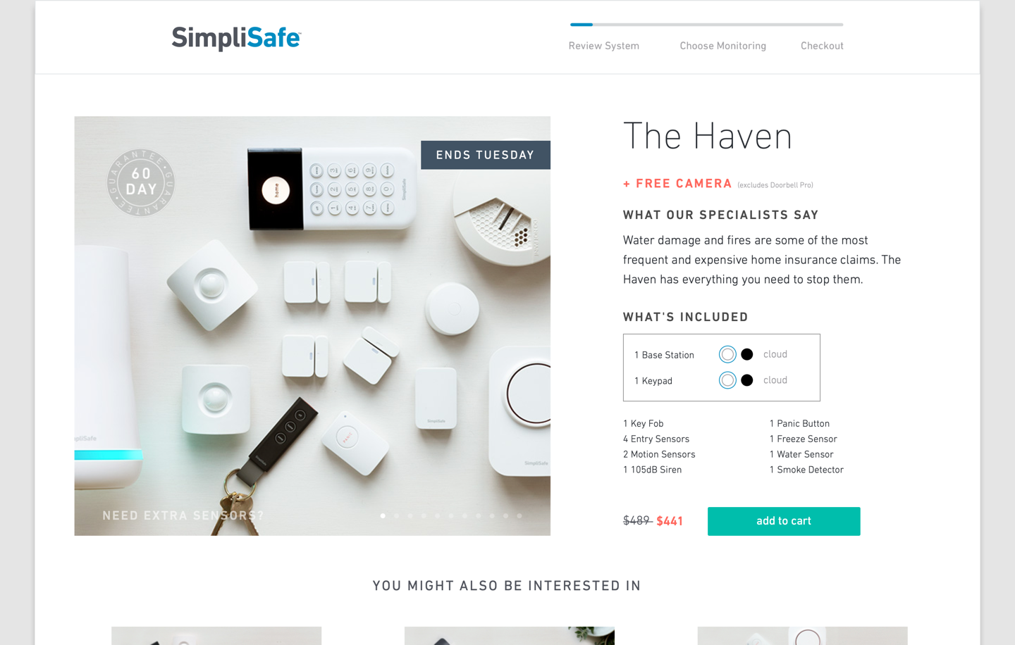
After reading them all, she said “I have no idea which one is which. They all have different amounts of the same parts and pieces.” She went back through the packages and copied the list of package contents into a text document where she could see the differences between them at a glance.
The user did not realize that the images from the listing page were representations of the package contents. The listing items were very large and took up the entire page, so it was not possible to see multiple packages at the same time. A small label in the bottom right corner of the image indicated the number of items included, but it was difficult to see. It’s doubtful that this listing view would have helped her understand the differences between packages anyway. One would have to be very familiar with the product line to identify what these elements are and the difference between them, since they all look very similar. It would have been better if the listing page had enumerated the elements included in each package or if it had provided a comparison table indicating the number of elements in each.
In contrast, ADT (a SimpliSafe competitor) included a straightforward comparison table to help users easily determine the differences between its packages.
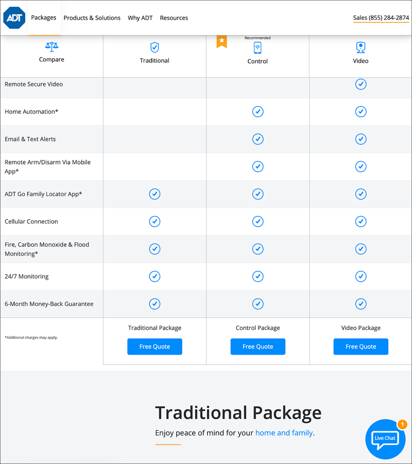
A comparison table is not a complicated, fancy, or unusual feature. It doesn’t require substantial coding to provide. The only reason SimpliSafe didn’t provide one is because the company failed to understand and support the task.
Understand Tasks, Answer Questions
As illustrated in the examples above, we saw serious consequences when sites failed to support users this way. In those situations, users:
- Made mistakes and misunderstood product or service offerings
- Suffered so much mental strain that they had to use external note-taking tools like spreadsheets, email, and paper
- Abandoned sites to find answers elsewhere — sometimes from a competitor
- Felt a lack of control, which negatively influenced their perception of the company and its offerings
Users often preferred a one-stop-shop, self-sufficient type of experience, where a platform enabled them to complete a task (not necessarily just shopping) without requiring additional external sources of information. They appreciated highly integrated experiences that brought together related information and services in one place. One American participant spoke positively about eBay for this reason, saying, “eBay makes it simple when I sell something, I buy the shipping label right through them instead of having to go to the USPS website!”
It is not enough just to put information on your site and let people deal with it on their own. That approach is a fundamental UX failure because it puts an unnecessary burden on users’ organization, memory, research, and synthesis skills. Users must know enough to connect the different pieces together to achieve the task, and, based on what we know from the OECD study above, only one third of users are adequately skilled.
(None of the tasks discussed in this article are truly complex tasks, like the ones required for knowledge-intensive work. Only 5% of the population can perform complex tasks with current user interfaces, so if you need to support such tasks, the usability requirements would increase even further.)
These findings underscore the importance of conducting qualitative research. Some teams rely solely on focused studies like A/B tests and targeted usability testing to address specific features or issues. It’s worth stepping back and investing in field studies and task analysis with your users, to see what you’re missing.
Talking to users and conducting research will help you determine what people don’t know, what their context is, and what decisions they’re trying to make. Only then can you fill in the gaps, provide the right type of information, and support that decision making.
Take the next step. Don’t just address immediate information needs, but help users achieve their true underlying goals. Bring together the right information, in the right format, at the right time. Only then will you be the one-stop-shop users prefer and recommend to their friends.
Reference
OECD (2016), Skills Matter: Further Results from the Survey of Adult Skills, OECD Skills Studies, OECD Publishing, Paris, France.


Share this article: