Many ecommerce websites offer a variety of sales, coupons, or discounts to their customers. In our research for the new fourth edition of the Ecommerce User Experience report series, we evaluated users’ experience with many of these promotions and discounts across a variety of websites.
Shoppers love deals, whether in the form of site-wide sales, select sale items, or coupons. However, for users to be successful using promotions, a website must do two things well: (1) it must communicate these various promotions effectively throughout the site, and (2) it must also make it easy for users to get the deals being communicated. In this article, we will provide a set of guidelines for helping users take advantage of the promotions and apply them to their purchases.
Applying Discounts and Promotions
When it comes to coupons, the easier to apply the better. Not only does this approach make customers happy, but it also prevents them from being disrupted or unnecessarily distracted during checkout.
1. If a discount or coupon code is offered on the site, allow users to automatically apply it by clicking on it.
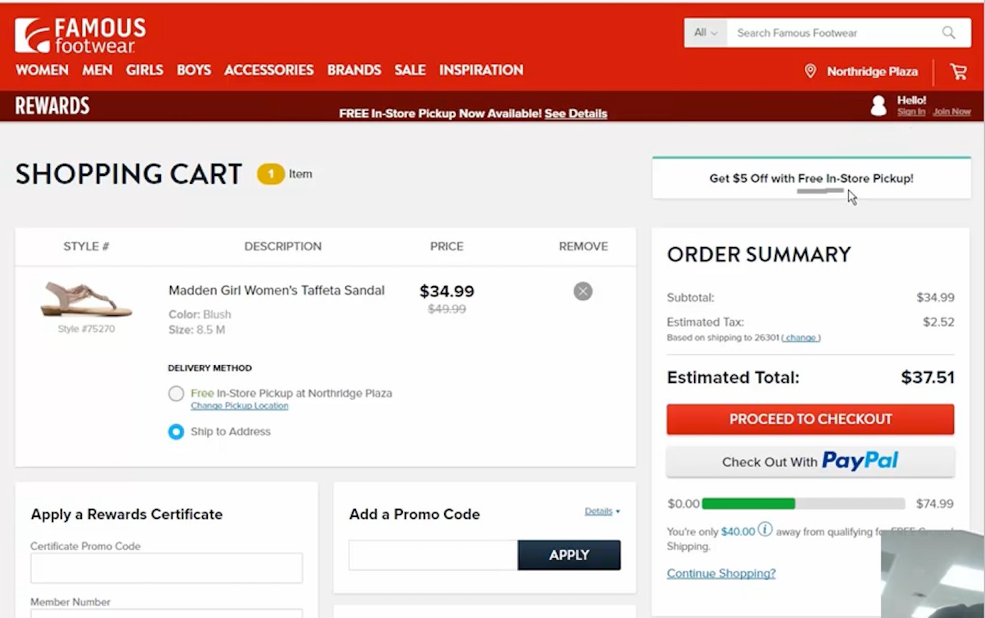
Allow users to interact with discount advertisements to have them automatically applied to their cart. Several users in our studies clicked on banners for discounts, attempting to apply the code to their orders (often unsuccessfully). For example, the shopping cart on Famous Footwear showed a promotional banner that looked like a button. Several users attempted to click it, unsuccessfully.
Sephora.com had numerous Beauty Offers consolidated on one page. This approach allowed users to quickly browse discounts; however, all discounts (and accompanying coupon codes) were (linked) images, not text. So, the coupon code could not be selected and copied — users had to memorize it and apply it in the cart. Further, the image links that accompanied the coupon description did not apply the coupon code for the user, as one might hope. Instead, they linked to full-sized versions of the promoted products (which were not free).

This technique can risk sales, especially in a stage as critical as checkout. Adding discounts in this convoluted way takes longer and can result in an incomplete or lost sale if users decide to spend their valued time elsewhere. Instead of sending users on a quest to find, memorize, and apply coupon codes, use the following techniques:
- Display all offers within the body of the shopping cart page.
- Display and allow users to apply discounts directly by interacting with sitewide banners promoting the offer.
- Let users browse offers within the shopping cart.
- Or, simply apply any applicable codes to the cart for them.
All these tactics will save time and grief (and maybe a sale).
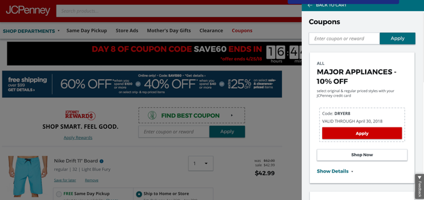
JCPenney was mindful of price-conscious buyers and implemented a Find Best Coupon banner during checkout. Users could click this, and an overlay would appear on the right, showing available coupons. Once users found an appropriate coupon, they could click Apply and the code would be applied automatically. This was a good way to keep users on the checkout page while making it easy to find a good deal.
2. When using discounts as incentive for certain actions, such as signing up for a mailing list, provide the discount immediately.
If codes must be delivered by email, at minimum, send the discount code right away. One user on Old Navy’s site saw that if she signed up for an email newsletter, she’d get a coupon for 10% off her purchase; so, she signed up. She instantly checked her email and the message with the discount code was there. She said, “Now I can spend more!”
While this user did not mind going to her email inbox to retrieve a discount, it can be risky to provide the code by email, because the user will need to navigate away from the site and could get sidetracked or simply get annoyed with the extra work needed to get a discount. Instead, rather than risking a sale, consider automatically applying coupon codes to the shopping cart or immediately providing a message that can be copied or applied with the click of a button. These options decrease users’ effort and keep them on the site. For users who don’t wish to use the offer right away, the email can be used as a long-term reminder of the offer.
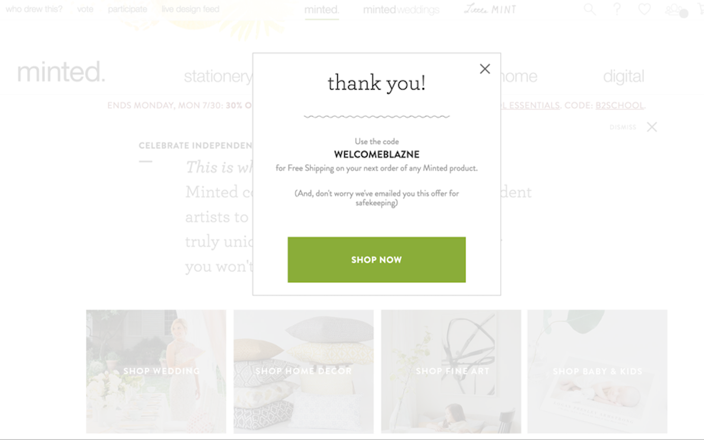
On Minted.com, one study participant appreciated that she got the promotional code right away on the website, as well as in her email. She said, “sometimes they don’t get back to you in time for you to use it for your order, and that is so frustrating… Not that I am an impatient person, but I like to have it so I can put it on this particular order.”
Taking too long to provide a discount is a sure way to lose trust. People will likely want to apply it to a purchase that day, so if it doesn’t come right away, they will feel that their time is not respected. Not to mention that their item of interest might no longer be available when they return with the code.
3. Include coupon-code fields as a core part of both the shopping cart and checkout pages.
Users who had a coupon code on a website wanted to enter them as soon as possible. Provide a clear place for coupon codes in the shopping cart, before the first step in the checkout process. This approach enables people to check that the coupon is valid before they enter any personal information and also allows the total to be updated appropriately early in the process.
It’s also strongly recommended to make promo codes a core part of the checkout process instead of a sidebar item. When promotions are placed in the right rail, they tend to be confused with ads and ignored due to banner blindness.
The Children’s Place had a field for coupon codes in the shopping cart, but its design made it easy to miss. In particular, the field label did not contrast well with the background and was placed below the checkout near other ad-like elements.

The place to provide a coupon code should be easily findable. It should be close to the payment information, hierarchically above or before the checkout button.
An open form field is easier to see than a text link like that on The Children’s Place website. That’s great for those who have a coupon, but not so great for those who don’t. Whether the coupon element should be an open field is situational.
We recommend only providing an open coupon code form field if there will be some sort of valid coupon clearly visible on the website at all times (e.g., through a global promotional banner) — including on the checkout page. Visible deals can mention exclusions — users will understand if their item doesn’t qualify and will continue with the purchase.
In our research, we have seen many ecommerce purchases side-tracked or abandoned by users who did not have a coupon to put in the coupon code field. Providing a coupon field signals to users that there is a deal to be had. If that deal is not readily visible, many users will leave the checkout page to look through the site, or even leave the site in search of a promotion to try. In the process, many shoppers become very anxious, feeling as if they are missing out on savings or are being cheated by the company by being required to pay full price when there was an elusive deal to be had.
Overall, not finding a coupon when an open field is present can significantly deteriorate the experience and the users’ trust in the company — and it’s one more reason to apply coupons automatically.
One user who encountered this issue on Hertz car rental’s website said, “I feel like if there’s a coupon field here I should have a coupon. It tells me there’s a way to get money off, and now I just have to find it so I’m not paying full price if I don’t have to.” She opened another tab and searched Google unsuccessfully for coupon codes.
If using an open field, it should be long enough to accommodate coupon codes used on the site, to ensure that users enter them correctly.
If you must support coupon codes in situations when a coupon may not be available on the site, it’s best not to provide an open text field. A better solution is to provide a text link to expose a text field. This design is less likely to prime users and send them on a coupon quest as many shoppers will not notice it. The tradeoff, of course, is that it’s less findable for those with a coupon code.
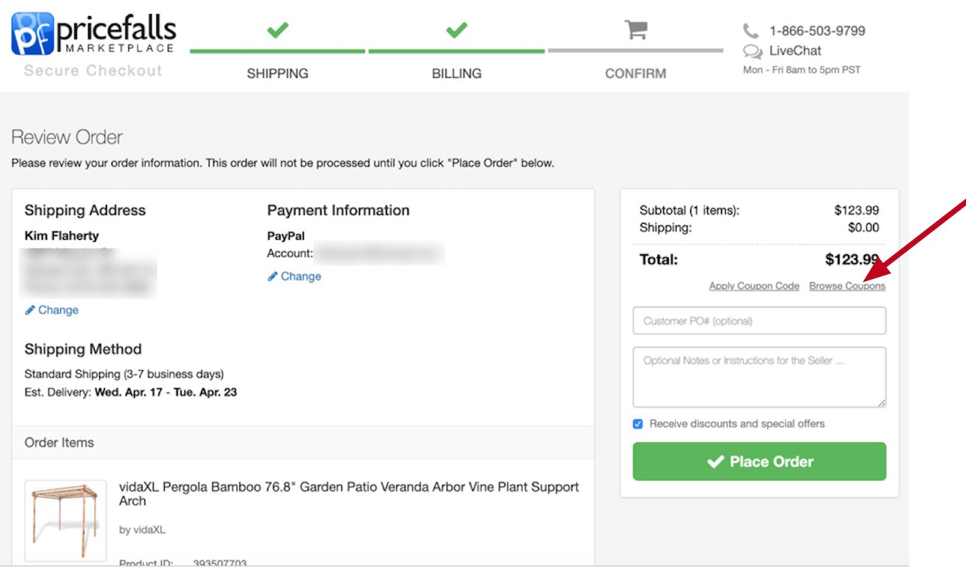
Pricefalls Marketplace used a link to allow users to input coupons if they had one. Interestingly, it also included a Browse Coupons link in the same place. So those who saw the Apply Coupon link and did not have a coupon could easily look through the list of available ones.
Reflecting Discounts Received
4. Show any discounts or special restrictions applied to items in the shopping cart.
It was helpful for users when they could clearly see that the coupon had (or had not) been applied to the individual items in their cart, instead of having to guess whether the price will be updated later or whether the item was not eligible for the promotion. Users were suspicious if discounts were not clearly listed.
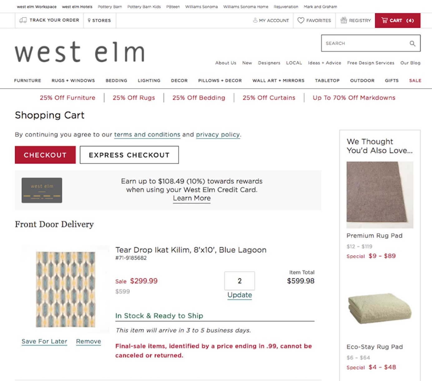
Special restricts on discounted items should also be communicated. For example, on WestElm.com, some sale items could not be returned due to the deep discount applied. This information was displayed in the shopping cart and placed in direct relation to the item in question.
When users don’t see discounted prices reflected in the cart, they may abandon the purchase. A user on Sainsbury’s wanted to take advantage of a 2-for-£6 offer. When she added the items to her cart, the price was listed as £7.50. She said, “They haven’t put it right. They’ve put £7.50. I’d just give up. I hate this site. Everything’s gone wrong. I’ve put 2 and it’s come up as £7.50.”


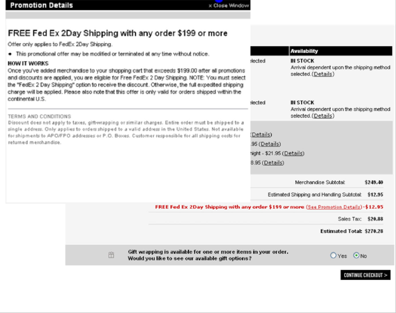
5. Reflect any specials, deals, or discounts in the payment total.
Users wanted to know that they were receiving any advertised specials, deals, or discounts before they entered payment information. Coupon codes should be validated and reflected in the cost before requesting payment information. It is essential that users can see savings and understand how the total is calculated.
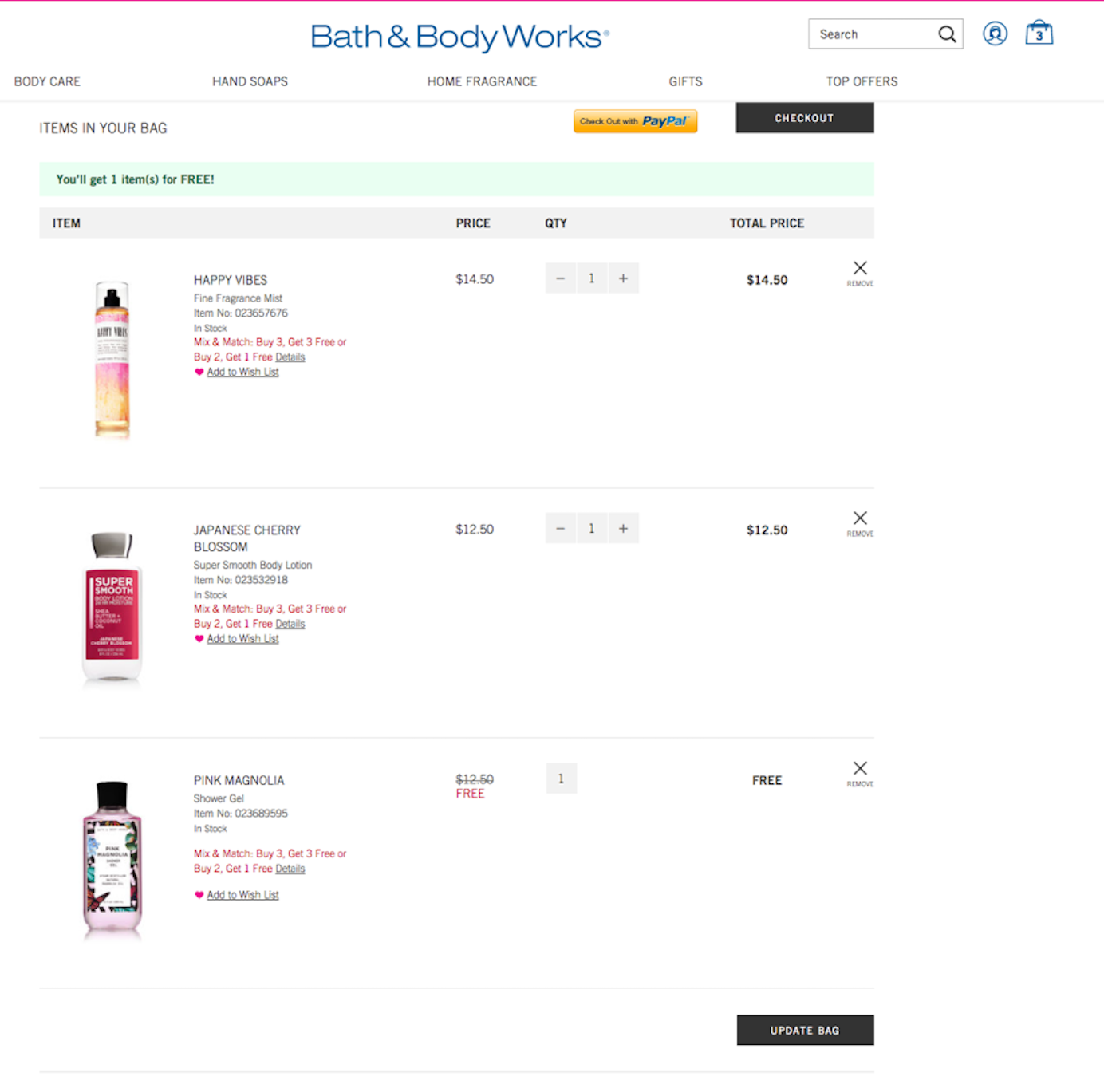
Our study participants often had difficulty understanding what was meant when a charge was listed in a line item and then later subtracted in a separate line item. It was clearer to users if the item was simply listed as free.
Conclusion
It is not enough to post deals and coupons on the site without thinking about how they will be used and applied by your customers. Coupon codes posted on the site should be interactive and easy to apply with one click; those promotions offered to users in response to a specific action (e.g., subscription to the newsletter) should be delivered immediately so people can take advantage of them right away.
The frequency of your promotions and their visibility throughout your site should guide you in deciding whether you should use an open coupon-code field on the checkout page or you should just provide an unobtrusive link for entering the discount code.
Seal the deal and make customers feel confident by clearly showing how the coupon affected the final price or the terms of the purchase before they make their final decision to buy.
Full Report
The 4th edition of our full series on Ecommerce User Experience including 11 volumes of topical design guidelines is now available for download.


Share this article: