In doing research to update our course on Emerging Patterns in Web Design, we looked more closely at what’s happening with search boxes. Many designs are swapping the traditional button labeled “Search” with a magnifying-glass icon without any label. Some even drop the text field entirely, leaving only the icon. Which version is most usable today?
Previous Guidelines About the Search Box
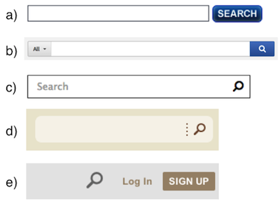
Our guidelines around the search field have remained the same for many years. (See the updated full list of 62 design recommendations for search). Regarding presentation, the main guidelines are:
- Provide an easily identifiable search box in the upper right-hand corner of the page, with an open text-field accompanied by a Search button.
- The search box needs no label. A Search button next to the field identifies the search for the user and tells them how to execute the search.
And yet, some patterns emerging today break these fundamental guidelines. The magnifying-glass icon saves space, so more websites use it. It’s OK to be flexible with previous guidelines, so long as we acknowledge that the users’ needs remain unchanged. People don’t care what the search area looks like: they just want a place where they can quickly go to type in their search query. If design conventions are changing, but still allow users to accomplish that goal easily without slowing them down, then there shouldn’t be a problem. As we’ll see from our findings though, icon-only search has some significant disadvantages.
Adoption of an Icon
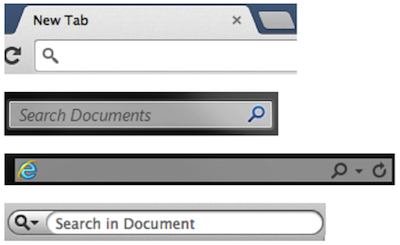
The magnifying glass has become associated with search partly because so many different websites, applications, and operating systems have been using it dependably as a way to find information.
With such consistent implementation, people have learned to recognize this icon more quickly. The icon-only pattern became especially popular with the emergence of responsive design (though good responsive sites show a search box with the icon when transitioning to larger screens).
Findings from Our Recent Research
Our recent user-research findings show that the transition to the search icon is not as smooth and without perils as designers may want. Here are some difficulties that people encounter with this new search-icon pattern.
The magnifying glass alone makes it much harder to locate the search.
When used without an open-entry text field, the icon takes up less space. Visually, it’s less prominent and, therefore, less noticeable. We don’t recommend the icon-only pattern for desktop websites. Icon-only search makes sense on mobile devices, because there’s less screen space and fewer icons and labels in general. But on desktop, there’s more to look at, and thus, it’s easier for the stand-alone search icon to get lost in the crowd.
Users understand the icon enough that, when styled appropriately, spelling out the word “Search” as a label is no longer required.
Most people in our recent studies recognize and understand the function of the magnifying glass. They notice it and associate it with search. If the icon is obvious and has a strong enough affordance that it’s clickable, a separate button labeled “Search” isn’t necessary. Because many users still have the habit of clicking a Search button to submit the query, it’s essential that clicking the magnifying glass submit the query. As an added benefit for sites with international versions, there is no need to translate "Search" when using the icon in place of a button. (However, for accessibility reasons, remember to include the word “search” or its translation as an ALT text for any graphics-only button.)
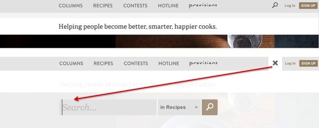
When search is placed in an unexpected location, people need extra help to find it.
People first look to the upper-right corner for search. If they don’t find it there, they start scanning the top of the page. Among sites that had the search icon on the left, those that used a large, empty open-text field fared best with our users. Although people eventually found the search box, they shouldn’t have had to scour the page for it in the first place.
Icon-only search increases the cost of interaction.
A downside to having only an icon for search means that the user has to wait for a search box to appear, find where to start typing, and sometimes click one more time to focus on the input field. These additional steps prolong the search process, where it would have been much faster to simply click in the text field and start typing immediately.
Most other icons still require labels for clarity.
Icon labels help people make decisions faster: they give good information scent about what will come next. Labels should still be used for newer icons, such as the three-line menu (hamburger) icon. The map-marker icon is another icon with a still cloudy meaning and inconsistent use. Sometimes it means current location, or a different particular location, or locations in general, or nearby places.
Users are still learning what these icons mean and how they behave, so it’s best to use a label. Besides, there’s enough room on desktop screens, so why not make it easier and faster for people to find what they’re looking for?
Recommendations for Designing with the Magnifying-Glass Icon
- Above all, retain an open text-entry field next to the icon in the desktop version of a website. It’s also best to retain the text field on tablets. When a site is viewed on small screens (such as those of smartphones and smartwatches), the text box can be hidden until the user touches the magnifying-glass icon. And in each of these cases, there is no need to include a label within the search box.
- Use a schematic icon, the simplest version of the magnifying glass. Fewer graphic details speed up recognition.
 instead of
- Use a large icon with lots of padding. A larger clickable area makes it easier to spot and to click.
 instead of
- Use plenty of contrast so that the icon stands out from the background and from the surrounding elements.
- Place the search tool in the upper-right corner, which is still the first place people expect to find search.
- Let users submit search using the Enter key and by clicking the icon. I mentioned this above, but it’s worth reiterating: many people still have the habit of clicking an actual button to submit search.
- Consider using a growing search box, which expands the text input field on click. This saves screen space while still giving the user enough visual cues to quickly find and execute search. If the box is a fixed size, we recommend making the text-entry area at least 27 characters wide, so people can easily see their queries and correct spelling without having to scroll the text in the box.

Top: Search box before clicking the text field. Bottom: After clicking, search box expands.
Recommendations 8-11 apply if you are using the icon without the text input field:
- Don’t crowd the surrounding area with other icons that might distract from it. Give search the priority it deserves.

- The reverse of the previous guideline: don’t isolate the search, which can make it just as difficult to find as crowding it.

- When users click on the search icon, display the text-entry field close to that icon. Placing it far away increases the interaction cost for the user by forcing them to find the box before they can start typing. It also goes against the Gestalt law of proximity to show related items far from each other.
- Don’t make people click twice when once (or not at all) will do. In some cases, the user has to first click the icon to open the search box and then click to move the input focus into the search field. One click on the icon should put the cursor in the field, ready for typing. Better yet, expand the search field on hover, with the cursor ready for input.
The Goal is to Help People Find and Execute Search Quickly
If your website uses a magnifying-glass icon instead of a search button on desktop, the recommendations here should help. At NN/g, we’re still using the search button on our website. We have the space, and we have no doubt that people can spot search on our site. We’ll also keep an eye on other emerging patterns regarding search, such as placement on the left, and use of voice command.


Share this article: