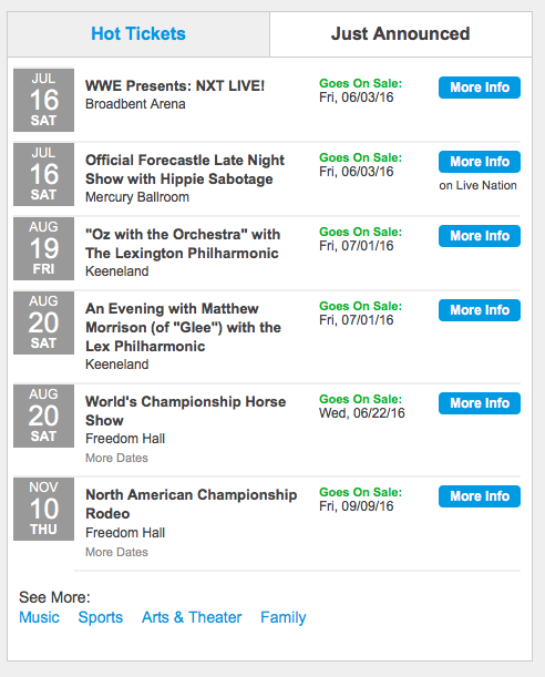
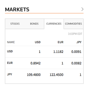
Simplest GUI widgets are the building blocks for most functionality on the web, but it's rare to find sites that use all the dialog controls correctly. Even something as simple as radio buttons and checkboxes are incorrectly used half the time. And let's not even get started on drop-down menus, which are horribly abused. This article talks about another design element that gets frequently misused: tabs.
(Here, I'm talking about in-page tabs, as shown in the several example screenshots below. These are the tabs you might design yourself, as part of your website or web-based application. A different kind of tabs is used as browser chrome to allow users to keep multiple pages open in the browser at the same time. I'm not discussing browser tabs in this article.)
Tab-Usability Guidelines
Here are 12 design guidelines for using tabs:
- Use tabs to alternate between views within the same context, not to navigate to different areas. This is the single most important point, because staying in place while alternating views is the reason we have tabs in the first place.
- Logically chunk the content behind the tabs so users can easily predict what they'll find when they select a given tab. (Card sorting is one option for researching this “mini-IA” problem. If you don't find clearly distinct groupings, then tabs are likely the wrong interface control for managing your content.)
- Use tabs only when users don't need to see content from multiple tabs simultaneously. If people do need to compare the info behind different tabs, then having to switch back and forth puts an added burden on their short-term memory, increases cognitive load and interaction cost, and lowers usability compared to a design that puts everything on one big page.
- Design tabs that are parallel in nature. If the tabs are significantly dissimilar, users will interpret them as site navigation.

- Highlight the currently selected tab. Make sure that the highlighting is prominent enough so people can tell which tab is selected.

In addition to highlighting, you can mark the current tab by size, a boldfaced label, an icon, or by making it appear to be in front of the other tabs. As shown in the above example, such additional signaling is important if there are only two tabs.
- The unselected tabs should be clearly visible and readable, reminding the user of the additional options. If the nonhighlighted tabs are faded too much into the background, there's a risk that users will never click them and never discover the many hidden features.
- Connect the current tab to the content area, just as if you were shuffling several physical index cards with tabs stuck to them. This emphasizes which panel is being shown, and also tells users which tab is selected when there are only 2 tabs.

- Write short tab labels and use plain language, rather than made-up terms. Tab labels should usually be 1–2 words. Short labels are more scannable; if you need longer labels, it’s a sign that the choices are too complicated for a tab control.
- Do not use ALL CAPS for tab labels. ALL CAPS is rarely a good idea because it's harder to read. Readability doesn't matter so much for single, short words, but — as guideline #20 for homepage usability states — you should pick one capitalization style (be it sentence-case or title-style capitalization) and stick to it.
- Stick to only one row of tabs. Multiple rows create jumping UI elements, which destroy spatial memory and thus make it impossible for users to remember which tabs they've already visited. Also, multiple rows are a sure symptom of excessive complexity: If you need more tabs than will fit in a single row, you must simplify your design.
- Place the row of tabs on top of the tab panel — not on the sides or the bottom, where users often overlook them.
The scope controlled by the tabs should be obvious from the visual design. Metaphorically, using tabs is like leafing through index cards in a drawer of an old-fashioned card catalog, so users must be able to tell at a glance what constitutes an "index card" (i.e., tab panel).

- Tabs should all look and work the same. Consistency is important in GUI control design because it builds the user’s feeling of mastery over the interface in several ways:
- Recognizability. When something always looks the same, you know what to look for and you know what it is when you find it.
- Predictability. When something always works the same way, you know what will happen when you act on it.
- Empowerment. When you can rely on your past knowledge of all the available features, you can easily compose a set of actions to achieve your goal.
- Efficiency. There's no need to spend time learning something new or worrying about the effect of inconsistent features.
Conclusion
Tabs may seem like a humble and uninteresting aspect of graphical user-interface design. But as shown here, there are many specific design issues in creating tabs that work well, are easy to use, and support an empowering user experience.
Tab-design problems are a common finding when using analytics for a UX health check. Assuming that you’re tracking within-page actions, you may find that users rarely use the tabs on certain pages. Check if you’re violating any of the guidelines in this article. If yes, you probably have the culprit, and you can be a hero by doing a quick A/B test that will often show twice the use of tabs redesigned to be compliant.
If you follow the design guidelines in this article, users will know how to use your tabs without further exploration or error-prone guessing. This again means that they can devote all their time and brainpower to understanding the content and features that you’re making available under these tabs. Tabs have no value in themselves, but they shine (in terms of meeting UX and business goals) when they don’t draw attention to themselves but facilitate access to the content.


Share this article: