In updating our course on Emerging Patterns in Web Design, I noticed prominent websites (such as Facebook and Google AdWords) taking a similar approach to presenting help content.
The trend has two main components:
- Presenting help content in a small overlay window, similar to a pop-up (except that these overlays are user initiated, which makes them far less jarring and annoying to users than system-initiated pop-ups).
- Offering contextually appropriate, adaptive help, by suggesting help topics based on the user’s situation, typically their current location within the application.
These components aren’t new. Researchers in Human Computer Interaction have studied adaptive help systems since the late 1980s. Microsoft Office products have used small pop-up windows for their help system for years. What is new is that high-influence leaders on the web have adopted them. As we’ve seen with the magnifying-glass icon and flat design, when well-known websites and applications begin implementing similar interaction patterns, other sites inevitably begin to copy them. It may be only a matter of time before we see other websites explore this method of presenting help content. (Of course, designers should never copy another pattern without first examining whether it will work for their own context — or whether it works at all, for that matter).
Golden Rules for Good Help
Before diving in to the particulars of these approaches, let’s remember that providing help is one of the 10 usability heuristics. Help systems should have 3 essential qualities:
- Available without interfering. Some type of help should be available in every application or website, but it should remain out of the way until users need it. And when they do, it should be easy to find.
- Succinct yet descriptive, in plain language. Help messages should use only as many words as are necessary, in a language that is understandable by lay people. (It’s amazing how many unhelpful help systems simply regurgitate the system’s own language: “checking the foobar checkbox activates the foobar feature.”)
- Unintrusive. It should be easy for users to return their attention to their original task after seeking help.
In this article, we’ll look at the advantages and disadvantages of small overlays and context-sensitive help, and provide recommendations for whether and how to implement them.
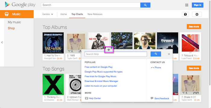
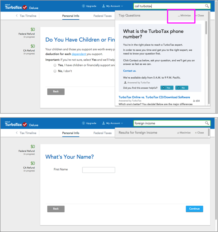
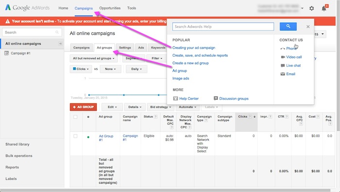
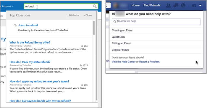
Small Overlay Help Window
Small overlay help windows are useful when more information than what can fit in a tooltip is needed, but not enough to warrant switching the users’ attention a full page.
Less annoying than a pop-up
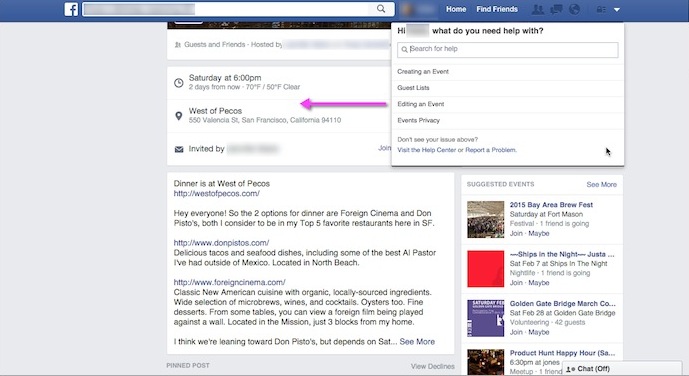
The help overlays presented here are nonmodal pop-up windows. They open within the browser window and allow users to interact with the main screen while they are open. The biggest difference between these overlays and the traditional pop-up, is that these are user initiated. Because the user sought the help out, the appearance of the window doesn’t provoke the same feelings of surprise and annoyance that unsolicited pop-up windows do.
Keeps users in the same place
One advantage to presenting help information on the same page with the main content is that people don’t have to leave their current location to go look at help This supports rule #3 above, because it requires minimal context switching and makes it easy for people to continue where they left off (Compare this to the real world: it’s easier if someone from tech support comes to your desk to help you fix a problem, than if you have to leave your office and walk over to the IT department to find help.)
Side-by-side guidance
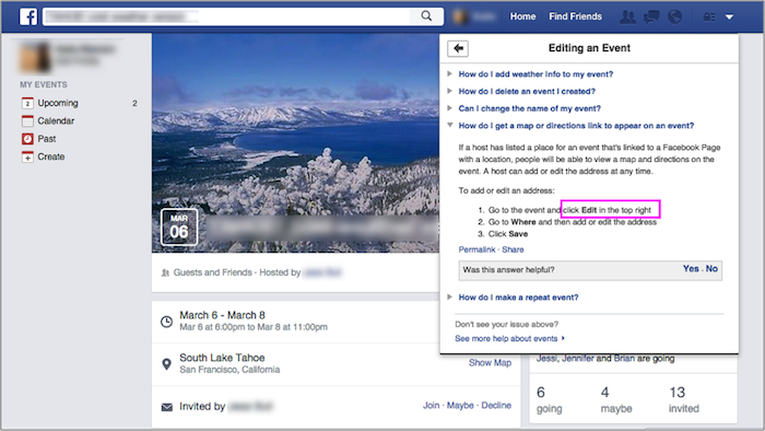
For step-by-step instructions, or guidance related to specific parts of the interface, it’s much easier for users to switch their gaze from the help window to the main area, than it is to toggle between pages. Help information presented on a separate page strains users’ short-term memory, as they must recall what they read in order to apply that information when they return to their work area.
Blocks important areas of the screen
Compared to opening a new page, or a pop-up window that takes up 3/4 of the screen, these small overlays do leave a lot of screen space visible. However, depending on the interface, there may be elements that users need to access, but get hidden by the window.
- Recommendation: Give users greater control over the window display, by letting them minimize, close, or move the window. This function is particularly important for applications and dashboards, which are more likely to have tools spread throughout the screen.
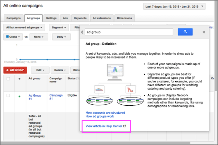
Cursory explanations
The size constraint of a small overlay window can be an effective way to ensure help documentation is succinct and to the point (following rule #2 above). For simple questions and answers, such as finding a phone number, a small window is all that’s needed. However, for more complex questions, some users need more context and greater detail than what’s offered in concise summaries. Advanced users often prefer full-page help knowledge bases, where there is room to more fully explain a feature.
- Recommendation: Include a link to view more information on a help page.
Adaptive Help
Adaptive or contextual help systems offer suggestions to users based on their recent actions or location within the application. Also called intelligent help systems, they present context-sensitive information. The simplest example of contextual help is the tooltip.
Anticipating user questions can make it faster to find answers
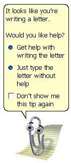
Microsoft’s Clippy was poorly received, in part because it appeared without the users’ direct request. Like pop-up windows, the animation surprised and annoyed users who hadn’t wanted help (violating rule #1 at the top of this article). But the intent was good: anticipate the user need and offer a shortcut to related information. Tooltips do this well, because they explain a specific UI element when the user hovers, clicks, or taps on it.
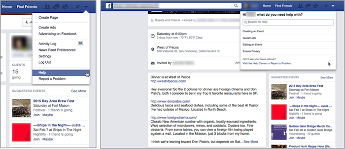
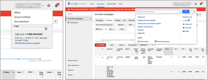
Help systems like those used by Google AdWords and Facebook offer links to deeper help content that is related to the users’ current situation. These links, when they correctly predict users’ needs, can shortcut the path to the information, similar to the way mega menus in navigation do.
Systems cannot predict everything, and users know it
If the system suggests topics that users aren’t interested in, they will quickly learn to disregard those suggestions. (The other reason that Clippy failed was because it was bad at predicting users’ problems). Even systems that manage to be highly accurate in their predictions face a tough battle. They must fight against what people have learned from other help systems they’ve used in the past, which is that the system has no idea what people want. For that reason, many users don’t bother looking through suggested topics, because they assume that the suggestions won’t answer their question.
- Recommendation: Only use an intelligent help system if it has a high accuracy in predicting user goals. (For designers looking to copy this trend, remember that the companies using these systems typically have substantially larger budgets to develop and maintain them than most companies).
- Recommendation: The suggested help topics should be scannable and front-loaded with keywords. Users will be more inclined to give any suggested topics a chance if they are easy to skim.
- Recommendation: Retain the search field within the help windows as an alternative way for users to find what they’re looking for. Also offer a link to the full help center, as advanced users may find it faster to skip over the suggestions entirely and may prefer to browse for answers instead.
Conclusion
Implementing the two help-related trends described in this article should not be done without careful consideration for time and budget. If an interface requires more help than will fit in tooltips or inline text, consider small help overlays as a supplement to a full knowledge base. This way, most users’ can get their simple and frequent questions answered, without being taken out of context and to a separate help page. For most companies, the cost of developing an intelligent adaptive help system far outweighs the benefits to the user. Most of the time, that budget can be better spent on usability tests and improvements to the interface itself.


Share this article: