We recently ran a usability study in the U.K. where one user was attempting the following task: "Does Siemens have any special deals on washing machines?"
Without much trouble, the user arrived at this homepage for Siemens Appliances in the U.K.:
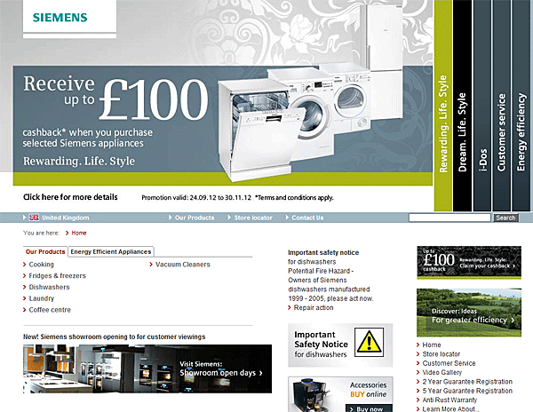
What do you think? Could the user answer the question? Given that the biggest item on the homepage — in both screen space and font size — is an offer of £100 off "selected Siemens appliances" next to a large photo of a washing machine, you would think so. For good measure, the same offer is featured in a small promotion tile in the right margin.
Nonetheless, the design failed for this user task. After an extended visit to the website — including much time scrutinizing this homepage — the user gave up and assumed that Siemens didn't have any special deals for her. (Her concluding comment? "I wouldn't choose [a Siemens appliance] unless I was very rich." )
Small Promo Box: Ignored
We can easily dismiss the small promotion on the right. We don't even need a test to know that most users will ignore this design element for three reasons:
- Banner blindness: This was the most important problem. The promotion looks so much like an ad that users are bound to ignore it.
- Location: Most user attention focuses on the left side of web pages. Placement in the right column drastically reduces the number of users who will see the item.
- Terrible ad copy: The wording is user-repelling. Yes, there's a nice big "£100" attention grabber, but the main copy is "Rewarding.Life.Style." Even if users do look (unlikely), few will click the box. This is content-free content to at least 99% of humans outside Siemens' marketing department. (Granted, I never wrote a column about the guideline that copywriting should make sense, but I thought it was self-evident. For an analysis of an often-tortured writing genre, see my discussion of taglines.)
Big Carousel-Like Accordion: Ignored
As the above screenshot shows, the page's big box has two points against it: it uses fancy formatting (which is often ignored), and it looks somewhat like a banner.
However, to identify the real conversion killer, you need one more clue that can't be deduced from a static screenshot:
- The box looks like an accordion, but it acts more like a carousel because it auto-rotates to show a new panel every 5 seconds.
Deadly. Accordions and carousels should show a new panel only when users ask for it. Otherwise, it should stand still and let users read the information in peace, without having the rug yanked from under them. As our user said about the Siemens big rotating box: "I didn't have time to read it. It keeps flashing too quickly."
Auto-forwarding causes many usability problems:
- Moving UI elements usually reduce accessibility, particularly for users with motor skill issues who have difficulty clicking something before it's taken away.
- Low-literacy users often don't have enough time to read the information before it's removed.
- International users also read more slowly if your site is not in their native language, and thus they won't be able to understand a panel if it's displayed only briefly.
- Single-item visibility is reduced by having to take turns being on display. The probability that users will spot the item they want is drastically reduced when only one thing is displayed at any given time; in the Siemens example, the discount deal is visible only 20% of the time.
- It's just plain annoying for users to lose control of the user interface when things move around of their own accord.
- Most important, because it moves, users automatically assume that it might be an advertisement, which makes them more likely to ignore it.
In my example, the user didn't see the £100 offer during her initial review of the top of the page. She then scrolled down a bit, and never saw the full box during her remaining time on the homepage.
The big box's dysfunctional design is further impaired by an even worse use of content-free content than the small box. In the accordion, the meaningless phrase Rewarding.Life.Style is used as the link text for the button to show the discount offer.
Although worthless word count is always wasteful, given how little people read on a website, it's downright disastrous to use worthless words for a link. Information scent is one of the main determinants of successful navigation: people only click links that (a) make sense and (b) describe something they want.
This example design is flawed in so many ways, but the worst offense is probably in making something move that should be static. It's sad to think that extra money was wasted on jazzing up this design with harmful moving features, rather than just creating simple content that clearly communicates the company's value proposition.


Share this article: