Universities that prioritize a good user experience leverage the website to contribute to larger institutional goals and see a clear return on investment. Based on our usability testing, the guidelines in this article can substantially improve the user experience on most college and university sites. The sad conclusion from our research is that most of these sites rank far below the usability levels expected on today's Internet.
User Research
In preparation for our report on university websites, we tested 57 university sites with 33 users (aged 16 to 68) in the United States, Canada, UK, and Taiwan. We recruited prospective students, both undergraduate and graduate, as well as parents of prospective students, and we asked them to perform exploratory tasks like, “Imagine a teacher recommended that you look at [University]. Browse the website and see if it might be a good option,” and more directed tasks like, “Find out how much it costs to attend [University].” We selected some universities for testing, but we also asked users to do any of their own pending tasks for schools of their choosing.
Why should universities care about usability? Aren't students smart and computer savvy? Well, even though you want high-IQ applicants, prospective undergraduate students haven't received the benefits of a college education yet and often have fairly poor research skills. Although they know how to use computers, they are not always great at advanced strategies like query reformulation, and they are often perplexed by insider language filled with terms and concepts that they haven't encountered yet.
In any case, it's an empirical fact derived from observing many prospective students using many university sites that these users are often frustrated or thwarted by the frequent usability problems on university sites. The best university websites speak clearly, even to yet-to-be students, and make it easy for everybody to find what they want. The rest fail.
Design Guidelines
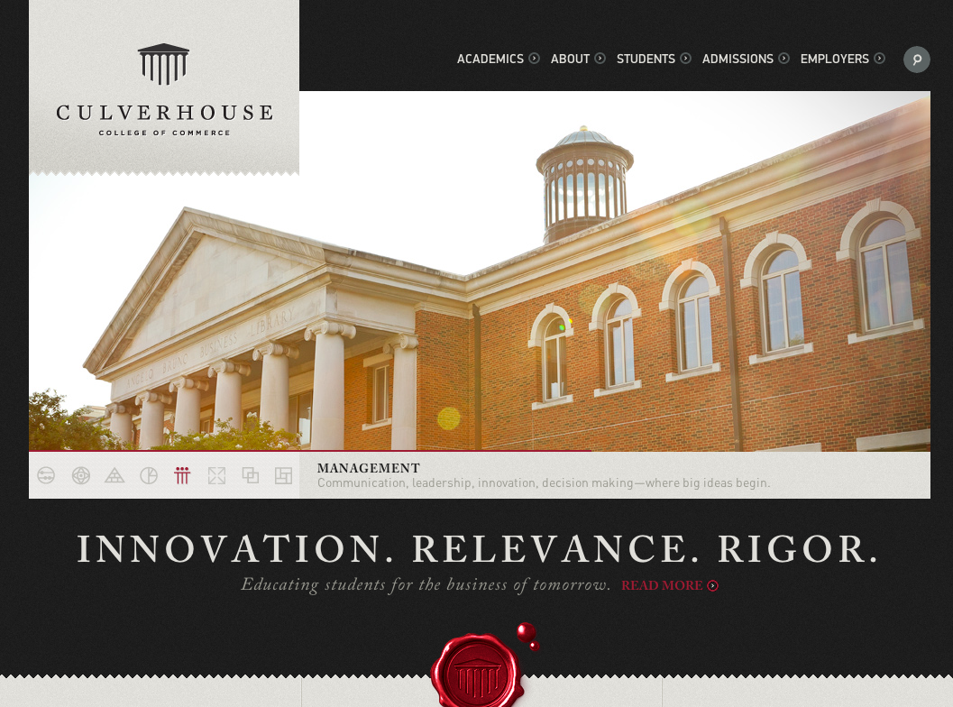
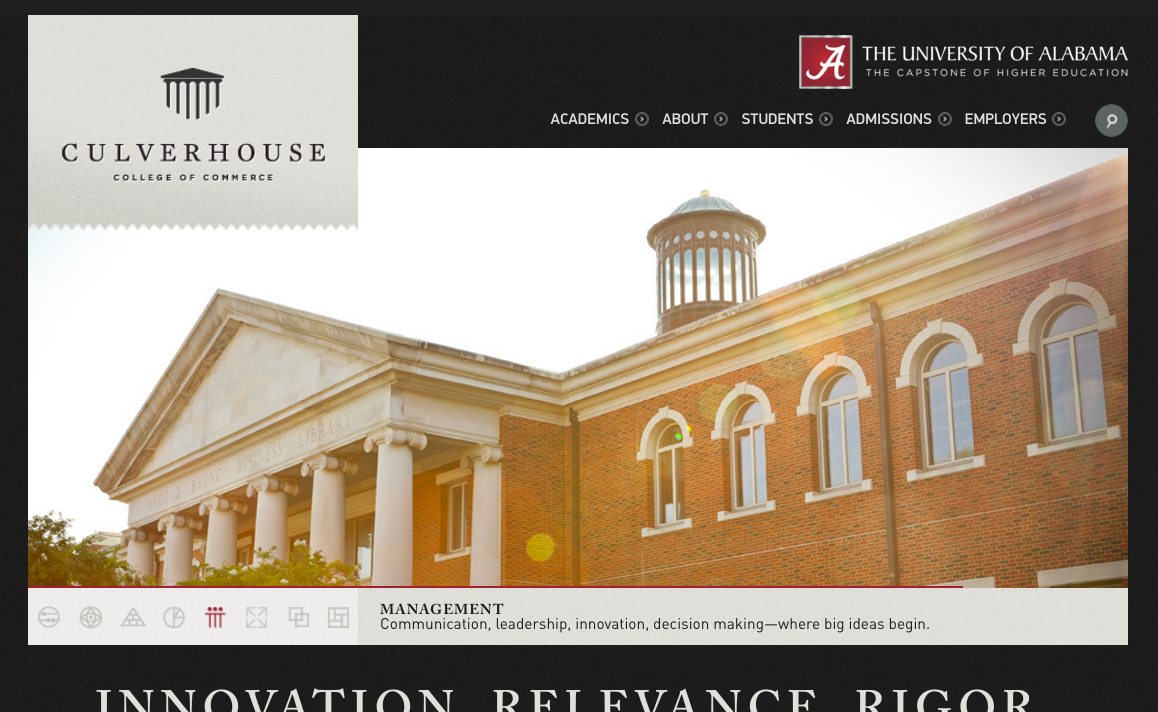
1. Clearly identify your university on every page
The name of your college or university should be clearly visible on every page. Remember, not everyone arrives at your website from the homepage; many will arrive on internal pages via search. For subsites and microsites especially, it is essential that users know which university they’re looking at. Although it might be obvious to you that the College of Commerce is a part of your university, not everyone will know that. By having your full university name shown prominently on each site (i.e., not just in the footer), you make it easy for users to identify you. As an added benefit, this can also help strengthen the brand association with individual department pages and subsites.
2. Use images that reflect your university’s values and priorities
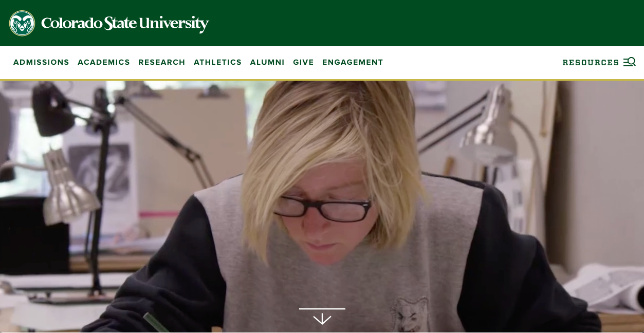
Visitors make value judgments about your school based on the images that you use. A few photos of sporting events: users see an emphasis on athletics. A video gallery with thumbnails of people that all look the same: users see a lack of diversity. When selecting images, be conscious of what each one communicates individually and as part of the whole. Users can tell the difference between genuine photos and stock images. Stock photos often elicit responses about the school being generic, bland, or showing little effort. In contrast, users appreciate images that look authentic and representative of what it’s like to be at your school. In one of our studies, a user stopped mid-task to comment on the images: “Visually, it seems like it’s not about taking your money. You’re going to get a degree, and you’re going to be proud of it. I see a lot of smiling faces, people that love what they’re doing.” Mission accomplished.
3. Make your About Us page count
The About Us page is one of the top places where prospective students go to decide if a university is a good fit for them. Unfortunately, this area is a missed opportunity on many university sites, with too much content that is dull, uninformative, and feels like generic marketese. Universities aren’t alone in having subsatisfactory About Us pages (in our study of About Us pages, the average satisfaction rating was 4.6 on a scale of 1–7), but that’s no excuse. Improve this page by leading with an informative summary of your school. Write this summary in plain language, and offer an easy-to-scan fact list. If you really want to make an impact, showcase a video that will give a sense of your school and will appeal to a broad range of users.
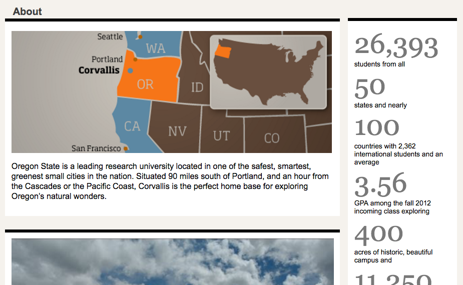
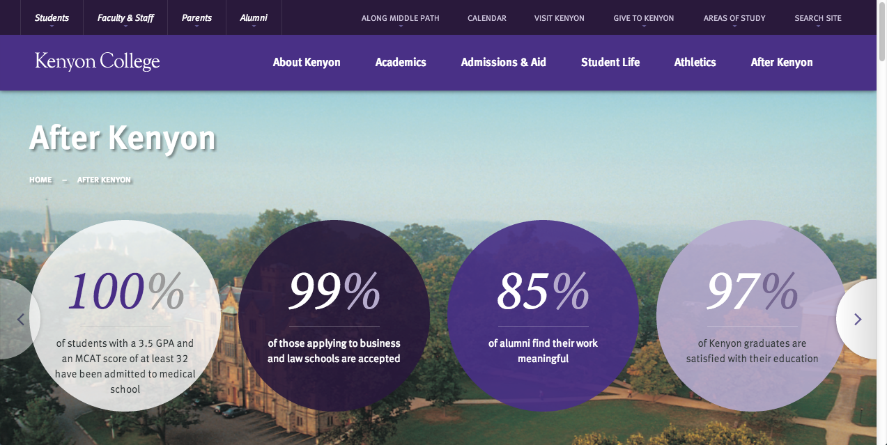
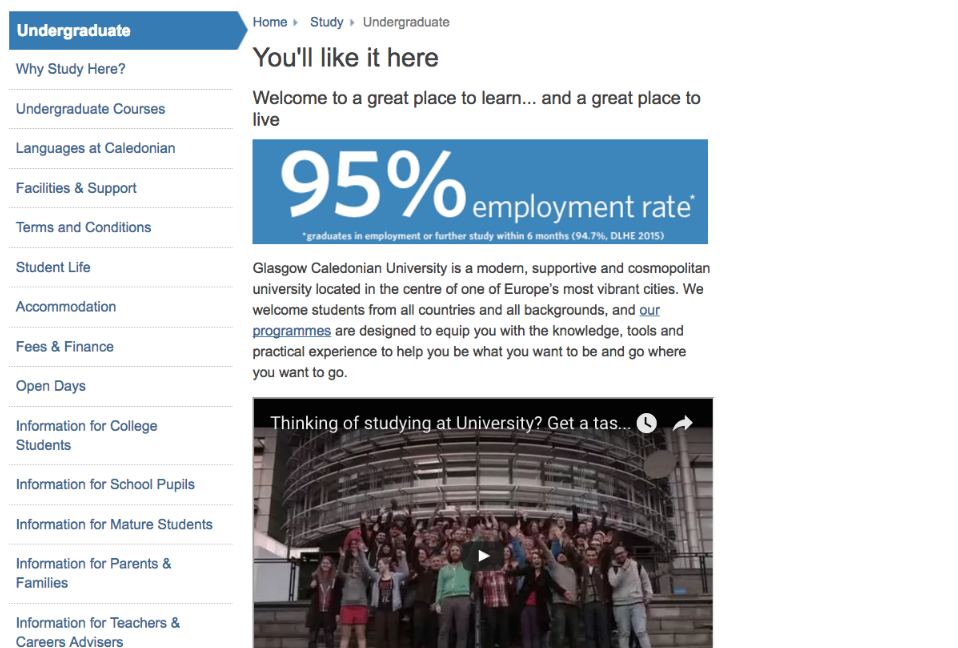
4. Emphasize your strengths and achievements
When first looking at new university, visitors want to know why your school is special and what you’re proud of as an institution. Gather those statistics, rankings, and awards, and make them easy to find (for example, on your About Us page). We know that users scan pages; they rarely read full text. So, don’t bury valuable, potentially persuasive, data in long, dense paragraphs. Walls of text won't work well on the main website, on individual school websites, or on department websites.
When confronted with a dense descriptive paragraph on a department page, a participant commented: “There are too many words above the ranking. Why don’t you just put that information on the top of the page?” Since information that is above the fold has a lower interaction cost, that is a good place to start. But rankings could be lower down, as long as they are easy to see when scanning the page.
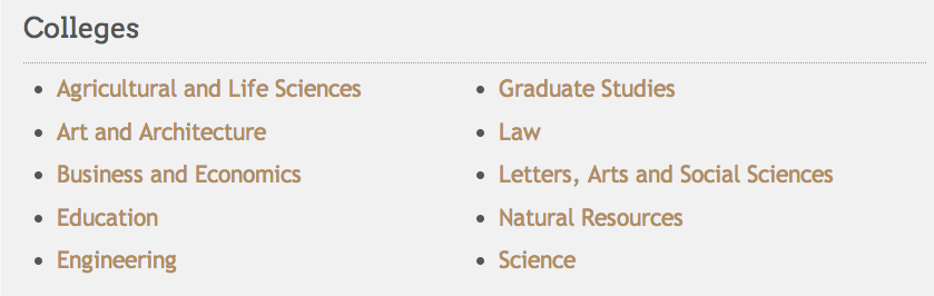
5. Make it easy for users to view a list of majors and programs
Prospective students look for majors and programs, not schools or colleges. In our research, a staggering 48% of users didn’t realize that the university offered the program that they were looking for even when it did. A reason was that people didn’t know which degrees belonged to which school — when they didn’t find a program where they expected it to be, they assumed it simply wasn’t offered. Instead of forcing users to guess where their program of interest is, offer the option to view all the majors and programs. For universities with lots of programs, group them by field or school, but make sure the degree names are visible.
6. Provide information about job placement after graduation, and link to it from the alumni section of the website
When evaluating schools, another top concern for both prospective students and parents is whether the investment in education will pay off after graduation. In our research, the first place where users went to find this information was the Alumni page, which they associated with all things after college. Universities should provide data about what graduates are doing after college, with numbers and sources to support those claims. At the very least, make job placement data available from the university’s About Us, Admissions, and/or Career Center pages, with a link from the Alumni section. If your university doesn’t have this data, start collecting it now, so you can show it off.
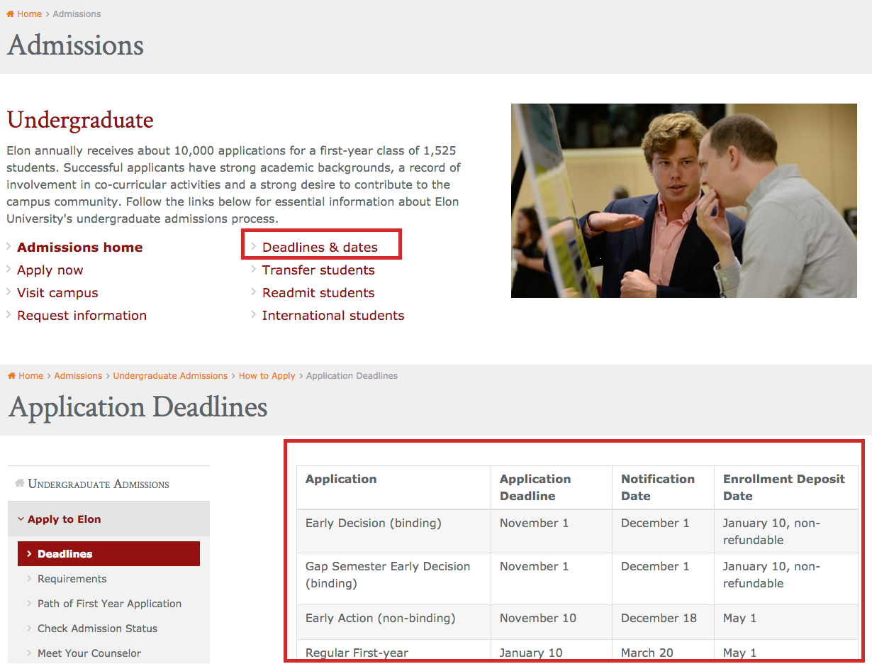
7. Clearly show the application deadlines, and offer a step-by-step description of the application process
Ask a prospective student to find the application deadline and you’re likely to hear them groan with dread. In our research, students frequently complained about how hard it is to find the deadline to apply. Depending on the structure of your site, place the dates in the body of the Admissions or Apply (or equivalent) page. If there are multiple or complicated deadlines, consider a dedicated Deadlines page in that section. Either way, make sure it’s clearly labeled and easy to spot.
8. Follow the user journey: check the main tasks for each of your audiences
Identify the top tasks that you want your users to accomplish and follow the path that they have to take to get there. See if and when they have to leave the global site. See if they are bounced from one office to another in search of a form or procedure. Keep your eyes open. Because university sites are so often large, with each department or office owning its own page and information, it’s common to find duplicate, contradictory, missing, or incomplete information. Follow the journey, starting at different entry points, and see what you learn. If you’re already using personas, test them out. Better yet, do some quick user testing. (Testing doesn’t have to be expensive. And, by testing with just 5 users, you can uncover 85% of the issues).
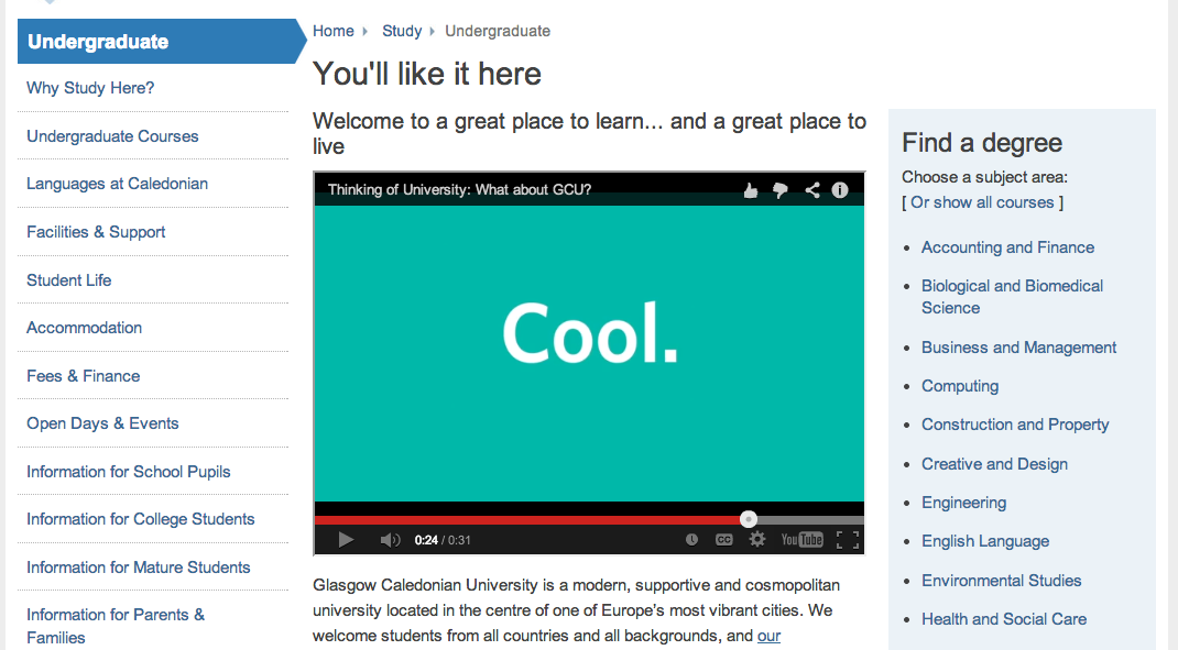
9. Beware the perils of making your website cool
Contrary to what you may think, teenagers and college-aged students don’t always appreciate a hip language or interaction. Students are conscious of the high costs of education; many will go into debt. They take that very seriously, and they want you to do the same. Using clever labels or flashy interactions that lack in substance isn’t fun: it’s superficial and a waste of your users’ energy. Concentrate on offering age-appropriate content that’s clear and easy to use. A great way to appeal to young adults and speak their language is to let your own students do the talking. Content created by students for students can be more conversational, engaging, and authentic. As a bonus, you also send the message that you trust your students and value their insights, which is inherently pretty cool.

10. Be prepared for users to search for information about your university on external sites
“Off-university websites have better information. I would just use Google.” – Usability study participant
“I’m thinking that a book might be easier to look that question up. Like, a book on college websites. These college websites are always so complex. See, when my head starts spinning like this, this is where I would go and ask Google.” – Usability study participant
When visitors to your site can’t find what they’re looking for, they quickly grow impatient and look to external sites for help. Teenagers, whose research skills aren’t yet fully developed, are especially quick to turn to an external search to find what they’re looking for. For example, they’ll use college-aggregator sites that give an overview of your school. They are also sensitive to marketing language and skeptical of content that feels generic or like a sales pitch. They may crowdsource the information by searching for answers from other students on popular question-and-answer forums. A robust internal search engine can mitigate this behavior, but, where possible, you should also make sure that the information on those external sites is accurate and up to date.
Conclusion
We know universities face large organizational challenges, including limited budgets and dauntingly large sites that can be hard to manage. But these guidelines are all things you can assess and improve starting today.
For more guidelines on how to improve university websites, check out our University Websites report containing 78 guidelines for improving higher-education websites and 177 screenshots from 109 universities in 10 countries, each with explanations of what works or doesn’t work, and why.
(An earlier version of this article was originally published January 19, 2014. The article was last updated and revised on April 24, 2016.)
On-Demand Course
University Website UX Essentials: Top High-Impact Usability Improvements for Higher-Ed Websites (one-hour online course).


Share this article: