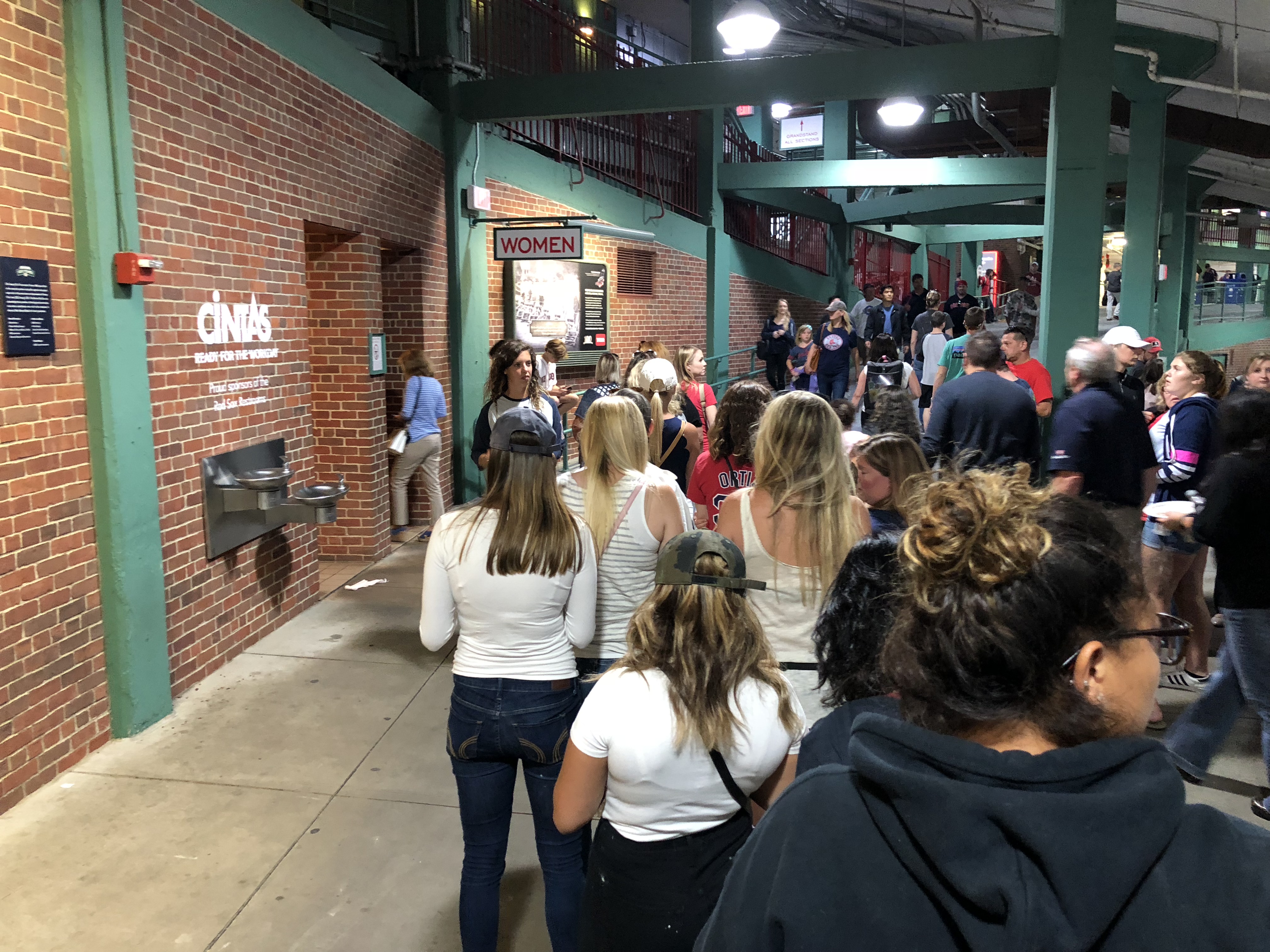
There’s an urgent need to improve the user experience of public restrooms. I address this unrefined topic because I am uncomfortable with the persistent delays at any well-attended venue — be it an opera hall, a baseball stadium, or a trendy restaurant — and I know that you are, too. The fault for the familiar line of squirming women (and sometimes men) does not belong to the users. While some common myths used to justify this sorry situation (like fixing makeup, tending to multiple biological issues, or wearing cumbersome clothing like jumpsuits) may occasionally be true, the three main reasons behind inordinate wait times for bathroom stalls are all related to user experience:
- Unusable toilet-paper dispensers
- Hidden or difficult toilet-flushing controls
- Poor communication of the stalls’ status
1. Unusable Toilet-Paper Dispensers
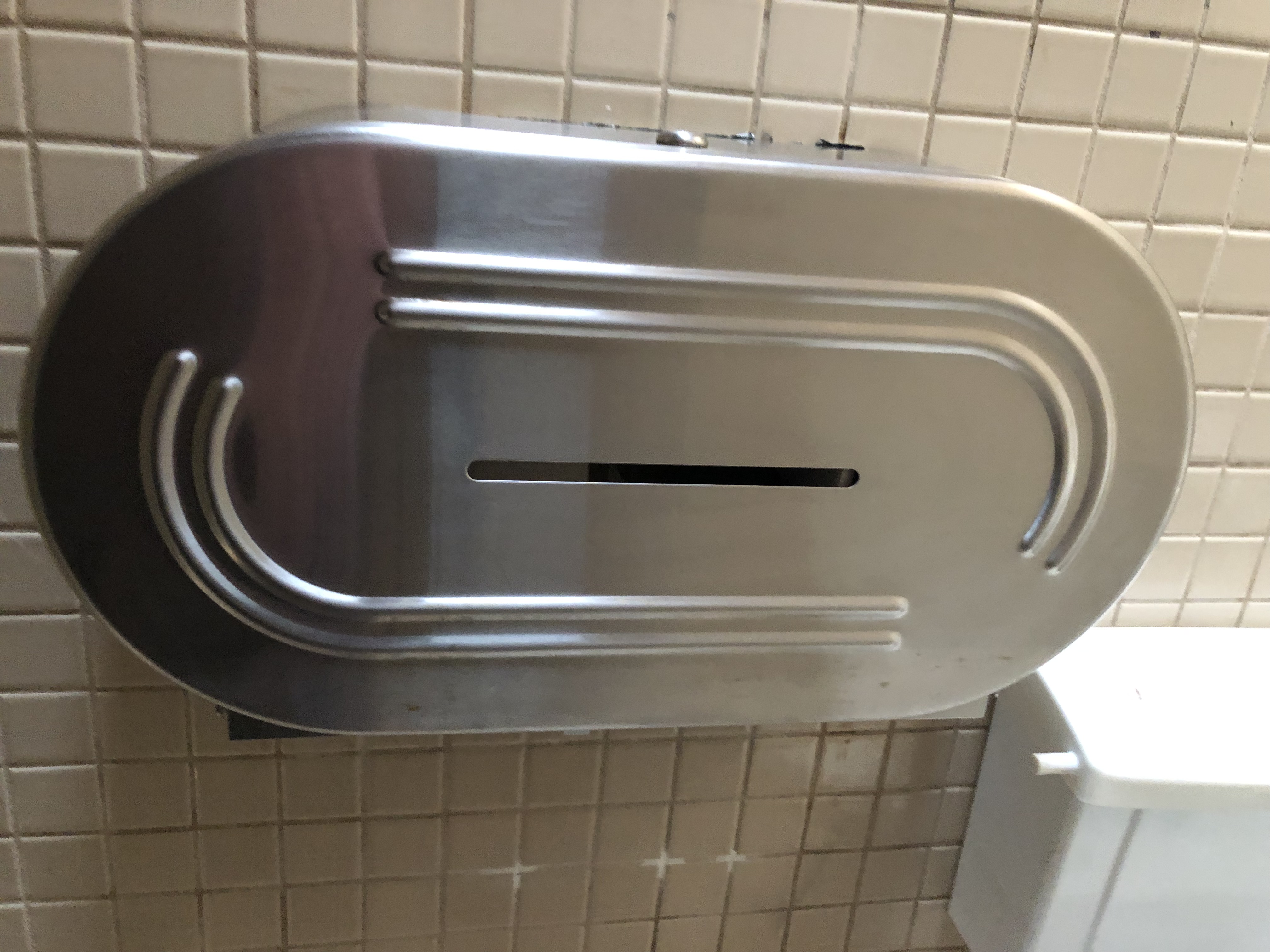
I am 100% sure that the people who design commercial toilet-paper dispensers don’t communicate with those who design the commercial rolls of toilet paper that go into these dispensers. Both types of designers do in fact share one common quality: no concept of physics. Most toilet-paper rolls are large and heavy, but the paper on those rolls is thin and weak. Using it is like trying to tow a Volkswagen with a string of dental floss: the paper rips before the roll will spool an inch.
To attain enough paper, users must be contortionists and wedge their hand up in the dispenser, pinpoint the end, and very gingerly and slowly persuade it forward. In the process, time passes and waste in the form of piles of torn paper bits accumulate on the floor.
Additionally, many of these huge toilet-paper dispensers hold two rolls, but they don’t let users see which roll has been started. So, people spend time searching blindly with their hands to find the current, moving roll. Related, it can be difficult to see when there is no paper available at all on any of the rolls, resulting in wasted time and uncomfortable situations. (Think Elaine on Seinfeld asking her neighbor to “spare a square”.)
Recommendations to Remedy the Issues
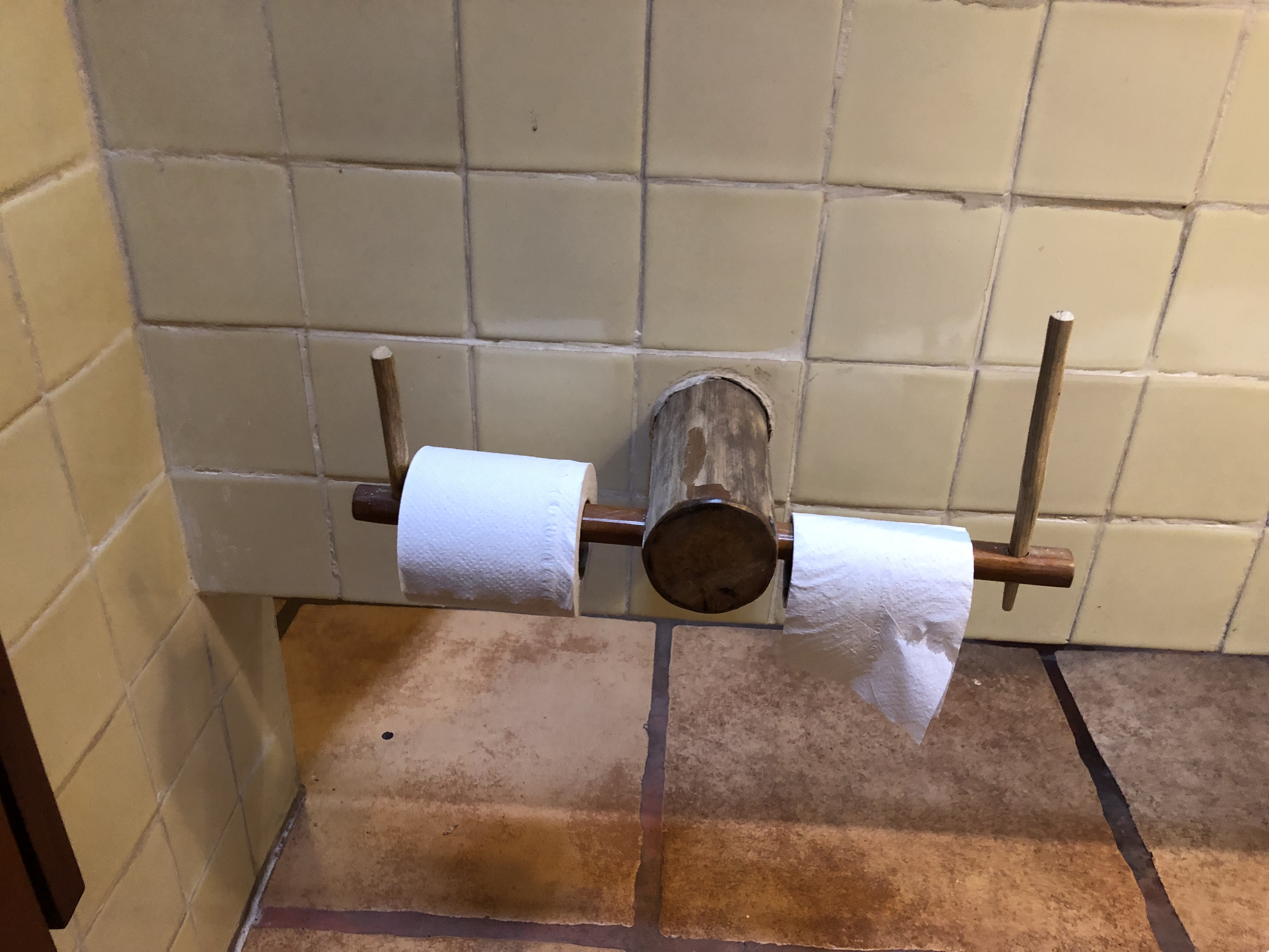
- Go back to smaller rolls of paper, and a simple stick-like dispenser so people can actually see what they are dealing with.
- If keeping the big rolls, expose them so people can see them and grab the paper easily.
- Provide a robot as the bathroom host. A white-glove–clad R2D2-like being would be a fun way to hand people toilet paper. And the robot could be taught to accommodate the particular stall doors. For example, with an open-bottom or open-top stall, the robot could simply hand under or toss over a wad of paper or a whole new roll. With a closed door, the robot could enter using a dog-door installed at the bottom. If the installation of such a door is not possible, the robot could be programmed to unlock and quickly open and close the door, tossing in the paper while using its body as a privacy shield to the outside.
2. Hidden or Difficult Controls for Toilet Flushing
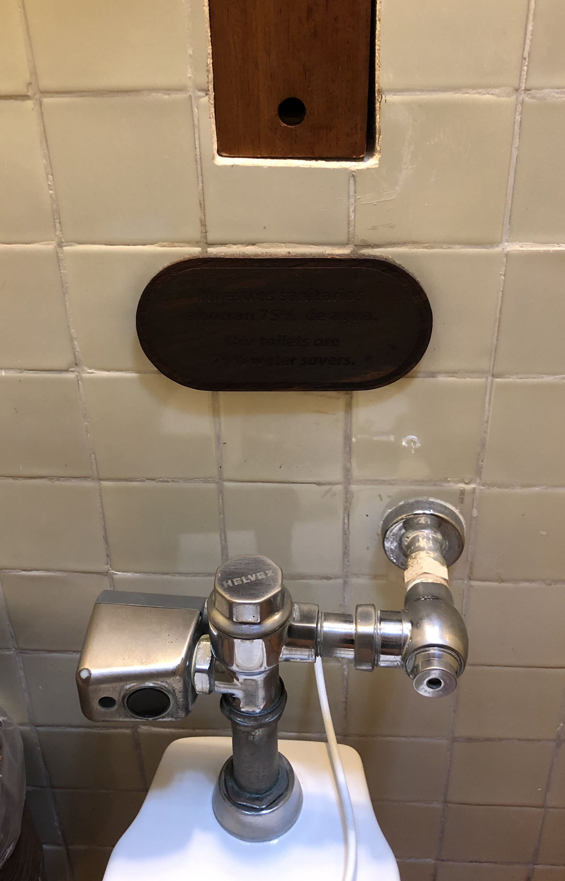
Applications and consumer products have many functions, often making it difficult for designers to home in on a short set of top tasks. But some products have only one specific function: for example, with a scale you weigh yourself; with a doorbell you ring it. With a toilet you flush it. If a user cannot easily flush the toilet in a public restroom, that toilet design has indisputably failed. And with that failure comes wasted time, user embarrassment, sanitation issues, and unhappy customers.
I heartily applaud and commend companies that have water-conserving and auto-flushing toilets that improve sanitation. But these toilets must be easy to use and not suffer from the issues mentioned below.
Overzealous or Underperforming Sensors
Toilets that flush after sensing movement save the user the trouble of coming in contact with a bacteria-laden handle or button. (Many years later, I can still hear my mother’s voice in public washrooms chastising, “For the love of God, don’t touch anything!”). Another benefit of these sensors is that they accommodate people who may not be able to easily reach the flushing mechanism, as well as those who follow people who forget to flush. But these toilets should not flush each time when a person moves. Sometimes toilets flush ten times in one visit, wasting water, splashing on the person using it, and frankly, startling the heck out of people. Men, we’ll let you in on a secret you may not know: some women don’t sit on the toilet, they squat so as to avoid bacteria or contracting what my parents’ generation refers to as “a social disease.” When squatting, people may not stand perfectly still, and that movement can be interpreted by the sensor as the person leaving the stall. (And no, the solution to this problem is not exercises to strengthen leg muscles. When there’s a mismatch between humans and technology, it’s the technology that must change.)
Hard-to-Find-Buttons
Fitts’s law says that the bigger the target, the faster it will be reached. This law applies as much to buttons on your toilet as it does to buttons on your phone or computer screen.
Rare in most parts of the world, but some toilets have many buttons that offer functions such as:
- Flush a little
- Flush a lot
- Clean itself between uses
- Clean the person after use
- Refresh the disposable sanitary cover
- Apply lipstick
- Play music
- Perform a “bottom facial”
The presence of many buttons can create clutter and make it difficult to find the most important one: the flush button.
Recommendations to Remedy the Issues
- Provide one, very large button on the wall behind the toilet. Be sure to not make it too colorful and large in order to prevent banner blindness.
- Support multiple modalities of flushing interactions for people who may have a preferred one. Although command duplication is generally not recommended, for mission-critical functionality where failure is not acceptable, it can be okay to offer multiple mechanisms so that if users miss one, they will see the other. At the very least include: the traditional lever handle on the back of the toilet, a button on the wall, a sensor on the wall, and a foot pedal at the bottom. Consider adding voice control capabilities for flushing (but if you do so, ensure it cannot be accidentally activated by a person in the nearby stall.)
- Consider creating a mobile app with a remote-control functionality to allow users to freshen the bowl before they enter a stall or to exit the stall then do the flushing on-the-go.
3. Poor Communication of the Stalls’ Status
Eight years ago, my mother, my sister Susan, my aunt Carol, and I visited Ellis Island. I remember several details about that visit; the sunny ferry ride, my sister’s earmuffs, searching for plaques of our relatives, and laughing a lot. But among my most vivid memories from that visit is that of an attendant at the ferry terminal’s public restroom. This woman was like the conductor of a great orchestra, pointing straight at people in line, deftly directing them toward the open stalls, and gently but forcefully coaxing the slow, tourist-minded bodies to step lively. In a period of about 15 minutes she must have moved 50 women through the stalls of this facility. My mother was so impressed she pressed a $20 note into the woman’s palm. Sadly, most public restrooms do not have a director like the one in the Battery Park Terminal. And without her, people stand in line and wait for stalls even when most of them are vacant. Why? They assume that the stalls are occupied.
This despite the fact that visibility of system status has been usability heuristic #1 since 1994. Restrooms designed long ago may have excuse, but any modern buildings are imposing waiting time on users with urgent needs when the designers should have known better.
Stall Doors Swing Closed by Default
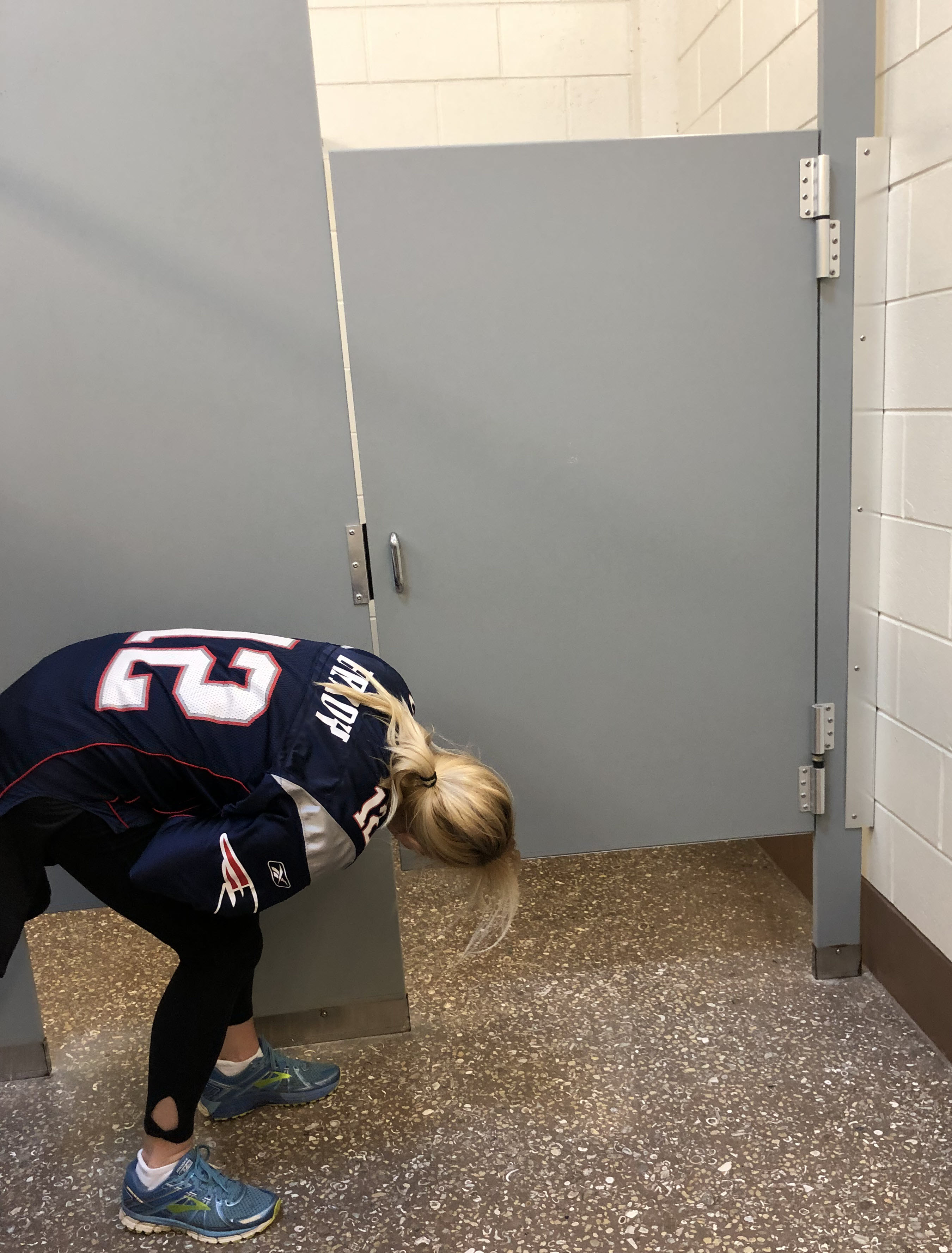
Engineers and architects probably want the stall doors to close even when they are unlocked because closed doors give the room a neater look, and, once a person enters the stall, the door is easier to close and likely to stay closed. But, to most people, a closed door means that someone is behind it. So, most users will wait until they see another human emerging from a stall before they take a step out of line.
Of course, we have probably all been on the opposite end of that statement where we have been walked in on, or have walked in on someone else. (I really don’t know which is more mortifying, but I think it’s being the walkin-er rather than the walkin-ee. Tweet to us @nngroup #bathroomUX which you think is worse: walkin-er, walkin-ee, or equally humiliating.)
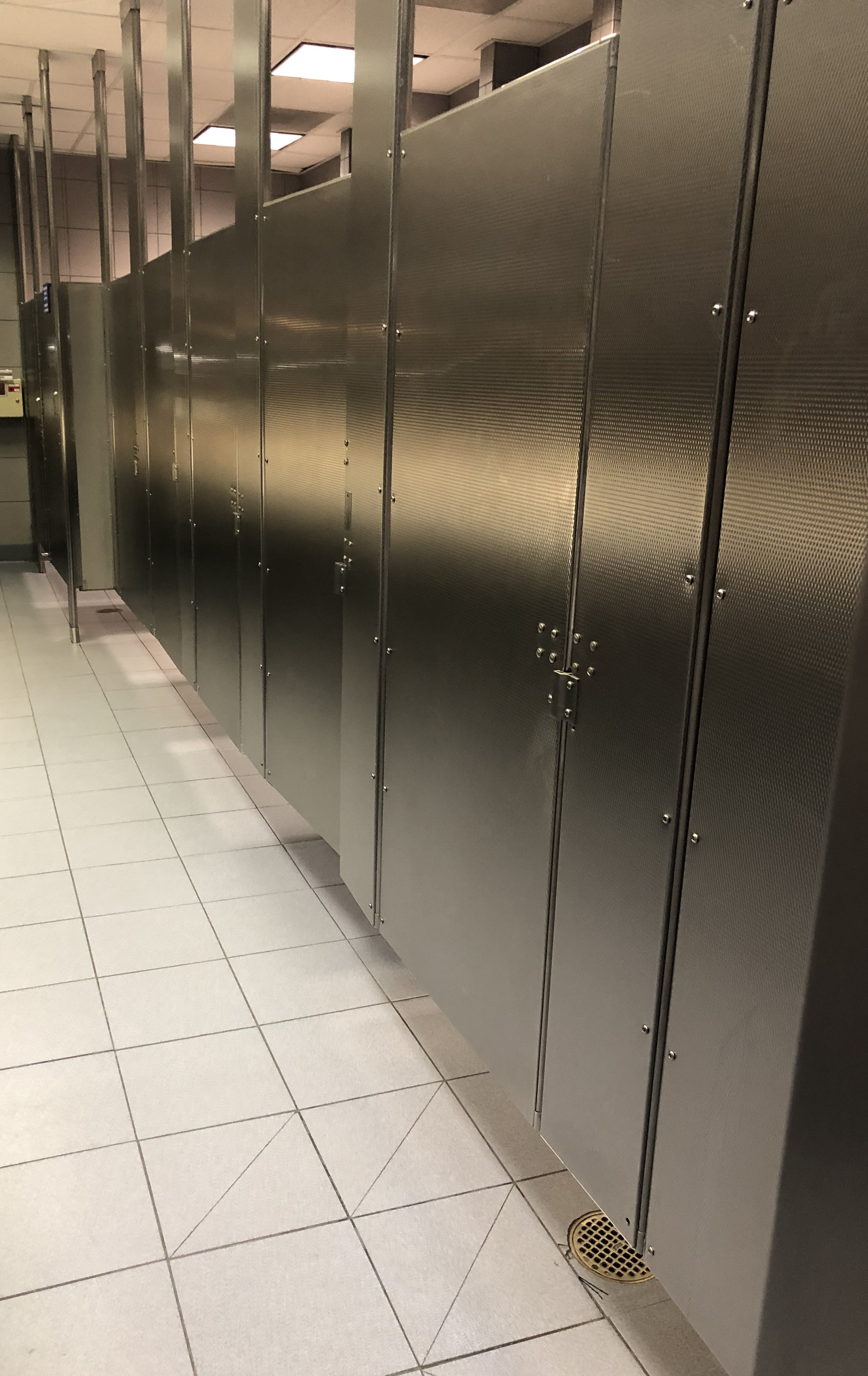

Shape of the Room
The shape of some restrooms makes it impossible to see, from your place in line, how many stalls there are (and how many are vacant).
Recommendations to Remedy the Issues
Whether you run a huge global venue or a small establishment, you can make improvements to address both the visibility of the stall status and the wait time.
Make the Status of the Stalls Visible
- Use a visual indicator to tell users whether the stall is open. The visual indicator could be:
- An open door: weighted stall doors that swing open by default (Choosing good defaults is an important usability guideline.)
- A flag on top the doors that falls outward and depicts a green “open” label and appropriate icon when the stall is vacant, and falls inward when the stall is occupied.
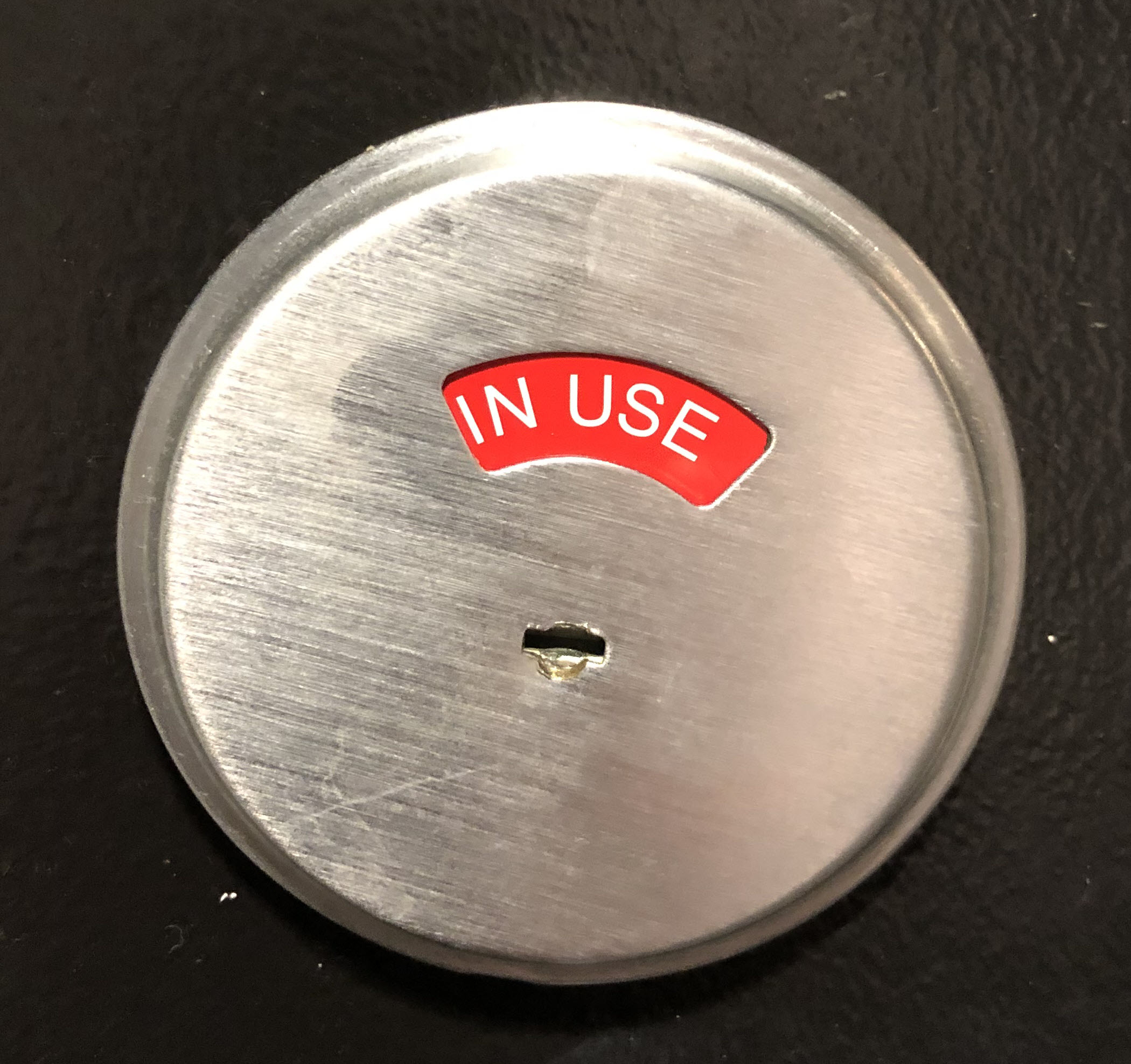
- A lock that changes color when the door is locked (This solution may not work well for large restroom, as the locks may not be visible to those waiting in line.)
- A digital door that changes color when it is locked and that could Indicate other helpful information on the door display — for example, the cleanliness, the state of the toilet-paper roll, or whether any elements of the stall (e.g., coat hook) are damaged.
When using color as a visual indicator, remember that some users are color-blind and may not be able to distinguish between certain colors. Consider using an icon together with color to signal availability.
- Use an auditory indicator to tell users that the stall is open. Have people vocally communicate to others when they have vacated a stall. For example, post signs with guidelines that people should yell, as loudly as they are able and feel is socially acceptable, which number stall they were in (counting from the far end of the room or the left side, right side in Arabic countries) followed by the word “open”. For example, if you vacate the fourth stall from the back you would shriek, “Four! Open!” and proceed to the sinks, knowing you did your part.
- Present an overview of the restroom at the entrance, to ensure that all stalls are visible from the queue. The overview could be implemented by:
- Providing ceiling mirrors so people in line have a birds-eye view of the stalls
- Installing a camera in each stall that live streams to a monitor visible at the restroom’s entry
For privacy considerations, ensure the camera points high in the stall so only the user’s face shows, and no private body parts. Even better, advances in machine vision will allow automatic blurring of any sensitive parts of the image, along similar lines as the Skype feature to blur out the user’s background.
Consider creating a mobile app for each restroom. This app could help you easily address all the guidelines listed above, and provide many additional perks for the user. For example, the app could have a live map of the restroom that shows which stalls are vacant. (To get that information, you could install buttons and sensors in each stall or ask users to “check in” and “check out” into the app whenever they enter and respectively leave a stall). A mobile app would open many doors, including personalizing the experience for the logged in user. Some app feature could be:
- Pre-flush the toilet as the user enters the stall.
- Use machine learning on prior user history to predict when the user will flush and do it automatically for them. To save water, lock the flushing mechanism so the toilet doesn’t accidentally flush more when the person moves.
- Play the person’s stall playlist music, white noise, or other calming or stimulating sounds.
- Spray their preferred air-freshener scent upon entering (or exiting) the stall.
Distract from the Wait Time
- Use progress indicators. For any long or multi-stepped process, it helps users to visualize where they are. Whenever people are expected to wait for more than 10 seconds, a percent-done progress indicator is a must. The UI could be just a simple system of lights displayed on the exterior of each stall door that communicates the stage at which the person in the stall is, and gives a rough estimate of how much longer there is to wait for that stall. Displaying the progress will not only keep people informed, but it might add some gamification effects, as people in line can root for people in the stalls, cheering them to go faster.
- Divert attention away from the wait by offering other things to occupy people’s time. People are less likely to mind long wait times when they feel busy. Try some of these ideas:
- Provide a karaoke machine so people in line can perform and have fun while they wait. Choose playlists carefully so as to avoid any water sounds or upsetting themes.
- In a mobile app, provide coupons so people can shop while they wait. If possible, give people with the longer wait times even greater discounts to reward them for their trouble. Offer the biggest discounts to people who let others, who really can’t wait, cut ahead of them in line.
- Create a community so people waiting can make new friends, share their waiting photos, stories, advice, and accolades. Consider awarding people who make the most helpful and popular posts. Also, award people for events in the restrooms, such as: fastest in and out of stall, most helpful, best karaoke performance, and so on.
- Consider offering a bank of stationary bicycles and elliptical machines so people can distract themselves from the wait time by burning calories.
- Connect the mobile app with food delivery apps so people with a long wait can have a snack. Be sure to promote food items that would be easy to deal with in the line, such as hand rolls, sliders, and small ice-cream cones. Avoid items such as fajitas, spaghetti and meatballs, and soups.
- Add animated ads in the stalls and on the digital doors. Sales will mitigate the costs of the solutions. If the ads are entertaining, they will also keep people busy. The venues should be able to fetch a fair price for these ads since people in restrooms are a captive audience.
Many More Public Restroom UX Issues
Anyone who has used a bathroom outside their home has experienced far more than these three UX issues. Many of these other issues important, but they have little or no effect on stall availability. Still, let’s review a few of the common and equally annoying restroom problems that cause hygiene issues, waste, frustration, and mortification:
- Inconsistent use of automatic and manual functions: How many times have you held your hand under a faucet and had that simple action start the water flowing, only to perform the same action under the nearby soap dispenser with no response? That’s because the faucet uses a sensor while the soap dispenser uses a manual lever. Expectations and mental models are set by the first UI and carry to the next.
- Sensors with poor response time and poor signifiers: When a sensor doesn’t respond quickly, the lack of feedback indicates to users that they should try something different. If a person holds her hand under a paper-towel dispenser and nothing happens, she might try touching it, pushing anything that looks like a button, hovering or waiving hands in front or under the unit. Better signifiers might give users the confidence that they did the right thing and the patience to wait if there is a slow response time. Fast response times would allow users to get immediate feedback even if they have low confidence about their selection. But the combination of sluggish feedback and lack of signifiers creates a perfect storm of confusion.
- Signage with unidentifiable icons: Inclusion and accessibility are not always considered, especially when having male-only and female-only restrooms. But even for gender-specific restrooms, the signage to determine who should enter can be difficult to understand. Icons without labels are probably the worst offender. Using creative, branded icons to differentiate the restrooms causes people to linger, question their judgement, or end up in the wrong restroom. For example, an icon based on Mayan masks may be cool and beautiful in an art setting, but female and male Mayan masks can look similar at a glance, and don’t adequately identify the different restrooms. Art is art and design is design. Design has a function, in this case, to identify the gender that is supposed to enter the restroom. Leave the masks in the museum.
Researching Public Restroom Design
Like designing any website or application, public-restroom designers should do research with users, iterate, and improve their designs. I suggest a few tried and tested research methods.
Intercept Studies in Public Restrooms
Approach people as they head toward the restroom and ask them if you may follow them through their experience and ask them questions. Immediately offer a valuable incentive, such as: cash, a roll of extra soft toilet paper, disinfectant spray or gel (for the seat or their hands), reusable seat covers, or movie-ticket vouchers. Wear a Go Pro camera on your head to keep your hands free to take notes. Alternatively, affix it to the front of your clipboard.
Ensure that when doing live-intercept studies that the participants’ consent form is short since people are often in a rush. You don’t want to further hold them up by asking them to read a long form.
Diary Studies About Public Restrooms
For longitudinal research, recruit people via social channels or other means and ask them to record their own experiences in public restrooms. Consider asking them to download a sound recorder on their phone so they can start recording any time they approach a restroom. Ask them to send you these files, and be sure to ask them to supplement their raw audio footage with some photos and sketches (or video if they are comfortable). Also, check in with them regularly with short questionnaires that include focused questions about their experiences.
Employees Must Wash Hands
A word about the Employees must wash hands signage in restrooms at establishments that serve food and drink: I realize this is a US government regulation, and understand the case studies about people around the world who get sick because they are unaware about restroom best practices. But it is still totally disgusting that we need to tell people working with food to wash their hands before they touch my lettuce. The signage gives me pause, as I wonder whether the command is sometimes ignored by employees on principle. (You will not be surprised that I eat in a lot.)
Conclusion
Discussing public restrooms is, admittedly, obtuse. But if conversations help decrease wait time and eliminate waste, hygiene issues, embarrassment, and people’s physical discomfort, let’s agree to flesh out some improved flushing. One more thing: April Fools’!
Other April Fools Articles
- Mobile Usability for Cats: Essential Design Principles for Felines
- Really Break Grammar Rules
- Banish the Hamburger Menu, Adopt Pizza Menus
- Difficult Designs Are Better (for Humanity)
- Motorist Trapped in Traffic Circle by Autonomous UX
- Ideation Is for Chumps
- Canine UX: Essential Usability Principles for Dogs
- Eartracking: A New UX-Research Method
- Slow UI: Pace Interaction to Increase Understanding
- Users Love Change: Combatting a UX Myth
Share this article: