As UX practitioners, we are often caught in a balancing act: usability improvements, tasks to be done, design ideas, personas, resources — the list goes on. The reality is that not everything can be done at once. Making an informed decision on what to prioritize can be daunting.
A prioritization matrix serves to identify the most important problems. This structured, objective approach helps achieve collaborative consensus while satisfying the varied needs of the user and business.
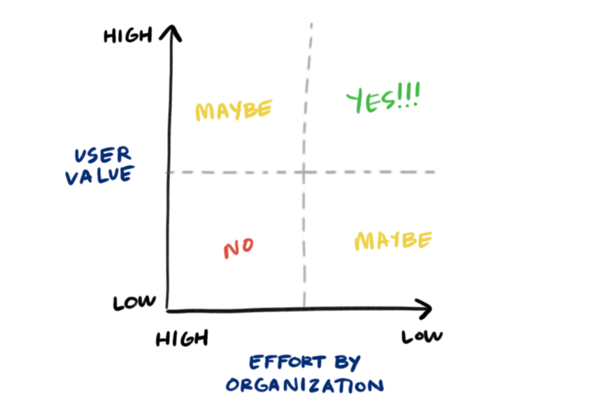
Definition: A prioritization matrix is a 2D-visual that shows the relative importance of a set of items based on two weighted criteria.
The term “prioritization matrix” is used in the design thinking community to refer to a variety of prioritization techniques and representations, that, technically, do not all qualify as matrices in the mathematical sense. For the sake of consistency, we use the same term although sometimes our “matrices” would be more accurately described as “charts.” Though the manifestation of each may slightly differ, all forms help teams visualize and communicate priorities.
History
Prioritization charts have been used for decades in many different fields, in many different ways. Many time-management matrices are based on the Eisenhower Method, which stems from a quote attributed to Dwight D. Eisenhower: "I have two kinds of problems, the urgent and the important. The urgent are not important, and the important are never urgent." With this method, activities are allotted to one of four quadrants: important/urgent, important/not urgent, unimportant/urgent, and unimportant/not urgent.
Another popular tool used in science and math is a decision matrix that allows numerous options to be systematically ranked according to some criteria. In UX, we can use a similar method to collaboratively weigh options and make informed decisions that balance our time and resources with the needs of the user.
Creating a Basic Prioritization Matrix
1. Establish the items, criteria, and scale you will use
There are three initial steps to creating a prioritization chart. First, establish the items you are prioritizing and write them on individual sticky notes. These can be:
- Projects
- Ideas
- Features that you plan to implement
- Jobs to be done
- User groups or personas
- Research activities
Next, you’ll define the criteria according to which you’ll perform the prioritization. For prioritizing different ideas, the criteria could be impact on the user or feasibility. For prioritizing personas, they could be percentage of user base and ROI. Regardless of what items you are prioritizing, the criteria should always be derived from the overall goals of the project and business needs.
Once you have the items and criteria, develop the scale. The scale can be as simple as high or low (if your criteria are feasibility’ or impact on the user, for example). Or, it could be made of actual numbers (if you were plotting the percentage of users, the scale could range from 0 to 100).
2. Individually vote based on expertise
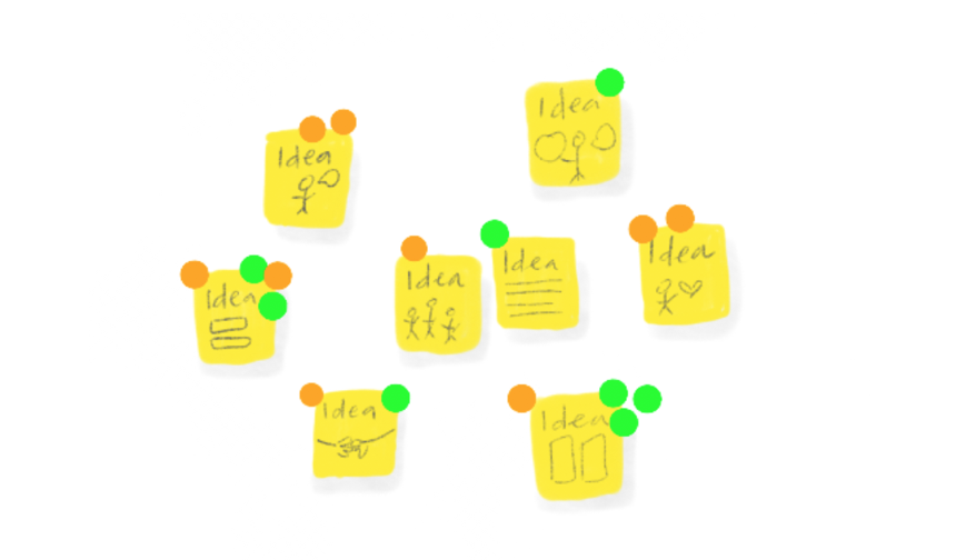
Disperse different colored dots to each team member. A general rule of thumb is the number of votes per person is half the number of items being prioritized. While each team member gets the same number of votes, they should vote based only on criteria that fall within their domain of expertise. Use different colors for different areas of expertise. For example, on a matrix plotting feasibility vs. impact on the user, developers may have green dots and rank feasibility, while designers may have orange dots that represent impact on the user.
Team members then silently vote on items. Members are allowed to place multiple votes on one item. These votes should be educated opinions, so time to research or investigate prior to voting may be needed.
Note that many prioritization techniques do not include this step. However, in UX, where crossdisciplinary consensus is integral to the success of a project, we recommend you begin by voting. This step will not only speed up the process and provide structure for plotting, but it will also prevent the loudest person in the room from dominating the outcome of the exercise.
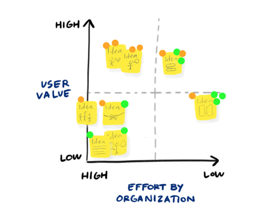
3. Draw a chart and use votes as a basis for placing items
Using the team’s votes as a guideline, collaboratively place each item onto your chart. There should be little discussion in this step. The goal is only to get the items up onto the plot based on the votes placed in the prior step.
4. Discuss and negotiate placement
Once everything is placed onto the chart, it’s time to discuss the results and compare where items fell. Some questions to ask the team may include:
- Are the items that received equal votes really equal? Is idea A equally feasible to idea B even though they received the same number of votes? Why or why not?
- Do we agree with the items that ended up at the ends of the scales?
- Why did certain items receive no votes? Was it that we didn’t have enough votes, or do they truly provide no value based on our criteria?
Throughout discussion, the team should feel free to collaboratively move items. At the end, there should be agreement on the final placement of all the items.
5. Share out and drive action
Following the plotting and discussion, the map should be documented and shared with stakeholders. The exercise should result in a clear action plan and timeline.
Adapting the Chart to Your Needs
One of the strongest characteristics of this technique is its adaptability depending on your team’s needs and goals.
Increase the number of criteria.
One can use an arbitrary number of criteria, though visualization becomes difficult with 3 criteria and extremely hard with 4 or more. Thus, if possible, we like to stick to 2 criteria.
If more criteria are truly important, split them into pairs, as shown below, then compare the two charts. (If there’s only a single criterion, you don’t need any decision tools: just pick the option with the highest score.)
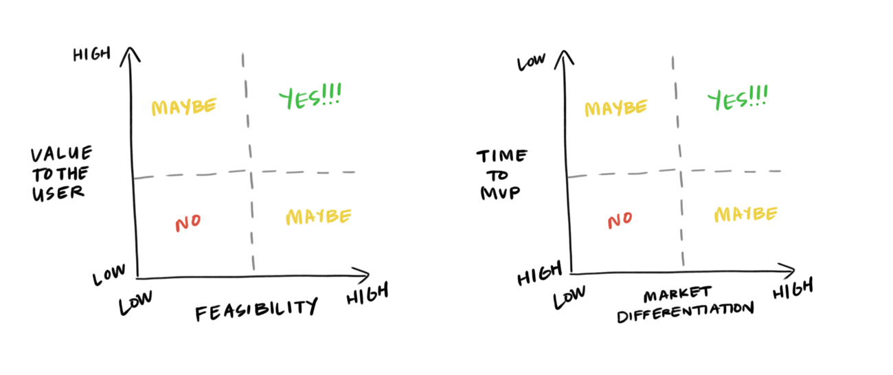
Create multiple plots to compare across criteria.
When there are more than two criteria that influence decision making, you can plot items across multiple graphs. Doing so allows the team to access multiple variables that may be important to users or to the business. For example, an idea may rank high in impact on the user and feasibility, but have very little effect on ROI.
When setting up multiple matrices, always place the best outcome on the far right or top left of your axis. This allows you to easily compare several matrices and identify the best items as those that consistently fall in the top right of your matrix.
Incorporate a more rigorous scale.
The above examples employ a simple, binary scale; however, you can use continuous scales when appropriate. For example, rather than just using a high–low scale for feasibility, you could use the estimated time for implementing a feature (e.g., 1 year vs. 2 weeks). Resources could be ranked according to a quarterly budget: $50,000 vs. $1,000.
If the outcome of the prioritization activity has significant repercussions, build additional rigor into the process. For example, have team members rank their voting dots (for example, by writing 1, 2, and 3 onto their 3 dots). When placing their votes, team members must determine the weight of each of their votes, rather than simply the top three. Thus, the outcome is not simply which items got the most votes, but which ones had the most top (1s) votes and so forth.
Items may receive ranked votes, which reflect how important they are to each voter. The ranked votes are used to determine placement onto the matrix.
Vote in private.
The process can also be adapted to meet the needs of your team. If your team’s culture is prone to group think or the HIPPO effect (highest paid person's opinion), then vote in private or digitally, rather than openly, to make the process truly democratic and prevent bias.
Apply it to life.
Prioritization charts are helpful outside of work, as well. If you are considering a new job opportunity, try plotting opportunities against the things most important to you: pay, travel, growth, or mentorship. If you are contemplating a big trip, perhaps you plot cities against what you value: weather, culture, price, food, or sights to see. In addition to better personal decisions, the extra practice will help you at work.
The Benefits
There are benefits from both the process of creating a prioritization chart and the tangible artifact itself:
- Facilitate important discussions
The process of creating a prioritization matrix brings together a collaborative group to use its expertise for making an informed decision. Regardless of the outcome, the exercise promotes productive, structured conversation: the options at hand weighed against the criteria important to the business.
- Create a shared mental model
While the process is the primary purpose of a prioritization exercise, the artifact that comes out of it is equally beneficial. The chart represents a shared visual representation of collaborative ranking and indicates a democratic process, rather than the opinions of any one individual. It is a valuable tangible artifact that documents the team history and process. Anyone can glance at the wall and understand what the team collectively agrees on.
- Provides structure and removes emotion
Prioritization plots are a quick and easy, yet consistent, method for evaluating options. They allow teams to consistently make informed decisions regardless of the emotion or bias in the room.
Conclusion
Everyday decisions affect the outcome of our work. As UX practitioners, it is our job to understand the opportunities at hand and pursue those that maximize business and user benefits. We cannot risk that these decisions be arbitrary or made in a silo.
Prioritization charts give us a simple way to assess and analyze what is most impactful to the user and business, in a collaborative, disciplined way.
Learn and create prioritization matrices in our full-day course Generating Big Ideas with Design Thinking.
References
Brown, Tim. 2009. Change By Design. Harper Collins.
Gray, D., Brown, S. & Macanufo, J. 2010. Gamestorming – A playbook for innovators, rulebreakers and changemakers. Sebastopol, CA: O’Reilly Media, Inc. http://gamestorming.com/impact-effort-matrix-2/
IBM Enterprise Design Thinking Toolkit. Prioritization Grid. https://www.ibm.com/design/thinking/page/toolkit/activity/prioritization


Share this article: