Traditionally, websites display a logo in the top left corner of every page (for sites that use left-to-right languages). This design pattern fulfills several critical needs for a good web user experience:
- Communicates the current location. Displaying the company logo on every page lets visitors quickly understand which site they are currently viewing. Telling users where they are is essential on the web, where a single click often teleports you to a completely different organization’s site.
- Reinforces the brand. The more often users see a logo, the more likely they are to remember the brand. (This is one of the laws of human memory, as explained in our seminar The Human Mind and Usability.) Better brand recognition means people are more likely to use your services and purchase your products. All other things being equal, people are more likely to trust an organization that they know over one they’ve never heard of.
- Permits easy navigation to the homepage. Website logos should always be clickable elements that link directly to the homepage. When this guideline is followed, the users can easily ‘start over’ by returning to the homepage, no matter where they are. A fresh start is helpful on large information sites, where users can become disoriented. It’s also frequently used on sites where users attempt several different tasks, because people often want to return to the homepage when starting a new activity. (Even when there is persistent global navigation for switching tasks, users often still choose to go ‘home’ first.)
The top-left placement of logos is so familiar to users that straying from this pattern risks significantly impairing the user experience. For example, we’ve previously reported that right-aligned logos hurt brand recall, based on a comparison of how likely users were to recall brand names when a logo was in the left vs. the right corner.
Centered Logos and Responsive Web Design
Centered logos appear more often on the web these days, perhaps due to the increasing adoption of responsive and “mobile-first” designs. Mobile designs often use the top-left corner to display a menu icon, and shift the logo towards the center of the screen. On small screens, the distance between the top-left corner and the top-center position is usually minor.
But when this design pattern is used on larger screens, the distance becomes significant — as on the website for the Library Hotel below. (The Library Hotel website does actually have an alternative design with a full global-navigation menu, but it does not appear until the viewport width exceeds 1024 pixels.)
Effects of Centered Logos on Navigation Success
Positioning the logo in the center of the page on both mobile and desktop layouts may be convenient for designers, but how does this affect the user experience?
To find out, we’ve compared sites with left-aligned logos to sites with center-aligned logos.
About the Study
To understand how logo placement affects the use of the logo as a navigation element, we compared 14 different fashion-retail sites: 8 with centered logos and 6 with left-aligned logos. All of the logos were clickable links to the homepage, and none of the sites offered a text link to the homepage.
50 users participated in this study; each of them interacted with a single site and completed 2 tasks:
- Select a gift for a friend that costs less than $100 and add it to the shopping cart. (This task began on the homepage.)
- Go to the main starting page of the website. (This task began from the page where they happened to conclude task 1.)
The first task was needed to set the stage for our second task but was otherwise not of interest to the current study.
We used UserZoom’s clickstream tracking to record every action taken by study participants. For each participant, we recorded whether that participant was able to navigate to the site’s homepage in a single click.
Study Findings
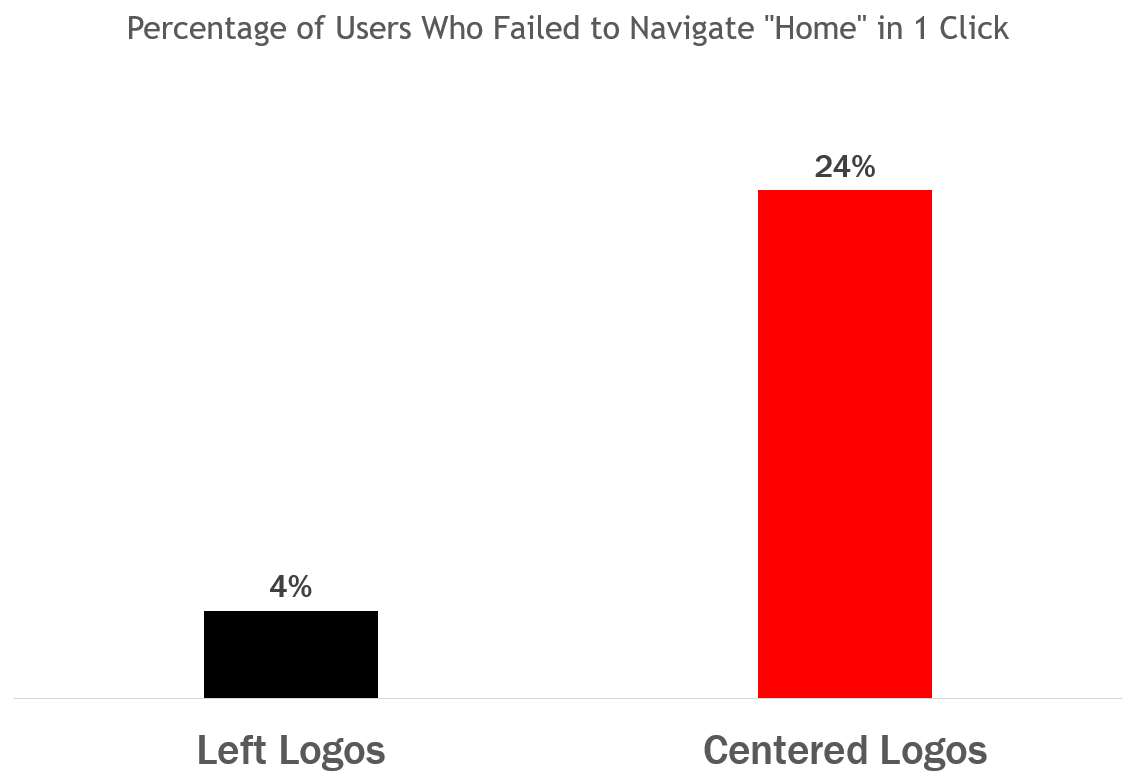
Our results show that, on sites with left logos, users are significantly more likely to navigate home in a single click than on sites with centered logos ( p <0.05 with a chi-squared test).
Comparing the failures to navigate in the two conditions, users were 6 times as likely to fail to navigate to the homepage in a single click when the site logo was centered versus left aligned.
As mentioned above, the ability to quickly return to the homepage is critical for users who become lost or simply want to switch to a different task or topic. Even when global navigation is shown on every page and lists all major sections of a website, many users still go ‘home’ by reflex when they want to start over.
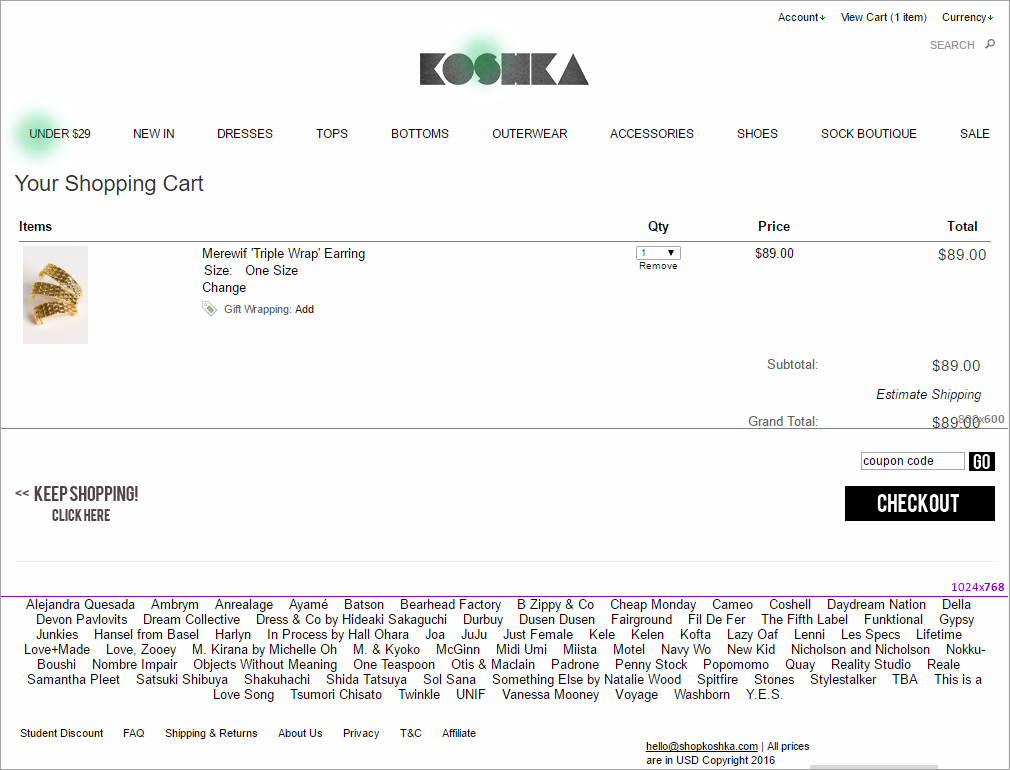
On most of the sites with centered logos, at least some users struggled to navigate to the homepage. An analysis of these users’ behavior indicates that the logo position was a big part of the problem. For example, on the Koshka website shown below, some users clicked the leftmost navigation link (Under $29) instead of the logo.
In some cases, users eventually did make it to the homepage — but only after several false starts and mistakes. Comparing the steps taken by users on left-logo sites versus centered-logo sites illustrates how painful this process can become.
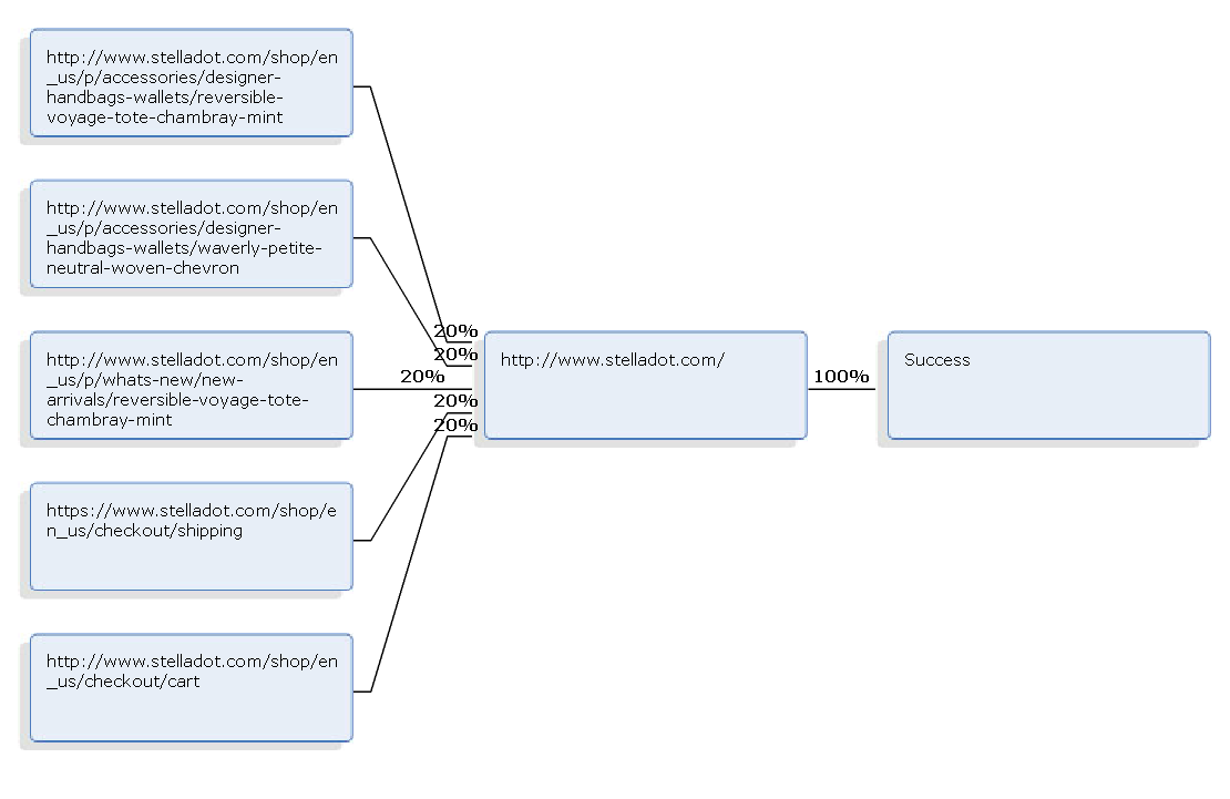
On Stella and Dot’s website (which had a left-aligned logo), users’ clickpaths to home were clear and straightforward, as displayed in the diagram below. All five users in this example started from different pages, but they all used the clickable site logo to arrive at the homepage with just one click.
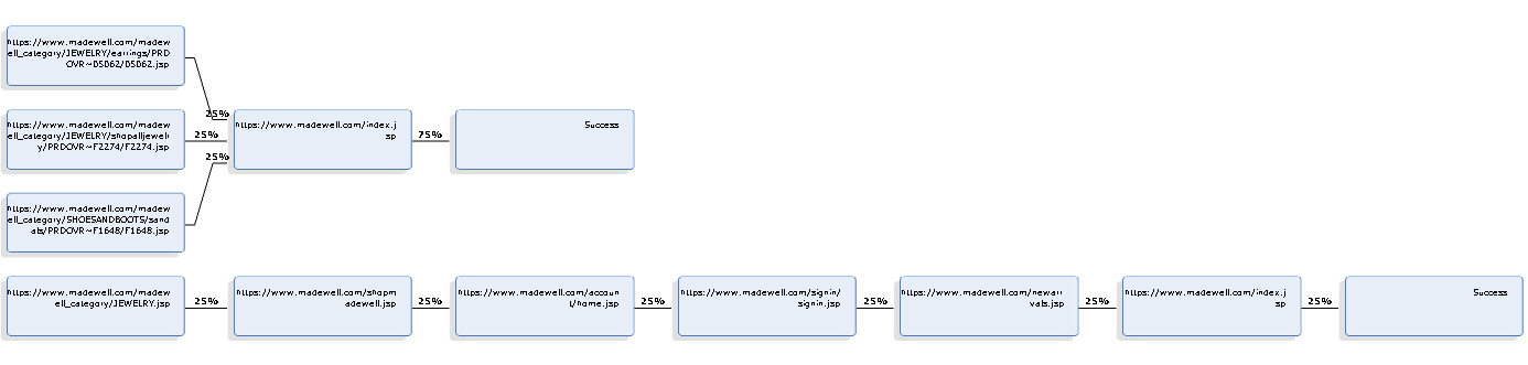
However, on sites with centered logos, some clickpaths back home were much longer. For example, on Madewell’s website, some users clicked the centered logo right away, but one poor soul tried four other links before finally reaching the homepage.
Based on these observations, it’s clear that left-aligned logos are better than centered logos for supporting user navigation to the homepage. Note that the left-logo sites in this study still caused some homepage-navigation errors (although far fewer than the centered-logo sites). This is because some users didn’t realize that logos were clickable, especially when the logos followed a flat-design aesthetic. Positioning the logo on the left is good, but an even better approach is to offer both a left-aligned clickable logo and an actual Home link.
Centered Logos and Brand Recall
In a different study, we also measured whether having the logo centered on the page (rather than in the top-left corner) affected how likely users were to remember the brand name.
About the Study
In this study we looked at 4 boutique hotel websites; for each site, we compared two versions: one with a left-aligned logo, and one with a centered logo.
128 participants completed two types of tasks:
- Exposure to hotel website homepages: each user viewed 5 different hotel-website homepages, presented in a random order. (Besides the 4 sites reported here, users also saw some sites with right-aligned logos.) For each site, users were randomly shown either a version with the centered logo or one with a left-aligned logo, then answered questions about their opinion of each hotel.
- Aided recall test for brand recognition: After viewing and rating all the sites, users completed a memory test which displayed a list of 10 different hotels and asked them to identify which hotels they had viewed during the first part of the study.
Study Findings
Unlike our study involving right-aligned logos, this study did not find that centered logos consistently affect brand recall (this effect was not statistically significant). Some sites had better recall for left-aligned logos and some for center aligned.
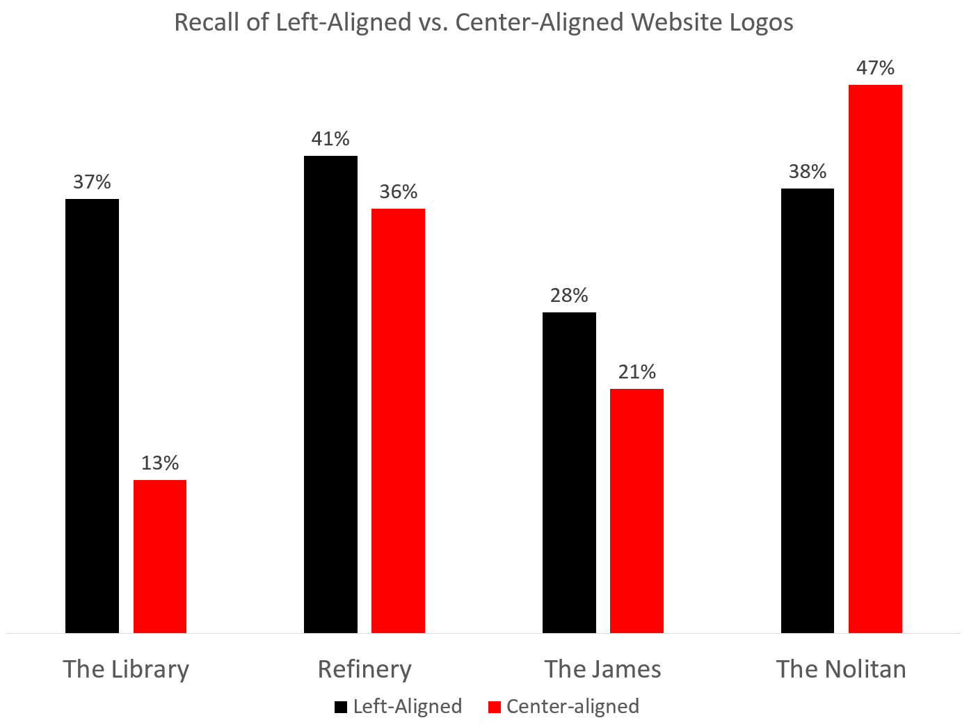
It appears that other factors (such as the contrast, padding, and legibility of the brand name) affect brand recall more than the position in the center of the page versus the top left corner. For example, the Nolitan hotel websites had a background image behind the logo, which may have overshadowed the effects of logo position: this main image has strong symmetry around a center axis and creates a visual path leading up to the centered logo position (which was the position in the original design).
In the other 3 hotel sites we examined, brands with left logos were recalled more frequently, but the effect was not statistically significant.
Conclusion
When we compare the findings from our two research studies of logo placement on websites, we see that centered logos degrade website usability to some extent, but not as much as right-aligned logos. In other words, logos should lean left. We speculate that the reason for this difference is that left-aligned logos are the norm and what users expect, and so the more a design deviates from the norm, the worse the user experience. The location of a centered logo is not as far removed from the expected location as that of a right-aligned logo. To generalize this finding beyond logo design:
- Usability suffers when a site fails to meet users’ expectations.
- The more severely a design diverges from user expectations, the worse the damage.
Branding and navigation are such critical functions for websites that anything which negatively impacts these goals should be avoided. Keep your logo where you can be sure users will find it, and your site will get the maximum value from this critical design feature.


Share this article: