As part of our recent research for the fourth edition of our Ecommerce User Experience report series, we conducted user studies to understand how people approach customer-service–type activities on the web and how websites provide support.
We conducted one large-scale study to discover general behaviors and usability across all areas of ecommerce websites, including customer service. A second study was designed to specifically gather data for the fourth edition of our report on the customer-service user experience, which is part of the overall ecommerce-report series. This more targeted study consisted of eight 90-minute remote moderated usability-test sessions with participants from across the United States. Each participant was given a subset of 57 customer-service–related activities across 23 unique business-to-consumer ecommerce websites.
These studies have helped us identify many best practices for delivering customer-service information on websites and develop a model for the organization and delivery of this information. Though this model came from research on ecommerce websites, it can be applied to all types of sites providing customer service and support to their users. Standardizing the presentation of customer-service information is important because it allows users to easily access this information when they need it and indirectly builds up trust in the company.
Research Findings
Although users were generally successful at finding customer-service information on websites, the path to this content was not always straightforward. Many study participants had to work hard to find the information they sought, and this process often included a lot of trial and error as users unnecessarily visited many different pages on the site. Eventually, participants were able to find the customer-service information in the utility and footer menus, which included links to customer-service pages for all the sites in our study.
Though similar information was provided across a lot of the sites we studied, the labels used in global navigation and the structure of service-related pages on these sites varied tremendously. The lack of a standardized framework for the delivery of customer-service information across the web meant that users encountered different experiences on nearly every site. Consequently, our study participants were often unsure where to click first when looking for the answer to a question. For example,
- Some websites used the label Customer Service, while others used the word Help.
- Some sites relied heavily on an FAQ page, while omitting a customer-service page altogether.
- Others focused on providing links to specific customer-service topics like privacy policy and return policy, rather than including a high-level customer-service page.
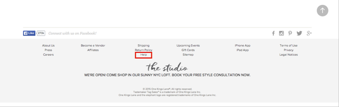
Some approaches worked better than others in enabling customers to efficiently locate the information they needed. One user on OneKingsLane.com was looking for a phone number. He spent several minutes on the home page going back and forth between the header and footer in search of a link, saying, “I’m looking for a Contact Us but I’m not seeing it anywhere.” He tried visiting About Us, but he got stuck in a separate microsite about the company and its employees. The contact information was located under the Help link, but in the end, he googled One King’s Lane and found the contact number on the company’s Facebook page.
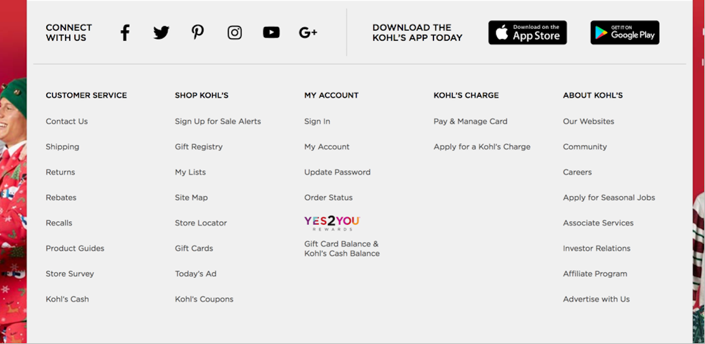
Users had a difficult time locating information about Kohl’s price-match guarantee on Kohl’s website. Several people looked at the bottom of the page, where the site listed multiple customer-service options (such as Contact Us, Shipping, and Kohl’s Cash), but the area provided no high-level link to general customer-service information or to a price-match policy. They inspected the list again and again, trying to determine where to click in order to find the right information. An aggravating factor was the header Customer Service, which housed all these links, but was not clickable.
In the end, each participant had to make a best guess and select from the available options, rather than confidently proceeding down a path to the answer. One user clicked on Returns because it seemed the most logical option. She spent several minutes reading about returns before opting to use the site search for price-match information. Happily, customer-service information was indexed by site search, so she was eventually able to find her answer.
Customer-Service Guidelines
Here are a few guidelines for presenting customer-service links in global navigation:
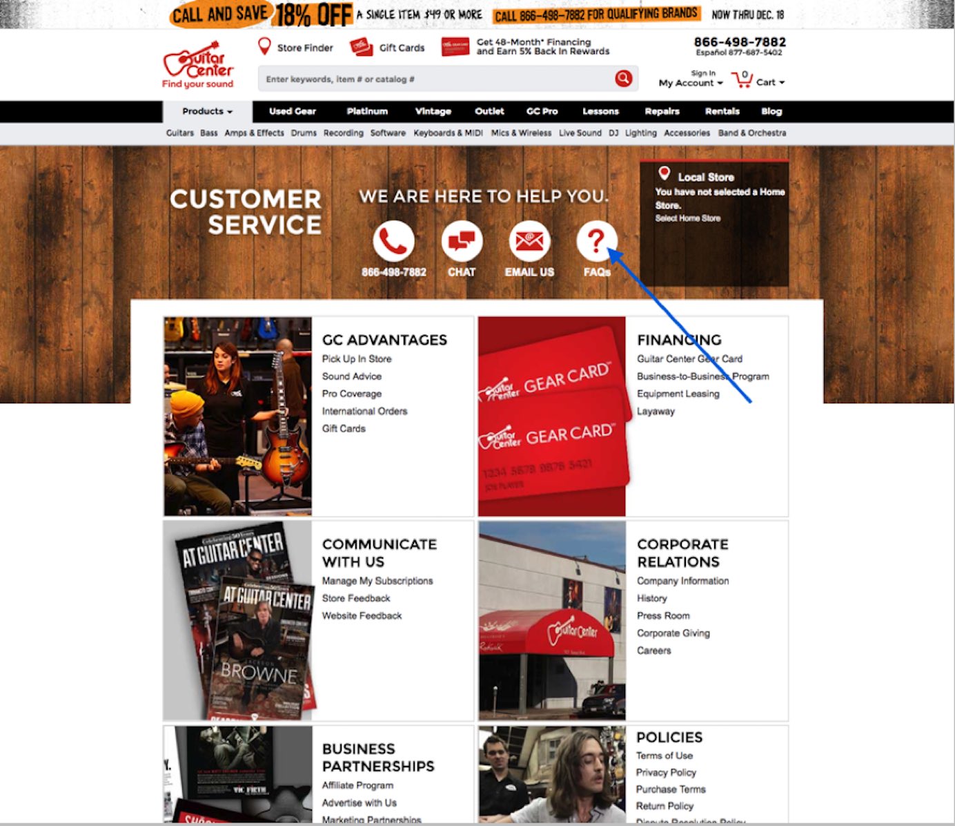
- Provide at least one customer-service hub page that serves as a catch-all. Sites should always include a high-level customer-service page housing links to any customer-service related question. If customers are unsure which link to visit, they should be able to rely on the hub page to find a path to any service information.
- Name the main hub page Customer Service or Customer Assistance. These labels always performed well in our study. Users were confident that they would find answers when they saw these labels. Alternative names such as Help or Help Center caused confusion. Many users skimmed past them looking for a more promising link and several shared their opinion that Help would bring them to website help rather than to general customer-service content about price matching or other policies. Though users would often visit these pages as a last resort and eventually find the information they were looking for, it wasn’t without confusion or uncertainty. (Also the word “help” has a bad rep, based on the poor online help provided by many applications.)
- Use only the following 3 standard customer-service hub pages.
- Customer Service: This page should be the main home for all customer-service information, as discussed above.
- FAQ: These pages should provide an alternative view of customer-service information presented in the format of common questions and answers.
- Contact Us: When users’ intention is to reach out to the company, they look for links labeled Contact Us; they don’t expect this information to be hosted under an FAQ link. Although people will click on a Customer Service link as a fallback, a Contact Us link is much more straightforward.
- The Customer Service page should always be present. FAQ and Contact Us are not required, but can be helpful. In any case, because users see them as general help pages, these pages should be presented at the same level in the information hierarchy and should deliver the expected experience — as described above. Stay away from providing other hub pages besides these three. The more such pages, the harder it will be for people to determine which is the right one.
- All hub pages should link together. Many sites label customer-service pages differently, so what is under the Returns link on one site will be found under FAQs on another, or under Customer Service on yet another site. For this reason, users may find themselves making a best guess as to which customer-service page holds the information they need. Often, they will navigate to a page and then realize it is not what they need. For this reason, the big three hub pages should crosslink to each other. For example, someone looking to contact the company may first see and visit the Customer Service link, and from there discover the path to contact the company, leading them to the Contact Us page.
But crosslinks to other hub pages can also help users figure out what would be the best way to approach their goal. Thus, a customer looking to contact the company may first see the Contact Us link, but upon seeing a path to FAQ, she may try to self-serve first by inspecting the most common questions before calling.

The Contact page on OutdoorVoices.com highlighted a few common questions with links to the appropriate area of the site for each. Additionally, a direct link to FAQs was provided for all other questions. -
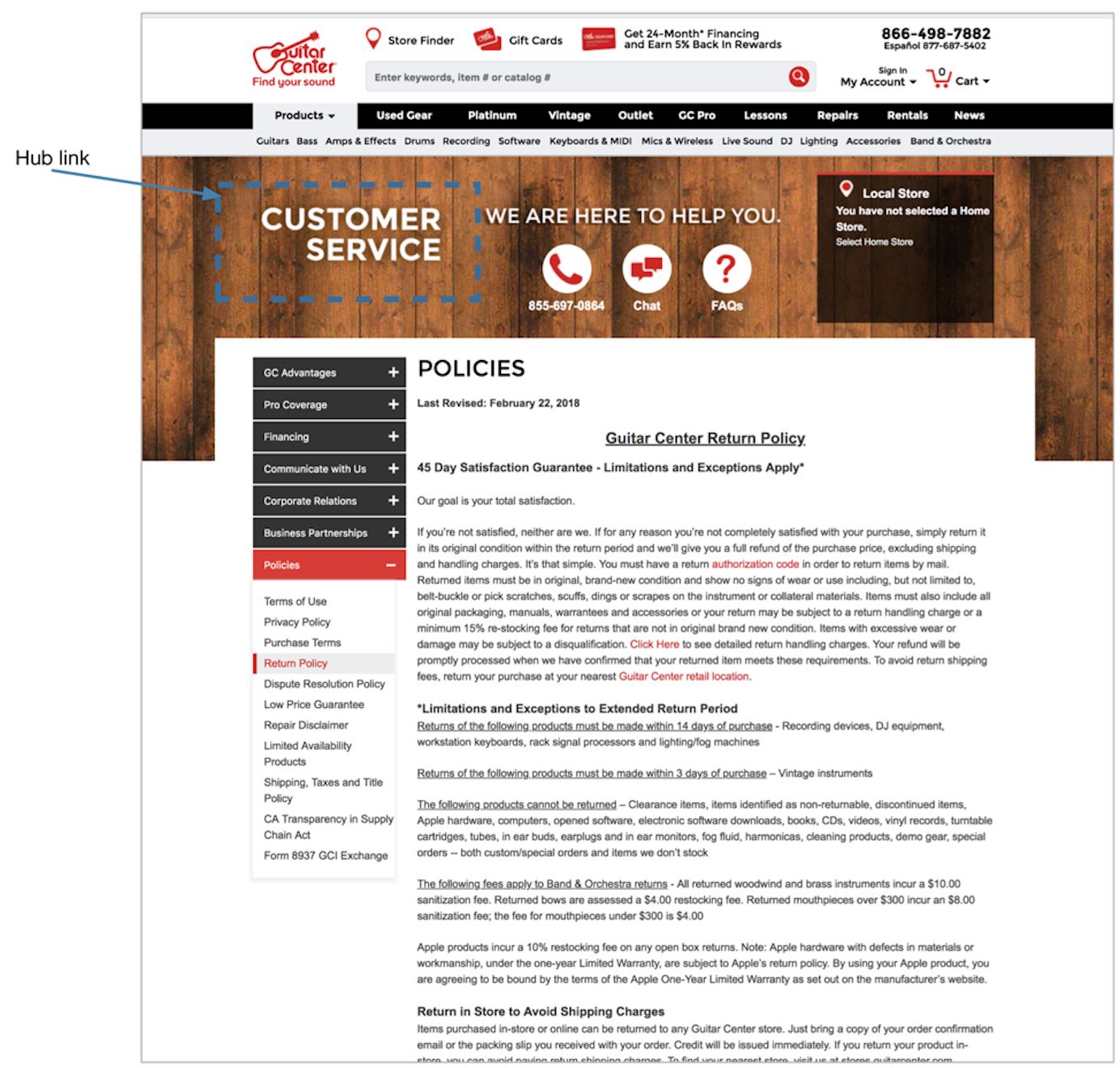
Customer-service pages should link to hub pages. To streamline access to important or commonly requested customer-service information, many sites expose direct links to pages that hold this information. This practice is appropriate and helpful for users. Links like Return policy, Track my order, and Shipping information were often exposed in the global navigation in order to provide visitors with a quick path to details. However, because of their prominence, these pages acted like magnets for visitors looking for other types of customer assistance; people tried them hoping for a path to the content they needed. To help such users, these pages should link to the customer-service hubs.
The links to the hubs should be found in the body of the page. Don’t rely on the links in the global navigation as the only pathway to hub and other related service pages. Often, if users didn’t find the answer on the first page they visited, they assumed it wasn’t provided on the site and did not return to the footer to try another page. Placing links to related information in the body of the page makes that information more discoverable.
On CooksDirect.com, users had a hard time finding the shipping charges for backordered items. The site’s footer provided a direct link to the shipping policy, and many users clicked it. However, the shipping-policy page had no information about whether there will be additional shipping charges for items on backorder.
This information did exist on the FAQ page, but that page was not linked to from the shipping-policy page, so users did not find it.

CooksDirect.com: Users could navigate to specific shipping-policy pages, but had trouble locating the additional information they needed, which existed on the FAQ page, but was not referenced on the policy page.
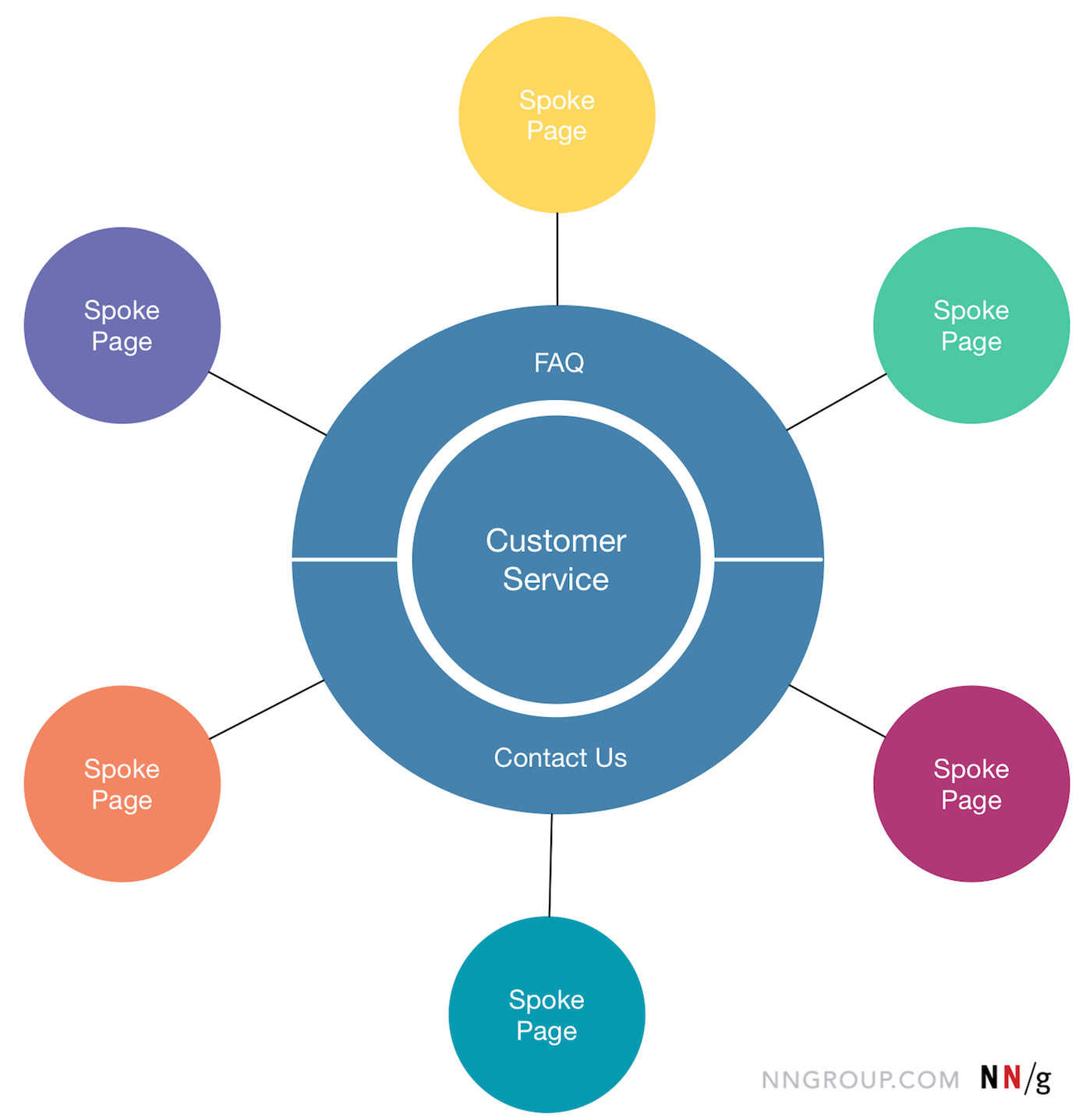
Hub-and-Spoke Customer-Service–Delivery Model
Based on these findings and best practices we propose the following model for the delivery of customer-service information on ecommerce websites. In this model you can see the following:
- The Customer Service page is the main hub page.
- FAQ and Contact us are secondary and may or may not need to exist.
- Hub pages link to each other.
- Other customer-service pages act as spokes outside of the main hubs and have links back to the main hub pages.
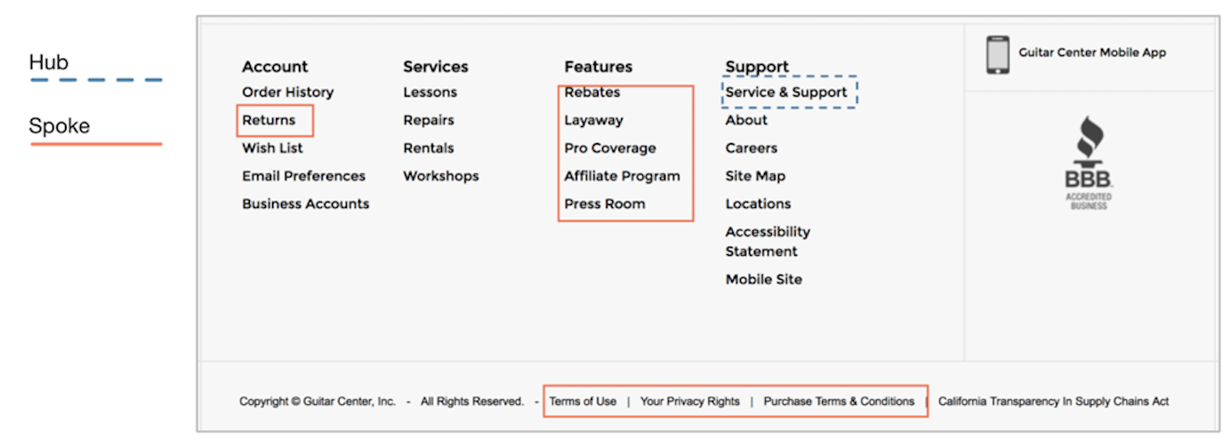
GuitarCenter.com’s customer-service pages adhered to this model. Our study participants found customer-service information easily on this site.
Conclusion
Do customers call or email your support channels looking for information that can be found on your website? This behavior may be an indication that your support information is not structured or delivered appropriately and that people have trouble locating it. Remember that for every one such request you can count, there are dozens of other frustrated customers who also couldn’t find the information they needed, but who either also couldn’t find your contact info, or simply gave up and went elsewhere (to Google or a competitor).
Even those who can find the customer-assistance information may put in an unnecessary amount of work. Hard to find customer-service content impacts customers’ perceptions of the company. The hub-and-spoke model for the organization and delivery of customer-service information shows what important customer service pages should exist and the most effective hierarchical relationships between them. Though this model was developed from research on ecommerce websites, it is valid and useful for other industries as well.
Take a look at the way customer-service information is delivered on your website. Use the hub-and-spoke model for delivery to ensure that your users are successful in getting the support they need on your website.


Share this article: