We encounter and process tremendous amounts of information every day. Think about all the information you’ve come across today — how much of it was actually relevant and useful to you?
Most of the information we encounter is noise — it’s irrelevant to our current need. Conversely, the information that is relevant and useful to us (the information we’re looking for or want) is the signal.
Definition: In human–computer interaction, the signal–to–noise ratio represents the ratio of relevant to irrelevant information in an interface or communication channel.
In a user interface, the “information” involved in this ratio could be anything — text content, visual elements, or animation. Essentially, anything that users have to process could count as signal or noise. To improve the efficiency of communicating information through your designs and help users complete their tasks, aim for a high signal–to–noise ratio.
Signal or Noise?
Although the definitions of signal and noise are simple, when it comes to real design, it isn’t always easy to tell the difference. Not every user will have the same goal, so exactly what counts as “signal” and “noise” will vary. One person’s signal could be noise to another. Therefore, the signal–to–noise ratio of your UI could be higher or lower depending on who’s looking at it, and what that person is trying to do.
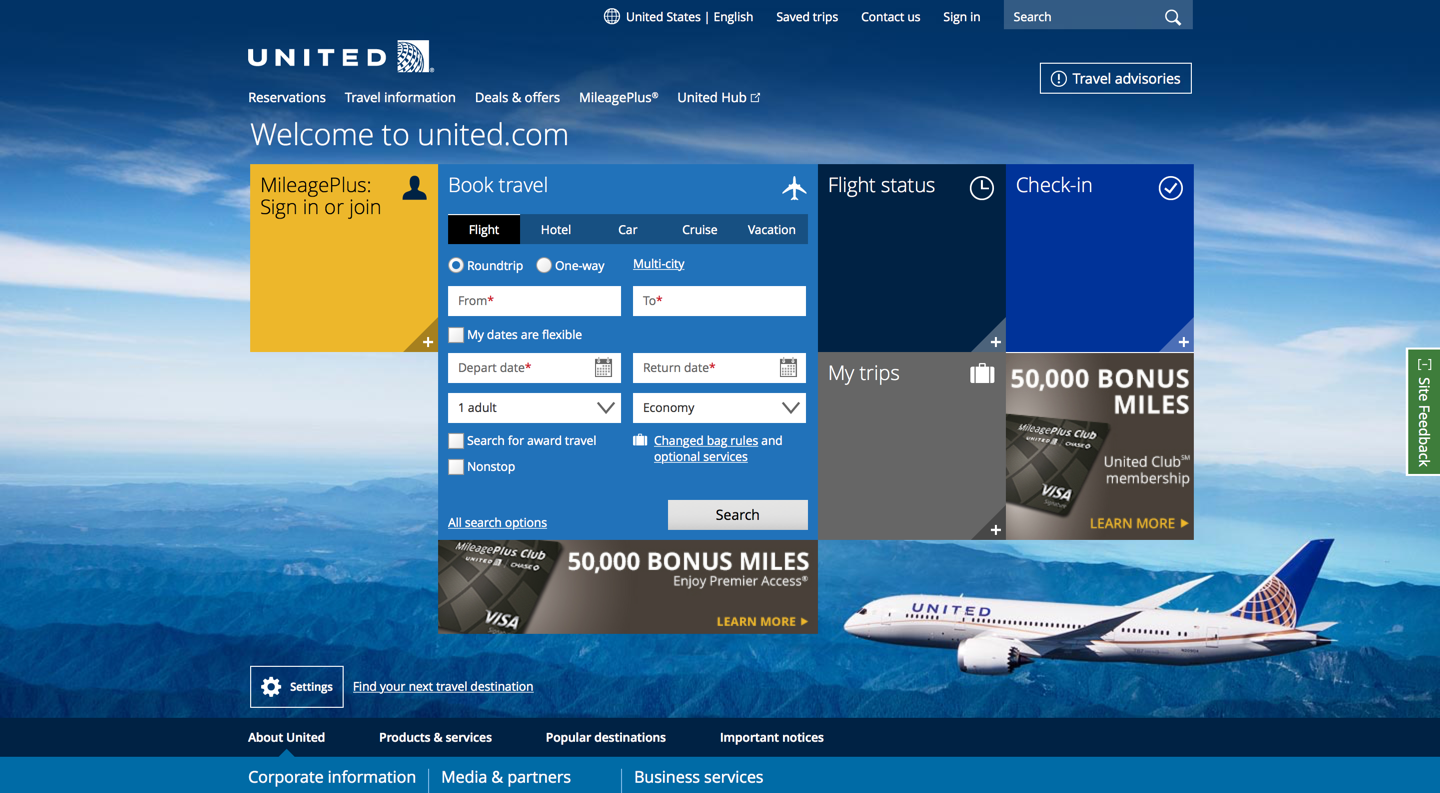
The homepage of United Airlines serves as a starting point for several different tasks. For example:
- Booking a flight
- Checking in for a booked flight
- Looking up details about a booked flight
For a user who wants to book a new flight, the blue Book Travel block will be the strongest signal — the part of the interface that’s most relevant to her. But for someone who wants to find details about a flight he’s already booked, the Book Travel block is just noise, while the My Trips section and the Sign In link are signal.
Some of the elements in this interface, however, will be noise to all users, irrespective of which of the three primary tasks they are doing; these include:
- the advertisements for the United credit card
- the decorative airplane at the bottom
- the Site Feedback link along the right side of the page
In an ideal world (from an HCI perspective, at least), we should remove any content or UI elements that are not relevant for any of the tasks supported on the site. Taken to the extreme, the goal of a high signal–to–noise ratio is closely related to minimalism — a web-design trend that aims to simplify interfaces by removing unnecessary elements or content. However, UI elements may serve functions other than simple communication or task efficiency.
Besides communicating information, we also want our interfaces to be visually appealing, and to evoke certain emotions in our users. We want to show off our brand, and need to serve business goals (like promoting certain products). With these additional goals, we should aim for a reasonable signal–to–noise ratio rather than seeking to exclude in an absolutist manner all ‘irrelevant’ parts.
Note, however, that there some things that are “noise” to everyone and fail to serve some other purpose — for example, gratuitous animations that distract and annoy users, or huge images that take a lot of space without communicating much information. Keep an eye out for any elements that aren’t serving your users’ goals or your business goals, and consider eliminating those.
Increasing the Signal–to–Noise Ratio
While balancing user and business priorities is crucial, a high signal–to–noise ratio can be achieved by paying attention to your content and by using a strong visual hierarchy.
Simple and Prioritized Content
To improve the signal–to–noise ratio, start with a clear content strategy to help you prioritize the information you want to convey.
Before starting to create content for a page, or revising an existing page, think about the needs of your page visitors and about what you must communicate to them. Once you have a list of candidate topics, create a content hierarchy: prioritize the ideas and topics you came up with. One useful way to work through this prioritization is by using content frames.
Since people don’t read carefully online, it’s important to be sure that every piece of text on a page has some importance to at least some of your users. Avoid redundant content, as well as large blocks of text, which are challenging for users to scan and quickly separate their signal from the noise. Consider structuring the text on the page using the inverted pyramid style — starting with the most important information first, and adding the nice-to-know details further down the page. Help users avoid the F-pattern by offering good formatting, with bolded keywords and bullet points.
Visual Hierarchy
For each page, think about the importance of the different elements (whether chrome or content), and then help your users pick out the signal and skip over the noise by using a visual hierarchy that reflects the relative importance of these elements. In other words, anything that is highly relevant for most users should have a high visual weight.
There are a lot of methods for creating visual hierarchy. For example:
- making the font large and bold
- changing the color of a call to action
- adding an icon
- increasing the size of a button
In general, important elements should be larger, bolder, or in a contrasting color relative to the elements around them. Just keep in mind: you should use these techniques sparingly. Only highlight the essential information, to make sure the page doesn’t become overwhelming.
Dynamic Noise
Designing a user interface is different than designing print collateral. Even though the basic principle of signal vs. noise applies to both interactive designs and static designs, there are some additional issues to consider for the online medium and other user interfaces. In particular, what counts as noise can change from moment to moment, as the user’s task changes.
Consider, for example, the navigation on a website: much of the time, the navigation UI is noise, as the user is focused on the page content. However, when the user is done with the current page and wants to move to another page, the navigation suddenly becomes signal. This tension can be resolved by a consistent design, so that the navigation is displayed in the same way on all pages on a site. Users will quickly learn to ignore the navigation area on a consistently designed site (until they need it, of course — at which time users will quickly locate the navigation). In this way, while the navigation will remain noise, it’s benign noise that doesn’t bother users. In contrast, a noisy design element that bounces from place to place across pages will definitely act as malign noise and bother users much more.
Conclusion
Interfaces with high signal–to–noise ratios improve communication with users and make their tasks easier. Strive to reduce the noise and make the signal stand out, while balancing organizational priorities and goals. In this way, users are likely to find the information they need easily and complete their tasks.


Share this article: