Screen sizes are constantly shifting and designs can respond to these sizes, rather than fit to a constant size. So when clients, designers, developers, or marketers talk about content “above the fold” — a term borrowed from print-newspaper terminology and used as a way to reference what is visible on the webpage without scrolling — does it make sense anymore?
Yes. The fold still exists and still applies. Even though the exact location of the fold will differ between devices, it exists for every single user on every single screen. From a technical standpoint, the fold for the most common device sizes can be determined by looking at web traffic and at device and browser statistics. A responsive design may have 2, 3, 4, or more different folds, specific to the devices and screen sizes that the design was optimized for. Each target device has its own fold to consider.
But more than a measurement, the fold is a concept. The fold matters because what appears at the top of your page matters. Users do scroll, but only if what’s above the fold is promising enough. What is visible on the page without requiring any action is what encourages us to scroll. This is true on any size screen, be it mobile, tablet, or desktop: anything that’s hidden and that the user must uncover will only be seen if the user deems it worth the hassle.
It’s a simple matter of interaction cost:
- Visible without further action (i.e., above the fold) = low interaction cost to view
- Invisible and requiring an action to be made visible (i.e., below the fold, or otherwise hidden) = higher interaction cost, consisting of (a) the mental effort of guessing that something is hidden and having to make the positive decision to reveal the content, and (b) the physical effort of doing what is required to see the content (e.g., scrolling the page).
We don’t go to a page, see useless and irrelevant content, and scroll out of the blind hope that something useful may be hidden 5 screens down. What we find at the top of the page helps us decide to continue scrolling, navigate to another page, try another site, or abandon the task altogether. So, long pages can benefit from signposts at the top of the page, via links or through content, that show users what is coming next.
As screens get smaller, we’re forced to scroll more, out of necessity. When little appears at the top of a small mobile screen, we look for more below. But we don’t do so because we like scrolling. We do so because we expect that there is more information of value to us below the fold.
Encourage Scrolling
Webpages need to build a solid story. Users can be encouraged to scroll by giving them good reason to do so. Visual elements can draw the eye down the page. Compelling content can draw the user in. If the most interesting information is at the top of the page, users may be enticed to visit the bottom of the page as well.
When pages of any size offer little content at the top, it is difficult for users to know what else is available on the page. It may make for an attractive page, but that may come at the cost of discouraging users from scrolling. Such designs can create “false floors” that make users think they’ve seen the full page of content.


When users fail to see information of value, they stop scrolling. In usability testing, the occasional user does a “lay of the land” scroll to get a sense of what’s on a page before engaging, but this behavior is far from standard. Users scroll when there is reason to.
The fold will always matter because scrolling is an extra action that users need to take to access content. Just like waiting for a page to load, flipping through a carousel, or opening an accordion to view text, scrolling adds an extra step that users must take to accomplish their goal.
There are certainly designs that successfully offer very little at the top of the page while enticing users to scroll. Successful designs encourage the extra effort — they offer a glimpse of interesting content, a compelling introduction, engaging imagery. Those designers who create compelling and successful long pages are aware of the fold — they know how to craft a page that will encourage users to explore, rather than to navigate away. They prioritize content that leads the user down the page, content that makes the extra effort pay off.
Evidence for the Fold’s Impact
In interface design dilemmas, it’s common to have arguments both ways, requiring the user experience team to estimate which argument is the strongest. In this case, the theory is unusually clear-cut: the interaction costs are substantially different for material above vs. below the fold, so these two areas will be treated differently by users.
Still, it’s nice when there’s empirical data to support a theory. And that evidence is abundantly available in the case of the page fold. We have observed countless users in qualitative usability studies having their behaviors impacted by the fold — often for the worse, because websites didn’t prioritize above-the-fold content appropriately. Users stopped scrolling before finding the information they needed, or worse, didn’t realize that there was more information waiting for them below the fold.
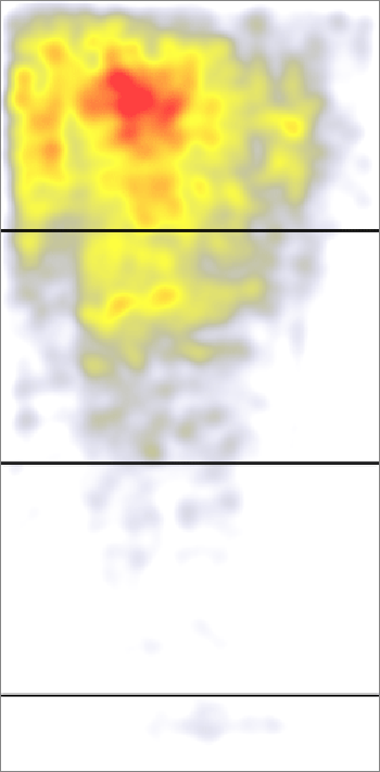
There’s also quantitative evidence: in an analysis of 57,453 eyetracking fixations, we found that there was a dramatic drop-off in user attention at the position of the page fold. Elements above the fold were seen more than elements below the fold: the 100 pixels just above the fold were viewed 102% more than the 100 pixels just below the fold.
The following heatmap aggregates all the sites in our study (excluding search engines and search pages). Content below the fold does gather some looks, but not nearly as many as the content above the fold.
A second set of data comes from Google’s analysis of display advertising (PDF) across a huge number of websites. The study looked at how “viewable” an advertisement was, with viewability defined as 50% of the ad’s pixels being on-screen for one second. Advertisements just above the fold had 73% viewability, whereas ads just below the fold had 44% viewability. In the Google study, the drop-off caused by the fold was 66%, because that’s how much more ads just above the fold were visible, compared with ads just below the fold.
Why did Google measure the fold’s impact at 66% when we measured it at 102%? The explanation lies in the two different metrics employed. Google measured whether an ad was displayed on the screen, so that the user might see it, if they happened to look at that spot. We measured where people actually looked on the screen and how much time they spent on looking.
The two quantitative studies produce slightly different estimates of the fold’s impact on the user experience. But both numbers are big: we’re not talking a 5% difference or a 10% difference between information above vs. below the fold. The difference is on the order of 66%–102%. If you want a single number as our best current estimate, let's take the mid-point of this range: 84% is the average difference in how users treat info above vs. below the fold. Huge. Believe in the fold. It’s there, and the user experience changes drastically at that spot.
Users don’t scroll for fun. They scroll for a purpose. So if talking about the fold puts the focus on what’s first on the page, let’s continue the conversation.


Share this article: