Have you ever involved stakeholders in design critiques, ideation sessions, or meetings devoted to analyzing research findings only to find them uninterested? And were the ideas and research findings ever ignored or forgotten? UX workshops have numerous benefits: educate people and make them empathic towards users, make stakeholders feel involved and responsible for ideas and research findings, create awareness of usability issues and design challenges, build common ground across all parties involved, and bring together many types of backgrounds and expertise.
However, in such UX workshops, it can be challenging to engage the team, and create order among diverse ideas and facts.
One method that helps teams collaboratively analyze research findings as well as ideas from ideation sessions is affinity diagramming. Often used in UX, affinity diagramming is adapted from the KJ diagramming method (named after author Kawakita Jiro).
Definition: Affinity diagramming refers to organizing related facts into distinct clusters.
Affinity diagramming is also known as affinity mapping, collaborative sorting, snowballing, or even card sorting. (However, in UX, ‘card sorting’ stands for a very specific research method for determining the IA of a site or application. In it, users sort index cards with category names and commands written on them.)
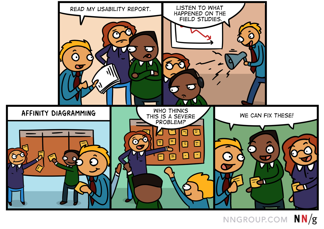
Affinity Diagramming in UX
While affinity diagramming as a method can be used by individuals as well as groups, in UX, it is used primarily by teams for quickly organizing:
- observations or ideas from a research study
- ideas that surface in design-ideation meetings
- ideas about UX strategy and vision

Affinity diagramming in UX usually involves two steps:
A. Generating the sticky notes. In this step, team members write down ideas or facts on separate sticky notes.
- During a usability session, the facilitator and the observers write observations, findings, or ideas — each on one sticky note.
- During an ideation workshop, attendees or the workshop facilitator write each idea on a sticky note.
B. Organizing the notes in groups. After the test or the ideation session, the team has a workshop devoted to analyzing the notes by:
- sorting them into categories
- prioritizing each note, and determining the next steps in design or further research
Workshop Leader
It can be tiring to interpret and sort many notes, and attendees can lose interest if the meeting drags on. So, it’s important to have a leader to keep the meeting moving quickly and productively. This person’s job is to:
- Communicate the agenda and goals.
- Describe what people should be doing at each phase of the workshop.
- Track and communicate time for each step.
- Get all the notes on the wall.
- Facilitate moving past any issues that may arise, such as helping the person who seems lost, or pairing people when one is idle and another is very busy.
Steps for Affinity Diagramming in UX
Before the Affinity-Diagramming Workshop
- Choose a room that has walls on which sticky notes can be attached (e.g., glass or whiteboard). Alternatively, tape flip-chart paper on the walls and stick the notes on top, or use easels if walls are not tape-friendly.
- Just before the meeting begins, enlist some help and put all notes on the wall, in no order.

3. Consider creating a few category names to help get the sorting started. For webpages, some common categories are: Search, Global navigation, Homepage, Legibility, Footer, Page layout. Stick these category names high on a blank part of a wall, so many notes can fit below.
4. Add a “?” category name for notes that are not understandable.
5. Put some pens or markers and blank pads of sticky notes on a table.
At the Start of the Meeting: Announce the Steps and Timing Guidelines
The leader should announce what the different steps of the process are and how long the workshop will take:
6. The general steps we’ll follow are:
- Sort into top-level categories.
- Sort each of those categories into subcategories.
- Summarize those categories.
- Determine priorities (e.g., by taking votes).
- Plan subsequent design meetings as needed.
No talking as you sort, please. It gets distracting and makes the process take longer. This meeting should take not more than 3 (usually 2) hours. We’ll all need to work hard and quickly to make that happen.
Sort Notes into Top-Level Categories
The leader should describe the process and announce the time for this step:
7. Pluck a note off the wall and read it.
8. Look for a category under which it would make sense.
9. Stick it there.
10. If there is already a note that says the same thing, stack the notes on top of one another, so the most descriptive note is the only visible one.
11. If the note doesn’t fit under any category, think of a new one. Use markers and blank sticky notes to write down any new categories.
12. Yell out the names of new categories as they are stuck on a blank section of the wall, so everyone knows when a new category has been created.
13. If you can’t understand a note, move it to the “?” category. We’ll try to make sense of that in the end.
14. Let’s work to get these sorted within 30 minutes (or however much time you feel it will take).
15. I’ll periodically yell out how much time we have left.
16. Questions? Let’s go!
In most browsers, hover over the video to display the controls if they're not already visible. Affinity-diagramming workshop for analyzing findings from user research on Marriott International's intranet
Sort Notes from Each Top-Level Category into Subcategories
Here are instructions for this step:
17. Everyone choose a category.
18. Categories with a lot of notes may require two people to sort them. Some people will be fast and will be able to sort multiple categories.
19. Look for related themes and sort those notes into subcategories.
20. Write the names for the subcategories on sticky notes.
21. When you finish sorting a category, look for another category that needs sorting, or for a person who could use help. Don’t be idle.
22. Questions? Let’s go!
Present Each Category
23. Anyone who sorted a category can start. Stand by it and read each finding, then summarize the category.
24. It’s okay for the rest of the attendees to make related points or ask questions now. (But these comments add time to the meeting, so you may choose to skip this instruction.)
25. One-by-one, each person stand by her category and present it. Go clockwise around the room until all categories are done. If multiple people sorted a category, they can present it together, or choose one delegate.
26. Questions? Let’s go!
Determine Priorities
Slightly different methods are used depending on whether the purpose of the workshop is to analyze usability-test findings or organize new ideas.
A. Usability-Test Findings
There are two common ways to determine which usability-testing issues have the highest importance: either by going through all findings and having people vote on their severity (high, medium, low), or by having people assign a finite set of points to those items they think are important and need to be fixed. The latter method often can be more effective and more immediately actionable than the former (which can result in many problems rated as “high importance”).
Severity
27. The meeting leader reads each finding again and asks people to vote about its importance by show of hands: high, medium, and low. Whichever rating gets the most votes is the rating assigned to the problem.
28. Write the rating (H, M, or L) on each note.
OR
Points
29. Each attendee gets a certain number (usually 3) of importance points which she can assign to the items she thinks most need to be addressed.
30. Then, people walk around and stick a sticker (or draw a dot with a colored marker) on the items they wish to cast their votes for.
31. The voting rules differ by team and local preferences, but usually people are allowed to assign multiple importance points (up to their allocated maximum) to a single issue if they think it’s crucial enough. For example, an attendee with 3 votes could assign two votes to one issue and one vote to another.
B. Design Ideation
Design ideas from ideation workshops can also be voted on, or assigned value in some other way. Two common methods are the one-hundred-dollar test and the NUF test.
One-Hundred-Dollar Test
32. When there are several design ideas for the same problem, give the group $100 (any currency will do) to split among the ideas generated, such that the total for the group of ideas equals $100. This method forces people to think in terms of each design’s worth, and usually one design emerges more valuable than the other(s).
NUF
33. NUF stands for: New, Useful, and Feasible. Each design idea is rated on a 1- to-7 scale for each of these three attributes: 1) whether the team has used that design before (usually newer items are considered better); 2) whether the idea is useful and it solves the problem; and 3) how feasible it is for the team to implement the idea. The ratings are totaled, and the overall score is used to rank the ideas.
Capture
The resulting clusters and the determined priorities are the end product of the affinity diagramming. To record it:
34. Write the main points on flipchart paper so all can see them.
35. Take photos of the walls. By now the stickies are usually falling down, which signals the meeting’s end.
End the Meeting
36. Assign follow-up tasks (or announce when these will be assigned).
37. Announce that a written report and (or) video recordings will be available.
38. Announce that design-workshop meetings will be scheduled, if appropriate, to design based on the outcome from affinity diagramming.
Timing for Each Step
The timing for each affinity-diagramming step can vary depending on the:
- Number of notes
- Number of meeting attendees
- Attendees’ experience with user research and affinity diagramming
Even with an abundance of notes, we suggest limiting the meeting to about three hours, and having a scheduled 10-minute break. It’s also helpful to bring out some treats at key times — for example, while people are sorting categories into subcategories.
We like to keep most meetings between 90 minutes and 2 hours. Below are some general timing guidelines for each step:

Variations on the Affinity-Diagramming Process
- In ideation workshops, teams often sort ideas after they generate them, within the same workshop.
- For affinity diagramming of research findings, some teams prefer to sort the sticky notes after each participant’s test session, and again after all (four to eight) sessions. Here are some pros and cons of this variation:
Benefits
Benefits of sorting after each session are that:
- It helps the team gain a shared understanding after each user.
- It reminds the team members of what they saw, right when their memories are fresh, which can help with further discussions and with observing future test sessions.
- It may ultimately be faster if your team members tend to take a lot of notes.
- It enables you to summarize results quickly when you plan to make design changes between user tests — for example, for rapid prototype testing with very early design iterations.
Drawbacks
- It takes a lot of time, and the same benefits may be achieved with just a quick discussion after each test.
- It can deter stakeholders from coming to the final, posttest affinity-diagramming meeting.
Who Should Sort Notes
Anyone can come to the affinity-diagramming meeting. In particular, anyone who:
- Attended all or some of the usability-test sessions or design workshop
- Has an interest in the design that was tested, or in any changes that will be made to that design
Conclusion
I used to think that, as a user researcher, my job was to make the information I collected about users as understandable and digestible as possible for my team. And as a designer, I was supposed to come up with the best design solution. While I still feel these things are true, I have learned that insulating stakeholders from all the false starts, design ideas, details and messy notes taken in tests does them a disservice. To educate other team members, involve them in design, build consensus, and increase sensitivity to usability issues, get them involved in taking notes, sorting them, and discussing them rather that protecting them from these processes.
Reference
Karl Ulrich, 2003. KJ Diagrams. The Wharton School, University of Pennsylvania, Philadelphia, PA
Raymond Scupin, 1997. The KJ Method: A Technique for Analyzing Data Derived from Japanese Ethnology. The Society for Applied Anthropology


Share this article: