To update our report on UX Design for Children, we recently conducted user testing in US and China. The participants were aged 3 to 12 and used a variety of kid-geared websites and applications on laptops and mobile devices. We ran individual sessions for the youngest (3–5) and oldest (9–11) age groups, and dyads for participants aged 6 to 8. During these studies, it was striking to see how children only two years apart in age behaved differently on the same task because of their physical development. When designing apps for kids, designers must consider the physical abilities and constraints of target age groups.
When interacting with devices, the users’ motor skills set the scope of the interactive gestures that work best for them. (This is true for young children, older adults, and everyone in between.) Generally speaking, there are three major categories of motor skills:
- Gross motor skills refer to the ability to perform movements that involve large muscle groups, like those in arms or legs. Jumping, hopping, skipping are all examples of gross motor skills.
- Fine motor skills refer to the ability to perform precise movements that involve the small muscles in the wrists and fingers. Grabbing an object with the thumb and the finger or handwriting belong to fine motor skills.
- Motor coordination is the general ability to combine gross and fine motor skills and coordinate different parts of the body to accomplish a certain task.
Although the precise timeline will depend on the child and on the complexity of the actions involved, gross motor skills tend to develop earlier than fine motor skills.
Our research with kids on the web and mobile devices shows that the physical development of motor skills and motor coordination influences children’s ability to interact with devices.
Roughly, children under 5 have limited motor abilities and require very simple physical interactions on touchscreens. For kids between 6–8 years old, their developing motor skills allow them to perform simple interaction gestures on laptops like clicking and simple keyboard usage. Whereas starting around the age of 9 years, more advanced interaction techniques become possible. Around the age of 11 years, children become able to use the same range of physical interactions as adult users. (Though obviously, their mental development stage and educational level still dictate simpler overall user interfaces for 11-year olds than for adults.) Scroll the table to the right to see more data.
|
|
|
3–5-year-olds |
6–8-year-olds |
9–12-year-olds |
|
Physical ability |
Gross motor skills |
Limited |
Partially developed |
Well developed |
|
Fine motor skills |
Very limited |
Limited |
Well developed |
|
|
Motor coordination |
Very limited |
Limited |
Partially developed |
|
|
Device preference |
Touchscreens |
Touchscreens and the trackpad of laptops |
Both laptops and touchscreens; can use both the mouse and the trackpad |
|
|
Gestures mastered at each age |
Tapping, swiping, dragging on touchscreens |
Clicking with mouse & trackpad, simple keyboard use |
Dragging and scrolling with mouse & trackpad, complex coordination between keyboard and mouse |
|
(Our research with teenage users aged 13–17 is a separate series of studies, presented in a separate report on UX for Teens and briefly summarized in a separate article.)
Device Differences
Like many adults, kids in our studies preferred easy-to-use interfaces. The development of each user’s motor skills and coordination influenced kids’ preference for the mouse versus the trackpad. Touch gestures such swiping, tapping on big targets, or dragging were easy even for the youngest of users because they involved less advanced motor skills — big movements of arms and hands.
Many younger children are more comfortable with the trackpad than with the mouse; however, as they advance in age, children become proficient with both devices.
A 3-year-old girl preferred the trackpad because she couldn’t comfortably fit her hand around the mouse. Her limited eye–hand motor coordination also impeded her ability to understand the connection between the cursor and the movement of the mouse. But since she was familiar with touchscreen mobile devices, she performed better when using the trackpad. 5-year-olds in our study still showed a preference for the trackpad. 7-year-olds using a touchscreen PC abandoned the trackpad and mouse immediately, preferring the touchscreen instead. However, 8-year-olds could easily switch among different tools based on the requirement of the game: for dragging or scrolling, they turned to the mouse instead of the trackpad, but they still preferred the trackpad for other actions. 11-year-olds were familiar with computers and could use the mouse easily.
Below are three main design recommendations to ensure that physical gestures are age-appropriate for young users.
Design Recommendations
- Touchscreen designs for kids under 9 should emphasize swiping, tapping, and dragging. These gestures are the simplest for younger users, because they require big movements of arms and hands, which are better developed during early childhood than fine motor skills.
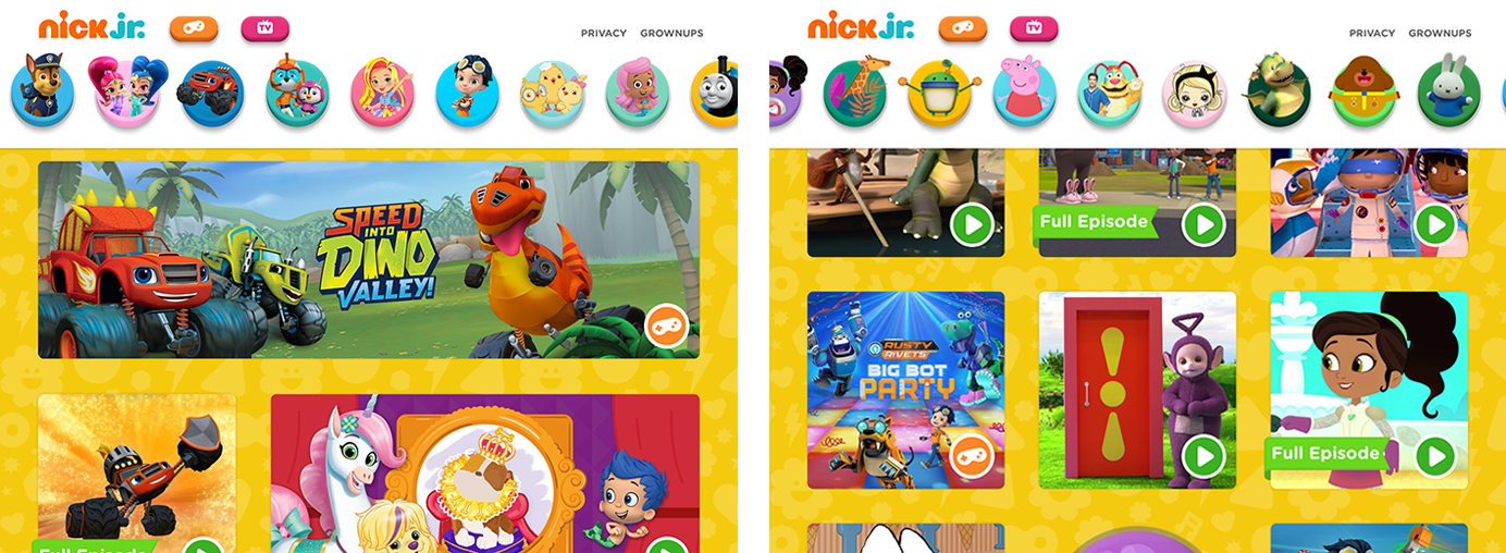
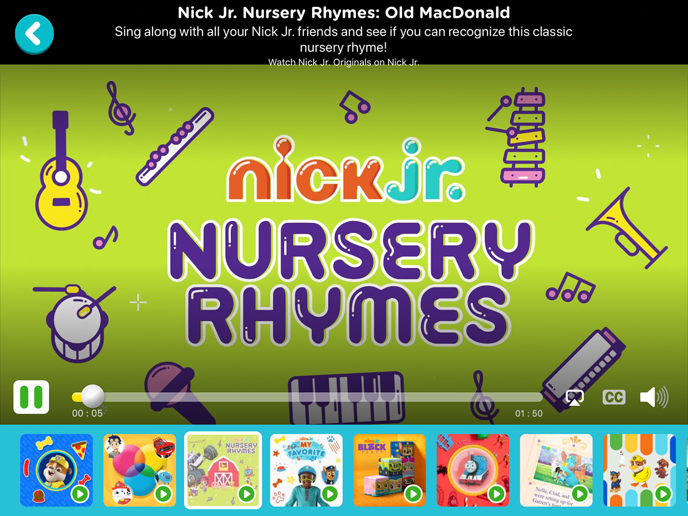
Design big, noticeable buttons for touchscreens to take advantage of young children’s gross motor skills and support their limited fine motor skills. We recommend at least 2cm × 2cm touch targets for young children (4 times bigger than the 1cm x 1cm recommended target size for adult users). For example, the Nick Jr. app did a great job of using simple navigation, together with swiping and tapping to encourage kids to explore its content. During our usability testing, a 3-year-old girl easily swiped both horizontally (to browse the character navigation and pick her favorite) and vertically (to browse more content within a certain category). The buttons were large, colorful, and informative, so kids could easily figure out which one they wanted to tap.
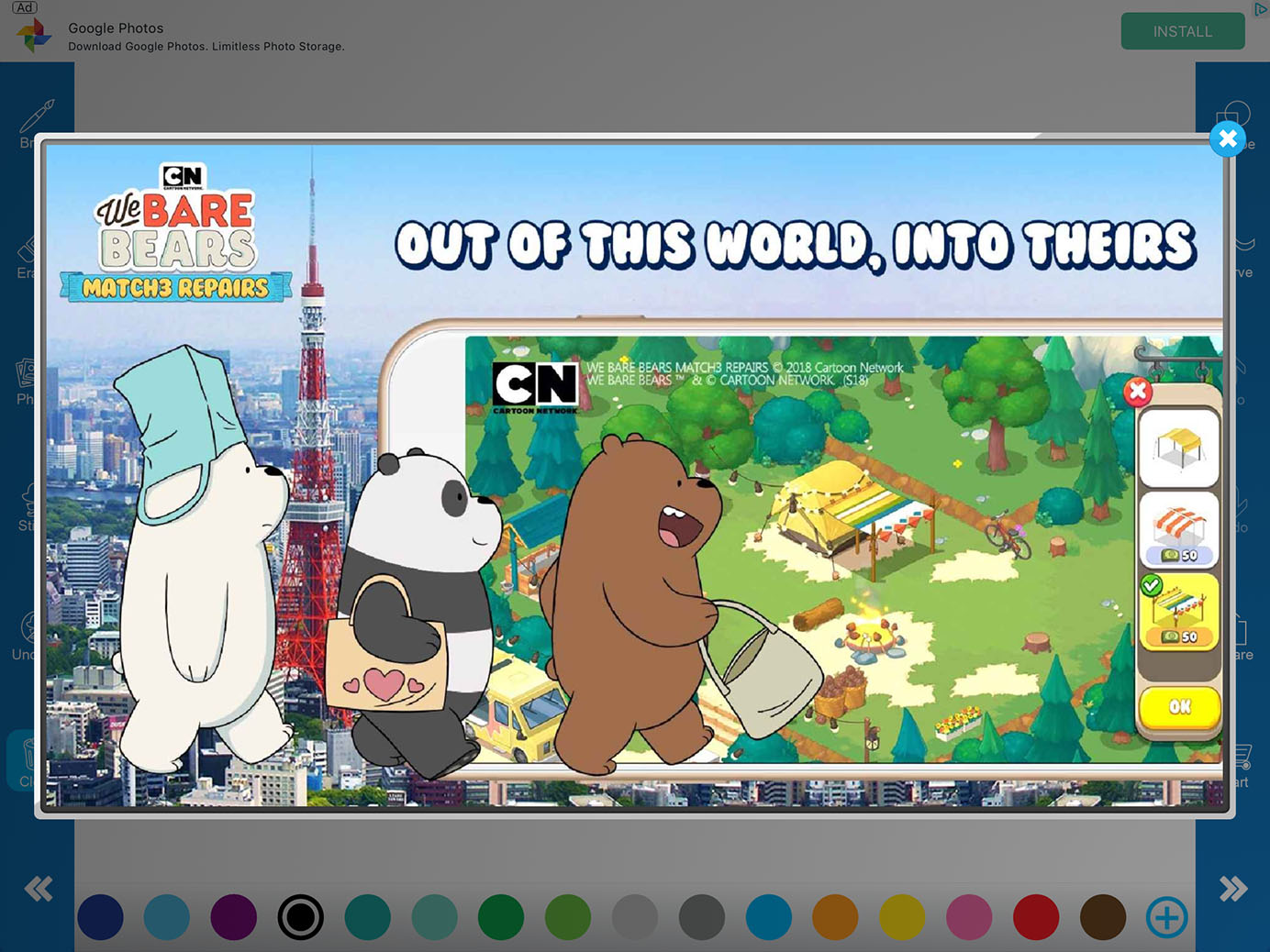
On the contrary, small and unnoticeable targets caused confusion and a bad user experience. For example, two 7-year-olds testing the Sketchbook app had a hard time trying to tap the ‘x’ to close the advertisement. The close button was too small (5 mm across) and the task thus required a high level of fine motor skills and motor coordination. What’s worse, accidentally clicking on any other part of the advertisement took the kids directly to the app store. They finally had to use an Apple Pencil, a more precise tool than their finger, to close the ad. The kids were so annoyed that they left the app quickly.
Make designs more flexible to support the motor ability of young users. When kids want to move a target on a touchscreen, there are two options: dragging the target to the destination or tapping the destination. Designs can be flexible by allowing both forms of interaction. For example, a Chinese app called Baby Earthquake Education let kids use both tapping and dragging to complete the same tasks. During our testing, we saw kids use both gestures to move the app’s characters to a safe place when there was an earthquake.
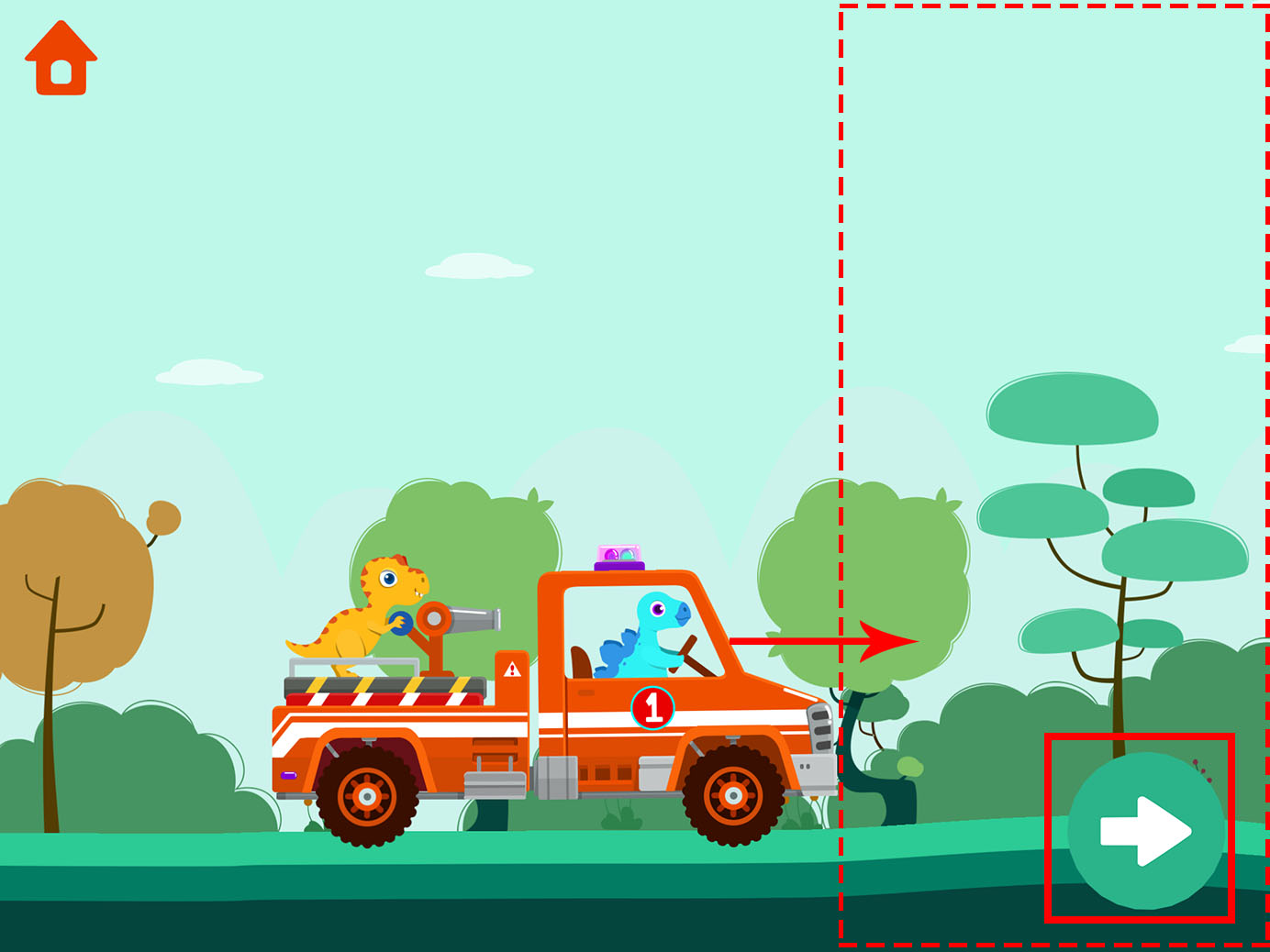
The design of another game, Go Firemen, also showed concern for flexibility of usage. Kids needed to drive the trunk to a house; to move the truck to the right, could either drag the car, tap an arrow button, or tap anywhere in the right half of the screen. During our testing, every kid who played the game was able to move the trunk smoothly.
In addition to easing interactions by providing simple gestures and increasing flexibility, designers can support young users by reducing navigation and recommending similar content instead. For example, in the Nick Jr. app, 3–5-year-olds easily browsed recommended content related to what they were currently watching and simply chose one, instead of going back to the homepage to find another topic.
- Desktop-based designs for kids under 9 should use simple keyboard interactions or clicks. Dragging, scrolling, and clicking small objects with a mouse or a trackpad are hard for this age group. Those gestures require a relatively high level of fine motor skills; to perform them, kids need to move their wrists and fingers much more precisely than on a touchscreen.
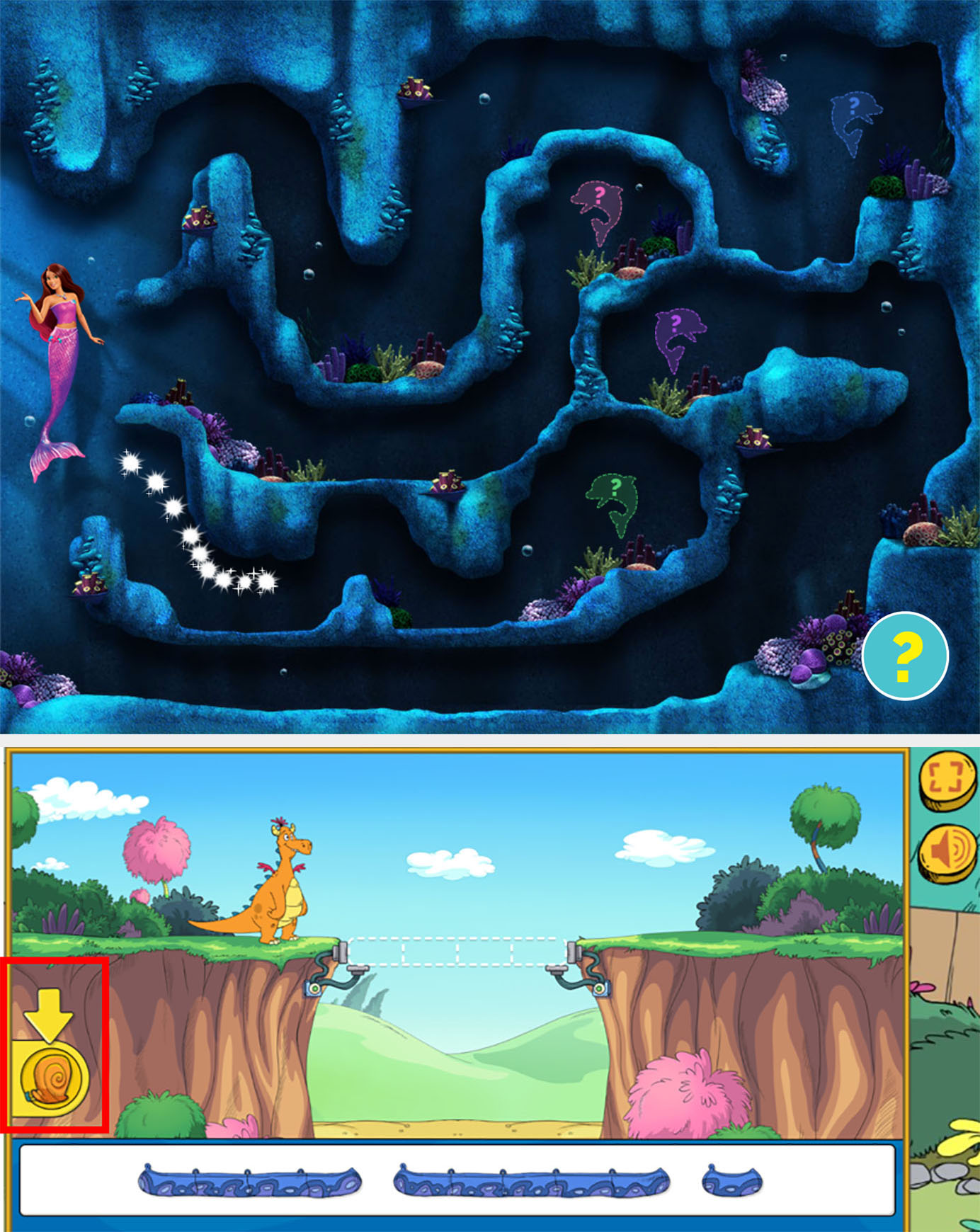
Children in our study had a difficult time dragging the cursor, especially over a long distance. On Barbie.com, two 8-year-old girls played the game Dolphin Magic Rescue. To find the dolphin, they had to drag the cursor without hitting any stones along the way. First, they tried to complete the task on the trackpad: they even used two fingers. At last, they gave up using the trackpad and successfully used the mouse instead.
The same thing happened on the PBS Kids site: to build a bridge, a 5-year-old boy was supposed to use a tape measure to find the length of the bridge and then select the right piece. He tried his best to use the trackpad to drag the tape measure near the pieces, but the pieces were too narrow for him to click and put the ruler on, so, after several attempts, he abandoned that tool. Note that the game did support a nondrag interaction (which involved clicking the tape measure and then the bridge piece), but none of the kids in our study discovered that function.
For kids under 9, desktop sites should be based on simple keyboard interactions or should only require clicks. Another game on the Barbie site worked better. For different levels on Barbie Dreamhouse Adventures, users needed to control the left and right arrow on the keyboard to move back and forth to play badminton or click to find the hidden puppies. As long as the site offered clear instructions with images, 7–9-year-olds had no trouble with keyboard or click-only games.

Even on touchscreens, dragging can become difficult. Precise dragging of target through a tunnel or to a specific spot was hard for kids, because it required relatively high motor dexterity. The Chinese Funny Food app required kids to drag vegetables to empty circles during a counting game. If users didn’t drag a vegetable exactly to the circle, the vegetable would disappear, and the kids needed to do it again. A 5-year-old boy was confused and struggled to drag 7 pumpkins precisely to where they should have been. After playing, he said, “I don’t like this game. Don’t ask me why.”
- Design for kids under 5 should not require complex motor coordination such as two-handed use or quick manual actions in response to a visual stimulus. Even for kids under 8, your site or app should impose only limited motor-coordination demands. Remember, motor coordination develops later, and games that require coordinative gestures beyond the kids’ skillset aren’t fun; they are frustrating.
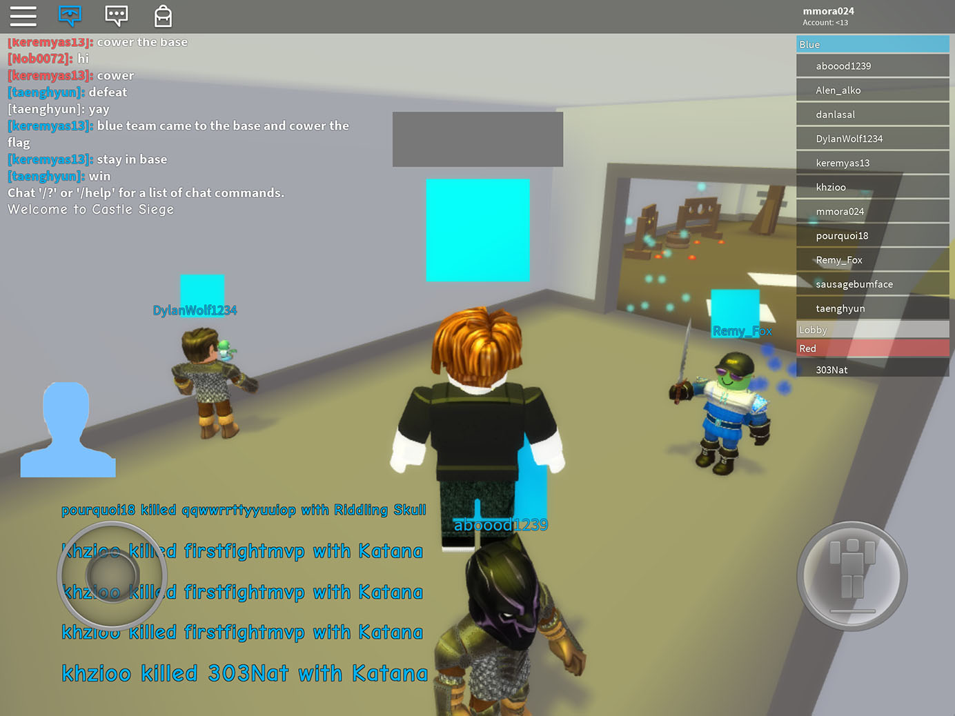
The popular game platform Roblox differed in usability for users in each age group we tested (3–5, 6–8, and 9–12) because of the variation in motor-coordination abilities at these ages. On the tablet version, the game had two control buttons, one on each side of the screen. The left one was for navigating and changing direction; the right one made the avatar jump. Swiping vertically on any other part of the interface changed the perspective of the game. On the PC version, the game required the usage of mouse as well as multiple keys. While users of all ages loved the game, their motor abilities influenced their game play. For example:
- On the tablet version of the app, a 5-year-old boy struggled with bimanual motor coordination. He discovered the swipe for changing the view, as well as the two control buttons, but he couldn’t manage to get them to work together smoothly. He used his dominant hand to tap the two controllers one at a time and move slowly. Sometimes he changed the perspective accidentally while moving his hand from one side of the screen to the other and didn’t know how it happened.
- A 7-year-old tablet user was able to coordinate his two hands to move smoothly.
- An 11-year-old girl was able to play the PC version of the game seamlessly. She coordinated her two hands smoothly by using her left hand to press different keys on the keyboard and her right hand to click around.
Conclusion
When designing websites, games, and apps for young kids, consider their physical abilities. Design mobile-friendly sites with big targets. For desktop, use simple keyboard interaction or clicks only; avoid complex gestures like dragging and scrolling that may discourage younger kids. Moreover, many young children are used with trackpads; with these devices, complex gestures are even harder than with the mouse. When designing interfaces for kids, carefully consider the target age group, their physical ability, and their device preference. UIs that exceed the kids’ motor ability will discourage them and even make them lose confidence in the device.
Learn more: full 399-page report UX Design for Children (Ages 3-12), 4th edition, with 156 design guidelines is available for download. See also follow-up article on the Cognitive Considerations When Designing for Kids.
Reference
Feldman, R. S. (2016). Development across the life span, 8th Edition. Pearson/Prentice Hall.


Share this article: