On desktop, the carousel has always been a popular way to stick multiple pieces of content on the front page without taking up too much space. On mobile, carousels increased in popularity when the iPad was first introduced. (Original iPad designs were fascinated by the etched-screen aesthetic and wanted to control the layout in the tiniest detail. As a result they often forewent vertical scrolling in favor of a card or carousel-like design.)
Like menus and accordions, carousels have an important advantage on mobile: they fit a lot of content into a relatively small footprint. Their second big plus is that they may solve content-priority quarrels within the organization by allowing everybody to make their mark on the main screen (even though it often turns into an invisible mark). However, carousels also have some important disadvantages:
- They are based on sequential access: users must go through all the items in the carousel one by one in order to get to the last one. This interaction is inefficient.
- They are not always discoverable. Even if people recognize the carousel, they will often have no way to know what types of items are hosted in it without interacting with the carousel.
Additionally, not all carousel controls are implemented correctly on touchscreens.
In this article we discuss a few usability guidelines meant to alleviate these issues on mobile devices.
Sequential Access
Going through items one by one with the hope of possibly finding one of interest is no fun: most people stop after viewing 3–4 different pages in the carousel. Because of that, we recommend that users should be able to reach the last item in the carousel in 3–4 steps (i.e., taps or swipes).
If you have a high number of items, use a list view instead and allow people to directly access any of the items on the page.
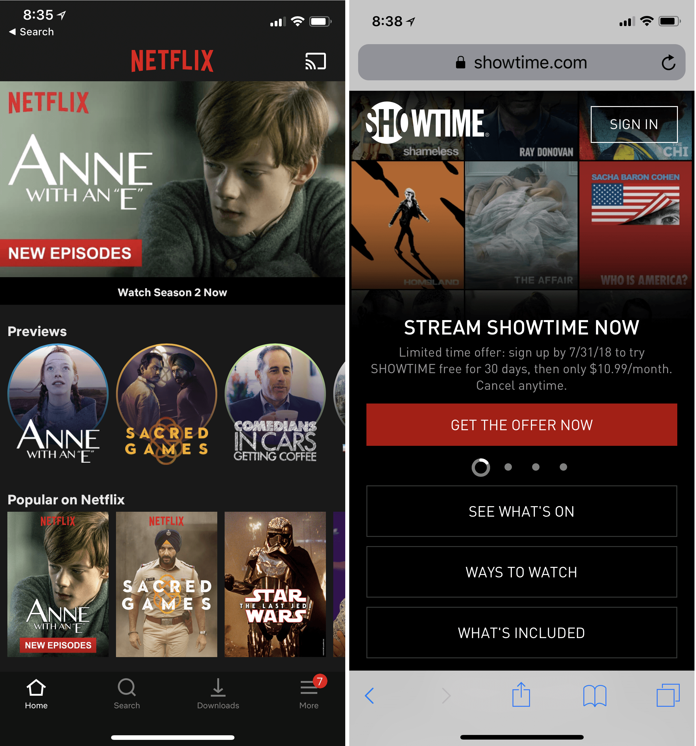
Note that the recommendation of 3 to 4 steps to reach the last item does not necessarily mean that the carousel should have only 3 or 4 items. If multiple items per page are displayed, then the carousel may fit more. In the Netflix example below, the hero carousel displayed just one item per page and required 5 swipes to reach the 6th item in the carousel, but the other carousels displayed 3 items per page (thus requiring 16 swipes to reach the last item in a list of 50).
Aim to prioritize carousel items, so that the ones of most interest to users are shown first. Consider using personalization to make the first few swipes even more relevant to the specific user. Prioritization alleviates the tediousness of sequential access, because users often won’t need to proceed through many steps. Also, by showing the best items first, a prioritized sequence may draw users in and encourage them to stick with the carousel longer than with a random sequence.
Discoverability
A hurried mobile user looking for specific content may never notice a carousel. Even when the carousel is self-animated, a mobile page is so small that by the time the carousel image has changed, the user may have scrolled down and not see it anymore.
There are three types of carousel cues traditionally used to signal carousels on mobile:
- Dots or lines
- Arrows
- The illusion of continuity
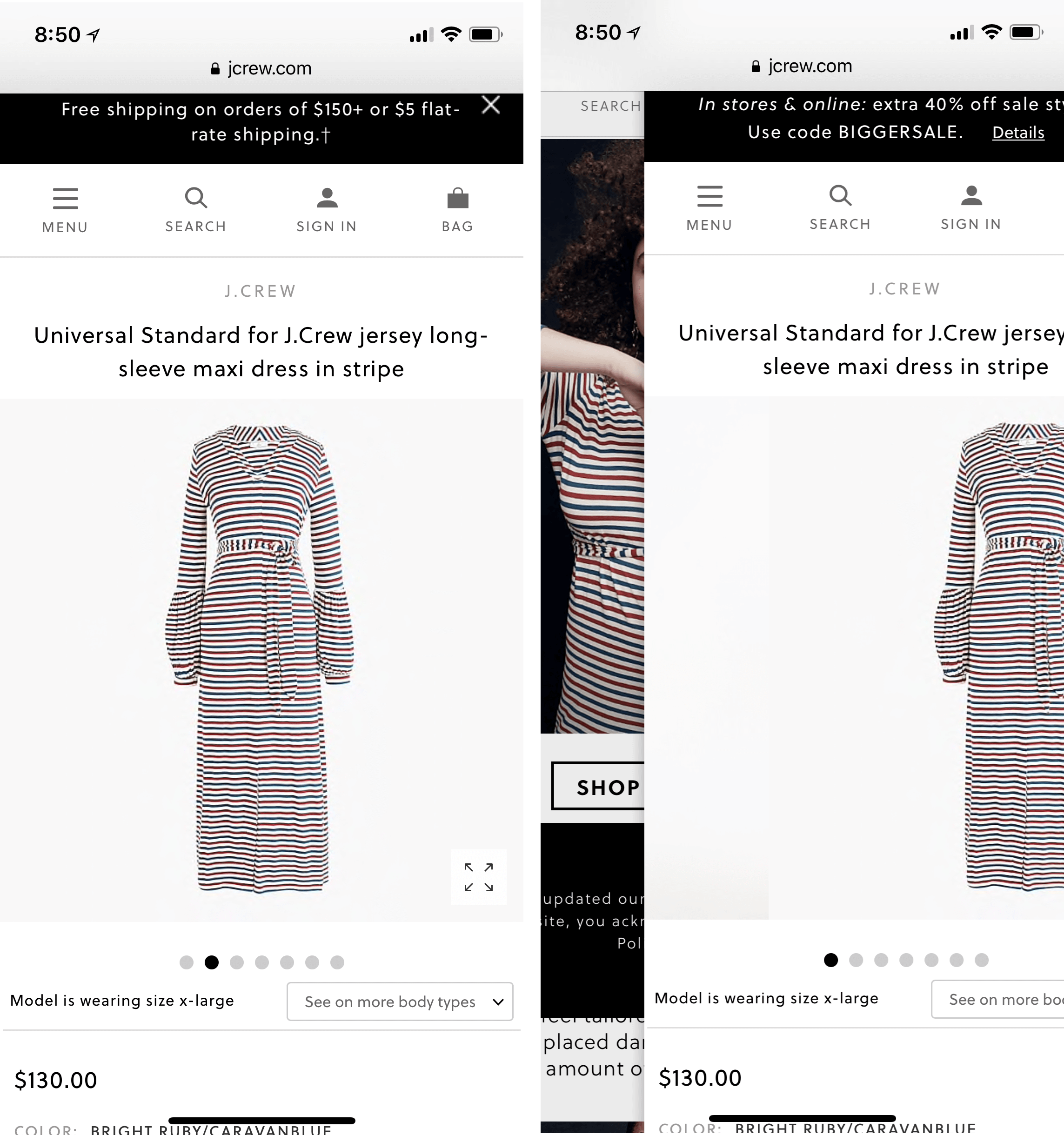
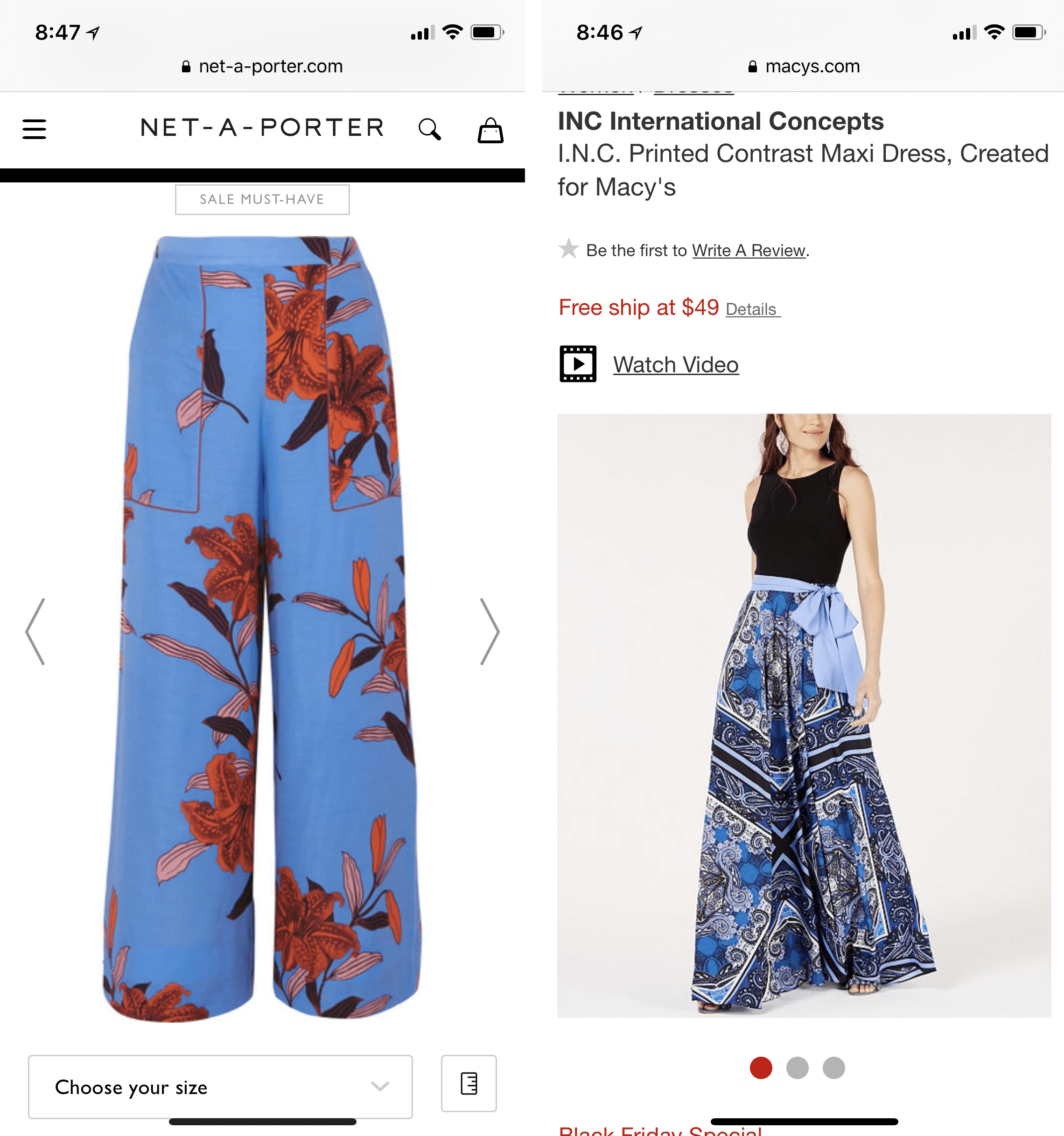
Some carousel cues are stronger than others. Dots are generally weak signifiers: because they are small, people often don’t notice them. The illusion of continuity, created by half images or text that look like they are continued beyond the vertical edge of the screen, is a strong carousel cue — users quickly understand that they can get more content by moving beyond screen edge.
Another problem that makes carousel cues such as arrows and dots easy to miss is that they often appear on top of a carousel image. When UI elements appear on top of a busy background, they can have low contrast with the surrounding image and can blend in with it. This problem is especially critical on mobile, where glare due to outside use can also impact the quality of the contrast.
Below are a few examples of designs with either strong or weak carousel cues.


Even for carousels with good signifiers, people may not bother to look at the subsequent items if the first item is not interesting to them. The first item acts as a letter of recommendation for the rest of the content in the carousel and effectively is a source of information scent for the other items — people will browse through the carousel if the first item seems related to their goal, and will ignore it if it doesn’t (although, in fact, other elements in the carousel may be relevant).
Thus:
- The items in the carousel should be highly related to each other, so people will be able to predict the type of content they will discover if they engage with the carousel.
- Important items used in hero carousels should be accessible in some other way, in case that content is ignored completely by the user. If the content is in any way critical, there should be some other path to it.
Controlling the Carousel
When people want to engage with a carousel on a touchscreen, they swipe. Not supporting this gesture for advancing a carousel is completely unexpected and makes for a bad user experience. By now most users have become familiar with this gesture for horizontal navigation. Make sure your carousel supports swipe.

Using swipe to control the carousel creates the problem of swipe ambiguity on iOS. Swipe ambiguity refers to the fact that the same swipe gesture can be interpreted to mean different things depending on the precise location where it is executed. Since iOS 7, swipe ambiguity has become a constant danger with iOS. For instance, in the Safari browser, a horizontal swipe on the left edge is synonymous with Back: it takes users back to the previous page. With iPhone X, swiping horizontally close to the lower edge of the screen will switch applications. Unfortunately, the same gesture is also used to navigate through carousels when initiated in a slightly different spot on the screen.Because swipe is not a gesture available on nontouch devices, some responsive designs choose to forego it on mobile and replace it with some other way of advancing the carousel. For example, Dropbox expected people to tap on the small dots below the carousel image to advance the carousel. First, although the dots have always been tappable in iOS implementations of carousels, the vast majority of users would not even dream to tap on them — they are not aware that these dots can be used to control the carousel. And, second, even if they wanted to tap them, they are so tiny and close to each other, that any attempt to select one will be futile.
A partial solution for the problems created by swipe ambiguity is to leave a “page gutter” around the carousel — essentially, some white space that tells the user that the carousel borders do not reach the screen edges. Some users will continue to swipe close to the screen edge to move the carousel (and accidentally navigate away from the current page), but others will keep their finger closer to the visible carousel border and thus not run into swipe ambiguity.
Conclusion
The temptation to use a carousel to save space on a small screen can be big, yet carousel items can have little discoverability, especially when not advertised well with strong cues such as the illusion of continuity or arrows. If you end up with a carousel on your mobile site or in your mobile app, make sure that it doesn’t have an excessive number of elements and that it supports swipe.
For more on designing mobile carousels, see our report User Experience for Mobile Applications and Websites.


Share this article: