Gestalt principles were discovered in the first half of the 20th century by Gestalt psychologists, who were trying to make sense of how people visually perceive the world — specifically, how people decide whether certain elements are part of the same group or not. These principles include proximity, similarity, and closure — which are all important in the visual design of digital interfaces. Later, more grouping principles (such as common region) were added to the original Gestalt list.
UI design heavily relies on proximity and other grouping principles, as correctly interpreting which elements are related is critical to successfully interacting with the interface.
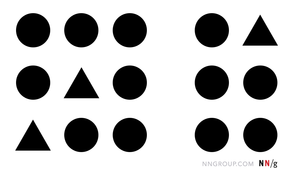
Definition: The principle of proximity states that items close together are likely to be perceived as part of the same group — sharing similar functionality or traits.
Place Related Elements near Each Other
Proximity is one of the most important grouping principles and can overpower competing visual cues such as similarity of color or shape. The practice of placing related elements close together and separating unrelated elements can be seen almost everywhere in UI design.
Using varying amounts of whitespace to either unite or separate elements is key to communicating meaningful groupings. For example, in the header area of the Wellington City Council website, the Search function is located on the same line as the main navigation of the site when viewed on a large screen. However, the extra whitespace between the main navigation and Search indicates that they belong to separate groups and thus have distinctive functionalities. This whitespace is critical for making the Search function stand out from the rest of the main menu.

On smaller screens, however, maintaining this spacing is not possible. To avoid these areas from being perceived as a single group, the Search is shifted up, away from the main navigation altogether. (Yes, other aspects of this design could be further improved, such as grouping the Search label and the corresponding icon using either proximity or common region.)

Leveraging proximity to create meaningful groups is reflected even when presenting basic text content: sentences are grouped together in paragraphs separated above and below by whitespace. Further, whitespace around well-designed headings signals which paragraphs they are associated with — the text from the corresponding section is usually placed closer to the heading than the text from the preceding section.

Chunking applies to form design as well: when related fields appear grouped together, the form seems easier to scan and less daunting to complete. For example, a single form with 12 fields may appear too taxing to fill out, while a 3-chunk form with 4 fields each seems simple in comparison. (The principle of proximity is applied in many ways in good form design. For instance, a minimal amount of spacing between a top-aligned label and its corresponding form field makes that relationship apparent compared to a larger margin before the next label-field pair.)

On the other hand, grouping together unrelated elements may camouflage them from users. For example, on the California EDD website, the Add button to list employer information required for a form is buried among the unrelated buttons to move to the Next step of the process, Save as Draft, and Cancel. When looking around the page, users may only look at one item within a perceived grouping and use that to make a judgement about what the other items in that group must be. (In contrast, Previous and Next are related, so grouping them would have increased usability.)

Far-Away Elements Appear Unrelated, Are Easily Overlooked
When users completely miss a link, button, or piece of information even though it’s right in front of them, proximity (or rather, the lack of it) is often to blame. Because elements separated by whitespace are perceived as being less related, far-away items can be easily overlooked by task-focused users who expect all relevant information and interactive elements to be placed close together. This behavior is sometimes described as “tunnel vision:” users selectively attend to certain areas of the screen as they complete their task and miss things “in plain sight” because they are outside this focal area.
For instance, in our mobile-usability studies, participants often get frustrated when apps require them to create an account before gaining access to content. However, in many of these designs, the account creation can be skipped — this option is simply hard to find because it is placed in a top corner of the page, far from the main calls to action.

Similarly, the Hulu app on an Apple TV presents instructions for how to interact with the current screen’s content all the way in the lower-right corner of the screen, far from the relevant content. Moreover, the text is obscured by the photo background for the selected show. This lack of proximity led my husband to believe there was no way to access the Details screen (where the other episodes in the season were listed) — luckily, he had me there to correct him!

Proximity May Shift in Responsive Designs
Paying attention to the proximity of elements is particularly important when designing responsive layouts, as these groupings may change as they adapt to varying screen sizes. Scaling down to smaller devices can minimize the space between elements or can push elements farther apart, destroying grouping relationships.
For instance, on the Transport for London Driving page on desktop, links to information about the Ultra Low Emission Zone and the Low Emission Zone appear side by side, in two different columns. Presenting these two links in close proximity allows users to easily see and compare them to decide which they want to click on. However, on small screens, these links appear far apart because the two columns are stacked one above the other, rather than side by side. This unfortunate placement can cause mobile users to never discover the second type of emission zone.

Conclusion
Placing related elements in close proximity and using whitespace to create meaningful groups is a foundational principle in visual design. Users are task-focused and may scan pages quite quickly, so making these groupings visually obvious increases usability by helping users quickly find and focus only on those UI elements that are most related to their current task.
Learn more about visual perception, how it applies to UI design, and other psychology principles in our training course on The Human Mind and Usability.


Share this article: