In the early 20th century, Gestalt psychologists developed a set of principles aimed at describing how people visually perceive and organize the world. These principles are commonly referred to as Gestalt laws or the Gestalt principles. Some of the most popular principles include proximity, similarity, common regions, and closure. As designers, we can apply these principles to create usable interfaces.
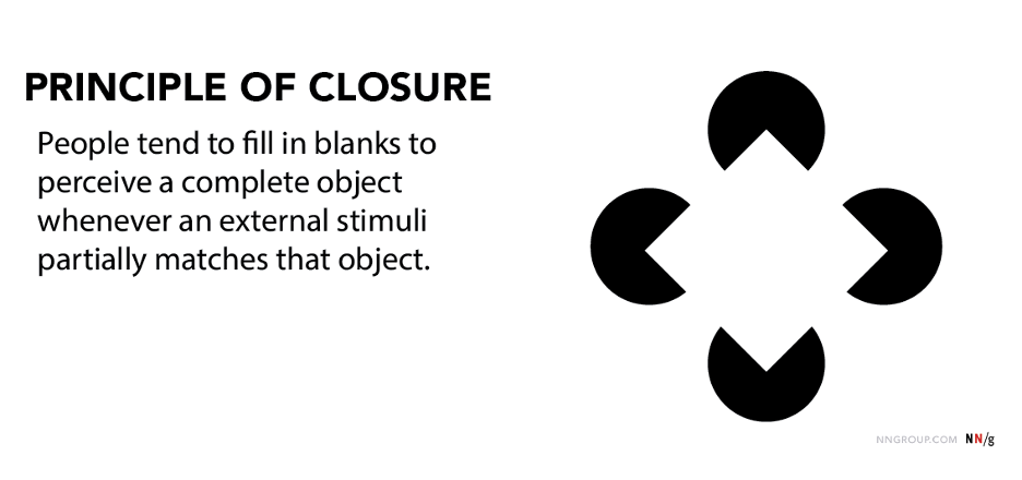
Definition: The principle of closure states that people will fill in blanks to perceive a complete object whenever an external stimulus partially matches that object.
Even when we’re missing information, we tend to make sense of our environment by filling in the gaps to see a complete object. This recognition happens automatically.
Applications
The principle of closure describes our tendency to perceive segmented visual elements as complete or whole objects, even when we’re missing information. This principle is frequently associated with logo design, but it can influence other visual-design decisions related to icons and various page elements.
Company Logos
This principle is commonly implemented in logo design. For instance, Public Broadcasting Service (PBS) and Major League Baseball both apply the principle of closure to their logo design.
In each of these examples, our minds fill in the blanks to perceive complete shapes. The shapes and objects depicted are recognizable (faces and baseball player respectively) and though each could be depicted with greater visual complexity, the application of the principle of closure creates simple yet interesting designs.


Interface Icons
Most user-experience practitioners do not have much control over our company’s logo design. However, icons serve as another vehicle for the principle of closure.
For example, Google Slides applied the principle of closure to one of its icons. The icon communicates function through a minimalist visual design.

While using the principle of closure may simplify the visual complexity of your icons, you must still test whether users understand what the icons represents and augment the icons with clear labels. If users don’t understand what the icon means, it doesn’t matter that it’s minimalist or aesthetically pleasing.
Apply the Principle of Closure to Signal Additional Content
Designers can use the principle of closure to 1) indicate that additional content exists, and 2) encourage interaction with said content.
Many carousel designs take advantage of the principle of closure when they show only parts of an item in the carousel. Even though users may not be able to guess the exact details of the partially displayed item, the incomplete item signals to them that there are more items beyond the vertical fold and that they should swipe to reach them.

If, on the other hand, the page appears complete to users, we run into the so-called illusion of completeness. Applying the principle of closure to prevent the illusion of completeness means segmenting page elements above the fold so that they appear incomplete and encourage interaction (scrolling or swiping). This technique works well for contexts with predictable viewport sizes, but is much more difficult to implement for when there is a wide range of possible window sizes.
For example, the Sleep page in Headspace, a meditation app, appears complete, even though there are several other meditation offerings below the fold. This design could be improved by displaying a segmented element (like half of the subsequent See all recent button) to communicate additional content is below.

Ensure that Segmented Elements Communicate the Whole
Not all applications of the principle of closure are effective. When cutting off content and page elements, consider how much of that element will be on screen and whether it’s enough to communicate value and function. Providing too little information makes it difficult for users to fill in the blanks.

When we cut off page elements and content from our interfaces, we need to provide enough context to communicate there’s more content to be seen. HelloFresh, a meal-subscription service, used the principle of closure to signal a carousel to its users. However, the segmented element was miniscule and very easy to miss.

In contrast, the Target app successfully applied the principle of closure to indicate additional page elements. The design presented 3 button options under Shop your store; the third option was cut off. This third element had approximately 40% of the size of the other two elements and supplied enough content to communicate information.

Conclusion
When presented with incomplete objects and information, humans have a tendency to fill in the blanks. As designers, we can apply the principle of closure to simplify visual elements and communicate (and encourage interaction with) additional information.
Learn more about visual perception and other psychology principles affecting designs in our training course The Human Mind and Usability.


Share this article: