In ecommerce, product pages are critical to the success of a site. Customers need to have enough information to make an informed purchase decision. The product page, or product-detail page, is where users decide whether and what to buy. The page must include complete product information, educating and informing the user about the product in a straightforward way.
Online customers can’t touch the product, ask a salesperson a question, try an item on, or use the item before buying. Sure, motivated shoppers may be able to order swatches to feel the material. Or they can ask questions via live chat (usually as a last resort). The most intrepid shoppers may even be willing to attempt a virtual try-on tool. But all those have a high interaction cost, requiring strong motivation and willingness to spend a chunk of time in the app or on the site. In many cases, customers don’t want to invest that much time, so the product page needs to help them get their information as fast as possible. It’s in the store’s best interest to make sure that users’ questions are answered and that the product is accurately represented.
Poor product pages have two main results, both of which harm the customers’ relationship to the site:
- Shoppers cannot decide if the product meets their qualifications and so abandon the purchase. (Better safe than sorry.)
- Shoppers buy the wrong product, based on inaccurate assumptions, which results in unhappy customers or returned purchases. (The more people have been burned this way, the more they’ll be skeptical and react according to scenario #1 when encountering weak product pages.)
After analyzing hundreds of examples from our latest research across 49 ecommerce sites, we derived guidelines for how to design effective product-detail pages. This article presents a brief overview of our findings and recommendations.
What to Include on Product Pages
The product page is a workhorse with a lot of responsibility and jobs-to-be-done, answering customers’ questions and getting shoppers ready to buy. So, it’s critical that sites and apps get it right. Well-designed product pages have the following characteristics, which we have categorized as must-have, nice-to-have, and fancy features. (Don’t be fooled by the name “fancy” features — these elements can be distracting and disappointing if they aren’t truly necessary or well-executed).
| Must Have At an absolute minimum, product pages must have these core components. |
|
| Nice to Have Shoppers generally expect and appreciate these elements on product pages, but not all sites and apps need each of these. |
|
| Fancy Features These may be worthwhile for some products, but only if they are flawlessly executed with high usability and utility for the user. |
|
Anticipate and Answer Product Questions
Shoppers are looking to the product page to answer all their product questions. In our studies, the only participants who paid little attention to the product page were those who already knew the exact product they wanted. Even those product-focused shoppers needed the product page to confirm that they had found the correct item.
Many sites offered insufficient product information, which left users with unanswered questions and not enough information to make purchase decisions. While it is impossible to know every question someone may have about a product, some sites neglected to offer even basic product information.
One common concern about shopping online was having to return the item. When sites fully described products, users were likely to buy the correct item and were confident in their purchases. They didn't worry about potential returns. Effective product pages should describe products with text and images:
- Be complete, but not wordy or fluffy. Users are not looking for marketing fluff, but for a solid description of the product, how it can be used, what it looks like, and what it does. Users typically skim text when reading online, reading more at the beginning of a description than at the end, and more at the start of a line than the end of a line. Don’t waste the first few lines of product descriptions — get right to the gist.
Descriptions should also explain any terms that users aren’t likely to know. For example, some items on Urban Outfitters’ site were labeled Urban Renewal Recycled. Product details explained what this label meant: each dress has been updated by hand so the item you receive will vary in color, tone + wear from the item you see pictured here.
A product description on Urban Outfitter’s site included a section called “About Urban Renewal Recycled,” which helpfully explained that no two are exactly alike.
- Use images and/or videos to answer questions. Product images set users’ expectations about the products they are selecting and buying. Images and videos should work together with the description to give a complete understanding of the product. One product view is rarely adequate to answer users’ questions. Users appreciated sites offering multiple or animated views, including rotated images, details, enlarged pictures and images of the product in use or in context.
A user on eBags was considering a tote bag based on the picture on the category page. As she clicked into the full product page, she said, “I’d like to know what the inside looks like.” When she got to the product page, she said, “Oh, here we go! This looks very nice! It has 2 side pockets.” She then went back to the category page and picked other bags she liked, immediately clicking to the product page and viewing the interior and detailed pictures. She said of another bag, “It’s nicely lined and it has this convenient side zipper.” She picked the bag without reading a single word of a product description.
Shoppers on eBags.com relied heavily on detailed images of totes and briefcases to determine which bags were best for their needs.
Help Users Compare Products
Users frequently compared items on a site and wanted to see the same information about each item they were considering. Consistent information about comparable products was key. The display of information affected how easy it was to compare items as well. Some sites varied the page design or information available for products, forcing users to hunt for the information they needed.
Shoppers needed information to be reliable on three different levels:
- Product variant. Shoppers considering options for an item, such as size, color, or flavor, expected the same information to be available for all variations.
One study participant was frustrated by inconsistent information about product sizes on Adagio.com. The site nicely told users approximately how many cups of tea could be made by the sample size. However, it did not do the same for larger sizes. Instead it listed the cost per cup, so users could evaluate the options based on price. This was helpful, but the inconsistency irritated the user. She said,
“On the bags when you order, what would be helpful to me is that under the sample, it states how many cups that size makes. But under the others, there’s no mention of how many cups. You’re left to make the assumption. But it would be helpful if you could actually know how many cups. It’s not there. It’s indicated under the sample and not the other ones.”
A user appreciated that Adagio’s site indicated how many cups of tea could be made from the sample size, but wished it did the same for the larger product sizes as well. - Product category. Customers shopping for a type of product expected the site to show similar types of details across brands and models. For example, a shopper looking at washing machines wanted to be able to compare information about capacity, space it would take up, and the type of wash cycles (such as delicate, eco, and quick cycles) that were available. For data-heavy specifications, comparison tables may be the best way to present this kind of information.
- Site-wide product page. Generally, as people move page to page within a site, they expect pages to look and feel consistent. It’s one of the ten heuristics for user-interface design. With product pages, customers expect that the product page for a vacuum will look similar to the page for a pair of home speakers. It’s fine for the amount and type of information on each page to vary by type of product, but the look and feel, access to site-wide navigation, and search should all be consistent.
- Competitors’ product page. It’s worthwhile to make an effort to understand what information users might see on your competitors’ sites and offer that same information on your product pages. For instance, a customer compared mattresses at TuftAndNeedle.com and Casper.com, but only Casper’s site highlighted free shipping on the product page. He explained, “Casper has 100 nights, free return or pickup, with free shipping. So the price difference between Tuft & Needle and this could come down to the shipping.” Then he switched to his browser tab where Tuft & Needle’s site was open: “I’d have to go further into the purchase process on Tuft & Needle to see if their shipping wasn’t free. Ok, so I select the Queen, add to cart, and oh, shipping is free.”

Casper’s page mentioned free shipping on the product page. Users noticed the free shipping and took it into account when evaluating the mattress price. 
In contrast to Casper’s site, Tuft & Needle’s site required that users add a mattress to their cart to find out that shipping was free.
Lastly, product pages were helpful to shoppers when they showed recommendations for related or associated products. These suggestions helped users discover product alternatives they may not have thought to look for otherwise. Even a single category of highly relevant recommendations, such as You may also like or socially informed recommendations such as Customers who bought this item also bought were appreciated. Use caution and offer only highly relevant recommendations, because showing too many suggestions on a product page can distract from or obscure important product information.
Show Customer Experiences — Even the Bad Ones
Even the most complete product description will still leave some users’ questions unanswered. Product reviews from other customers or from experts will bring in another voice to the site, adding further insight into the product.
Users often used product reviews to gather more information about potential purchases. In many cases, those reviews answered the exact questions that users had, which were often related to use of the product. Product descriptions can describe product characteristics, but product reviews can provide insight into product use.
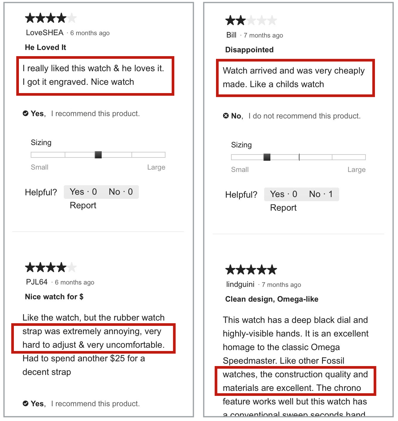
A shopper on Fossil.com read mixed reviews of a smartwatch. He said, “someone says the rubber strap is extremely hard to use. Someone else says the strap is cheaply made, like a child’s watch. But then someone else says the materials are excellent.” Ultimately, despite the negative comments about the watch, the positive reviews were enough to persuade him to continue considering the watch. He left the reviews and returned to the product features, specifications, and product images.
Shoppers have come to expect robust reviews that include positive and negative comments and that are quick to skim through. We still consistently observe users that want to skip to the negative reviews first, in order to see “what’s the worst this product might be.” Below are some top guidelines for a successful customer-reviews section on a product page:
- Clearly differentiate between positive and negative reviews. Simply providing reviews is not enough. Users wanted and needed to see summaries of the reviews, to get a sense of the overall quality of the product. Users needed to be able to quickly locate both favorable and negative reviews, to see the best and worst other customers had to say. Tools to sort or filter reviews were used frequently.
- Provide relevant details about the reviewer. It was also helpful to users to know a little information about the people posting the reviews — for example, the reviewer’s age, size, use for the product, or other relevant details. Users didn’t need to see an entire user profile, but baseline information came in handy when determining if the review was relevant and applicable to the user’s situation.
A shopper on Macys.com used product reviews to decide what to buy on the site. She said of a review of a bag,
“I like this because it has the age of the writer. I want to know what a person my age thinks. Because I’m thinking they might have a similar lifestyle. Like a 23-year-old, why they’re using the bag and liking the bag might be very different than mine.”
Because some shoppers doubt whether reviewers are honest, sites can help establish trust by indicating when reviews have been verified by the site.
Start the Purchase Process
The product page is the key area where users decide to purchase a product and move the item to the shopping cart. To do so, users must know what their product options are and how to select them.
To help users begin the purchase processes, product pages must:
- Explain each product variation. Users must understand what each option means — whether it is color, size, amount of memory, or any other product characteristic. The selection of options must be simple, as well, so users can easily select the exact item they want.
- Communicate product availability. This is particularly important if availability differs for various colors or sizes of the product. Users should know when items aren’t available, without having to add an item to the cart only to find out it is backordered or sold out.
- Provide clear feedback after adding an item to cart. The final step in moving a user to the purchase process is putting the item in the cart. It was surprising how many times shoppers ran into problems because they did not know whether an item had been placed in the cart.
Inadequate feedback caused many problems. Some users thought they had added items when they had not. In other cases, users did not realize they had added items, so added them again and again, ending up with multiple items in the shopping cart. Worse, some users went to the cart thinking it was full of products they wanted, only to find out it was empty, had duplicate items in it, or contained only some of the desired products.
What worked better was to either display a conspicuous persistent window or layer notifying the user that the item was added or take users to a different screen which confirmed that the item was added successfully. Chewy.com moved users to an interstitial page when they added an item to the cart. From this page, users could confirm the item that they added was correct, they could proceed to check out, or view their cart.
After adding an item to the cart, Chewy.com navigated shoppers to an interstitial page. From there, people could confirm the item that they added was correct, proceed to check out, or view their cart. Interstitial pages should also include a Continue Shopping button, so that users don’t have to use their browser Back button if they aren’t ready to check out at that time. (Chewy.com did not include such a link.)
Conclusion
Product pages are where shoppers go to determine whether a product suits their needs. To be successful, ecommerce sites must first conduct research to determine the kinds of questions customers have about their products. Designers should use descriptions and images to answer user questions, help them compare products, and enable people to begin the purchase process as quickly and easily as possible.
For more tips on how to design ecommerce product pages, read our full report with 85 UX guidelines for product pages.


Share this article: