Search suggestions (sometimes also called autocomplete or autosuggest) used to be an optional, nice-to-have feature for site search. (In this article, we use the term “site search” to refer to a website’s own search feature — that only searches within that single site’s content — as opposed to web-wide search engines like Google, Bing, or Baidu that search across multiple sites.)
Definition:
Search suggestions are recommended queries that appear in a dropdown as users type in a search box. These recommendations appear beneath the search box and change as users type each letter of their query.
In recent years, search suggestions have become an expected sign of a well-designed search feature. This change in expectations is likely a result of users’ frequent exposure to query suggestions on Google, which always sets the (unrealistic) standard of what a “good” search feature should be.
When your users select from search suggestions rather than typing in their own complete query, they benefit because they:
- Pick an appropriate term, which will show them good results, rather than making up a query which might have no results or poor results
- Decrease interaction cost, because they can type less
- Avoid typos, because they don’t need to type out the entire query themselves
- Use less mental effort to search, because they can simply recognize the right words or phrasing they want
Interestingly, even though users expect this feature and sometimes comment on it when it isn’t available on a site, they don’t always actually use it. In our recent study on ecommerce websites, suggested queries were selected by users in only 23% of the instances where they were offered. (There were 31 suggestions selected out of 136 instances where suggestions were offered. The margin of error for this proportion is 7%.)
However, even when users didn’t actually choose from the list of query suggestions, the feature still had the potential to provide some benefits as a reference. Users could read the suggestions to see what’s available on the site, how to spell difficult terms, and what other users search for. In some cases, particularly when the query phrase is short, it is easier for users to just finish typing out the query themselves, rather than to reacquire their mouse or tap the screen.
For site search, search suggestions have the further benefit of informing users of the range of products or options offered by the site. Conversely, if something isn’t shown as a search suggestion after entering the first few characters of a product name, some users may conclude that the site doesn’t offer that product and abandon the site without even executing the search.
If you’re planning to implement or improve your site’s search suggestions, follow these tips to make them as helpful as possible.
Don’t Suggest Bad Results
Make sure every suggested query actually has good, relevant results.
One participant in a usability test was shopping for a new suitcase on JC Penney’s website. He typed “luggage” into the search box and saw the phrase “luggage sets clearance” in the suggested queries.
He selected the query and was taken to a results page that had no luggage sets at all — just two travel items for pets.
“That’s very weird,” he said. “The search was suggested to me, so I would think that clicking luggage sets clearance would take me to luggage on sale. So this is not great.”
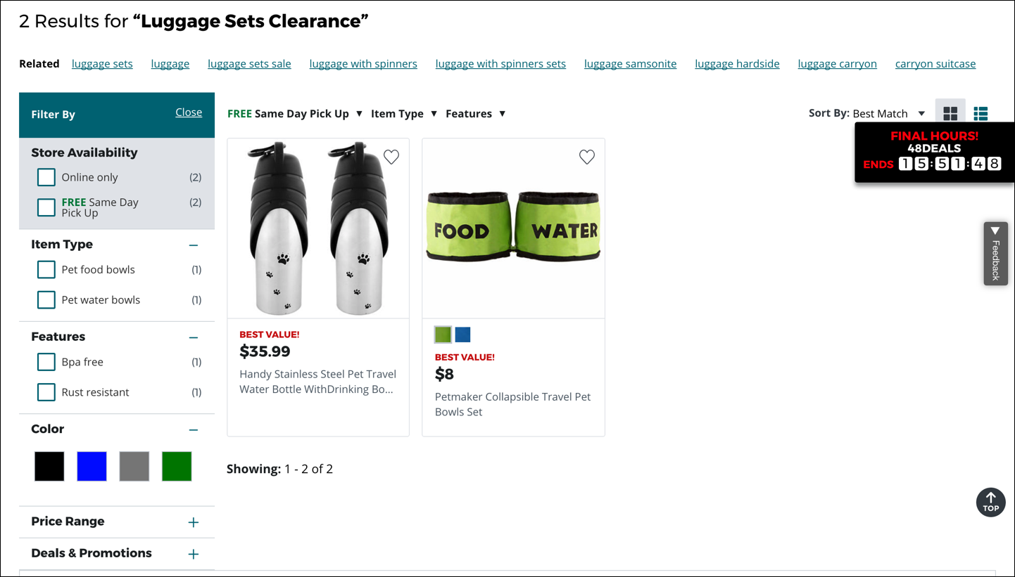
Suggested terms that return zero results, or irrelevant results, are worse than unhelpful — they sidetrack users and are downright irritating.
Use Text Styling to Differentiate Between Typed Query Text and Suggested Terms
Within a suggested search dropdown, each suggestion has two parts: the characters already typed by the user, and the characters suggested by the system to complete the query.
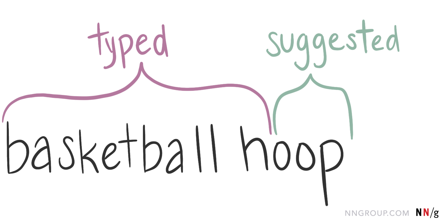
It’s important to use different visual styles to show which characters fall into each category. You can use bolding, italics, color, or indenting to communicate the differences between these parts. Visual differentiation helps users understand why the suggestions are shown and scan the available options.
The type of suggestions your site offers should help you determine how to style the suggestions.
- If your suggested search feature only appends characters to the end of the user’s text to finish the query, then you should highlight the suggested characters.
- If, instead, your suggested search feature will suggest popular queries that contain the user’s text anywhere in the query, it’s best to highlight the user’s query.
For example, one user typed his query, “basketball hoop,” on the website for Dick’s Sporting Goods. As he typed each letter, suggested search terms appeared in a dropdown.
Dick’s Sporting Goods uses the first type of suggestions — it only appends characters to the user’s text, in an effort to complete that query. The characters that matched what this particular user had already typed were shown in bold (“basketball h”) while the characters suggested to complete the query had a normal font weight.

This approach clearly showed the difference between the two parts, but unfortunately placed the emphasis on the repetitive characters in each suggestion (the already-typed characters). So, it would’ve been better for Dick’s Sporting Goods to present the search suggestions like this, with the emphasis on the unique characters:
- basketball hoodie
- basketball hoop
- basketball hat
But if your feature suggests popular queries that contain the user’s text anywhere in the query, the opposite approach is better — you want to highlight the user’s query.
Using our basketball example, a system with this type of suggestions would return suggestions like “basketball hoodie,” but also things like “portable basketball hoop” and “kids basketball hat.” In this case, you should highlight the user’s query to help the user scan the suggestions and identify where the query text fits within each suggestion. For example:
- basketball hoodie
- portable basketball hoop
- kids basketball hat
Include Scope in Search Suggestions
Scoped search should only be used on some websites, and even then, only if it can be implemented well. If your site scopes content, you’ll want to reflect that in the site’s search suggestions.
For scoped sites, each search suggestion can have three components:
- the characters already typed by the user
- the characters suggested by the system to complete the query
- the scope of that suggestion (if any)
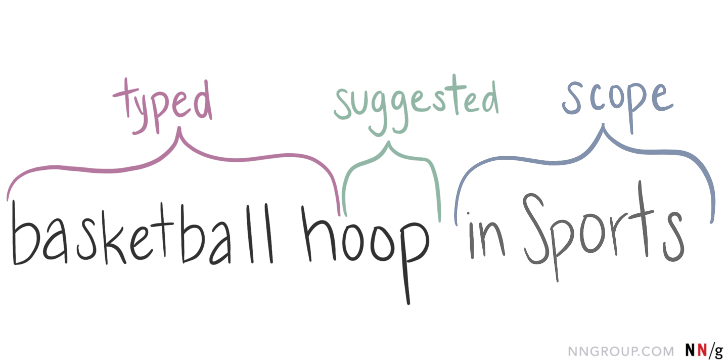
Just like the other two parts, you’ll need to visually distinguish the scope from the rest of the suggestion. It’s important for users to know that the system will search for “basketball shorts” in the Women’s section of the site, rather than just searching for the terms “basketball shorts in Women’s.” Indenting scoped or category suggestions beneath the recommended query can communicate their relationship to the query.
One user’s search for “water bottle” on Amazon.com brought up two scoped suggestions: in Home & Kitchen and in Outdoor Recreation. The text of these scoped suggestions was presented in a lighter gray color, and indented beneath the suggested query.

This approach worked well because all three levels were linked. The user could choose between three slightly different options:
- search for “water bottle” without any scope
- search for “water bottle” in the Home & Kitchen scoped category
- search for “water bottle” in the Outdoor Recreation scoped category
Consider Including More than Simple Query Recommendations
Beyond just completing a user’s query, the search suggestions dropdown can include links to other types of related content. For example, B&H Photo Video uses a huge, full-width search suggestion dropdown that provided query suggestions, but also linked to:
- Category pages
- Product-detail pages
- Resources/articles
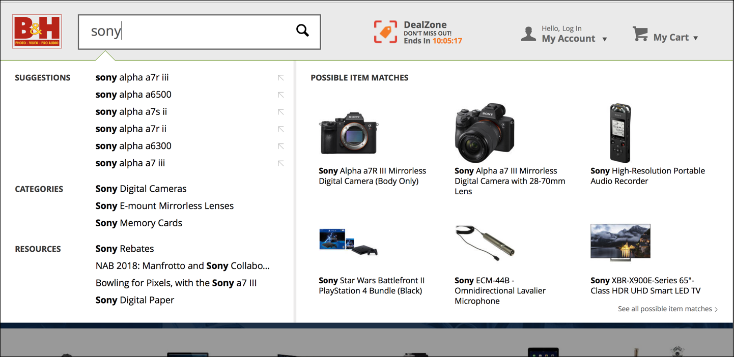
Consider if this type of complex search-suggestion dropdown would be helpful for your users, or confusing overkill. If you do adopt this approach, your suggestion dropdown should be well organized and labeled. Users should be able to easily scan and understand all of the information presented.
In particular, providing links to related products in the dropdown can be a good shortcut for those who know what they were looking for. However, we found that it was rare for participants in our study to select a specific item from the rich suggestions. Instead, most users preferred to see the full list of results, so they could browse and compare.
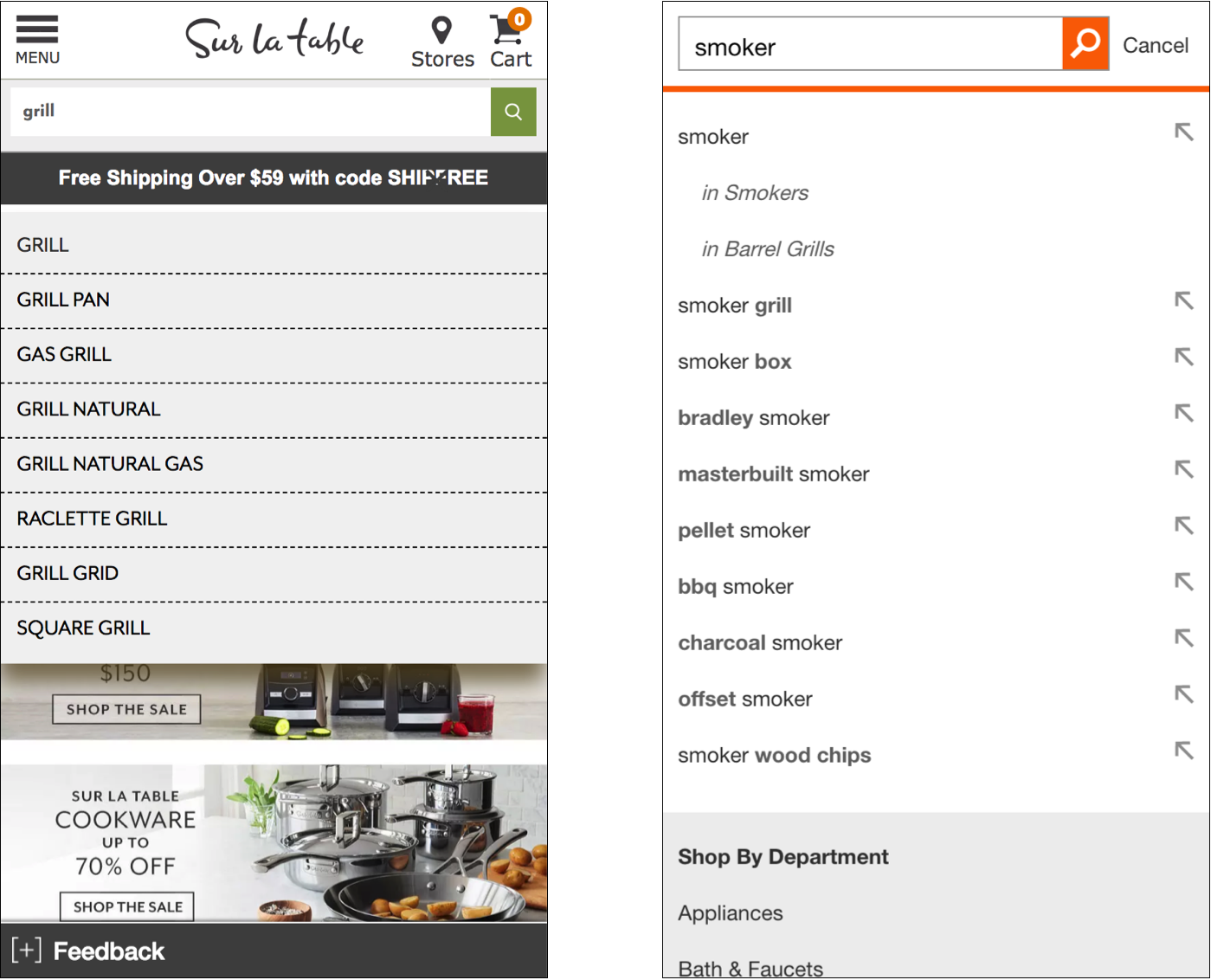
If you decide to use rich search suggestions, use an adaptive approach to simplify the feature for mobile devices. On smaller devices, just offer simple text search suggestions.
Conclusion
Prioritize scannability and ease of processing in your search suggestions. Remember that their primary purpose is to make it as easy as possible for your users to express their information need and to see helpful results.
(For more information, see the new 4th edition of our report on Ecommerce Search User Experience, with 80 design guidelines.)


Share this article: