Mobile screen space is limited, and on-the-go users are often interrupted and exhibit fragmented attention. As a result, mobile designers are always on the lookout for ways to simplify and declutter the UI. This is a noble effort! However, some types of “clutter” may actually be a helpful and important part of the interface, and should not be removed for the sake of saving space.
Visual indicators are one such example. A visual indicator is a “marker” that helps users quickly locate an item that has an important distinctive attribute within a list of otherwise similar objects.
Some designs may use a family of multiple visual indicators at the same time — for example, an ecommerce site may want to mark items that are “new” and items that are “on sale.” In such situations, what is the best way to design the members of such a family so they each stand out and users can locate items quickly?
In this article we report a quantitative study that measured how visual-design differences within a family of visual indicators impacts people’s ability to locate the associated items.
About the Study
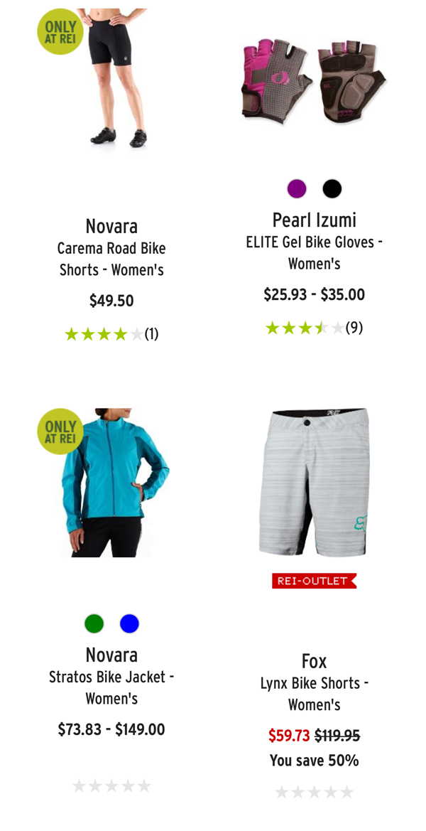
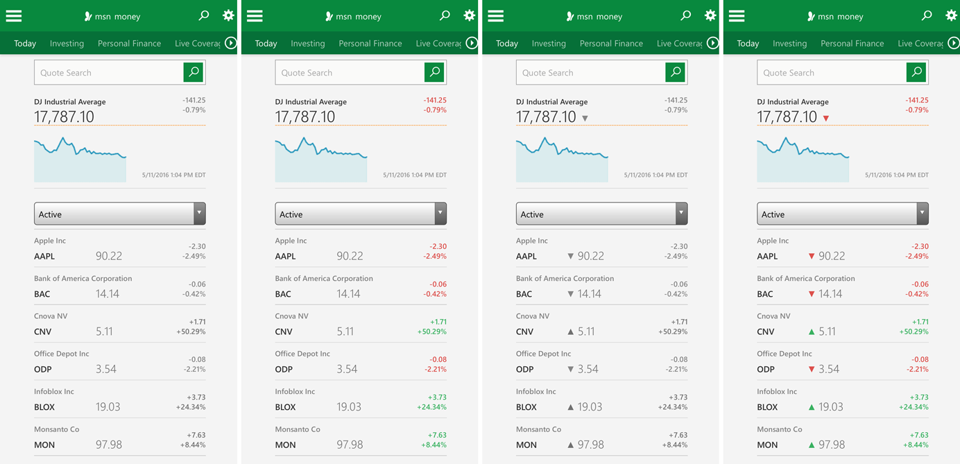
We selected 4 different mobile pages: 2 ecommerce listing pages and 2 stock-performance data tables. For each page, we identified 2 types of items to be marked by visual indicators (for example, in the stock-performance pages, we wanted to differentiate between stocks that increased in value and stocks that decreased in value) and we designed 4 pairs of visual indicators. The visual indicators within each pair could differ in one of 4 possible ways:
- text only: each indicator within the family differs only in the text label
- color only: each indicator has a different color
- icon only: each indicator has a different icon
- color and icon: each indicator has a different icon of a different color
Based on these 4 pairs of indicators, we designed 4 possible versions of each mobile page. Each page displayed a list of several items; of them, 3 items were marked with one visual indicator and 3 with the other.
96 users participated in this study; each of them interacted with one version of each of the 4 sites. Their task was to locate 3 items associated with one of the two indicators (e.g., “You are interested in finding high-performing stocks. Locate 3 stocks in this list whose values have increased recently.”). (Note: we randomly selected which type of indicator within a pair a participant had to find.)
Each participant saw all 4 types of visual indicators (text only, color only, icon only, color and icon), while viewing each site only once. The order of site tasks and conditions was randomized to avoid any ordering effects.
To measure the effectiveness of each condition, we collected four UX metrics:
- Time to first click
- Time to first correct click
- Time to complete task
- Rate of success (how many clicks were correct out of the 3 possible)
We used UserZoom’s screenshot click testing to record every click on the mobile screenshots and measure success. The UserZoom support team also provided timing data by request for all clicks.
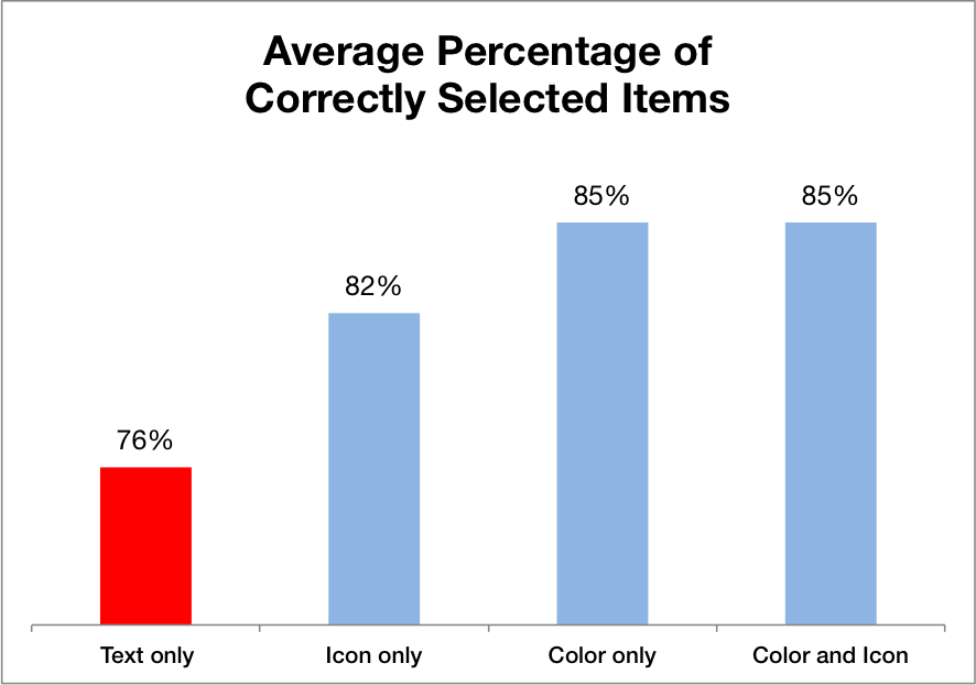
Text Only: Not Effective
All nontext variations performed better than text alone for all variables measured. These results show that people rely on secondary cues such as color or shape to distinguish groupings and locate relevant information quickly and easily.
The chart below shows the average task time for each type of visual indicator. The effect of condition was highly significant (p<0.005) by a repeated-measures generalized linear model. Pairwise comparisons show that the text-only condition was worse than each of the other conditions (p<0.05).
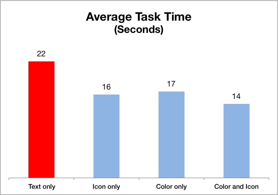
Text only was 57% slower than the best performing condition, which varied both the color and the icon of the visual indicators within the same pair.
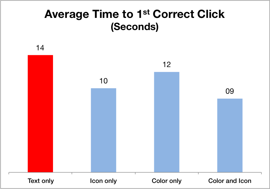
Even when considering only the time it took users to find any matching item (i.e., average time to 1st correct click), text only was 56% slower than the condition varying both the color and icon of visual indicators (p<0.05). Moreover, the icon-only condition was marginally faster than the color-only condition (p<0.01).
In addition, the effect of condition on percentage correct was marginally significant (p<0.1). The percentage of correct selections was lowest for the text-only indicator designs; our contrast analysis showed that the text-only condition was significantly worse than all the other nontext conditions combined (p<0.05).
Icon vs. Color
One of the motivations for this study was to investigate any differences between the icon-only and the color-only conditions. The literature on human perception shows that both are preattentive features — that is, people tend to pick up on variations in these features fairly quickly when looking at a display, without having to visually search and inspect each item on the screen individually. (The impact of perception on user interface design is explored further in our full-day training course The Human Mind and Usability.)
Our data indicated a weak effect of icon versus color for the time to the 1st correct click: as discussed in the previous section, we found that people were slightly faster in detecting indicators in the icon-only condition compared with those in the color-only condition.
To better understand this effect, we focused on the data from the stock tables. These data were the most interesting and also challenging for the icon-only condition, because the icons were most similar (upward- and downward-pointing arrows).
When we analyzed only the data from the stock tables, we found that the icon condition performed significantly better than color on 2 out of 4 metrics (time to 1st correct click, and time to 1st click, p<0.05) and marginally better on task time (p=0.08).
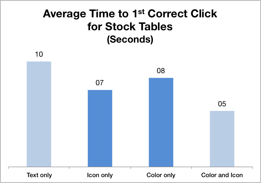
There are several possible reasons why the icon-only condition performed better than the color-only condition on stock-performance tables: (1) arrow indicators are expected design elements for this sort of data; (2) the color is more ambiguous than the icon: users have to infer that red is a stock decrease and green a stock increase, which may take slightly longer the first time when the users have to make that deduction; on the other hand the meaning of the upward or downward arrows is more straightforward.
Further research needs to be done in order to determine if there are any measurable advantages of one type of indicator over another, or if this is strongly linked to the context of each design.
Both Is Best
While it’s interesting to debate and research whether colors or icons have the most powerful effect on usability, these are not mutually exclusive choices in most practical user interface design projects. We have the option of using color and icons in combination, so that both differ between indicators.
Combining a unique icon with a color for each type of indicator used within a design proved to perform the best out of all the variations for all UX metrics we measured. Using only one method of differentiating items lessens the likelihood that people will notice small differences. Relying on color alone runs the risk of failing color-blind users and also may be more open to interpretation, while merely swapping out similarly designed icons or subtly adjusting the shape of an indicator can be easily overlooked by users who scan. Secondary cues for different indicators (e.g., a unique color in addition to a unique shape) increase the chance that users will notice them and be able to use them to quickly find items of interest.
In summary, we recommend that if you’re considering a family of visual indicators to mark items on your site:
- Using both color and icon differentiation is most noticeable.
- If, for some reason, you are trying to decide between using two fairly similar icons for the two indicators or two different colors, prefer adding a unique icon with good information scent as a distinguishing factor.
On the mobile screens we tested, users were roughly 37% faster at finding items when visual indicators varied both in color and icon compared to text alone. While we didn’t test these indicators on larger desktop screens, there is every reason to believe that a similar outcome would be found, even if the exact percentage would be different — in fact, on a bigger screen, the speed advantage from more noticeable indicators might even be bigger, but we’ll leave it as an exercise for any graduate students or other researchers among the readers to measure this.
(For more visual design considerations for mobile, attend our full-day Visual Design for Mobile & Tablet training course.)


Share this article: