Almost every app on the market today has some sort of coach mark (a transparent overlay of UI hints) or tutorial shown on the first launch. While the presence of such instructional screens is often unnecessary, there are times when it is helpful to the user to get a nudge in the right direction. If you have decided to include a coach mark or some other form of hints and tips to explain a unique feature of your app, follow these guidelines to increase your odds of the tip being seen as helpful, and not as a hurdle to jump past.
Short, Focused Tips
Users cannot be expected to read a manual before using your app. People do not launch an app to spend time learning how to use the interface, but rather to complete a task in as short an amount of time as possible, using the least amount of effort possible. This is the paradox of the active user, as learning how to effectively use advanced features could actually save time in the long run. Web users are notorious for not reading, and mobile users tend to be even worse due to limited time and fragmented attention.
Even if people did decide to read the instructions, showing too many at once increases users cognitive load. Because users cannot read the hint overlay and use the app at the same time, they are forced to memorize the instructions and then apply them. Unfortunately, our short-term memory cannot retain very much information, and that information fades in about 20 seconds (more on memory in our full-day training course on The Human Mind and Usability). Thus, it is more effective to focus on a single interaction rather than attempting to explain every possible area of the user interface.
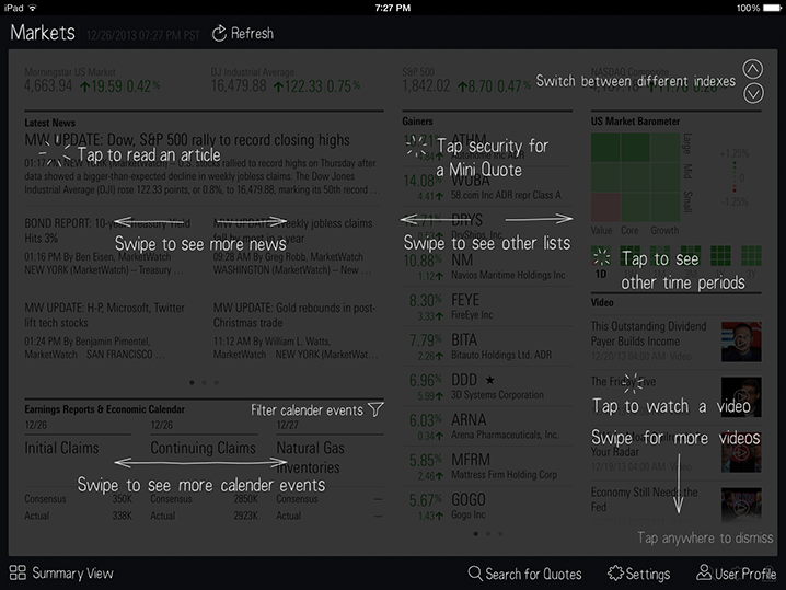
Morningstar iPad app: Rather than focusing on a single feature, this coach mark outlines every possible thing a user can do on the screen, many of which should be self-explanatory (such as tapping an article link to get the full article).
Minimizing the amount of instructions focuses the users’ attention on a single, primary action. The less text overall, the more likely it is that users will read it and then actually follow that instruction. This idea of deferring secondary content is not unique to coach marks, but applying it to interaction hints can be very persuasive in leading people to try a particular feature, as they will often mimic the action to make sure they correctly understood the instruction.
The YouTube Android app focuses each coach mark on a single, unfamiliar interaction. These hints appear on the first launch for new users, one at a time, as the user reaches the relevant section of the app.
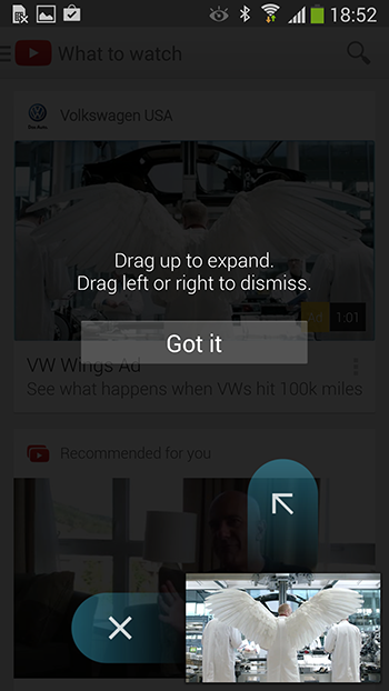
YouTube Android app: The focus on how to interact with a single element of the UI minimizes the amount of text required of people to read, and entices users to try it.
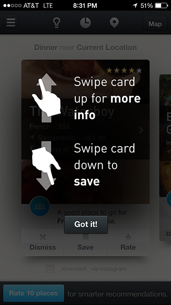
Presenting hints one-by-one, at the right moment, makes it a lot easier for users to understand and learn instructions. This interaction pattern has the added benefit of teaching the user at which point in the workflow these interactions or functions become applicable.
Avoid Chains of Tips
For some applications, there may be more than one functionality worth describing on the same screen. Bombarding users with frequent hint screens causes them to dismiss hints more quickly, regardless of how helpful each may be. It’s as if each user has a very tiny vessel to hold new instructions — think shot glass, not beer tankard — and if you pour too much or too fast it’ll spill over.
Showing multiple coach marks or tips in a row not only creates problems with users’ short-term memory, but can also make your app appear overly complicated and daunting to new users. This alone may be enough to dissuade them from using your app, and send them hunting for a simpler alternative.
The Makr iPad app uses a series of tips each time the user reaches a new section of the app. Unfortunately, these tips are overly wordy, and present a multi-step workflow before the user has been able to do anything. Rather than learning-by-doing, users must memorize all of the steps before being allowed to interact with the UI. With no indication of how many tips there will be, the task of reading and memorizing all the tips can be quite intimidating.
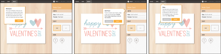
(Current) Makr iPad app: Presenting a series of tips causes an unnecessary load on users’ working memory, as all the tips must be read and memorized before interacting with the tool.
Because Makr’s tips are text-based rather than visual, if users tap through them quickly they will likely not absorb any of the information presented, and will reach the workspace without an idea of how best to proceed with their task. At least the tooltips do have arrows pointing to tools in the workspace, but each paragraph of text also refers to other elements of the UI that are not visually indicated.
Use Visuals When Possible
Including visuals alongside written instructions allow users to get the basic idea of what to do without reading very much. Additionally, ultra-short text is much easier to scan quickly than the long paragraphs used in Makr’s series of introductory tips. Including a brief introduction to a new section of an application can increase usability by explaining the purpose of the screen, so rather than simply cutting out the tips, we can be much more helpful and informative to the user by combining the content of the series into a single visuals-based hint modal.
In the following proposed redesign for the Makr app, the primary actions that the user should take are clearly outlined in a digestible format of images with ultra-short text. People can immediately understand that their goal is to personalize their chosen template, and what they can do to accomplish this goal. This redesign is not a perfect solution, as it still requires users to remember the steps, but it is at least less intimidating than the original. Especially for workflows that are more complicated than merely editing and adding items, a simple single screen introduction similar to this is a nice alternative to lengthier intros or serial popup tips.
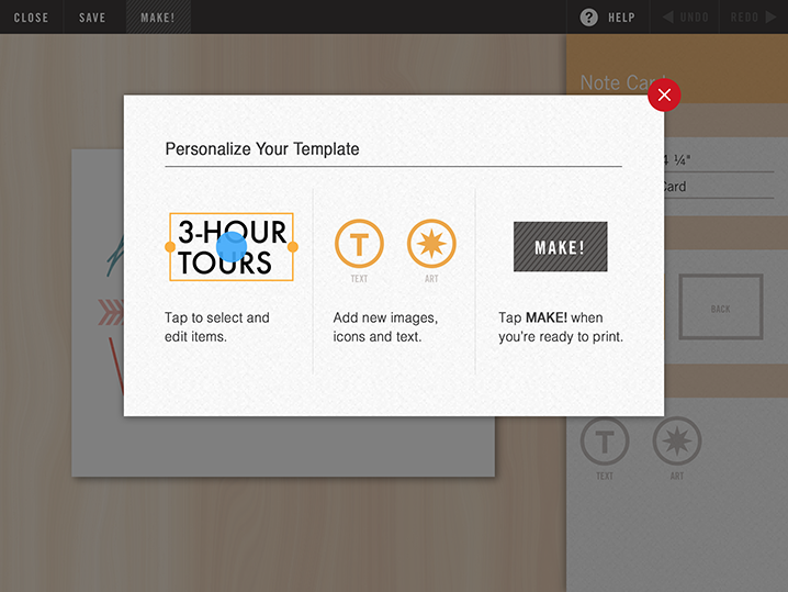
Proposed redesign for Makr iPad app: A brief hint modal of visuals with accompanying text would allow users to understand the main goal of this page without reading and memorizing large blocks of text instructions as is currently required.
Do Not Match the UI
People must immediately be able to distinguish between hint screens and actual elements of the interface. If it is not completely obvious that the tips are simply annotating the interface, people will sometimes get confused and try to interact with the tips without realizing that they are viewing a tutorial.
During our recent tablet usability study for our report on Tablet Website and Application UX, users expected to be able to navigate from the icons shown in the tutorial of the Wimbledon app. The overlay of annotations is perhaps too polished, and people did not realize these elements were not interactive.
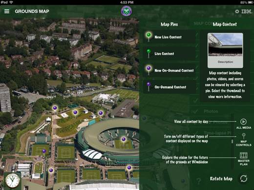
Wimbledon iPad app: Some users did not realize this was a hint overlay, and expected to be able to interact with it.
One easy method of creating a clear distinction between hints and actual interactive elements is to use a different font for coach marks than the one used for the main UI. Fonts and illustrations that have a handwritten feel work well for coach marks and other tips since they strongly signal that these are interface annotations for the user, rather than a polished part of the app.
On the Ness app for iPhone, similar styles are used on both the overlays for coach marks and for power-user features reached through hidden gestures. This similarity can easily create confusion, as users may not be able to distinguish between help and actual interface widgets.

Ness iPhone App: When users swipe up on the page, they can access extra features of the app (right). However, the font and style used in the design of these features is identical with those used for coach marks (left).
Keep Tips Scannable and Sparse
When designing tips, coach marks, and any other types of hints for mobile applications, the main guideline to remember is to keep them as short as possible. Focus on primary user tasks or atypical interactions, and design for maximum scannability by using visuals and succinct text. Additionally, ensure your coach mark design is distinct enough from the actual user interface to signal to your users that these hints are not interactive.


Share this article: