To better understand the difference between modal and nonmodal dialogs, let’s look at what the terms “dialog” and “modal,” mean.
A dialog (or dialogue) refers to a conversation between two people. In user interfaces, a dialog is a “conversation” between the system and the user, and often requests information or an action from the user.
User-interface modes are special states in which the same system has somewhat different user interfaces. Each mode may come with different commands, or the same command (or action) can produce different results depending on the mode of system. In other words, in different modes, the same input will have different results. For example, a computer with Caps Lock turned on is in a special mode: all the letters being typed will be shown as capital letters. Typing a letter has a different effect when the Caps Lock is on versus when it’s off. Or, in Microsoft Word’s Track Changes mode, all previously made edits and comments are visible (whereas in the normal, default mode they are not tracked or displayed).
With this understanding of “mode” and “dialog”, we can easily define modal dialogs.
Definition: A modal dialog is a dialog that appears on top of the main content and moves the system into a special mode requiring user interaction. This dialog disables the main content until the user explicitly interacts with the modal dialog.
A modal dialog is like my cat, Emma — who meows at 7am every morning to prompt me to feed her. I might be trying to sleep or get ready for the day, but my cat will place herself in front of me, then meow louder and incessantly until I look at her. I have to stop what I am doing to address the cat immediately if I ever hope to finish my task. Sometimes she chooses to do this at 3am while we are sleeping. Should we have guests staying over, it can get annoying and embarrassing. (In defense of my cat, once I feed her, she is very calm and has a sweet and sociable temperament.)
In contrast, nonmodal (or modeless) dialogs and windows do not disable the main content: showing the dialog box doesn’t change the functionality of the user interface. The user can continue interacting with the main content (and perhaps even move the window, minimize it, etc.) while the dialog is open. To continue our cat analogy, a nonmodal dialog is like a kitty who patiently sits near the dinner table during a meal, waiting for the off chance that food scraps may fall from the table. When Emma is doing this, I can eat, have a conversation, and enjoy dinner without much interruption. I can choose to either ignore her altogether, or, as my husband likes to do, slip a bite of food to her under the table near the end of the meal. (She is very well-fed, as you might be able to tell.)
Modal dialogs were originally intended to alert users to an error or to some other system state that required immediate user action. In these cases, it was essential for users to be interrupted in order to fix the error. Thus, placing the dialog box in the middle of the screen as the focal point of the interface, made it very effective. The big advantage of such modal dialogs was that they attracted users’ attention and allowed them to acknowledge the problem and correct it quickly.
However, this original use has evolved, and now modal dialogs and windows are used persuasively to attract user attention for legitimate or less legitimate reasons.
Disadvantages of Modal Dialogs
Here are some of the common problems caused by modal dialogs:
- They require immediate attention. Modal windows, by their nature, are compulsory and require the user to act immediately. Since the dialogs place the system in a different mode, users cannot continue what they are doing until they acknowledge the dialog.
- They interrupt the user’s workflow. Modal dialogs force users away from the tasks they were working on in the first place. Each interruption translates in lost time and effort, not only because users must address the dialog, but also because, once they go back to their original tasks, people will have to spend some time recovering context.
- They cause users to forget what they were doing. Once the context is switched to a different task, because of the additional cognitive load imposed by the modal dialog, people may forget some of the details associated with the original task. If that is the case, recovering context for the original task may be even more difficult.
- They cause the users to create and address an extra goal — to dismiss the dialog. When the dialog is presented, extra steps are added to the user’s workflow: to read and comprehend the dialog, then make a decision on that dialog. This increase in interaction cost is likely to put off users, unless the dialog is well justified and indeed contains important information. We will elaborate more on this point later.
- They block the content in the background. When a dialog appears on top of the current window, it can cover important content and remove context. As a result, it may become harder to respond to the dialog when the dialog asks a question related to information that was just obscured.
Because of these disadvantages, modal dialogs become problematic when used for noncritical activities.
Guidelines for Using Modal Dialogs
When is it appropriate to use modal dialogs? Here are a few guidelines to help determine if modal dialogs are truly necessary.
1. Use modal dialogs for important warnings, as a way to prevent or correct critical errors.
Whenever there is a chance that users’ work be lost or that an action may have destructive, irreversible consequences, interrupt the users to avoid a disaster.
To determine what error is severe enough to warrant a modal dialog, consider the following:
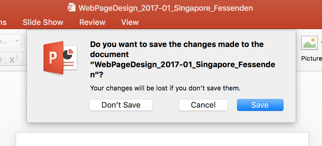
- Would the problem be easier or harder to correct if users’ attention is taken away from the task? It is always good to prevent human error before it happens, if possible. However, once the error was made, it may be easier to fix it if the error message is presented within the main content instead of in a modal dialog. For example, an error in a form should be reported on the page, next to where it occurred, so that users can refer to the error message while they fix the problem. But informing the user that her computer will be restarted in 10 seconds could be displayed in a modal dialog, to make sure that the user notices the message.
- Is the error irreversible? Irreversible errors often result in the loss of information, which can be especially damaging for complex and time-intensive tasks. For example, failing to add an item to a cart might be an unfortunate error for an ecommerce business, but not irreversible to its users should they not notice a subtle notification (they can redo their action if they really wanted the item). On the other hand, overwriting a file or failing to save changes to hundreds of slides are both irreversible actions, and, thus, an interruption is much needed, and often welcomed.
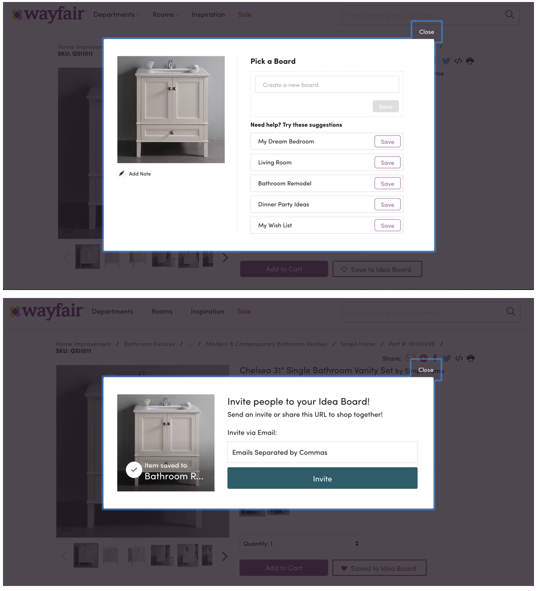
2. Use modal dialogs to request the user to enter information critical to continuing the current process.
When missing information prevents the system from continuing a user-initiated process, a modal dialog can prompt the user for that information.
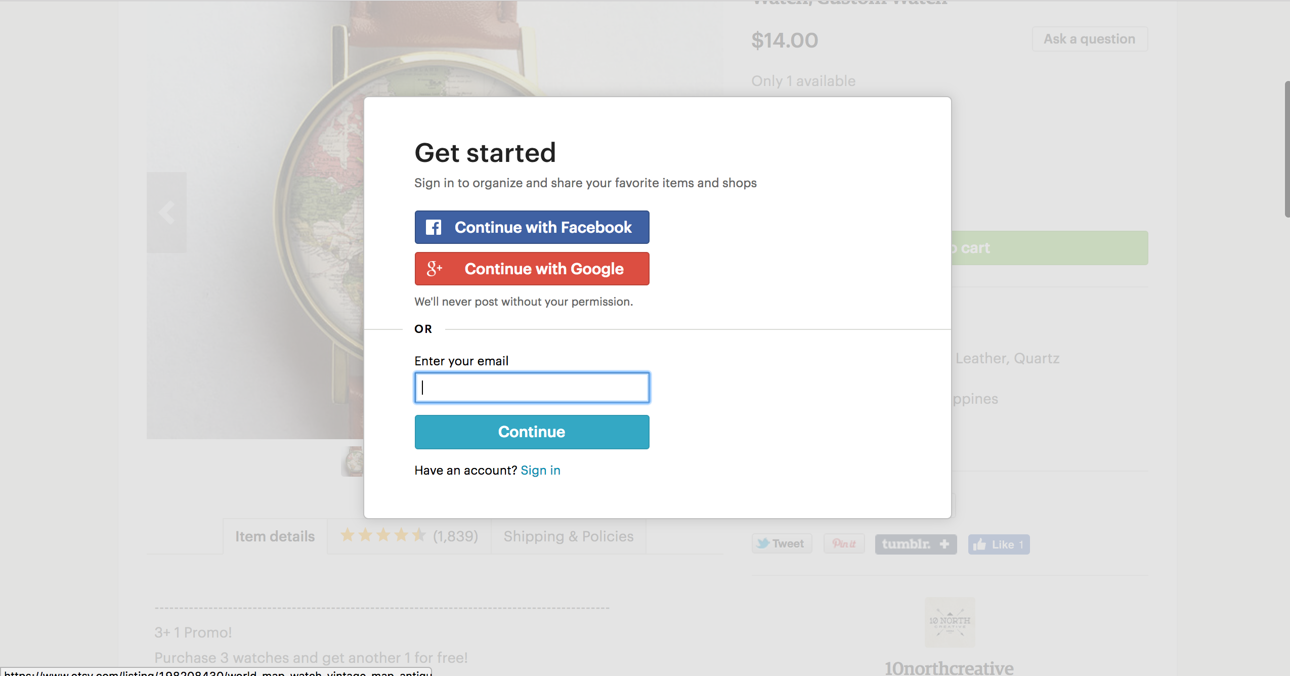
Etsy, shown below, uses a modal window to interrupt the user for login information when that user attempts to save an item to a list of favorites.
3. Modal dialogs can be used to fragment a complex workflow into simpler steps.
When it comes to workflows, faster isn’t always better. For time-consuming and mentally (and emotionally) involved tasks, it can be overwhelming to ask for lots of information all at once. In those situations, modal dialogs can be used to break complex information up into simpler, more digestible chunks. Wizards are common instances of such a use of modal dialogs.
However, it’s important to note that a modal with multiple steps will just prolong the amount of time spent away from the main tasks, making it more likely that users will forget what they were doing in the first place. So if you must do multiple-step modals, give users a sense of their progress, so they don’t abandon immediately. That said, if it requires multiple steps to begin with, it probably justifies dedicating a full page to it.
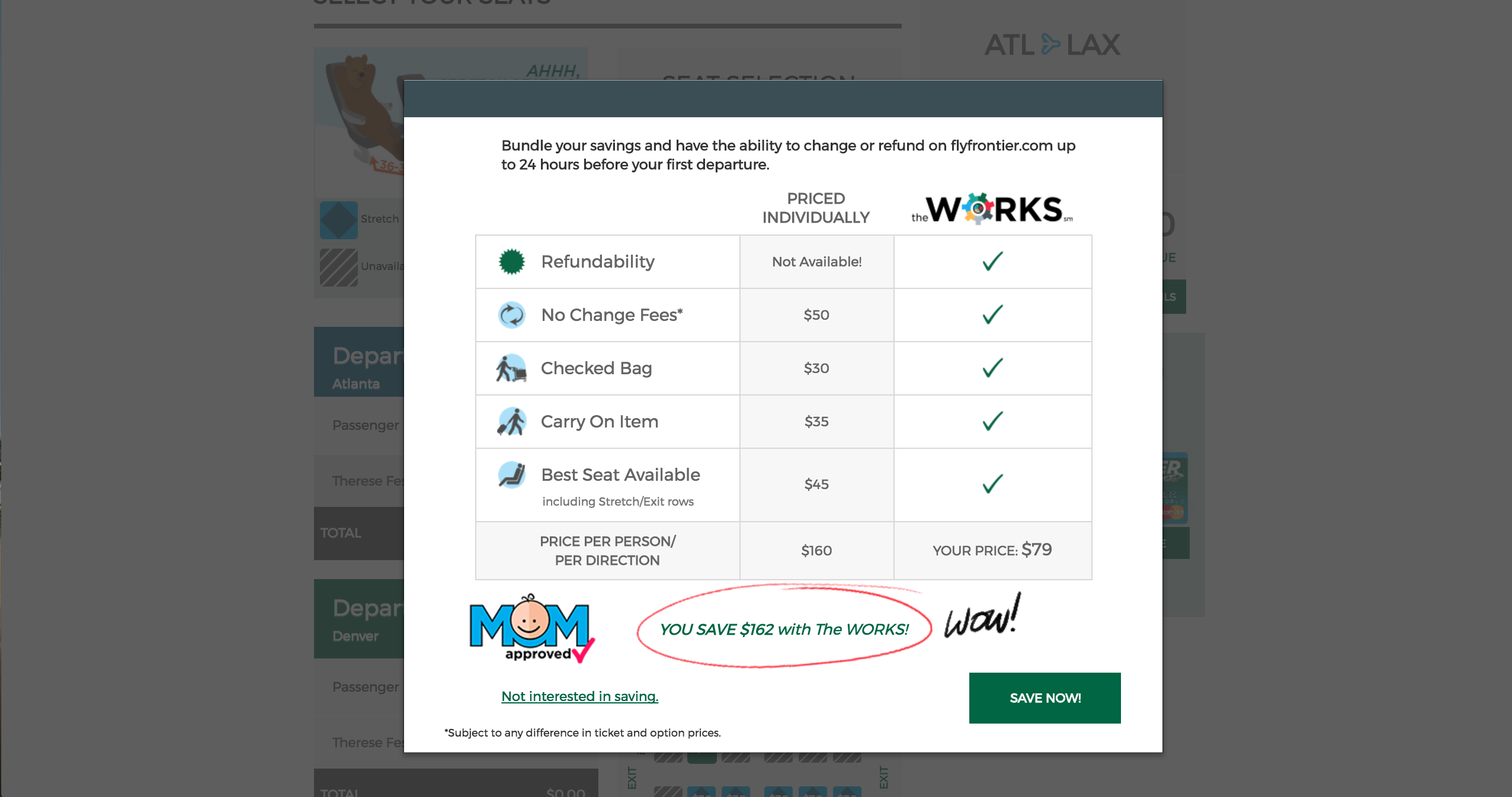
4. Use modal dialogs to ask for information that, when provided, could significantly lessen users’ work or effort.
Modals can work effectively when the information being requested or presented is relevant or can streamline the completion of the current task.
In the case of Zillow.com, a real-estate website, users can browse property listings without having an account or real-estate agent. However, when they attempt to contact an agent for a listing, the site displays a modal dialog asking them whether they already have an agent. This information is not critical to the immediate next step (contacting the listing agent), but it can still be valuable in streamlining future interactions. The dialog uses progressive profiling and presents one easy-to-answer question at a time. These questions are low-commitment and focused on relevant details.
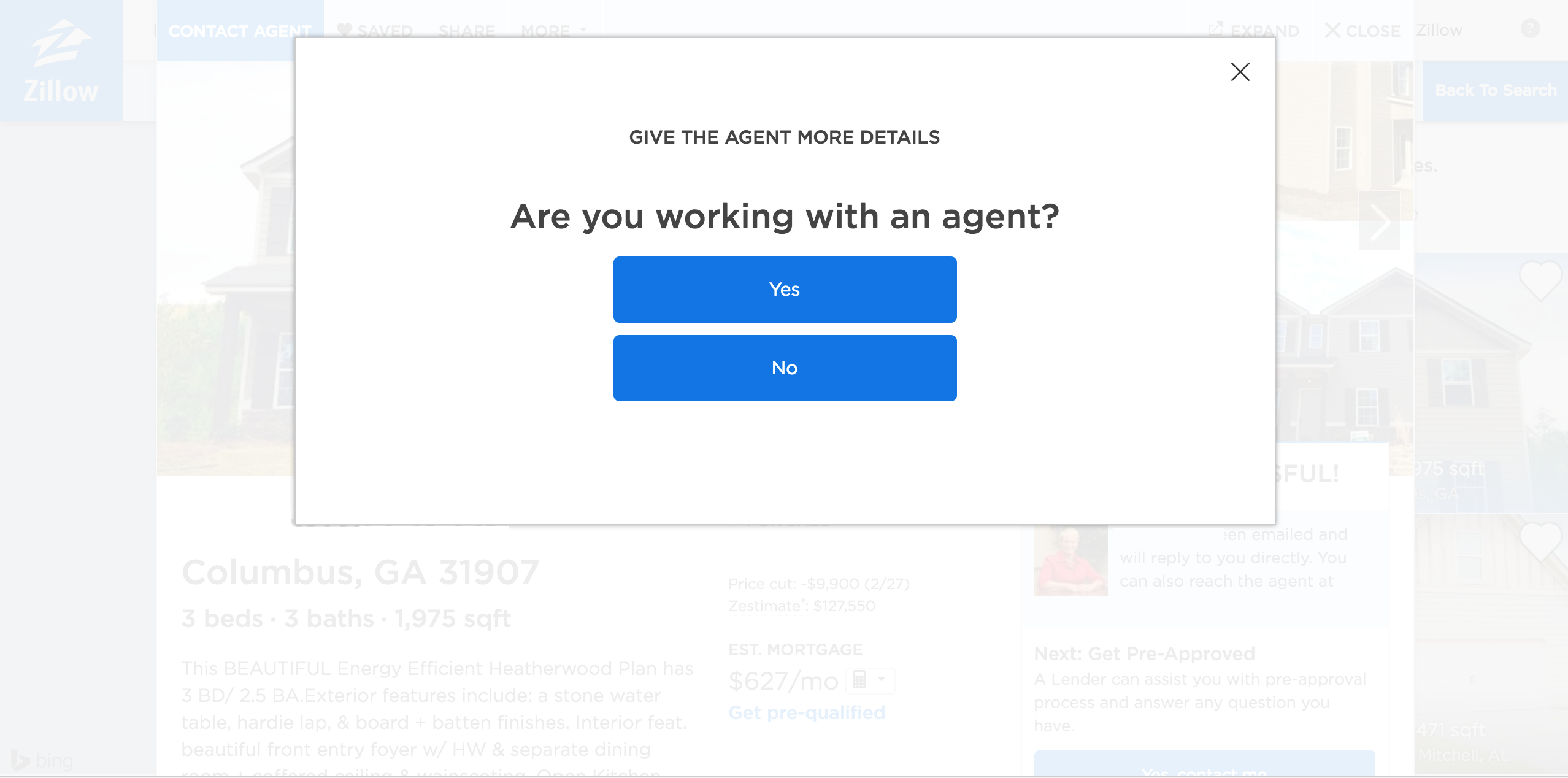
The key with progressive profiling is that they follow the user’s expectation of the workflow — interruptions only help when they are relevant or helpful to the current task.
5. Do not use modal dialogs for nonessential information that is not related to the current user flow.
As discussed above, modal dialogs have numerous disadvantages and costs to users. In order for these costs to be justified, their relevance to the task and importance should be high. Modal dialogs that are not directly related to users’ goals are perceived as annoying and can diminish trust in the company.
Additionally, when nonessential information is presented in a high-priority format such as a modal dialog, users will refuse to give attention to further instances of this format. It’s much like in Aesop’s fable, “The Boy Who Cried Wolf”— repeatedly misleading others will make them not give you their trust when you really need it.
Contrary to popular belief, mailing list signups, while critical for generating business leads, are not critical to the user. In a recent web-usability study, we heard visceral disdain for modal dialogs pertaining to email newsletter signups.

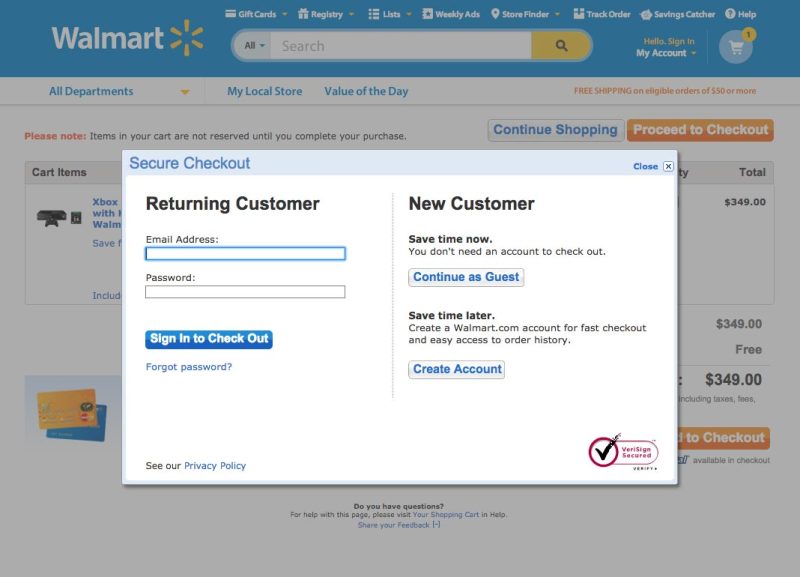
6. Avoid modal dialogs that interrupt high-stake processes such as checkout flows.
Checkout is a high-stakes process for both users and businesses: users want to ensure that the process is seamless, secure, and error-free, and businesses want to ensure the user follows through on their purchasing decision. Modal dialogs, if unwarranted, can distract users at best and erode user confidence at worst.
An older version of Walmart.com used a modal dialog to prompt users to log in during checkout. At best, this modal could distract users and launch them into a full-fledged quest to find the Walmart.com password rather than simply completing checkout as a guest. At worst, users may feel that they’re pressured into creating an account — and that alone can influence a purchasing decision. Walmart has since redesigned its website to remove this modal dialog (but the redesign also removed guest checkout completely and now requires users to have an account for checking out — which, to be honest, is just as off-putting).
7. Avoid modal dialogs for complex decision making that requires additional sources of information unavailable in the modal.
Modal dialogs should be used for short, direct dialogs with the user. If a modal requires the user to do complex research or consult additional sources of information (potentially blocked by the modal), then it’s not the right UI element for that interaction.
Consider Nonmodal Dialogs Instead
In situations where the task is not critical, a nonmodal dialog might be appropriate. Nonmodal dialogs are less offensive than modal ones because they allow users to continue their activity and ignore them if they are irrelevant. However, they can still be disruptive, especially if they obscure important information on the screen or if they require too complex interactions.
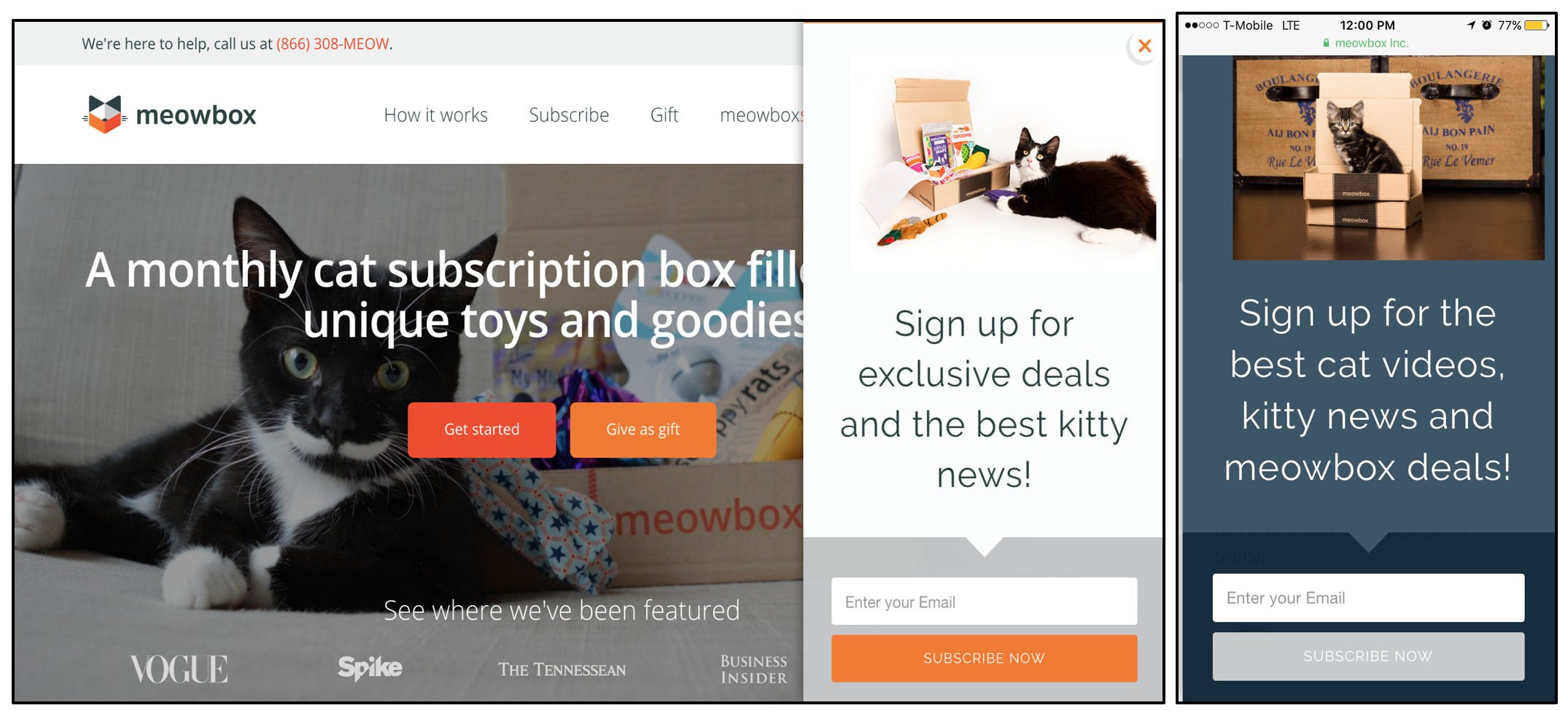
Moreover, some nonmodal dialogs do not translate well across devices and browsers — for example, a nonmodal window in Chrome on a desktop may become a modal one in Safari on an iPhone, such as with Meowbox.com below.
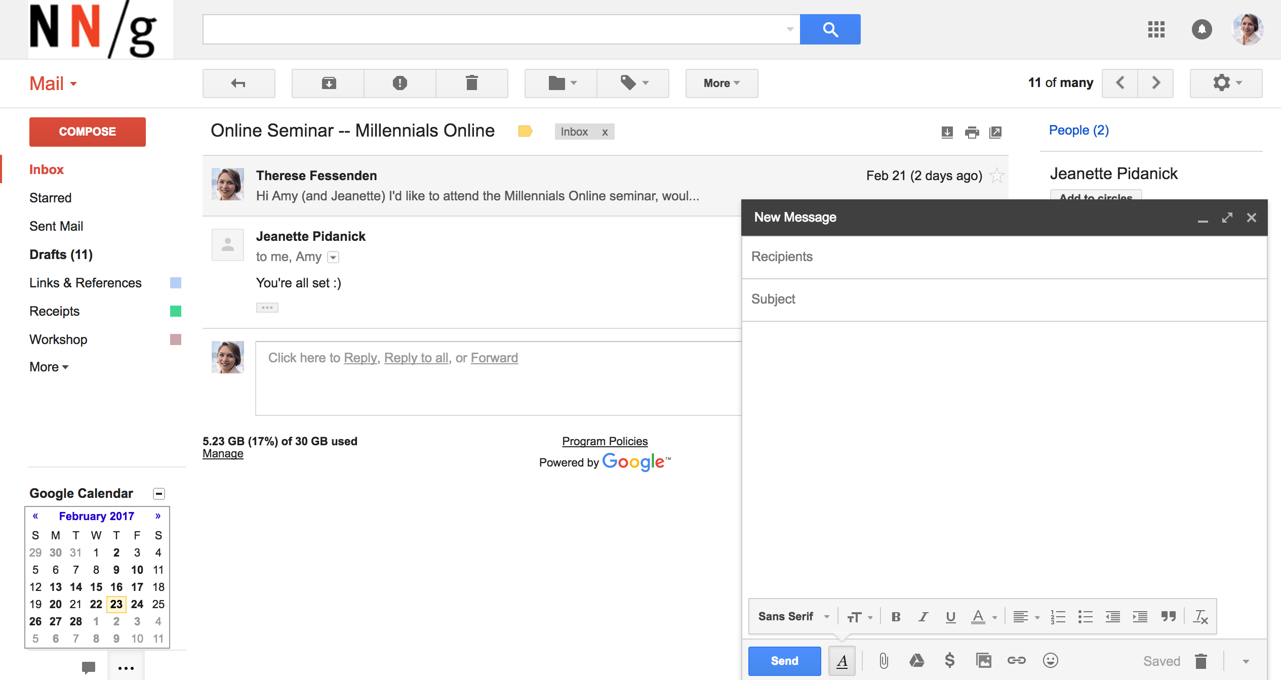
Nonmodal windows are useful when users need to quickly switch between modes in order to access certain information. For example, Google Mail uses nonmodal windows as the default method for composing new email messages. Users can continue working with this window open, minimize the composed email without losing it (or optionally, maximize it into a modal window). This separate view allows users to locate older emails or additional information that might be helpful for composing the current email.
Conclusion
Both modal and nonmodal dialogs are useful and request or encourage user participation. When it comes to deciding between these two types of dialogs, consider the user context and the workflow. Avoid unnecessarily interrupting users and disrupting their workflows. Make it easier for users to solve problems and accomplish their goals. If a company wishes to make sustainable progress toward business goals, user goals must be prioritized during these design decisions.
When it comes to modal dialogs, consider this: no one likes to be interrupted, but if you must, make sure it’s worth the cost.


Share this article: