In interaction design, a system, whether an application, website, or piece of hardware (anything from a smartwatch to a thermostat), should always keep users informed, by providing appropriate feedback. Ensuring that the state of the system is always visible is one of the 10 usability heuristics for interface design. Information about system status, such as error messages and notifications of system activity, allows users to fully understand the current context.
The best way to communicate system status varies depending on several key factors:
- The type of information being communicated
- The urgency of the information — how important it is that the user sees it immediately
- Whether the user needs to take action as a result of the information
Three common approaches for status communication include validation, notifications, and status indicators. These terms are used sometimes interchangeably in product design, but they stand for different communication methods that should be used in different circumstances. Understanding the differences between them will help you sharpen your feedback to users by choosing the best option for each need.
Indicators
An indicator is a way of making a page element (be it content or part of the user interface) stand out to inform the user that there is something special about it that warrants the user’s attention. Often, the indicator will denote that there has been some change to the item represented by that element.
Although, as we’ll see later, indicators are used quite frequently to signal validation errors or notifications, they can also be used on their own. Indicators are visual cues intended to attract users’ attention to a particular piece of content or UI element that is dynamic in nature. (If something always looks the same, it’s not an indicator, no matter how flamboyantly it’s designed.)
There are at least three possible ways of implementing indicators:
- Oftentimes, but not always, indicators are implemented as icons. Easily recognizable icons can make very effective communication tools.
- Typographical variations can also be used as indicators; examples include the common convention of boldfacing unread email messages or color-coding stock symbols in an investment account if their price has changed substantially.
- Though less common, enlarged size or animation (e.g., vibration) can also be used to make certain items stand out from the crowd and thus serve as an indicator.

Characteristics of indicators:
- Indicators are contextual. They are associated with a UI element or with a piece of content, and should be shown in close proximity to that element.
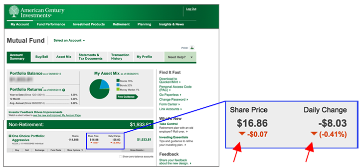
- Indicators are conditional— they are not always present, but appear or change depending on certain conditions. For example, a stock-performance indicator, such as the one in the American Century example below, may change to indicate if the stock price is increasing or decreasing. Additionally, the tag indicator in the Yelp example above only appears if there is a deal at that business.
- Indicators are passive. They do not require that a user take action, but are used as a communication tool to cue the user to something of note.
Indicators can introduce noise and clutter to your overall interface, and may distract users, so it is important to consider how many (if any) indicators to use in your design.
Consider the following when deciding if an indicator is appropriate:
- How important is the information to the user? Is it worth taking up space on the page to inform the user?
- How often is the information used?
- Would the user expect to see the information?
- Would it be missed if it weren’t provided?
- How important is it for the application that the user discovers the information?
Validations
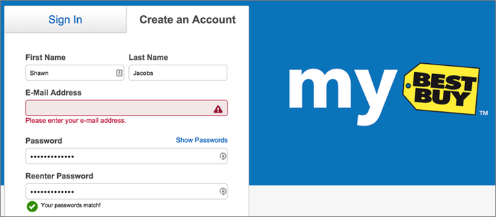
Validation messages are error messages related to users’ inputs: they communicate whether the data just entered was incomplete or incorrect. For example, in e-commerce systems, validation messages often involve information such as name, billing address, and credit-card information.

Characteristics of validation:
- A user needs to take action to clear the validation message.
- The information in the validation message is contextual and applies to a specific user input that has a problem.
The way in which validation should be implemented varies based on the unique needs of the form. However, in general, if the user’s input is incorrect, the system should inform the user by providing an identifiable and clear message that aids in correcting the error. Validation messages should follow the guidelines for error messages rather than simply identifying the problem, they should tell users how to fix it. For instance, don’t state “Field is blank.” Please enter your street address” is more polite and directs to a solution.
Since validation is contextual, it can be helpful to use an icon indicator along with the validation message to help communicate which input(s) are missing or need corrected.
Notifications
Notifications are informational messages that alert the user of general occurrences within a system. Unlike validation, notifications may not be directly tied to user input or even to the user’s current activity in the system, but they usually inform the user of a change in the system state or of an event that may be of interest. In the case of email, social networks, and mobile-phone applications, notifications can even be delivered while a user is away from the application.
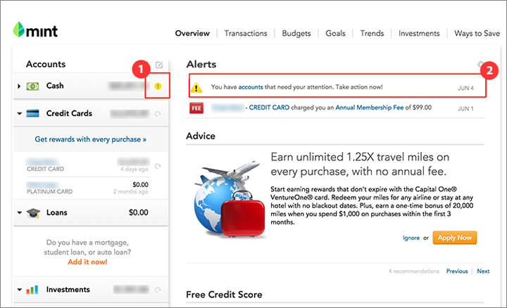
Notifications can be contextual —applying to a specific UI element— or global —applying to the system as a whole.

Characteristics of notifications:
- They are not triggered by users’ immediate actions.
- They announce an event that has some significance to the user.
There are two main types of notifications, which differ based on whether the user is required to act upon the notification:
- Action-required notifications alert the user of an event that requires a user action. In this sense, they are similar to validation, but since they were not sparked by the user’s own action, they require a different design.
Action-required notifications are often urgent and should be intrusive; for instance, they could be implemented as modal popups that interrupt the user, forcing immediate attention and requiring an action to be dismissed.

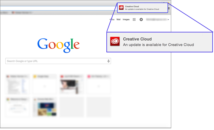
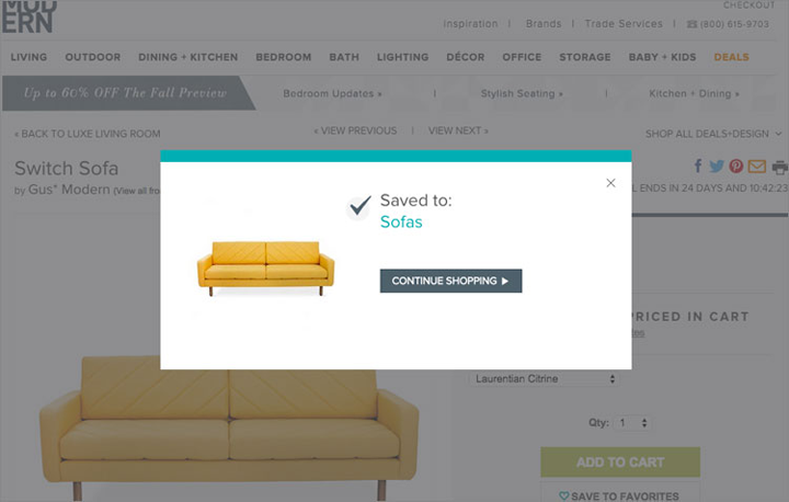
- Passive notifications are informational; they report a system occurrence that does not require any user action. Many notifications in mobile apps are passive: they usually announce an event of potential interest to the user.
Passive notifications are typically not urgent and should be less intrusive. A typical implementation of a passive notification may be a badge icon or a small nonmodal popover in a corner of a screen. Passive notifications can easily be missed, since they require no user action. When the information provided by the notification is key to the understanding of the system, an easy-to-ignore passive notification can be problematic.

Notifications have the design challenge that they are not the immediate and obvious result of a specific user action. On the contrary, the user is likely in the middle of doing something different and may not be thinking about the issue raised by the notification. This requires notifications to establish more context and provide users with sufficient background information to understand what the notification is about.
(In contrast, with a validation, the user has just done the thing that needs to be corrected. Thus, the validation message doesn’t need to educate users about the task at hand. For example, if an e-commerce checkout form has a field for a credit-card expiration date that was left blank, the validation message doesn’t need to say “Please provide the expiration date for the credit card you want to have charged $29.90 to pay for the blue sleeveless dress you are in the process of buying on Uniqlo.com.” However, a notification the following day that the dress has been shipped from the warehouse would need to say more than “Your package has shipped.”)
If a notification is contextual and relates to a specific element in the interface, an icon indicator on the element can communicate where that notification applies and catch the user’s attention. For instance, an indicator badge on a mobile-app icon shows that the user has received a notification from the corresponding app.

Picking the Right Communication Option Is Important
Using the wrong communication method can have a negative impact on the users’ experience. Let’s refer back to the scenario above where Yelp utilized a green-tag indicator in the search results to indicate that Tea Market had a special deal running. This information is contextual and important to users who have specifically searched for a place to have tea.
You may think that an alternative way of alerting users of potential tea deals would be to send them a notification when such a deal has become available. Wrong! A notification sent irrespective of the current user goal would likely be ignored, and may even annoy users because it will disrupt their current task and be irrelevant to their current needs.
(In general, any type of ad tends to be ignored unless it is related to the users’ aims and mindset.)
Alternatively, a toast (a small nonmodal popup that disappears after a few seconds, like the New Stories one used by the Facebook app), while appropriate for passive notifications, would be a bad way to implement an error message, be it validation or otherwise. In fact, one of our mobile users spent 5 minutes waiting for some content to load only because she hadn’t notice the little error message presented at the bottom of the screen that quickly faded away after 5 seconds.
Conclusion
Remember the key differences between the three communication methods are:
- Indicators provide supplementary information about a dynamic piece of content or UI element. They are conditional —that is, they may appear or change under specific conditions.
- Validations are tied to a user’s action or input.
- Notifications are focused on system-related events.
These differences are summarized in the table below:
|
Validation |
Notifications |
Indicators |
|
|
Global vs. contextual: Related to a global system event or to a particular page element |
Contextual |
Global or contextual |
Contextual |
|
Passive vs. requiring a user action |
Action required |
Action required or passive |
Passive |
|
Triggered by user action vs. system event |
User action |
System event |
User action or system event |
Understanding when and how to use each of these feedback tools is important in order to build consistency in the communication to users. By assessing the type of information delivered, we can determine the correct mechanism to use.


Share this article: