Along with satisfaction-rating scales or qualitative-comment analysis, the Microsoft Desirability Toolkit (also known as the Microsoft Reaction Card Method) can help designers gauge users’ responses to the aesthetic qualities of a site.
This desirability study methodology was first introduced by Joey Benedeck and Trish Miner in their 2002 paper, “Measuring Desirability: New methods for evaluating desirability in a usability lab setting.” Benedeck and Miner set out to develop a practitioner’s methodology suited to the challenges of measuring intangible emotional responses like desirability and fun. They created 118 physical cards with different product-reaction words written on each card. At the end of usability testing sessions, participants were given the deck of cards and asked to select the five words that best described the product.
(The product reaction cards are called "Microsoft reaction cards" because the 2002 study was done at Microsoft.)
A major benefit of this methodology is that it introduces a controlled vocabulary for participants. The variability in word choice that naturally occurs during free-form qualitative evaluation can be problematic for data analysis. For example, a researcher must determine what exactly a participant meant when she said the site design was ‘intriguing’. (A controlled vocabulary can’t remove this problem entirely, however — I encountered one study participant who seemed to have a uniquely negative interpretation of the word ‘sophisticated’.)
The full list of product reaction words is quite large and comprehensive. Taken together, the words cover a wide variety of possible reactions to features ranging from the design’s visual appeal, the microcopy used, the functionality, to the user experience as a whole. Here are a few example words:
- Empowering
- Approachable
- Disconnected
- Friendly
- Irrelevant
- Patronizing
- Stable
To adapt this methodology to focus on visual appeal, we recommend modifying the list of product-reaction words. There are a few points to keep in mind if you compress the word list:
- Which words you include depend on what you’re interested in measuring. Include words that you expect your users to use for describing the interface, as well as words that would be relevant for your study goals. Don’t be afraid to add your own words to the list as needed.
- To measure aesthetics, remove any words that are only relevant for functionality, content, or performance (such as, “Controllable,” “Too Technical,” or “Slow”).
- A list of 118 words takes a long time to read and consider, even in laboratory usability studies. If you plan on using a survey format (particularly an online survey), reduce the number of words in the list. Around 25 or less would be best, and the fewer the better, as long as you still have enough words to cover the range of possible reactions. Keeping the number of words down will help decrease respondent fatigue and ensure a better response rate.
- If possible, randomize the order in which the words are presented. This will help dilute the impact of lazy respondents who fail to read and just choose the first five words presented to them (which may be more of a problem in online surveys).
- Include a variety of words: negative, positive, and neutral. Your results won’t be useful if you let participants choose only flattering words to describe your UI. Benedek and Miner aimed for at least 40% negative words in their original set.
- Users don’t need to interact with the design. Simply showing participants a screenshot or a design mockup can reduce distractions that could arise from their evaluations of content or functionality.
In our online survey to measure the attractiveness of flat designs, we used this modified product reaction list.
- Boring
- Busy
- Calm
- Cheap
- Creative
- Cutting-edge
- Exciting
- Expensive
- Familiar
- Fresh
- Impressive
- Innovative
- Inspiring
- Intimidating
- Old
- Professional
- Trustworthy
- Unprofessional
To analyze your participants’ responses, determine the percentage of participants who selected each individual word, then rank the words to identify the most frequently selected ones.
- Report the top most-selected words (for example, ‘calm,’ ‘expensive,’ ‘innovative,’ ‘fresh,’ and ‘intimidating’).
- Use percentages rather than raw frequencies to report the number of times each word was selected. (For example, you may report that 71% of participants selected the word ‘fresh’ to describe the design.)
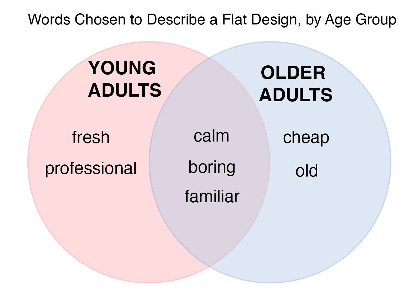
- If you have multiple user groups and can identify those in your participant responses, include them in the presentation of your results. Meaningful differences between the sets of words preferred by the two groups may give you insight into their different attitudes. (For example, you may report that 54% of experienced users described the design as ‘exciting’ while only 13% of novice users selected the same word.)
- If you’re evaluating multiple designs or multiple versions of the same design (for example, old and new), look at the differences between the sets of words chosen to describe the different designs. (For example, you may report that 83% of the users described the redesigned app as ‘professional,’ compared with only 20% using the same word for the older version of the app.)
- If the site is intended to communicate specific brand attributes, decide in advance what words correspond to your brand positioning. Then count how many users include at least one of those words in their top-5 list.
- Use a Venn diagram to present how your results map to design direction words, how different designs are described differently, or how different user groups describe a design differently (see the example below).
References
J. Benedek and T. Miner. 2010. Measuring desirability: New methods for evaluating desirability in a usability lab setting. Proceedings of UPA 2002 Conference
C. Rohrer. 2008. Desirability studies: Measuring aesthetic response to visual designs. xdStrategy.com


Share this article: