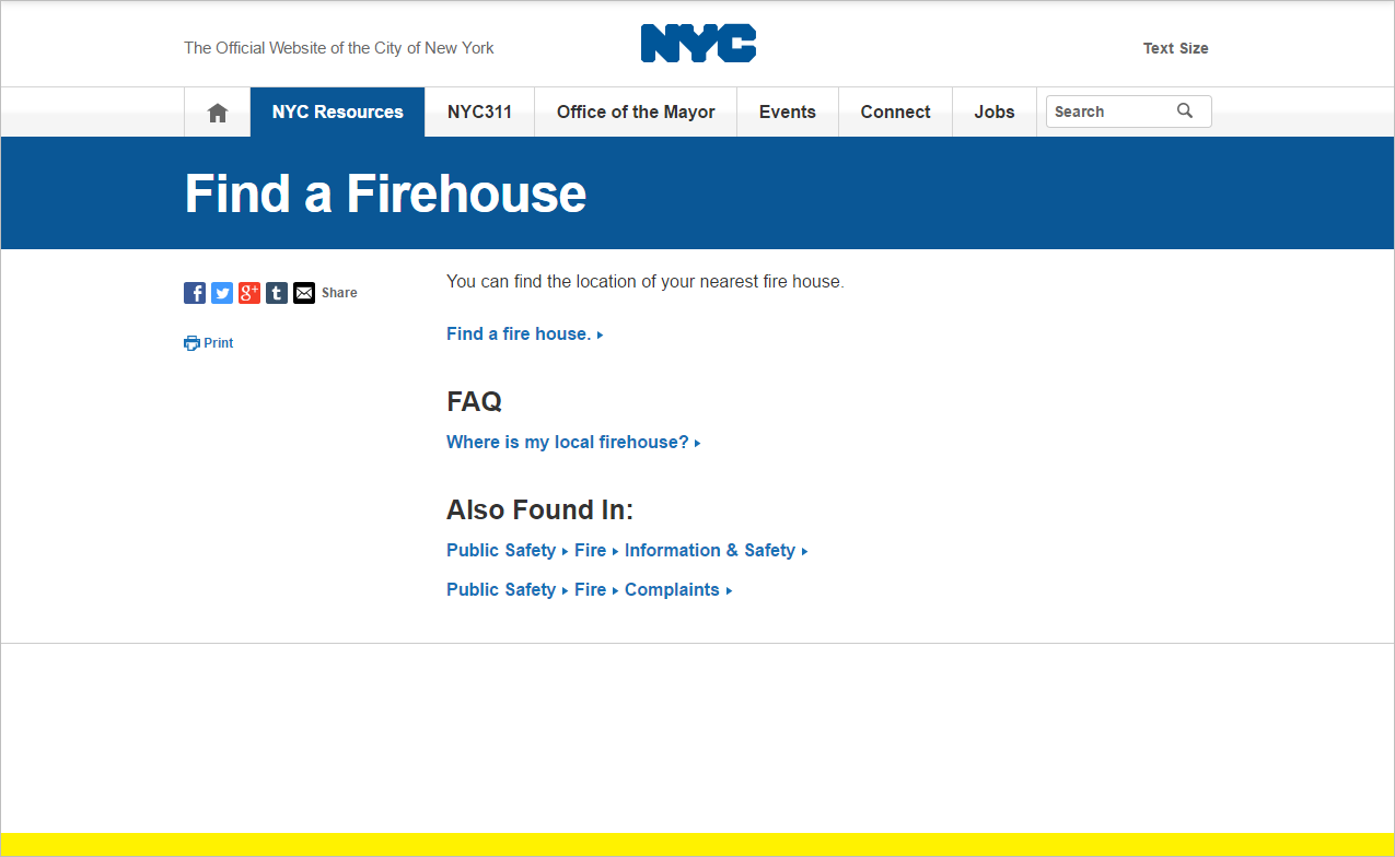
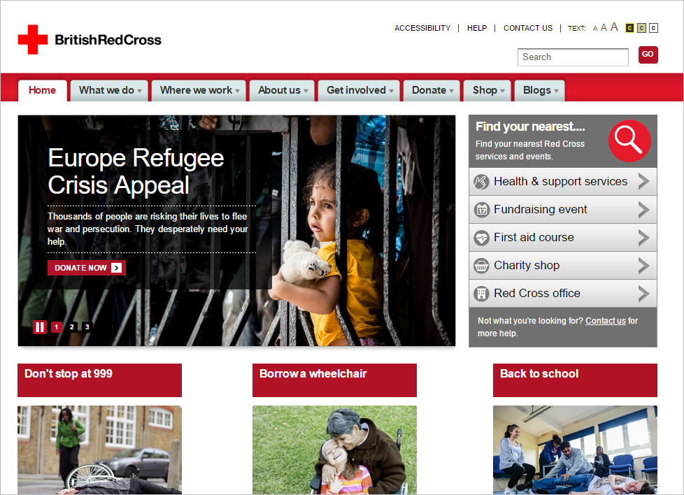
Since 1996, we have been compiling lists of the top 10 mistakes in web design. This year, we completed a large-scale usability study with 215 participants in the United States and United Kingdom to see what today’s web-design mistakes are. After analyzing results across 43 sites that ranged from small, local businesses to entertainment sites to nonprofits to global organizations, we identified 10 of the most common and most damaging web-design mistakes that hurt our users. (And by hurting their users, these design flaws most definitely also hurt the websites’ business metrics.)
The big news? None of the top issues today is new or surprising. Web design has come a long way. But these persistent problems remain. Modern design patterns and aesthetics change, but underlying user needs remain the same. Users still need to find information, be able to read it, and know what to click and where it leads.
How many of these mistakes is your website making?
1. Unexpected Locations for Content
People can’t use information they can’t find. Many sites offer poor category names that don’t adequately or accurately describe the content within them. Others are arranged based on how the company — rather than the user — thinks about content. When the site structure doesn’t match the users’ mental models of how information should be organized, people are unable to locate what they need.
Involve users in creating your site structure. A little usability work such as card sorting, tree testing, or usability testing can go a long way in creating a site structure that makes sense to users.

2. Competing Links and Categories
When users can’t clearly distinguish between similar navigational categories or links, they struggle to find the right path to content. Category and link names need to make sense on their own, but also in conjunction with other options on the site. If multiple sections or pages could address a specific information need, users must explore each or make their best guess. Alternatively, they may turn to search or even leave the site.

Card sorting and usability testing can help avoid overlapping category names. Problems with links that are too similar often stem from poor content strategy. Two likely causes for these problems are:
- Poor labeling: The links lead to different content, but, for some reason, they have similar labels. If that’s the case, try renaming your links to differentiate them from one another.
- Poor content differentiation: If links lead to different pages with highly related information, the solution may be not to rename the links, but to reorganize and consolidate the content.
3. Islands of Information
Some sites offer small bits of information scattered around the site, with little or no connection between them.
When users find one such island of information without links to other related information, they have no reason to think that another area of the site offers supplementary material. If people need additional information, they may move to a competitor’s site or to Google to acquire it.
Users trying to revisit the information may end up in an entirely different area of the site, with a different view of content than in the first experience. Those who do locate the disjointed information, are left to piece it together. Either way, they are left with a negative impression of the site.
From an organization’s perspective, this is not only a user-experience failure, but also a content-management nightmare: information in one area of the site may duplicate, differ from, or even contradict information elsewhere.
One solution is to add related links between pages that offer related information. A better solution is to consider why information is scattered throughout the site, consolidate it as appropriate, and pick the best spot for it. Other areas of the site can refer to the primary location for content about that topic, instead of replicating the information.
4. Repetitive Links
Even if users can determine the right site location for their information needs, they can still be stymied by unexpected or lengthy workflows.
Web teams often ask how many clicks it should take to get to content. There is no magic number — the quality of the clicks matters far more than the quantity. Users should get closer to the information goal as they click through pages. Repetitive clicks that force people to select what they want again and again aggravate users and require them to spend unnecessary effort.
Teams sometimes build pages in isolation and do not consider the route to the content they’ve created. When creating new pages, review how the user will get there and to see if a more direct path is possible.


5. Hidden Fees and Prices
People want to know about prices, subscription fees, convenience fees, and additional charges before or at the beginning of a process. On several sites, users had to proceed through complex interactions just to find basic information — for example, they had to start purchasing a membership on the AARP site in order to find out the membership cost. Users should be able to find information before committing to a complex process.
6. Stranding Users on Microsites
Sites that create separate, secondary sites for sections or specific types of content need to be cautious about stranding users on those sites. Many of our study participants moved to a new site or subsite without realizing it and then struggled to get back to the main site because the subsite offered no option for return. Some were able to navigate to the parent site by repeatedly using the browser’s Back button or retyping the site’s URL, but many did not even notice that they had switched sites (because of the similar look-and-feel of the parent and child sites) and wondered why the navigation they had used before was gone.
Think twice before creating a separate subsite. If you do build one, make sure that users can easily navigate back to the parent site as needed.


7. Poor Search Results
Users turn to search out of preference, as a last resort, or when they know precisely what they’re looking for. In any scenario, sites need to support users by providing strong search results.
Unfortunately, site search is still a major weakness for many websites. Some sites return results that do not match users’ queries. Others search only some of the site content but don’t clearly disclose that to the user. Results that are poorly named or accompanied by useless summaries leave people guessing the content behind the link. Ads interspersed with site-search results surprise users and lead them away from the site.
Regularly review search logs to learn more about your users’ search behavior and your search engine’s successes and failures. Use content tagging and features of the site’s search tool, such as Best Bets, to promote the most appropriate results for specific queries.
8. Flawed Filters and Facets
Facets and filters generally improve user experience. Users can narrow down their search to the exact resource, product or content they need. However, simply adding facets and filters does not ensure better usability. These tools need to support real users and real user needs.
Facets and filters define the search space for users, and different criteria help in different contexts. Employees looking specifically for last Tuesday’s PowerPoint presentation on sustainability can benefit from narrowing by document type and date, but also by topic. An ecommerce site might want to allow shoe shoppers to narrow by heel height and outerwear shoppers to narrow by warmth rating.
Sites create flawed facets and filters when they attempt a one-size-fits-all approach. The same criteria and characteristics may not apply across all content types. Be cautious in limiting users’ selections to an either-or approach, as well. Furniture shoppers may be looking for blue chairs, or for chairs that are any color other than blue. Both needs should be supported.
Content must be tagged correctly and reliably to produce relevant results. For instance, on the AARP site users looking for a chicken recipe were quite confused when 6 of the top 10 results did not include chicken in the recipe.

9. Overwhelming Users with Information
Poorly organized information leaves users struggling to find what they need. Dense walls of text make it difficult to scan for information of interest. Overloaded pages are filled with items competing for users’ attention.
Remember that users scan, not read, online. Make it easy for users to pick out information of interest, by writing for the web: use short sentences and paragraphs, bulleted lists, headings, and bolded keywords.

10. Hidden Links
For years, our usability research has shown that users often ignore or overlook content that resembles advertising or is placed in a page location typically used for ads. This problem still exists and is even worse when content is listed alongside actual advertisements.
Site designers sometimes think that adding more design elements, such as a border, background color or graphic to a link will make it stand out. The result is commonly the opposite: The fancier the design around a link, the more users might mistake it for an advertisement.

Progress Has Been Made: There's Progress to Be Made
We can safely assume that no one sets out to create a poorly designed website. If these problems have been well-known for years, why do they persist? Potential answers to that question could likely fill a book. Some of these mistakes likely reflect a deeper, organization-specific UX-strategy failure. For example:
- Problems with site information hierarchy can be tied to organizational structure or a company’s internal politics.
- Content issues arise when different departments create content without being aware of each other and without following an overarching content strategy.
- Poor search results may stem from poor content-management systems, flawed or missing tagging of content, or a poor search tool.
The reasons behind these problems are less important than fixing them. Many, if not all, of the mistakes listed above could be easily identified by including user research and usability testing in the website-development process and paying attention to the findings from that research.
Websites will never be perfect. No site is. There is always one more form field to be fixed, one more piece of content to be edited, one more navigational category to be determined. But knowing what needs fixing is essential to moving in the right direction.
When doing user research, hold on to old findings. As design preferences change 5 years from now, those old findings may keep you from making the same key usability-related mistakes a second, third, or fourth time.
More on how to make a website that works for your users and your business in the courses on Web Page UX Design and Information Architecture.


Share this article: